")
Sherwin-Williams’ Alabaster (SW-7008) is a soft white that has stood the test of time. This gentle color brings warmth to any room without being too yellow or stark. Homeowners and designers choose Alabaster for its ability to work with many styles—from modern to farmhouse.
In this blog, you’ll learn:
- What undertones hide in Alabaster
- How it stacks up against similar whites
- Tips for using it in your home
I’ve tested Alabaster in hundreds of homes with different lighting situations. My advice will help you decide if this popular white is right for your space.
Why Is Sherwin-Williams Alabaster so Popular?
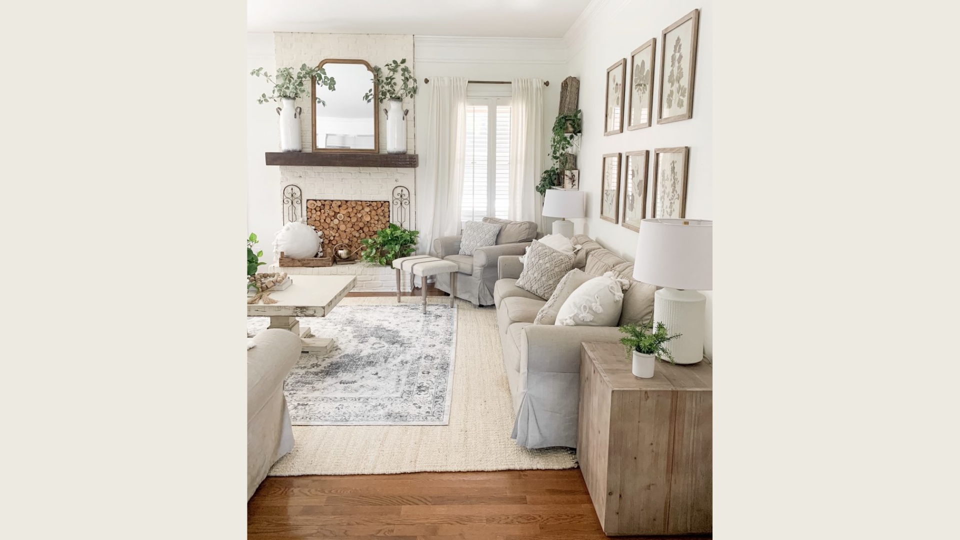
Alabaster sits perfectly between warm and neutral. It’s not too yellow, not too stark. This balance makes it work in almost any space, which is why I recommend it so often to my clients. Designers and homeowners trust this color for good reason.
When you need a white that won’t feel cold or clinical, Alabaster delivers every time. It has a gentle softness that makes rooms feel welcoming.
Did you know? Sherwin-Williams named Alabaster their Color of the Year in2016. This recognition boosted its already growing fan base. I’ve seen this versatile white transform both sleek, minimalist spaces and cozy, traditional homes. In modern settings, it provides a clean backdrop without the harshness of pure white.
In traditional rooms, it adds a touch of freshness while respecting classic elements. What makes Alabaster truly special is how it changes throughout the day. Morning light brings out its warmth, while evening light showcases its neutral side.
The color’s staying power is no accident. When you want a white that won’t go out of style next season, Alabaster proves itself worthy time and again.
What Undertones Does Sherwin-Williams’ Alabaster Have?

Alabaster carries soft, creamy undertones with slight hints of beige or greige. When you look closely, you’ll notice it’s not a pure, stark white. But don’t worry—it won’t feel too yellow either. The magic of Alabaster is in its balance. I’ve tested this color in hundreds of homes and found it sits comfortably in the middle.
With an LRV (Light Reflectance Value) of 82, Alabaster reflects plenty of light while still maintaining depth. This means your walls won’t look flat or one-dimensional.
Light changes everything with this color:
- Morning sunlight: Brings out warmer, creamier tones
- Midday natural light: Shows its most neutral face
- Evening light: Can lean slightly into its beige side
- Artificial lighting: LED bulbs keep it neutral, while incandescent bulbs pull out the warmth
Have north-facing rooms? Alabaster helps counter the cooler light without feeling too yellow. I find Alabaster creates a calm, cozy feeling in most spaces. Your room won’t feel like a sterile doctor’s office or an overly yellow cream box. The undertones are subtle—you might not even notice them until you compare Alabaster directly with other whites.
Is Alabaster a Popular White Color for Exteriors?
Yes, Alabaster shines on home exteriors. I’ve seen it transform countless houses, from siding and brick to trim and garage doors. This white stands out as a top pick for good reasons. In natural daylight, Alabaster looks crisp without being harsh.
You won’t get that blinding effect that some whites create in full sun. Instead, your home will appear clean and fresh throughout the day. What makes this color work so well outside? It’s the subtle warmth.
I often recommend Alabaster for:
- Main siding color
- Painted brick renovations
- Trim against darker siding
- Front door color for a clean look
The pairing options make this white even more useful. Dark shutters in navy or black create beautiful contrast. Natural stone elements feel right at home next to Alabaster. Even soft greige tones on accent areas blend perfectly.
Your home style matters in this choice. Farmhouse looks? Alabaster feels right at home. Cottage beauty? It works wonderfully. Modern-traditional mix? This white bridges both worlds nicely. Unlike some exterior whites, Alabaster won’t turn too yellow or too pink as seasons change.
What Paint Colors Are Similar to Alabaster?
Looking at whites can get confusing fast. I’ve compiled this comparison to help you see how Alabaster fits among similar shades. Alabaster sits comfortably in the middle of the creamy-white spectrum. Not too warm, not too cool, it offers that “just right” feeling many homeowners seek.
Let’s see how Alabaster stacks up against its closest competitors:
| Paint Color | Brand | How It Compares to Alabaster | Best For |
|---|---|---|---|
| White Dove | Benjamin Moore | Slightly warmer with more yellow tones | Rooms that need extra warmth |
| Snowbound | Sherwin-Williams | Cooler with faint gray undertones | Modern spaces seek a cleaner look |
| Greek Villa | Sherwin-Williams | Noticeably warmer with cream undertones | Traditional homes want a cozy feel |
| Pure White | Sherwin-Williams | Brighter with fewer undertones | Spaces needing a cleaner, less soft white |
| Swiss Coffee | Benjamin Moore | Much creamier with yellow undertones | Very warm, traditional settings |
When you place these whites side by side, the differences become clear. I often tell my clients to paint large sample boards of each and move them around different walls and lighting conditions. Your room’s lighting will change how each of these colors appears.
North-facing rooms make Alabaster look more neutral, while south-facing spaces bring out its subtle warmth. The right choice depends on your specific needs. Want something a touch cooler? Try Snowbound. Need more warmth? Greek Villa might be your answer.
What Makes Alabaster a Great Choice for Any Space?
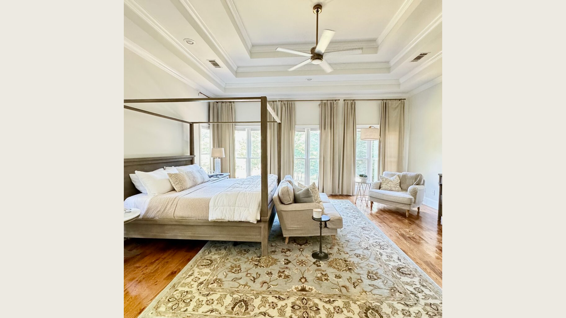
The soft warmth of Alabaster turns any room into a welcoming space. I’ve used this color in tiny bathrooms and vast living rooms with equal success. It never feels cold or uninviting. This color plays well with others.
Your existing floors—whether dark hardwood, light oak, or gray tile—will look at home with Alabaster walls. Cabinet colors from white to navy to natural wood all pair nicely with this versatile shade. Light matters, but Alabaster handles it all:
- Sunny south-facing rooms: Stays true without turning yellow
- Dark north-facing spaces: Adds warmth without feeling gloomy
- Artificial lighting: Maintains its gentle character from evening to morning
I painted my own kitchen Alabaster three years ago, and I still love it every day. Your decor style doesn’t matter much with this color. Alabaster forms a perfect backdrop for any look whether it is modern, farmhouse style or classic. It lets your furniture and art take center stage while still adding character to the walls.
The best part? You won’t need to change your whole color scheme to make it work. Alabaster fits in with what you already own. When clients ask for a “no-regrets” white, this is my go-to suggestion. It’s stood the test of time in hundreds of homes I’ve worked on.
Alabaster vs. Other Sherwin-Williams Colors?
When choosing whites, small differences matter. I’ve helped hundreds of homeowners pick between these close cousins in the Sherwin-Williams family. The right white depends on your space and what feeling you want to create. Let me break down how Alabaster compares to its siblings:
| Color | Feel | Best For | When to Choose Over Alabaster |
|---|---|---|---|
| Alabaster | Soft, balanced warmth | All-purpose spaces | When you want versatility and gentle warmth |
| Pure White | Clean, slightly cooler | Modern homes | When Alabaster feels too creamy for your style |
| Greek Villa | Noticeably warmer, creamier | Traditional spaces | When you need extra warmth in cool-light rooms |
| Snowbound | Crisp with gray hints | Contemporary settings | When Alabaster seems too warm for your taste |
| Extra White | Bright, stark | Trim, modern spaces | When you want a true, clean white with no cream |
I often tell my clients that Alabaster feels cozier than Pure White but less creamy than Greek Villa. It sits right in that sweet spot many homeowners look for. Your room matters too. In north-facing rooms with cool light, Greek Villa might work better than Alabaster.
For south-facing spaces flooded with warm sun, Snowbound might balance better than Alabaster would. The white you choose sets the mood for your entire space. Pick Alabaster when you want that “just right” feeling—not too warm, not too cool, but comfortable and timeless.
Conclusion
Alabaster stands as a reliable soft white with subtle warmth that works in nearly any room. Its balanced nature makes it a safe yet stylish choice for walls, trim, cabinets, and exteriors. Before you commit, I strongly suggest testing a swatch in your space. Paint a large board and move it around different walls.
Watch how it changes from morning to evening—this step saves both time and money. My favorite tip? Pair Alabaster with natural textures for a cozy, grounded look. Wood tones, woven baskets, and stone elements all enhance its gentle character. These combinations create spaces that feel both fresh and welcoming.
Remember that the perfect white is the one that makes you feel good in your space. While Alabaster works for many homes, your lighting and personal taste matter most.
Ready to try Alabaster? I’d love to hear how it works in your home!