
Standing in the paint aisle, staring at two seemingly identical white paint cans—sound familiar? White walls create a clean, timeless look, but choosing between Benjamin Moore’s Simply White and White Dove can be tricky.
These popular whites might look similar at first glance, but they have key differences that affect how they look in your home. One might make your space feel warm and cozy, while the other could create a crisp, bright feel. This blog breaks down everything you need to know about these two whites:
- How do they compare side-by-side
- Which rooms work best for
- How lighting changes their appearance
With years in home design, I’ve used both of these whites in countless homes. By the end of this blog, you’ll know exactly which white fits your space perfectly—no more second-guessing at the paint counter!
Simply White (OC-117)
Simply White (OC-117) is one of Benjamin Moore’s brightest whites. It has a clean, fresh look with a hint of yellow that gives it a slight warmth. When I use this white in homes, it creates a very bright, clean feel.
The LRV for Simply White is 89.52. What does that mean for you? It means this white reflects a lot of light, making spaces feel bigger and more open. Simply White works well on walls, trim, and cabinets. I’ve used it in many kitchens where clients want a bright, clean space.
But in north-facing rooms, Simply White can sometimes look a bit cold. Simply White has a soft yellow undertone. In most lights, you won’t directly see “yellow” – just a fresh, clean white. And here’s what happens: in bright afternoon sun, this yellow hint becomes more obvious. I once painted a west-facing living room Simply White, and by 4 PM, the walls had a subtle sunny glow.
This warm base makes Simply White feel welcoming. But be careful. In rooms with lots of warm light, it can look too yellow for some people’s taste.
White Dove (OC-17)
White Dove (OC-17) feels softer and more relaxed. It has a creamier look than Simply White, with small hints of gray that tone it down.
The LRV of White Dove is 83.16. This means it still brightens a room but doesn’t feel as stark as Simply White. You’ll often see White Dove on trim, doors, and cabinets. Many of my clients pick this white when they want something that feels warm but not yellow.
White Dove is more forgiving than Simply White. It hides dirt and smudges better—a big plus if you have kids or pets! It contains both gray and beige undertones (sometimes called “greige”). This combo creates a softer, more muted white.
Unlike Simply White, White Dove absorbs some light rather than bouncing it all back. This makes it feel calmer and less bright. The gray in White Dove helps it stay true to color in most lights. I’ve used it in north and south-facing rooms, and it looks good in both.
White Dove won’t flash yellow, even in strong light. Instead, it maintains its soft, creamy look throughout the day.
How They Compare?
The main difference? Simply White feels cleaner and brighter, while White Dove feels softer and more mellow. Think of Simply White as a crisp white shirt. White Dove is more like a soft white sweater. Both whites work in many homes, but for different reasons.
Simply White makes modern spaces feel fresh. White Dove adds warmth to older homes without feeling too yellow. I’ve painted entire houses in both colors. Your choice depends on the mood you want to create in your home. Don’t trust how whites look in the store! Paint a sample board and move it around your house.
Look at your sample:
- In morning light
- In afternoon light
- At night with lamps on
- Against your flooring
- Next to your furniture
This helps you see how the undertones react in your actual space before you commit.
How Does Lighting Affect Each Shade?
Light changes everything when it comes to white paint. I’ve seen the same white look completely different from room to room. This table breaks down how Simply White and White Dove react to various lighting conditions:
| Lighting Condition | Simply White (OC-117) | White Dove (OC-17) |
|---|---|---|
| Bright, Natural Light | Becomes very bright and can look almost stark. The yellow undertone becomes more visible. It can make a room feel extra sunny and open. | Stays balanced and soft. Doesn’t get too bright or harsh. Creates a clean but gentle feel that’s easier on the eyes. |
| North-Facing Rooms | It can look slightly cool or flat since there’s less warm light. Still maintains brightness but loses some of its warmth. | Holds up well and stays true to its soft, creamy nature. The gray undertones help it stay warm without looking dull. |
| South-Facing Rooms | Really glows and shows its yellow undertones. It can look too bright in peak sunlight hours. | Remains steady and doesn’t get too warm. The gray base helps control brightness while still looking white. |
| Evening/Lamp Light | It can shift toward a warmer, more golden tone under yellow-tinted bulbs. Looks clean under white LED lights. | Becomes extra cozy and soft. The creaminess gets more noticeable. Creates a gentle glow rather than stark white. |
| Darker Rooms | Helps brighten up spaces without much natural light. Can feel clean and fresh, but sometimes a bit cold. | Adds warmth to dark spaces. Feels cozy rather than stark. Helps the room feel lived-in rather than clinical. |
Pro tip: Paint samples on poster boards (at least 12×12 inches) and move them around your house throughout the day. This is what I do with my clients—it’s the only reliable way to see how these whites will truly look in your space.
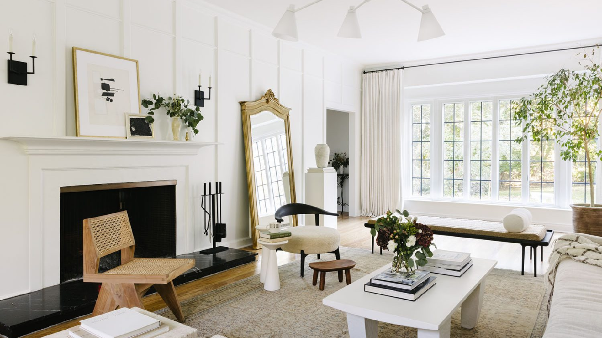
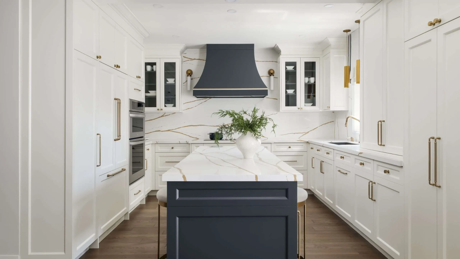
Best Rooms for Simply White
Simply White shines in kitchens. I’ve used it countless times for kitchen cabinets and walls. The clean look pairs perfectly with marble or quartz countertops. Bathrooms also benefit from Simply White’s brightness. It makes small bathroom spaces feel fresh and clean.
The slight warmth keeps these functional spaces from feeling too cold or hospital-like. Yet it’s still bright enough to look truly white, not off-white. Got a tiny room that feels cramped? Simply White can make it feel twice as big. I once painted a narrow hallway Simply White, and the difference was striking.
The space felt wider and more open immediately. Small home offices, laundry rooms, and powder rooms all open up with this bright white. Think of it as pushing the walls outward visually. Can’t knock down walls to get more space? Paint is the next best thing.
Simply White creates beautiful trim that stands out against colored walls. The crispness makes baseboards, crown molding, and door frames look sharp and defined.
For ceilings, I almost always recommend Simply White. It brightens the entire room from above and makes ceilings feel higher. If your home has clean lines and minimal decoration, Simply White enhances this style. The fresh, bright quality works with modern furniture and simple designs.
Best Rooms for White Dove
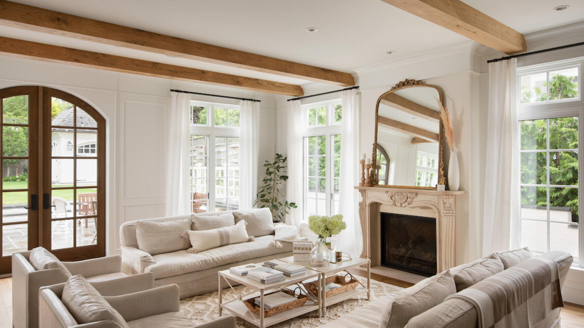
White Dove creates a peaceful feeling in bedrooms. I’ve used it in countless master bedrooms where clients want a calm, soft look. The gentle quality of White Dove helps you wind down at night. Unlike brighter whites that can feel too stimulating, this shade promotes relaxation.
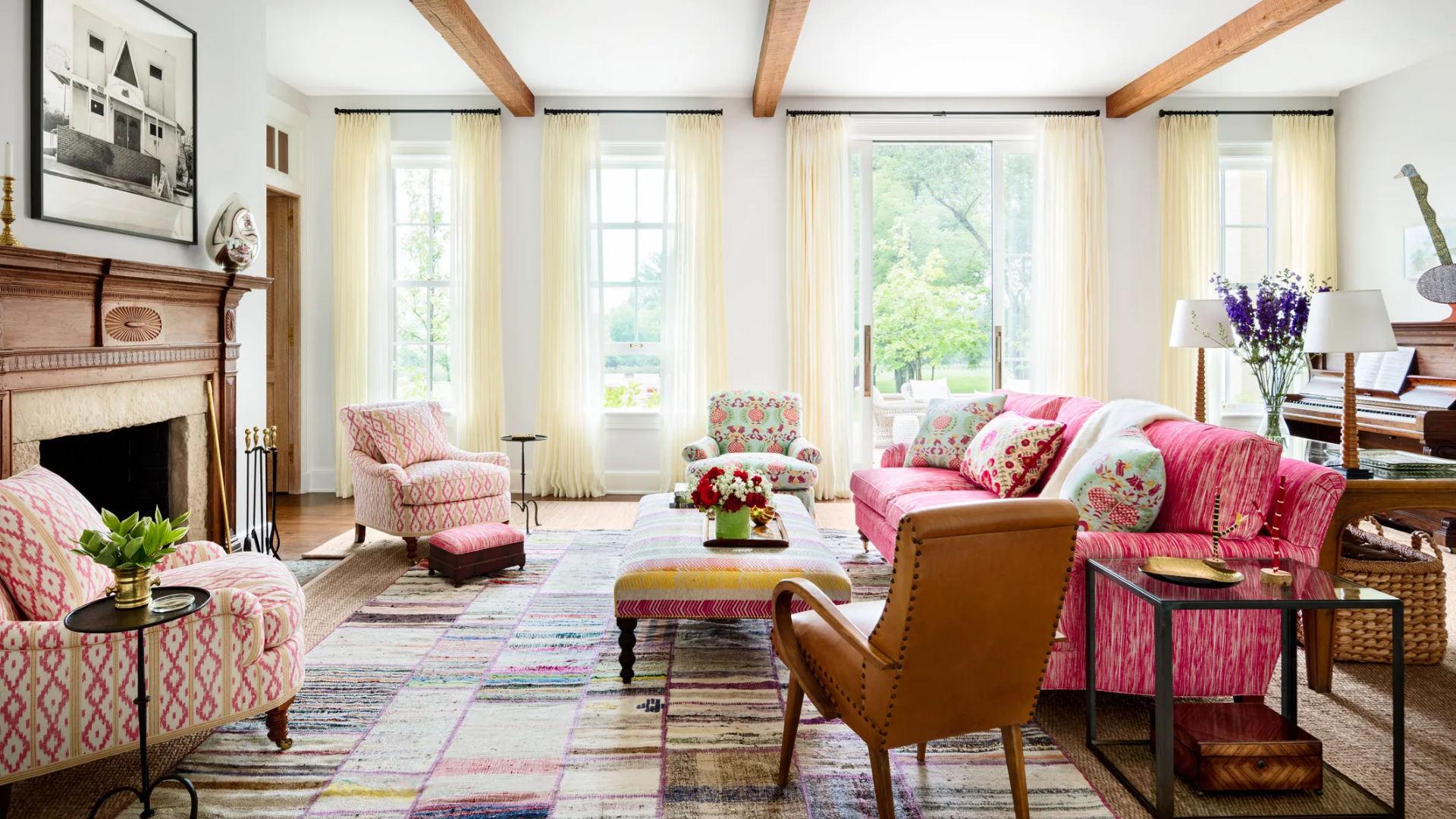
Living rooms also benefit from White Dove’s warm character. It creates walls that feel welcoming but still neutral enough to work with any furniture. Family movie nights feel cozier with White Dove as your backdrop rather than a stark white.
White Dove respects the beauty of older homes. I always suggest it for historic properties or houses with original woodwork. The subtle warmth complements original hardwood floors and millwork. It doesn’t fight with the yellow tones often found in older wood.
Craftsman homes, Victorian houses, and colonial-style properties all pair beautifully with White Dove. The softness honors the home’s history while keeping it fresh. I painted my own north-facing office White Dove. It brightens the space without the harsh, blue-ish cast that came with the brighter white I tried first.
White Dove works well in large, open spaces. It creates a soft, flowing feel throughout connected areas. The mild, muted quality stops big open areas from feeling too vast or empty. This white adds subtle texture even though it’s still neutral.
Mood and Style: What Each Color Says
| Aspect | Simply White (OC-117) | White Dove (OC-17) |
|---|---|---|
| Overall Feeling | Clean, fresh, and bright. Creates a crisp backdrop that feels modern but not cold. | Soft, gentle, and welcoming. Has a lived-in quality that feels established and calm. |
| Design Styles | Works best with: Contemporary, Scandinavian, Modern Farmhouse, Minimalist. | Complements: Traditional, Transitional, Cottage, Craftsman, Colonial. |
| Personality | Feels awake and lively. Like a fresh start or clean slate. Brings energy to a space. | Feels settled and serene. Like a comfortable sweater or well-loved book. Brings comfort. |
| Psychological Effect | Promotes clarity and focus. Helps spaces feel organized and fresh. | Promotes relaxation and ease. Helps spaces feel established and secure. |
| Time of Day It Shines | Looks its best in morning light when it glows without getting too bright. | Looks its best in evening light when its warmth creates a gentle glow. |
| What It Hides/Shows | Shows more imperfections on the walls. Makes art and decor stand out clearly. | Hides minor wall flaws better. Softens the look of furniture and decor. |
I like to think of these whites as having different personalities. Simply White is like your friend who’s always up early, ready for anything. White Dove is more like the friend who makes you feel at home the minute you walk in their door.
Conclusion
Choosing between Simply White and White Dove comes down to your home and what you want from a white paint. Neither is “better”—they’re just different. Always test both colors in your actual space before deciding. Paint large swatches on different walls and look at them throughout the day.
I’ve seen Simply White look perfect in one home and too stark in another just down the street. Lighting changes everything. White Dove might be your best choice if you have an older home with character, or if you want a soft, cozy feel.
And Simply White might work better if you need to brighten a small space, or you have a modern-style home, or you want a trim that pops. Remember that the perfect white is the one that makes you feel good when you walk into your room. Trust what your eyes tell you in your own home.