
When it comes to home colors, two shades often pop up—Accessible Beige and Agreeable Gray. These paint colors by Sherwin-Williams are both loved for being simple, soft, and flexible. They are safe picks, but they’re not boring. Each has its own style and feel.
Still, people often ask: Which one should I use, or can I use both?
In this blog, we’ll take a close look at each color. We’ll compare how they look, where they work best, and how they make a space feel. By the end, you’ll be able to pick the right one for your home—or even use both.
What Is Accessible Beige?
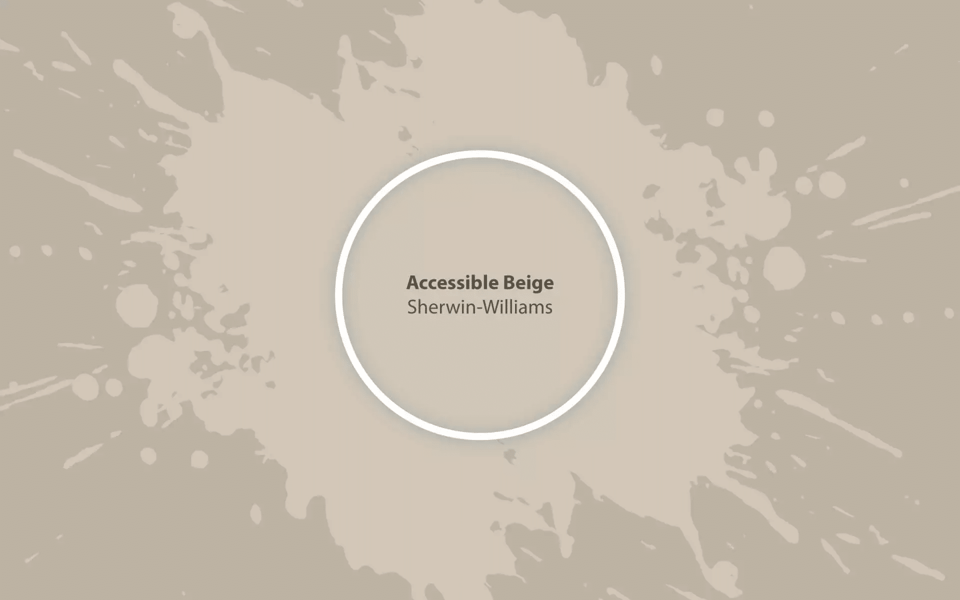
Accessible Beige (SW 7036) is not the usual beige you might expect. It’s softer and more balanced. A tiny bit of gray helps tone it down, making it feel calm and warm at the same time.
It doesn’t look yellow, which is a problem with some other beige shades. Instead, it leans more toward natural and earthy.
Main Features of Accessible Beige:
- Tone: Warm, soft
- Base: Beige with a bit of gray
- Best use: Living rooms, hallways, bedrooms
- Lighting: Works well in both bright and low light
What Is Agreeable Gray?
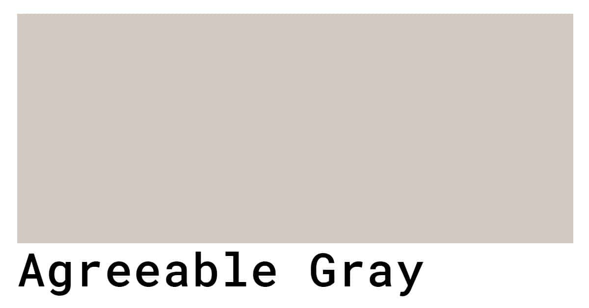
Agreeable Gray (SW 7029) is a soft gray color with warm undertones. It’s not cold or sharp. Instead, it feels friendly and calm. That’s why so many people choose it when they want something neutral but not dull.
It’s also very flexible. It can lean slightly gray or slightly beige depending on light and nearby colors.
Main Features of Agreeable Gray:
- Tone: Neutral, slightly warm
- Base: Gray with some beige (this makes it a greige)
- Best use: Walls, trims, cabinets
- Lighting: Changes with light—cooler in shade, warmer in sunlight
How They Compare Side by Side
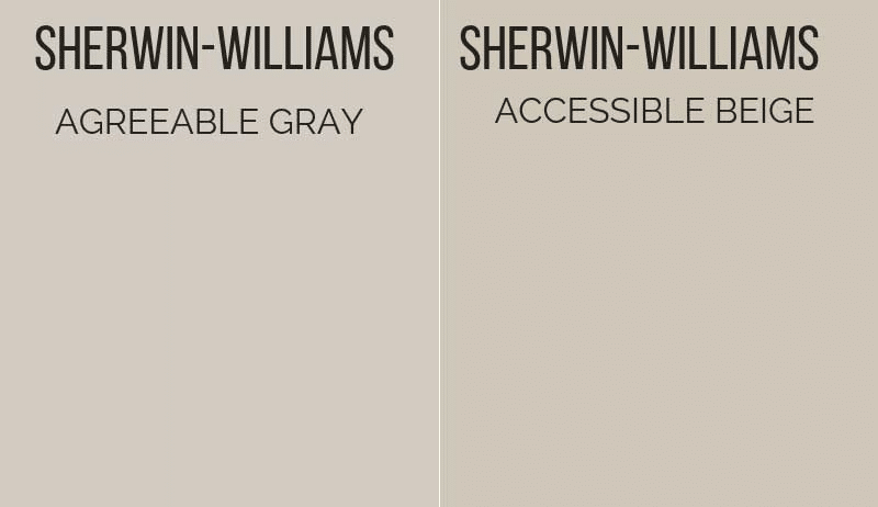
Let’s put them next to each other to see the real difference.
1. Color Family
- Accessible Beige belongs to the beige family with some gray added in.
- Agreeable Gray belongs to the gray family with some beige mixed in.
They’re both in the middle. That’s why they can look alike in some settings. But once you look closely, you’ll see the difference.
2. Temperature
- Accessible Beige is warmer. It feels soft and cozy.
- Agreeable Gray is more neutral. It’s still warm, but not as much.
So, if you want a slightly cozier feel, Accessible Beige might be better. If you want something a little cooler but still not cold, Agreeable Gray is a strong choice.
3. Light Reflectance Value (LRV)
LRV tells us how much light a color reflects. The higher the number, the brighter the color.
- Accessible Beige LRV: 58
- Agreeable Gray LRV: 60
They’re close, but Agreeable Gray reflects a tiny bit more light. That means it might feel a little brighter in certain rooms.
4. Mood and Feel
- Accessible Beige feels earthy and soft. It works great in cozy homes, relaxed rooms, and places with natural light.
- Agreeable Gray feels neat and smooth. It fits clean spaces, calm homes, or modern rooms.
Where to Use Accessible Beige
This color shines in spaces that need warmth without feeling yellow or orange. It’s great in:
Living Rooms
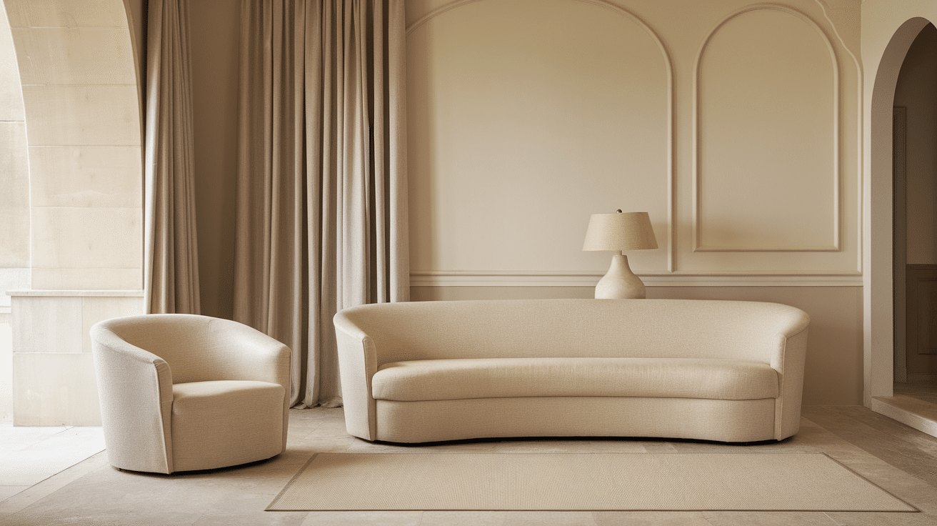
The warmth makes the space feel welcoming. It goes well with natural wood, tan furniture, and even soft greens or blues.
Bedrooms
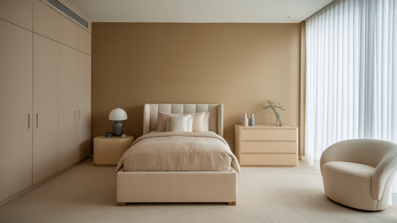
If you want your bedroom to feel calm and grounded, this is a great pick. It also looks good with light bedding, cream curtains, or soft gold tones.
Hallways and Entryways
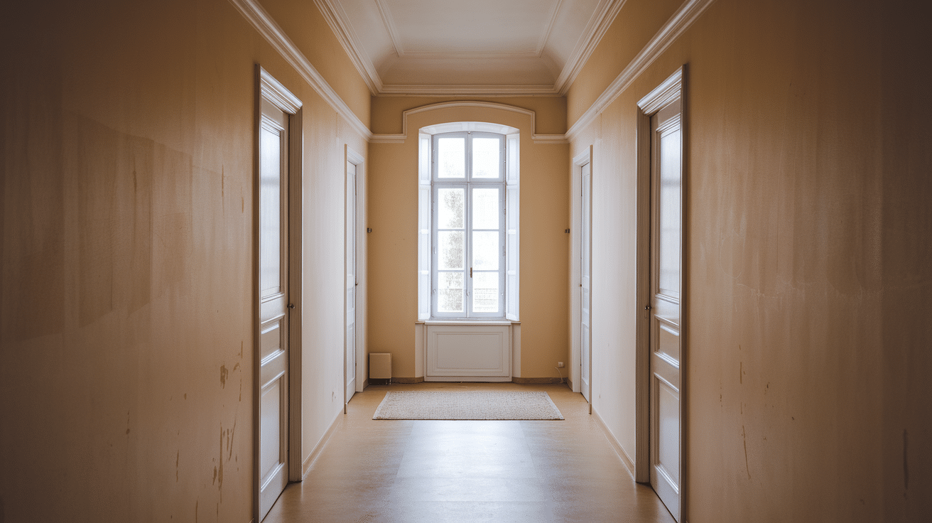
It’s perfect for spaces where you want a clean look but with a little softness. It helps tie different rooms together.
Where to Use Agreeable Gray
Agreeable Gray has a fresh, neat feel. That’s why people love it for:
Whole House Color
Because it’s so neutral, it works almost anywhere. If you’re painting an entire home or open space, this color keeps things balanced and even.
Kitchens and Bathrooms
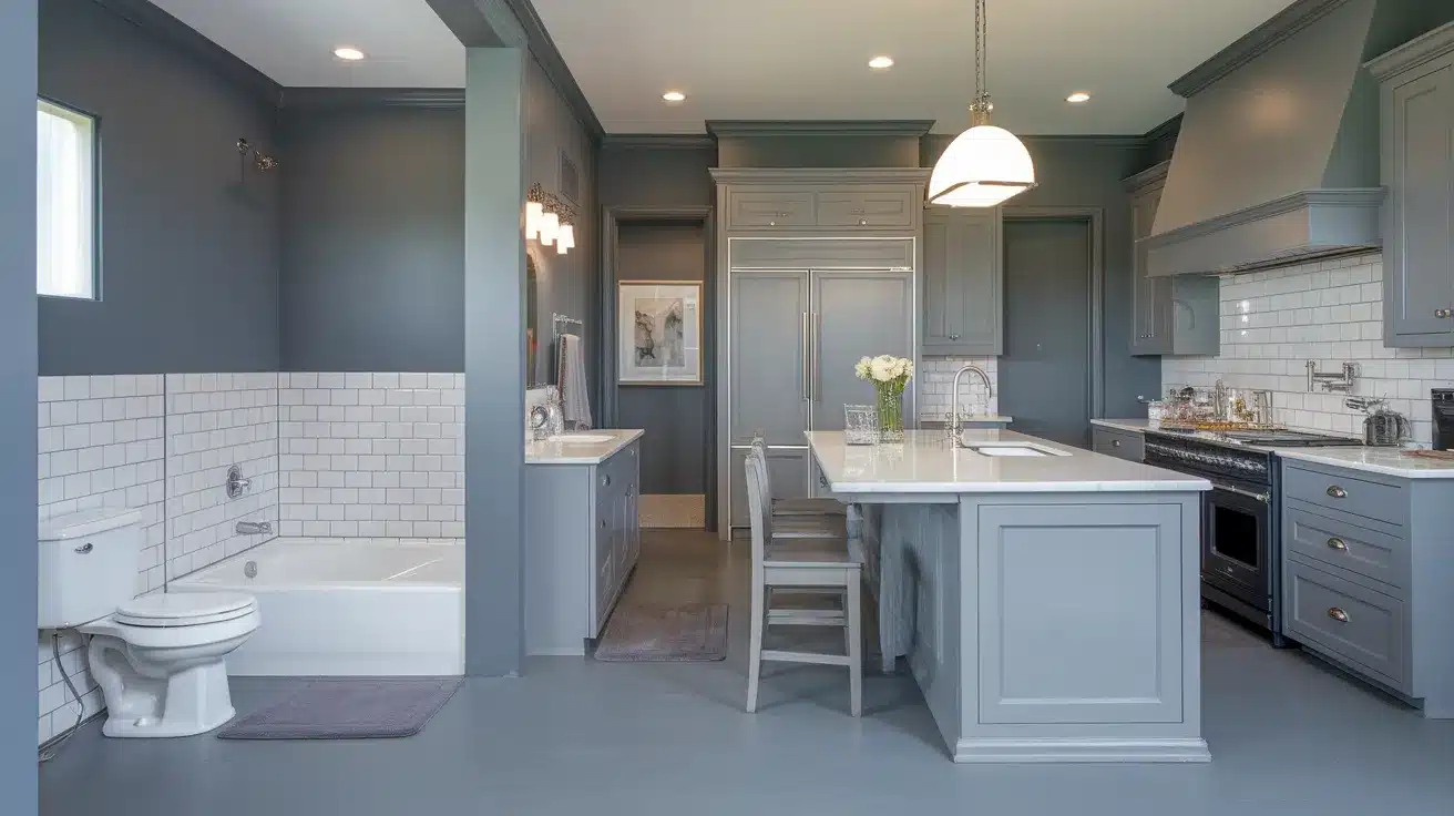
It works great with white cabinets, stainless steel, or black hardware. It makes the space feel crisp but not too cold.
Offices and Work Areas

This color helps keep the space calm and clear. It doesn’t distract, but also doesn’t feel too flat.
Lighting Matters—A Lot
Both Accessible Beige and Agreeable Gray can change depending on the light.
- In bright sunlight, both colors look lighter and warmer.
- In low light, Accessible Beige can look more tan, and Agreeable Gray may look a bit cooler.
- In LED or cool lighting, Agreeable Gray might feel more gray, while Accessible Beige might lean more taupe.
That’s why testing samples in your own space is key. Paint small sections and check them throughout the day. Look at them with your lights on and off.
What Colors Go with Each?
Accessible Beige Pairs Well With:
- Soft white
- Rich brown
- Light green
- Terracotta
- Muted gold
It leans into natural, earthy tones. These matches help it feel warm and grounded.
Agreeable Gray Pairs Well With:
- Crisp white
- Navy blue
- Charcoal
- Pale pink
- Brushed metal
These combos work great in modern and clean spaces. They help Agreeable Gray feel fresh but not cold.
Using Both Colors in One Home
You don’t have to choose just one. You can use both in the same house if done right.
Tips for Using Both:
- Use Accessible Beige in rooms with warmer lighting or where you want a cozy feel (like bedrooms or dens).
- Use Agreeable Gray in spaces where you want things to feel clean and airy (like kitchens or offices).
- Make sure there’s a smooth flow between the rooms. Use rugs, trim, or accents to tie the look together.
Using both adds variety without looking messy. Just keep the rest of your colors soft and simple.
Which Color Is More Popular?
Both colors are top picks for a reason. But in recent years, Agreeable Gray has become more common. That’s because people are choosing soft grays over warmer tones in modern homes.
Still, Accessible Beige is coming back. As more people want warmer, cozy spaces, it’s becoming a favorite again.
So, it’s not really about which is more popular. It’s about what works best for your home and your taste.
Helpful Questions to Ask Before Choosing
Here are a few things to think about before you pick your paint:
- How much light does the room get?
- Do you want the room to feel warm or cool?
- What colors are your floors, furniture, or cabinets?
- Are you painting one room or the whole house?
- Do you want a cozy feel or a clean look?
Answering these questions will guide you to the right choice.
Conclusion
Choosing between Accessible Beige and Agreeable Gray isn’t about which one is better. It’s about how you want your space to feel.
Accessible Beige is soft, warm, and down-to-earth. It brings comfort and warmth without being too yellow or too dark. If you want a space that feels homey and grounded, this is a solid choice.
Agreeable Gray is flexible, clean, and easy to match. It feels fresh but not cold. If you’re aiming for a tidy, modern space or something simple and neat, this color makes a lot of sense.
What makes them special is how they work with other colors. They’re both neutral, which means they let other pieces in your home stand out—your couch, your art, your rugs. They don’t take over the room. They support it.
In the end, there’s no wrong pick. Try small samples. See how they look at different times of day. Trust what feels right to you.
Both colors are smart, safe, and full of quiet charm. And with the right lighting and matching colors, they can change how your space feels—without trying too hard.
So whether you lean warm or cool, simple or cozy—Accessible Beige and Agreeable Gray have you covered.