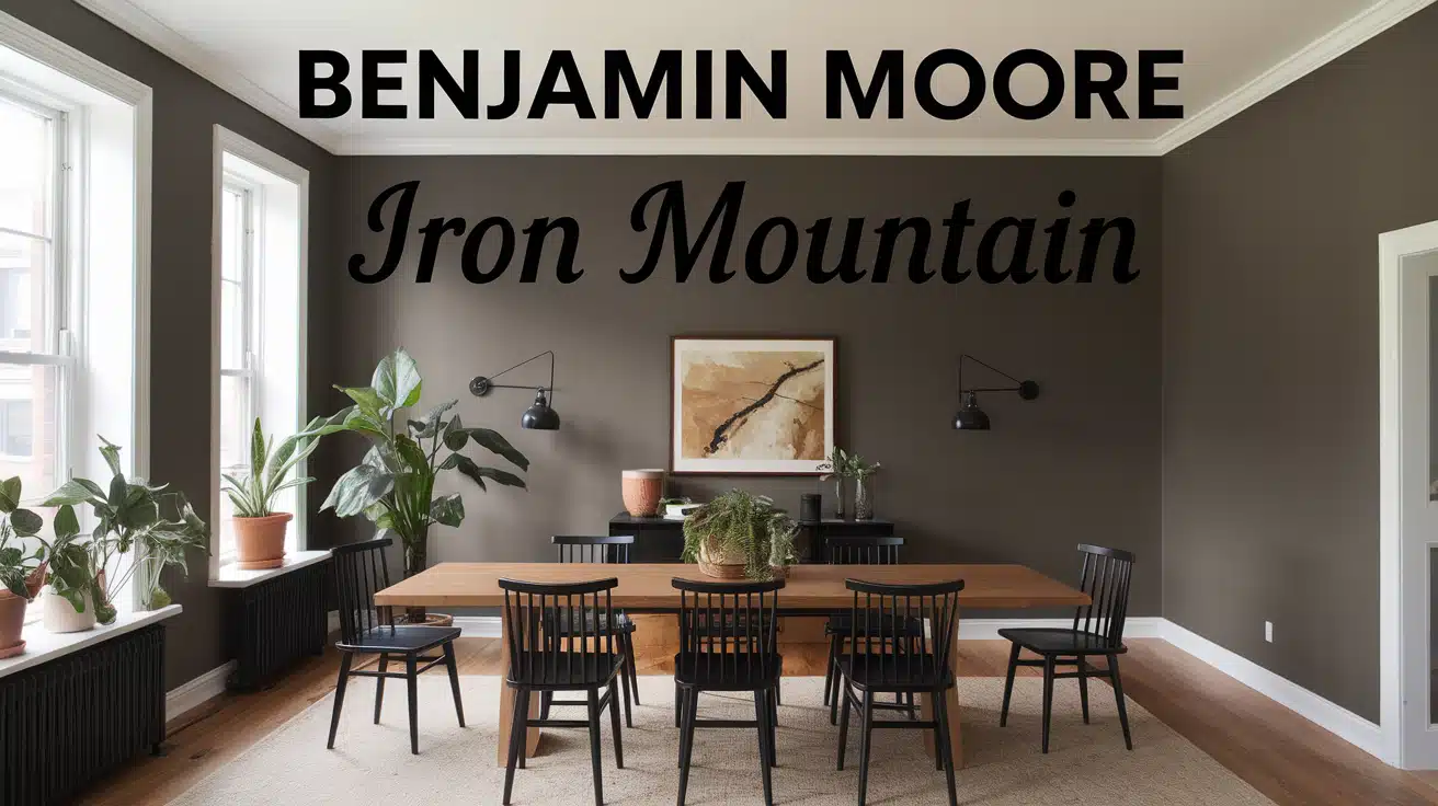
Tired of staring at the same old walls? I get it – picking the perfect paint color feels like solving a puzzle, especially when you want something versatile yet striking.
I’ve found the solution in Benjamin Moore’s Iron Mountain, a warm gray paint that brings character to any space without overwhelming it.
This soft black shade with rich undertones works magic on walls, cabinets, trim, and even exteriors.
In this post, I’ll share everything I’ve learned about Iron Mountain: its unique undertones, the best lighting conditions for it to shine, and my favorite color combinations that make it stand out.
Plus, I’ll give you real examples of how this paint performs in different rooms and settings.
Benjamin Moore’s Iron Mountain: Color Description
When I first saw Iron Mountain on my color cards, I noticed it’s not your typical gray.
It sits right in that sweet spot between a soft black and a deep gray, with the tiniest hint of green that you might miss at first glance.
What makes this color special is its warmth.
With an LRV (Light Reflectance Value) of 10.96, it’s on the darker side but doesn’t feel heavy or overwhelming.
The green undertones are subtle but important. They help the color feel natural and grounded, making it easier to work with than pure grays or blacks. I love how it pairs with both warm colors like cream and terra cotta, and cool shades like crisp white and navy.
In different lights, Iron Mountain shows different personalities. Morning light brings out its warmer side, while evening light emphasizes its deeper gray tones.
This flexibility is what makes it such a practical choice for various spaces.
How Lighting Changes Iron Mountain
Natural Light:
Morning sun makes Iron Mountain appear softer and brings out its warm gray notes.
- I’ve noticed that in south-facing rooms, the color looks brighter and shows more of its green undertones.
- In north-facing spaces, it takes on a cooler, more shadowy appearance.
- East-facing rooms show the color’s true depth in the morning hours.
- West-facing rooms make it shine in the afternoon.
The changing sunlight throughout the day creates subtle shifts in how the color reads on your walls.
Artificial Light:
Different bulbs can change how you see Iron Mountain:
- LED lights keep the color true to its warm gray nature
- Warm white bulbs enhance its cozy undertones
- Cool white bulbs make it appear more like a soft black
- Halogen lighting brings out the color’s depth
A helpful tip I learned: Test Iron Mountain under both your room’s natural light and the artificial lights you use most often.
I suggest painting a sample board and moving it around your space at different times of day. This helps you see exactly how the color will look in your home.
Rooms Best Suited for Iron Mountain Paint: A Visual Guide
1. Living Room Walls Transformation
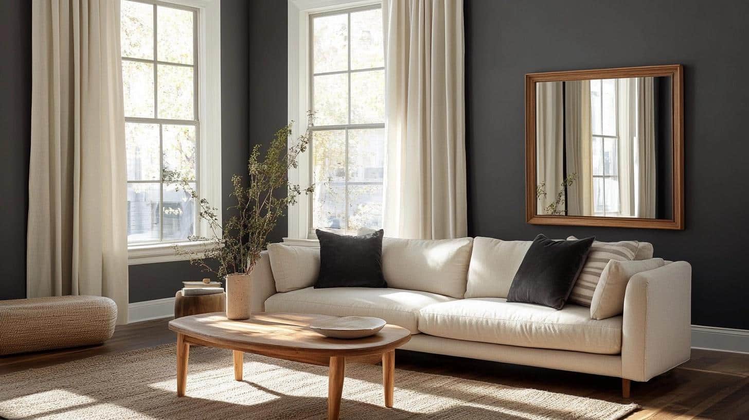
My love affair with Iron Mountain in living rooms started when I painted my own space last spring.
The color created such depth that my guests thought I’d hired an interior designer! The warm gray looks different on each wall, depending on the light, but never turns muddy or flat.
Here’s what I learned from my experience:
- Morning light brings out subtle green undertones, making the room feel fresh
- Evening light transforms it into a soft black, perfect for movie nights
- The color makes artwork pop without competing for attention
What really worked in my space:
- Off-white linen curtains that softened the contrast
- A mix of textures: velvet pillows, wool throws, and natural fiber rugs
- Light oak furniture that warms up against the deep walls
- Large mirrors to bounce light around the room
2. Kitchen Cabinets Upgrade
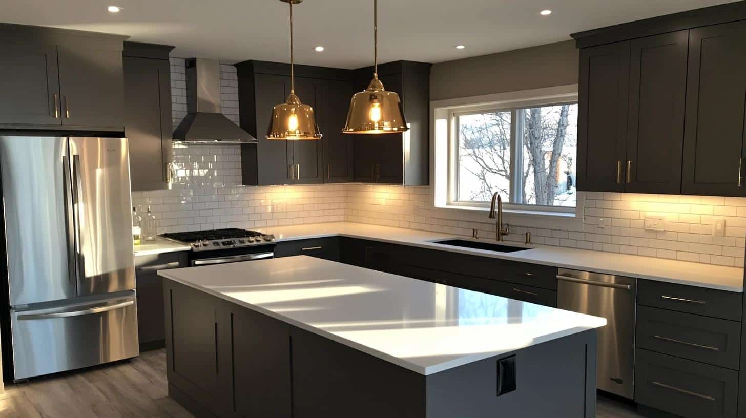
After painting over 20 kitchen cabinet sets, I can say Iron Mountain is a perfect middle ground between black and gray.
It pairs wonderfully with:
- White marble or quartz countertops
- Brass or chrome hardware
- Light-colored backsplashes
The color hides cooking marks well and looks fresh even after years of use.
3. Bedroom Makeover (my fav use of Benjamin Moore Iron Mountain)
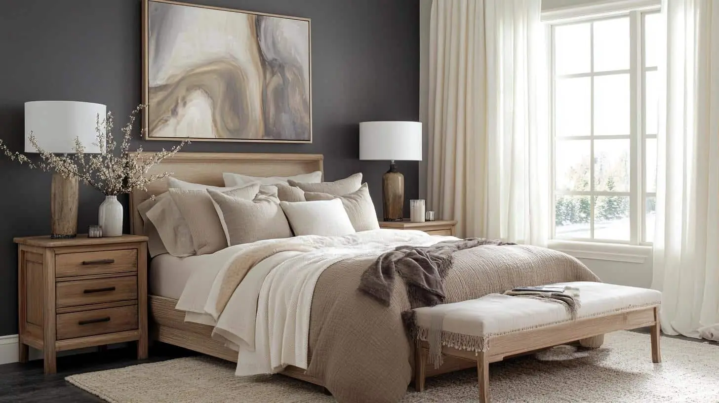
The magic of Iron Mountain in bedrooms lies in its ability to create a peaceful retreat. When I used it in my client Sarah’s master bedroom, it changed the entire feel of her space.
The color wrapped the room in comfort without feeling heavy or dark.
My favorite bedroom combinations:
- Layered bedding in cream, tan, and soft white
- A mix of lighting: table lamps with fabric shades and small reading lights
- Natural wood night stands that stand out against the walls
- Plush area rugs in light neutral tones to add softness
- White crown molding for crisp definition
Design tips I learned:
- Paint all walls for the full cocooning effect
- Add plenty of soft textiles to balance the color’s strength
- Include multiple light sources at different heights
- Keep window treatments light and simple for contrast
- Use large-scale art pieces – they look stunning against this backdrop
4. A Luxurious Laundry Room
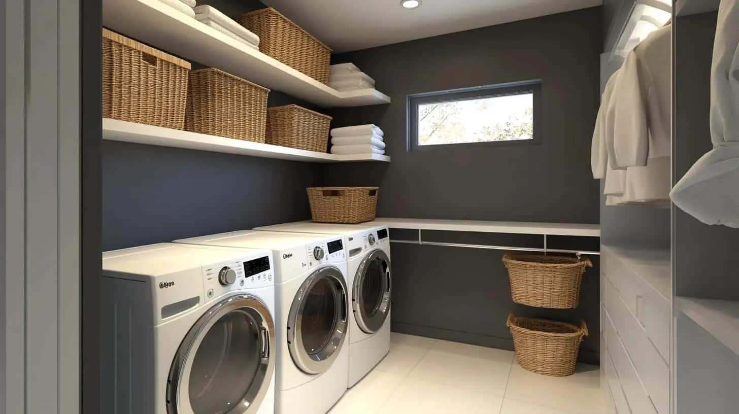
Who says laundry rooms need to be white?
I transformed my tiny laundry space with Iron Mountain, and it feels like a high-end boutique. The color makes white appliances stand out and hides dryer lint and water spots better than lighter shades.
What worked in my space:
- Painted upper walls only
- Added white open shelving
- Used bright task lighting
5. A Stunning Entry Featuring Iron Mountain Paint
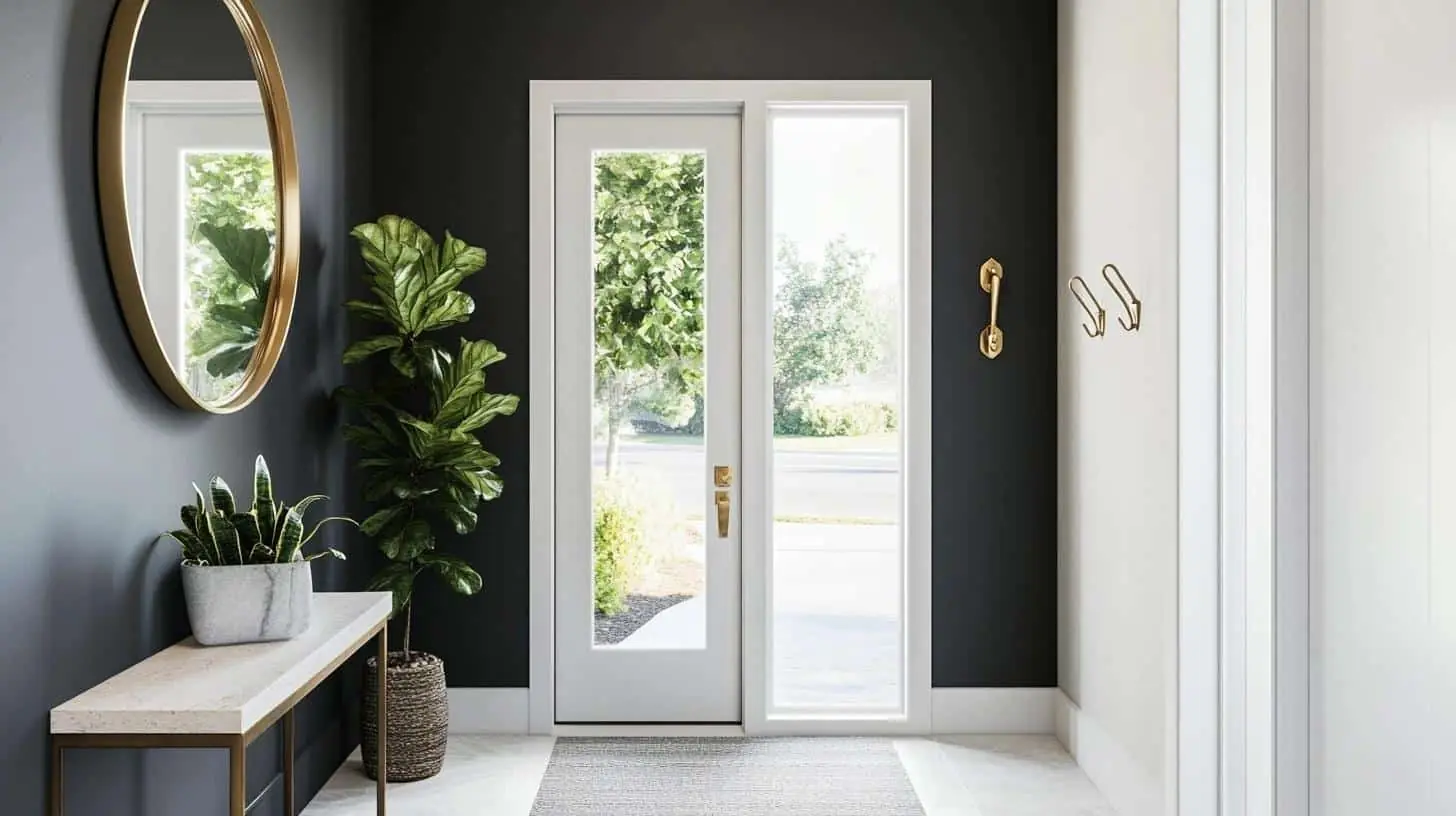
The entry sets the tone for your home, and Iron Mountain makes a statement without shouting. I painted my front door and entry walls in this shade.
It looked clean and fresh in all seasons and created a welcoming vibe that my guests always notice.
The color works beautifully with:
- Natural light from glass panels
- Wall hooks in gold or silver
- Light-colored floor tiles
- Simple greenery or flowers
Paint Your Front Door with Iron Mountain (trust me)
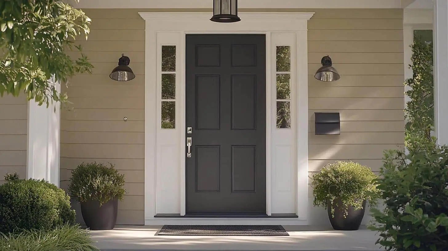
Let me tell you why Iron Mountain made the perfect choice for my front door.
After testing five different paint colors, this shade stood out because it stays true in both bright sun and shade.
Three reasons I stand by this choice:
- It looks clean and sharp against any siding color
- The gray undertones keep it from feeling too stark
- It enhances curb appeal without looking too bold
Here’s what I discovered during my paint job:
- Two coats give you perfect coverage
- The paint dries evenly without streaks
- It resists fading even in direct sunlight
- Door hardware in any metal finish looks great against it
Expert tips from my experience:
- Clean and sand your door thoroughly
- Use a high-quality exterior primer
- Paint in moderate temperatures (between 50-85°F)
- Apply thin coats with a foam roller
- Let each coat dry completely
My neighbor liked my door so much, she painted hers too!
The color looks different yet equally beautiful on her craftsman-style home as it does on my modern entry. That’s the beauty of Iron Mountain – it fits every home style while staying sophisticated and timeless.
Iron Mountain VS Other Similar Shades: Which One is For You?
| Feature | Iron Mountain | Iron Ore | Urbane Bronze | Collingwood |
|---|---|---|---|---|
| LRV | 10.96 | 6.0 | 8.0 | 29.96 |
| Base Tone | Warm Gray | Dark Gray | Brown-Gray | Light Gray |
| Undertones | Subtle Green | Purple | Bronze | Taupe |
| Best Light | North/South Facing | South Facing | East/West Facing | Any Direction |
| Room Match | Doors, Cabinets, Accent Walls | Exterior, Bold Accents | Rich, Traditional Rooms | Full Room Color |
| White Pairing | Chantilly Lace | Pure White | Greek Villa | White Dove |
| Coverage | 2 Coats | 2-3 Coats | 2 Coats | 1-2 Coats |
Key Differences I’ve Noticed:
- Iron Mountain has more warmth than Iron Ore
- Shows cleaner than Urbane Bronze in bright light
- Reads darker than Collingwood by about 60%
- Most versatile for interior and exterior use
Expert Insights on Benjamin Moore Iron Mountain
As a color consultant who has worked with Iron Mountain for five years, let me share some practical knowledge that can help you succeed with this paint color.
Perfect Timing and Conditions
Based on my hands-on testing, here’s what I’ve found works best:
- Paint during mid-day for the most even coverage
- Room temperature between 65-75°F helps with smooth application
- Use two thin coats rather than one thick layer
- Allow 4 hours between coats for best results
My Professional Tips
Things I’ve learned from using this color:
- Sample on large boards (at least 2×2 feet)
- Move samples around different walls
- Check the color during morning, noon, and evening
- Test under your actual room lighting
- Use high-quality brushes and rollers for best finish
When to Think Twice
In my experience, you might want to reconsider if:
- Your room gets very little natural light
- You’re not planning to update light fixtures
- Your furniture is mostly dark colored
- You prefer high-gloss finishes
Summing It Up
Iron Mountain proves that choosing the right paint color can change how you feel about your space.
From my experience with countless rooms and client projects, this shade brings a perfect mix of sophistication and comfort to any area it touches.
Remember, the key to success with Iron Mountain lies in proper testing and preparation.
Take time to sample the color in your space, observe it during different times of day, and pair it thoughtfully with your existing décor.
Ready to try Iron Mountain in your home? Start with a sample can and test it on a large board.
If you’re planning to paint, I’d love to hear about your project in the comments below. Share which room you’re thinking of transforming!

