
Hey there! Picking paint colors for your home can be overwhelming. I know—I’ve been there, staring at countless swatches and second-guessing every choice.
Here’s something interesting: Stonington Gray by Benjamin Moore is a muted gray paint color that appears different in various rooms. In my morning-lit living room, it reads blue, while in my sunlit kitchen, it stays pleasantly neutral.
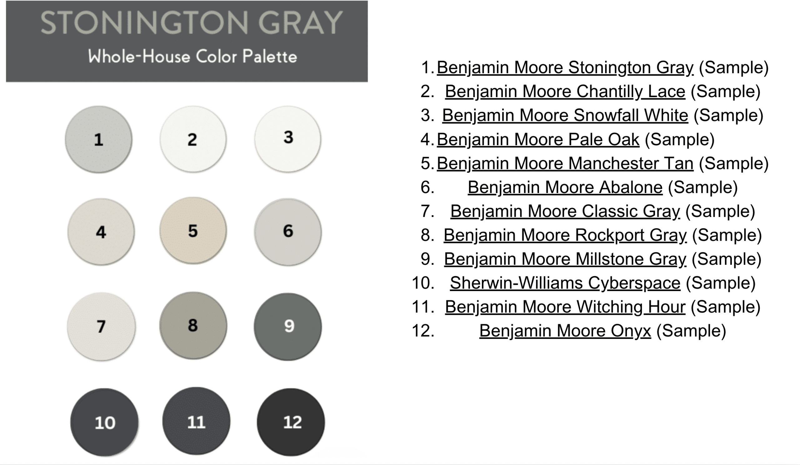
If you’re considering Stonington Gray but aren’t sure which colors to pair it with, I’ve got you covered.
As a color consultant who’s used this shade in countless homes, I’ll share the paint combinations that consistently work well.
From trim colors to accent walls, let’s find your perfect match—no more costly paint mistakes or color regrets.
Top Color Combinations For Stonington Gray
After testing countless color combinations in different homes, I’ve found several foolproof pairings that make Stonington Gray shine.
Let’s look at my top picks that have worked beautifully in real spaces.
1. Crisp Whites For Trim And Ceilings
Benjamin Moore Chantilly Lace has repeatedly proven itself as my top white pairing for Stonington Gray. Its bright, clean look and subtle cool undertones create perfect contrast without competing with the gray.
Key spots to use this combo:
- Crown molding and baseboards
- Window frames
- Kitchen cabinets
- Ceiling treatment
In my client’s sunlit living room, Chantilly Lace trim made Stonington Gray walls look simply perfect. The natural light brought out the best in both colors.
Pro tip: If your room gets lots of natural light, this pairing will give you that fresh, bright feel you see in magazines.
2. Soft Neutrals For Warmth
Want to add coziness? I love using Benjamin Moore Pale Oak with Stonington Gray. The light, greige tone brings warmth without overpowering the gray’s natural tone.
Best places I’ve used this duo:
- Master bedrooms
- Bathroom walls
- Reading nooks
- Home offices
I recently painted a north-facing bedroom using this combination. The Pale Oak accent wall perfectly balanced the cooler tones of Stonington Gray.
3. Muted Beige For Contrast
Manchester Tan has become my secret weapon when clients want warmth without going too dark. This combo works magic in spaces with warm afternoon light.
Where it works best:
- Family rooms
- Dining spaces
- Hallways
- Kitchen eating areas
A recent client’s open-plan living space uses this mix: Manchester Tan on the fireplace wall and Stonington Gray surrounding walls. The natural stone hearth ties it all together.
4. Dark Accents For Depth
When clients want impact, I turn to Benjamin Moore Witching Hour or Sherwin-Williams Cyberspace. These deep tones create stunning focal points.
Perfect spots for dark accents:
- Kitchen islands
- Built-in bookcases
- Powder room vanities
- Interior doors
I painted a bathroom vanity in Cyberspace against Stonington Gray walls in my home. The contrast looks striking without feeling heavy.
Remember: A little goes a long way with dark colors. I usually limit them to about 20% of a room’s painted surfaces.
Understanding Undertones And Lighting
The magic of Stonington Gray lies in how it changes throughout the day.
Let me share what I’ve learned from using it in hundreds of homes.
The Role Of Blue Undertones
I’m always upfront with my clients about Stonington Gray’s color shifts. In my north-facing office, it reads distinctly blue, while in my south-facing living room, it appears more neutral. This isn’t a flaw – it makes this color so special.
Morning light: Shows off blue undertones.
Midday sun: Looks most Neutral
Evening light: Takes on a softer, grayer appearance
How Light Affects Complementary Colors
Here’s something I tell every client: what looks perfect on a paint chip might look different on your walls. I learned this the hard way in my basement, where the low light made Stonington Gray appear much bluer than expected.
Testing tips I’ve learned:
- Paint samples on multiple walls
- Check colors at different times of day
- Look at the colors near windows and in corners
- Consider both natural and artificial lighting
Suggested Whole-House Palette With Stonington Gray
Based on my experience consulting thousands of homeowners, here’s a tested whole-house color combination that flows beautifully with Stonington Gray.
Living Rooms And Common Areas
I like starting with Stonington Gray in main living spaces, pairing it with Benjamin Moore Snowfall White for contrast. This combo creates an airy feeling – it worked wonders in my own family room. For ceilings, Snowfall White brings a bright, clean look that makes the space feel taller.
Kitchens And Dining Areas
Here’s a combination I swear by – Stonington Gray walls with Sherwin-Williams Cyberspace on lower cabinets. I used this in my kitchen—the deep blue-gray cabinets ground the space while white upper cabinets keep things light. To create visual interest, try adding a Millstone Gray ceiling for the dining room.
Bedrooms And Bathrooms
For these personal spaces, I’ve found success with:
- Main Bedroom: Classic Gray walls with Stonington Gray as an accent
- Kids’ Rooms: Pale Oak walls for a softer feel
- Bathrooms: Stonington Gray with bright white fixtures
- Guest Bath: Silver Fox vanity with Stonington Gray walls
Key Tips For Choosing Colors
After helping hundreds of homeowners, I’ve learned what makes or breaks a color scheme. Here are my battle-tested tips for success with Stonington Gray.
Always Test Colors in Your Space:
Let me share a quick story: A client once picked colors based only on photos, and the result wasn’t what she expected. Now, I always recommend testing first. My favorite method uses peel-and-stick samples because:
- They show true color from the manufacturer
- You can move them around different walls
- There’s no mess to clean up
- They’re large enough to see the color properly
Consider Existing Fixtures And Decor
| Fixture Type | Suggested Pairing | Why It Works |
|---|---|---|
| Hardwood floors | Pale Oak, Manchester Tan | Complements natural textures |
| Marble counters | Chantilly Lace, Cyberspace | Enhances elegance |
Before finalizing your colors, look at:
- Floor color and material
- Cabinet finishes
- Countertop materials
- Furniture tones
- Light fixture finishes
I learned this lesson in my own home, where the warm maple floors affected the way Stonington Gray appeared on the walls.
Create Flow Between Rooms:
Here’s my simple formula for a cohesive look:
- Keep hallway and main living area walls consistent
- Use darker shades of gray in rooms with lots of light
- Add lighter tones in rooms with less natural light
- Repeat accent colors in small doses throughout
Conclusion
Selecting colors to pair with Stonington Gray doesn’t have to be complicated. This versatile gray creates stunning looks in countless homes, from modern kitchens to cozy bedrooms.
Remember, your space’s lighting will guide your color choices. Start with Chantilly Lace for trim, add depth with darker accents like Witching Hour, or bring warmth with Manchester Tan. Most importantly, test your colors before committing.
Ready to start your painting project? Begin with a small room to get comfortable with how Stonington Gray behaves in your lighting.
Test samples on multiple walls, observe them at different times of day, and trust your instincts.
Your home tells a unique story – let these color combinations help you tell it beautifully.