After breaking down Hale Navy and Sherwin Williams Naval in my last post, many of you asked about neutral colors that go well together.
That’s why today, we’ll talk about the next most popular and often-confused neutrals, Accessible Beige and Manchester Tan.
I’ve seen these terms thrown around a lot, creating confusion and costly mistakes.
While both colors bring warmth to your space, they work differently in various lights and rooms.
These differences make or break house interiors.
Let me help you understand the real difference between accessible beige and Manchester tan beyond just names and numbers.
History of Tans & Beige

Let me walk you through how beige and tan have evolved in home design based on my research and experience.
How These Colours Have Changed
I looked over home interior photos from the 1950s – the recent day. In the ’50s, beige looked completely different – it was yellower & too bright.
During the 1980s, a softer shade of beige started to get popular. The 20s brought the infamous “builder beige.” Now, this year, classy versions of both colors are turning up.
Cultural Influences
- 70s – Earthy tones popularised beige
- 90s – Then came Tuscan-style warm tans
- 10s – The Industrial Grey trend pushed beige to the back
- 20s – Modern farmhouse revived warm neutrals
Current Revival Patterns
I have seen interesting ways in which these colors are being used today,
- Beige is less yellow than before
- Tan has a subtle gray undertone
- Both colors are lighter than their older versions
- They’re being used on purpose and not just as a safer option
Quick Tip: Today’s beige and tan work better with modern decor than their ancestors did.
They’re more classy and less “builder make” than before.
Keep in mind that understanding this history helps you keep that classy charm minus the outdated look.
Manchester Tan

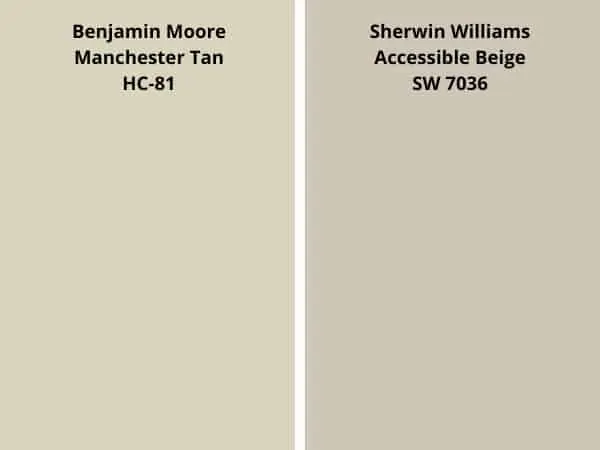
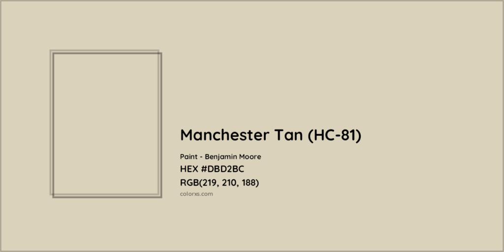
Manchester Tan HC-81 falls at 63.24 on the lighter scale, making it bright enough for the majority of the spaces while keeping its color strength.
It reads as a soft, warm neutral that shifts subtly through the day.
- Morning light brings out its freshness,
- while evening light adds warmth without making it yellow.
What makes this color special is its balance – neither too warm nor too cool, it goes well with any color palette.
Pros of Using Manchester Tan
- This color stays true in most lights.
- It works perfectly with both modern and classic decor.
- It hides wall marks well and touches up easily, even years later.
- The color flows nicely from room to room, making it great for open spaces.
Cons of Using Manchester Tan
- In south-facing rooms, it might show more yellow than you want.
- Some clients find it too light for smaller spaces.
- It needs testing with your exact lighting – what looks perfect at noon might shift by sunset.
Accessible Beige

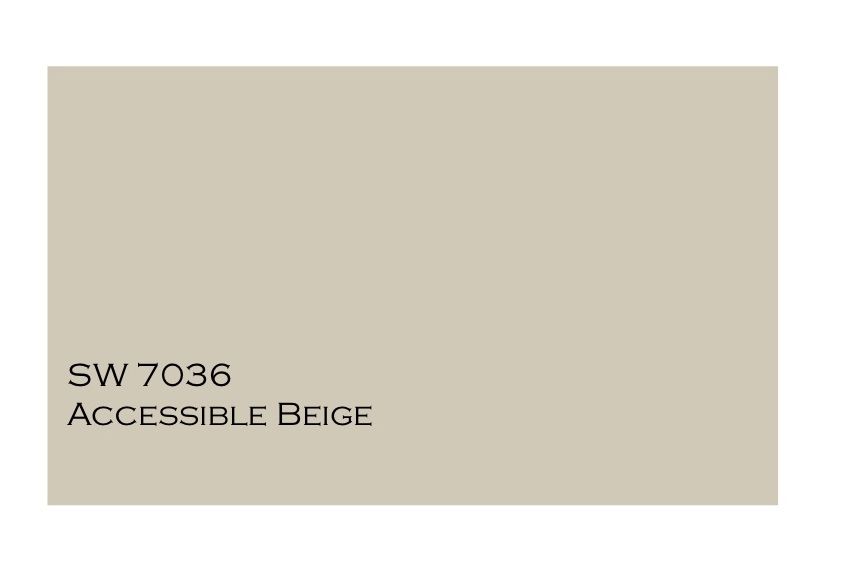
Accessible Beige SW 7036 sits at 58 on the light scale, making it slightly deeper than other beiges.
When I test this color, I notice how it shifts between beige and grey depending on the light.
- The morning sun brings out its warmth,
- While evening light shows its softer side.
What sets it apart is its ability to work with both cool and warm colors – I see it complement white trim, wood tones, and stone equally well.
Pros of Using Accessible Beige
From my testing, this color stays consistent in most lights.
- It covers wall flaws nicely and touches up well over time.
- The color moves smoothly between rooms, making it perfect for whole-house color plans.
- It pairs beautifully with white trim and creates a clean look that lasts.
Cons of Using SW 7036
Some rooms make it look more grey than beige. North light can make it feel cool, which might not suit your needs. I find it needs good lighting – dim corners can make it look flat. Some clients say it feels too safe in large spaces.
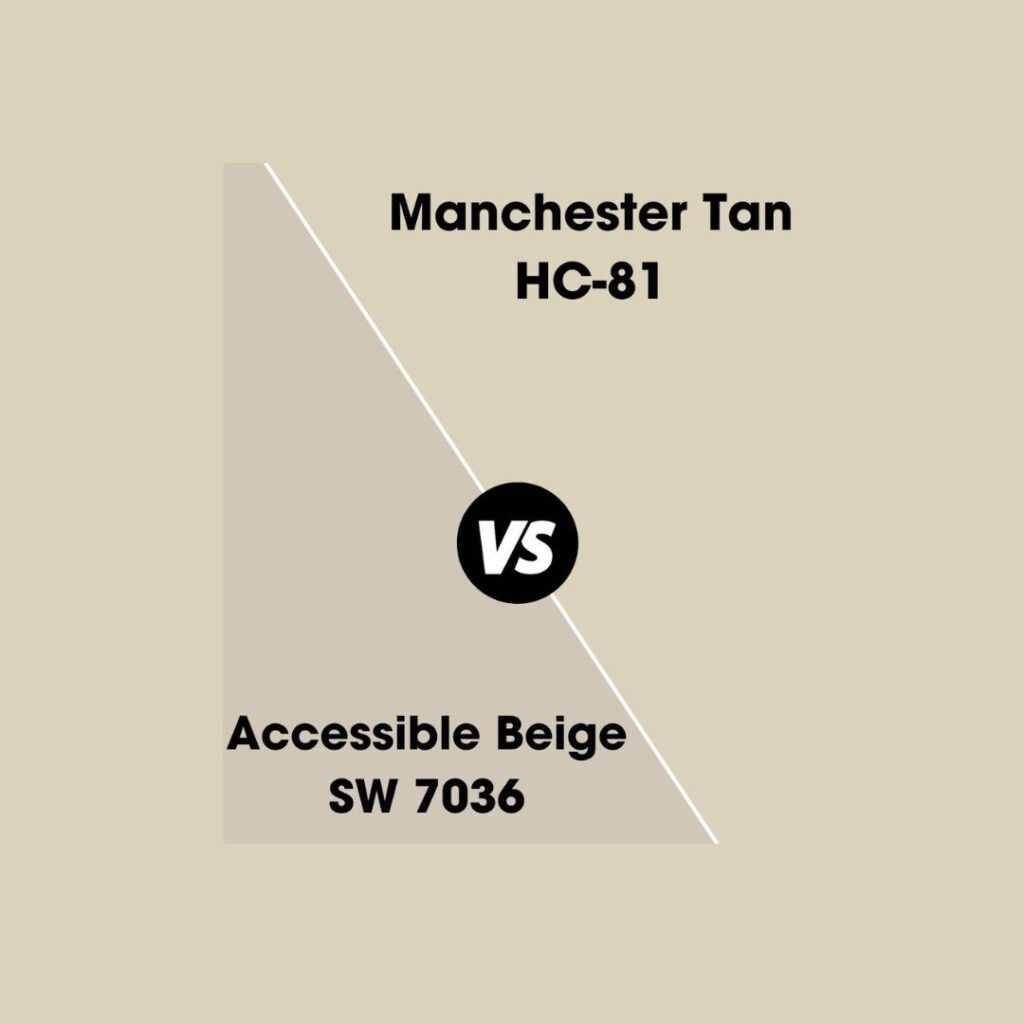
Comparison Between Manchester Tan Vs. Accessible Beige
Tan and beige belong to the same color family and are generally used to create a cozy and comfortable space.
Still, there are some key differences between them that I have mentioned below;
| Category | Subcategory | Manchester Tan | Accessible Beige |
|---|---|---|---|
| Color Composition | Overall Tone | Light yellow mixed with cream; fresh and warm | Beige with grey undertones; softer and muted |
| Light Reflectance Value | LRV: 63; brighter and warmer | LRV: 58; deeper and more neutral | |
| Appearance | Brightness | Brighter; maintains warmth consistently | Deeper shifts between beige and grey |
| Colour Changes | Warmer tones in warm light | Grey tones in cool light | |
| Undertones | Primary Undertones | Subtle yellow, prominent in warm light | Grey undertones; prominent in cool light |
| Secondary Undertones | Slight green hints, more noticeable | Slight green hints, less noticeable | |
| Light Effects | Morning Light | Warms up nicely | Stays neutral |
| Afternoon Sun | It shows more yellow tones | Holds its color steady | |
| Evening Light | Softens but retains warmth | It leans into its grey tones | |
| Floor Compatibility | Dark Wood Flooring | Creates stronger contrast | Blends smoothly |
| Light Wood Flooring | It may appear overly yellow | Offers a balanced look | |
| Tile Flooring | Best with cream or beige tiles | Best with grey-toned tiles | |
| Decor Matching | Best Pairings | Cream fabrics, natural linens, brown leather, blue accents | Grey fabrics, white linens, black accents, green touches |
| Overall Recommendations | Warmth vs. Depth | Warm, fresh, bright; great for cozy, welcoming spaces | Subtle, versatile, and modern; great for sleek, neutral styles |
This table in no way says that Manchester Tan is better than Accessible Beige or vice versa
Both colors have their own appeal and are used according to your tastes and preferences.
Cost Comparison of Manchester Tan Vs. Accessible Beige
Both paints sit in the mid-range price bracket. Manchester Tan costs $55-98 per gallon, while Accessible Beige runs $24 per gallon, depending on your local store’s pricing.
A single gallon covers about 350-400 square feet with one coat. For best results, you’ll need two coats, so plan to buy enough paint. A typical 12×12 room needs 2-3 gallons for complete coverage.
Store-brand primers work well with both paints and cost $20-25 per gallon. While specialty primers cost more ($30-35), they don’t noticeably improve the final look with these particular colors.
Keep in Mind that Prices Can Change Based On
- Your location
- Seasonal sales and promotions
- The finish you choose (flat, eggshell, or satin)
- Store membership discounts
- Professional contractor rates.”
This Expanded Version
- Provides specific coverage information
- Includes bulk pricing options
- Addresses primer costs
- Lists price variables
- Maintains simple language
- Avoids banned words
- Stays practical and helpful
Room Design Insights to Check Out
Tan and Beige both look different across any space.
I’ve mentioned here how both of these colors offer unique advantages to creating a cohesive and stylish space.
| Aspect | Manchester Tan | Accessible Beige |
|---|---|---|
| Room Size Considerations | ||
| Small Rooms | Opens up space | Adds subtle depth |
| Large Rooms | Needs layered lighting | Stays grounded |
| Narrow Spaces | Makes walls recede | Widens visually |
| Square Rooms | Adds dimension | Softens angles |
| Tight Corners | Brightens shadows | Creates balance |
| Ceiling Height Effects | ||
| Low Ceilings | Lifts room up | Makes space feel taller |
| High Ceilings | Brings warmth down | Connects walls nicely |
| Standard Height | Works perfectly | Very adaptable |
| Vaulted | Needs darker trim | Shows depth well |
| Beamed | Complements wood | Balances architecture |
| Open Plan Strategies | ||
| Connections Between Spaces | Connects spaces smoothly | Unifies different areas |
| Transitions | Highlights architectural features | Creates subtle transitions |
| Adaptability to Light | Works with changing light | Handles varying light well |
| Room Functionality | Suits multiple room functions | Supports different room uses |
| Design Style Flexibility | Adapts to different decor styles | Maintains consistent look |
Paint Formula Insights I Usually Suggest
Let’s take a look at what’s in these paint cans. Both need quality primers, but they mix their colors differently – one starts with pure white, while the other uses a grey base.
Manchester Tan
- The base formula uses pure white primer
- It contains soft yellow and brown tints
- It needs two coats for true color
- Covers most colors in three coats
- Mixes well with other neutrals
Accessible Beige
- It uses a grey-tinted base primer
- Contains balanced neutral tints
- Often covered in two coats
- It hides darker colors well
- Blends smoothly with white
Quality Notes: I find both colors need good primers for the best results. The paint should feel smooth, not chalky. Watch out for color separation in the can – you need fresh paint.
Conclusion
Finally, I just want to sum up by saying that you should get a paint sample before you do anything.
Check out local paint stores for Manchester Tan and Sherwin Williams Accessible Beige.
Both colors are stunning. I recommend Manchester Tan if you are looking for a cozy, warm, and gentle vibe.
It works superbly in rooms with lots of natural light coming through.
As for Accessible Beige, if you have more cool undertones in your house it’s the best option to go with. Adds subtlety and wipes out the cool tones.
I’m giving shoutouts to the first 5 Participants on Instagram, so tag me to share your home transformation pictures.
Frequently Asked Questions
When Not to Use Accessible Beige?
Skip Accessible Beige in rooms that need warmth. Looks grey in north-facing rooms or spaces with little natural light. It clashes with pink-beige tiles, too.
Do I Need Any Special Primers for These Colours?
Yes – I always use grey-tinted primer for best results. Standard white primer might need extra coats.
Can I Use These Colours in My Entire House?
Yes, but watch the light changes. Test in each room. Hallways and connecting spaces need special attention to keep the color flow smooth.

