")
Webster Green (HC-130) is a dark green paint color by Benjamin Moore with a clean, crisp finish. It’s also known as 636. With a light reflectance value (LRV) of 20.2, it reflects little light, giving it a rich and grounded look.
This color is part of the Benjamin Moore Historic Collection, a line of timeless shades inspired by classic American homes. Webster Green stands out because it’s bold but not too dark, making it easy to use in different rooms.
It adds depth without feeling heavy. In this post, I’ll examine why it works in many spaces, its undertones, where to use it, which floors match well, how to decorate with it, and how it compares to other warm neutral paint colors.
Why does Webster Green (HC-130) work in Any Room?

A dark green that feels fresh, not heavy. Webster Green is a deep, rich green. But unlike some dark colors, it doesn’t feel dull or gloomy. It looks clean and crisp, which makes it easy to use throughout your home.
It fits both old and new styles
This color works in modern spaces and classic homes. Whether your space is minimal and sleek or full of character, Webster Green can match the look. Here’s why:
- It has a balanced tone—not too warm or cool
- It pairs well with both light and dark accents
- It looks timeless, not trendy
It changes with the light—in a good way
Webster Green has an LRV (light reflectance value) of 20.2, so it reflects some light but not a lot. That means:
- In bright rooms, it feels rich but not too bold
- In low light, it creates a cozy and calm mood
- It adjusts just enough to feel right in any part of the house.
It’s bold but not too much
Some dark greens can feel intense. Webster Green doesn’t. It brings depth, but it also feels calm and steady. It stands out, but it won’t take over the room. This makes it great for:
- Bedrooms
- Offices
- Entryways
Understanding the Subtle Undertones of Webster Green
Webster Green is a dark green, but it isn’t flat or plain. It has hidden undertones that can change how it feels.
Warm or cool? It depends
This color leans slightly warm, but it can look cooler in certain lighting. That’s why it’s smart to test it in your space first. Here’s what affects it:
- Natural light brings out a softer, greener look
- Cool light bulbs might make it look deeper or even a bit gray
- Warm bulbs bring out a rich, earthy tone
How undertones change the feel of a room
Small changes in lighting can shift the whole look. Undertones matter. They help set the mood. Webster Green’s undertones can make a room feel:
- Calm and grounded in low light
- Fresh and open in sunlight
- Warm and inviting under soft yellow light
How does it compare to other dark greens
Webster Green stands out because it’s balanced. It sits right in the middle—not too dark, not too bright. Here’s how it stacks up:
- Backwoods (469): More brown, feels warmer
- Essex Green (HC-188): Deeper, almost black
- Tarrytown Green (HC-134): Brighter, cooler
What lighting works best?
Avoid harsh, cold lighting. It can make the color feel flat. This color shines in spaces with:
- Natural daylight from windows
- Warm white bulbs (2700K–3000K)
- Accent lighting, like sconces or lamps
Best Places to Use Webster Green (HC-130) in Your Home
Webster Green adds depth without feeling heavy. You can use it in big or small ways throughout your home.
Living rooms and accent walls
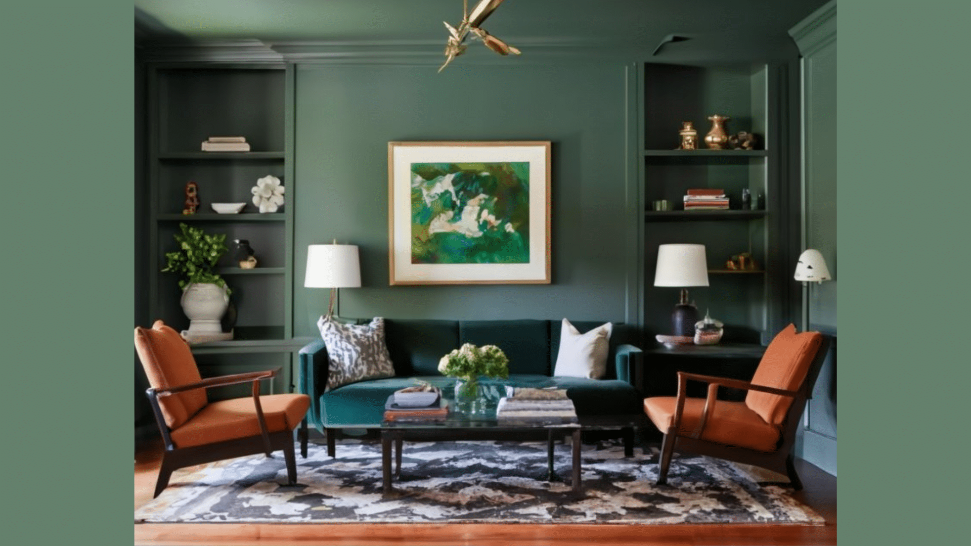
This color looks great on one wall or the whole room. It gives the room a strong base without making it feel dark. Use it to:
- Make a fireplace wall stand out
- Frame a TV or bookshelf area
- Add contrast behind light-colored furniture
Bedrooms that feel calm and grounded
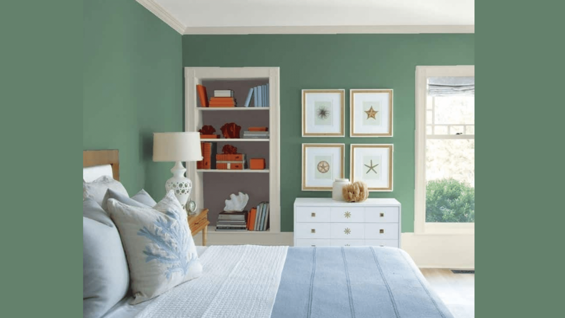
Webster Green helps a bedroom feel peaceful. Pair it with white bedding or soft neutrals. Try it on:
- All four walls for a cozy look
- A headboard wall for a soft backdrop
- Trim or doors for something different
Bathrooms and powder rooms
Small rooms are a good place to try bold colors. Add brass or gold hardware for a nice contrast. Webster Green makes them feel:
- Quiet and relaxed
- Stylish and clean
- A little more private
Kitchen cabinets or islands
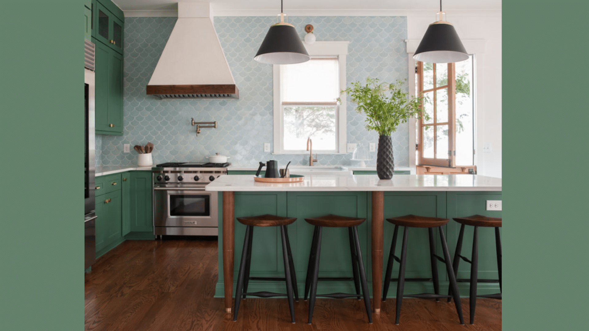
This green works well in the kitchen, too. It adds color but still feels natural. Use it on:
- Lower cabinets with white uppers
- A center island to break up an all-white kitchen
- Pantry doors or built-ins for something unique
Flooring Options That Pair with Webster Green (HC-130)
The floor you choose can change how Webster Green looks and feels. Here are solid options that work well with it.
Light oak or natural wood floors
These bring out the warmer side of the color. They help balance the depth of the green and keep the room feeling open.
- Great for living rooms and bedrooms
- Add soft contrast without clashing
- Works with both modern and classic furniture
Whitewashed or gray-toned wood
Cooler floors bring a different kind of balance. They give Webster Green a crisp, fresh look.
- Good for coastal or minimal styles
- Helps tone down the warmth in the paint
- Keeps the space light and calm
Terracotta tiles for earthy contrast
Warm tile gives the space a cozy, natural feel. The red-orange tones bring out the richness in the green. This works best in:
- Kitchens
- Entryways
- Bathrooms
Neutral or warm-tone carpets and rugs
These choices let the wall color shine while keeping the room balanced. Soft flooring works well, too. Look for:
- Beige or cream carpets
- Jute or sisal rugs
- Warm grays or taupes
Creative Ways to Decorate with Webster Green (HC-130)
Webster Green is flexible. You can match it with all kinds of decor. Here are some easy ways to make it work in your space.
Accent furniture and warm metals
Add a few bold pieces to pull the room together. Metal and wood tones look even better against this deep green.
- Wood furniture in walnut, oak, or black
- Brass or gold hardware for shine and warmth
- Velvet chairs or a soft bench in cream, tan, or rust
Trim and color pairings
Use lighter shades for trim or extra color. These tones help Webster Green stand out without feeling too sharp. Try:
- White or off-white for a clean, crisp edge
- Soft beige or grey for a warm feel
- Muted blush or terracotta for a hint of contrast
Add art and texture
Layering makes the room feel complete. Mixing smooth and rough textures adds interest.
- Framed prints with black, gold, or natural wood frames
- Woven baskets, ceramic vases, or linen curtains
- Throw pillows in deep rust, ivory, or mustard
Webster Green Compared to Other Warm Neutral Paints
Webster Green is bold, but it still works as a neutral in many spaces. Here’s how it compares to a few popular choices:
| Color | Tone | Undertones | Best Use |
|---|---|---|---|
| Webster Green (HC-130) | Dark, muted green | Slightly warm, earthy | Bedrooms, accent walls, cabinets |
| Tate Olive (HC-112) | Soft olive | Brown, yellow | Cozy dens, living rooms |
| Saybrook Sage (HC-114) | Light sage | Cool green-gray | Kitchens, sunrooms |
| Backwoods (469) | Deep, dark green | Warm brown undertones | Offices, trim, front doors |
| October Mist (1495) | Pale green | Gray, silver hints |
Whole rooms, airy spaces |
Conclusion
Webster Green is a dark, grounded green that works well in both modern and traditional homes. Its slightly warm undertones add depth without overwhelming a space.
It pairs nicely with natural wood, brass hardware, soft fabrics, and neutral trim. Whether used on walls, cabinets, or built-ins, this color brings balance and calm to any room.
Its strength lies in its flexibility—you can use it in living rooms, bedrooms, bathrooms, or kitchens. Before choosing it, always test a sample in your space.
Check it in different lighting and next to your floors or furniture. A little testing helps you see how the color will truly look in your home.