")
After a full year with Sea Salt on my walls, I’m ready to share what I’ve learned about this gentle, balanced color. This soft coastal shade has changed my home in ways I didn’t expect when I first chose it.
In this blog, I’ll cover:
- The true appearance of Sea Salt in actual homes
- The best rooms for this versatile color
- Perfect color combinations that enhance its beauty
- How to test it properly before committing
I’ve used this paint in several rooms with varying light conditions and observed how it changes throughout the day. I’ve made some errors along the way, so you won’t have to repeat them. Let’s find out if this soft, coastal-inspired shade might be the right choice for your home, too.
What Kind of Color Is Sea Salt?
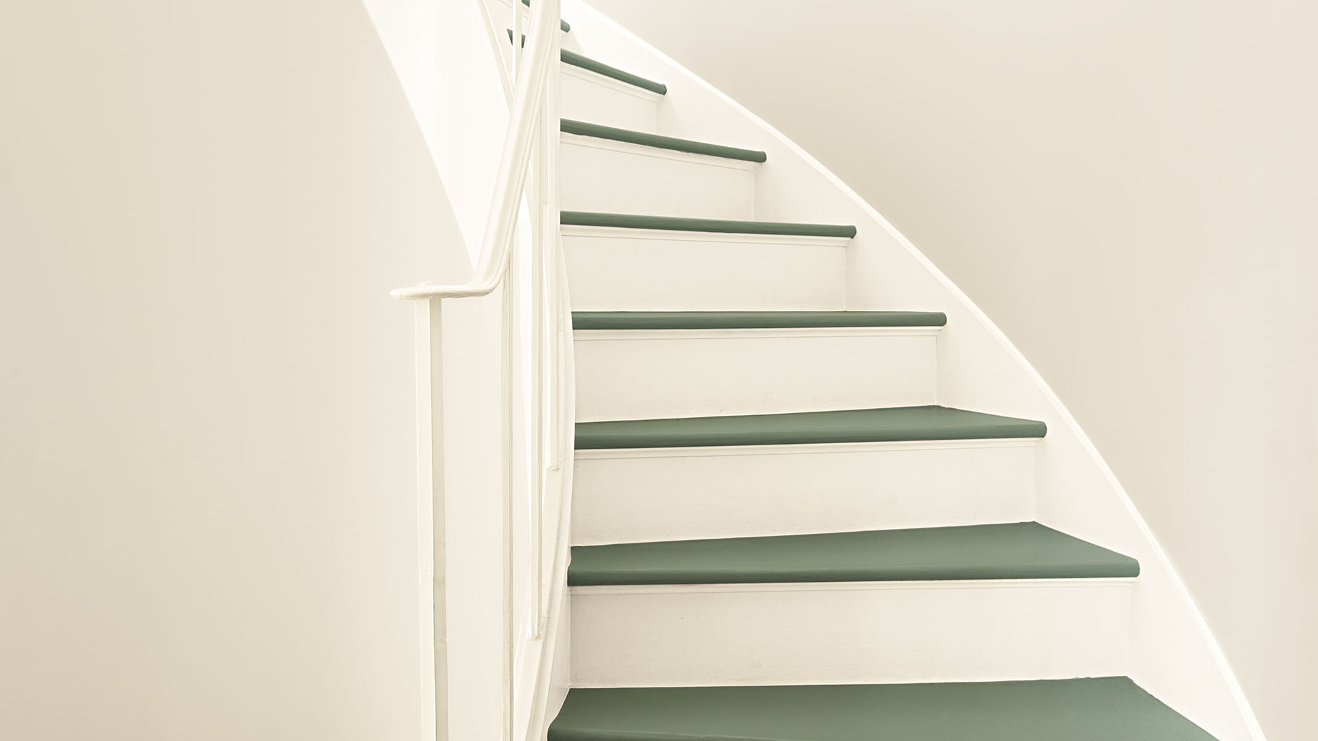
Sea Salt (Benjamin Moore CSP-95) is a light blue-green color with subtle gray notes that add depth. It creates a serene backdrop and brings a cool, fresh feel to any space. To me, it looks like the color of clear, shallow water—quiet, balanced, and surprisingly complex.
I’ve observed its changes as daylight shifts. Morning sunlight brings out more of its blue-green character. By afternoon, the gray aspects become more pronounced, and by evening, it takes on a deeper, more nuanced quality.
With an LRV (Light Reflectance Value) of 61.09, it sits comfortably in the light range. This means it bounces back a good amount of light, making rooms brighter without feeling too stark or cold. The balanced nature of Sea Salt makes it ideal for creating spaces that feel both fresh and comfortable.
What makes Sea Salt special is how it brings a sense of calm and a subtle, natural feel to a room. In most settings, it adds both peace and a touch of class that works with many home styles.
What Rooms Work Best with Sea Salt?
Based on my year-long experience, Sea Salt works wonderfully in spaces where you want a clean, lasting look. These are the five spaces where I found Sea Salt performs best:
Living Rooms
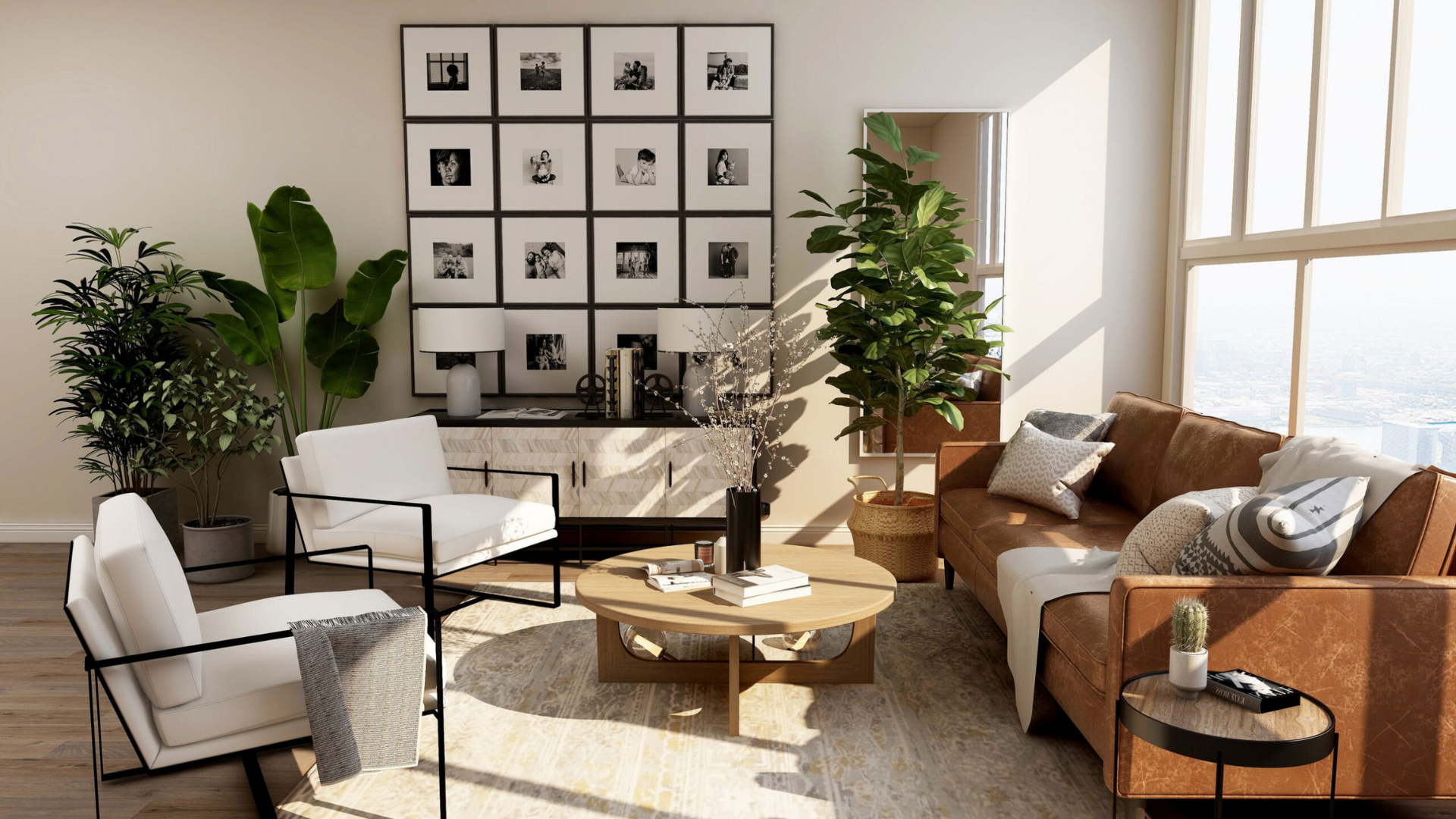
This color brings a sense of peace and warmth to living areas. It creates a soothing backdrop that allows furniture and artwork to stand out naturally. In my living room, Sea Salt walls create a balanced feeling while highlighting my wooden furniture and silver decorative items.
The color is especially suitable for spaces that require brightness without stark whiteness. With proper lighting, it creates a room that feels both clean and inviting.
Bedrooms
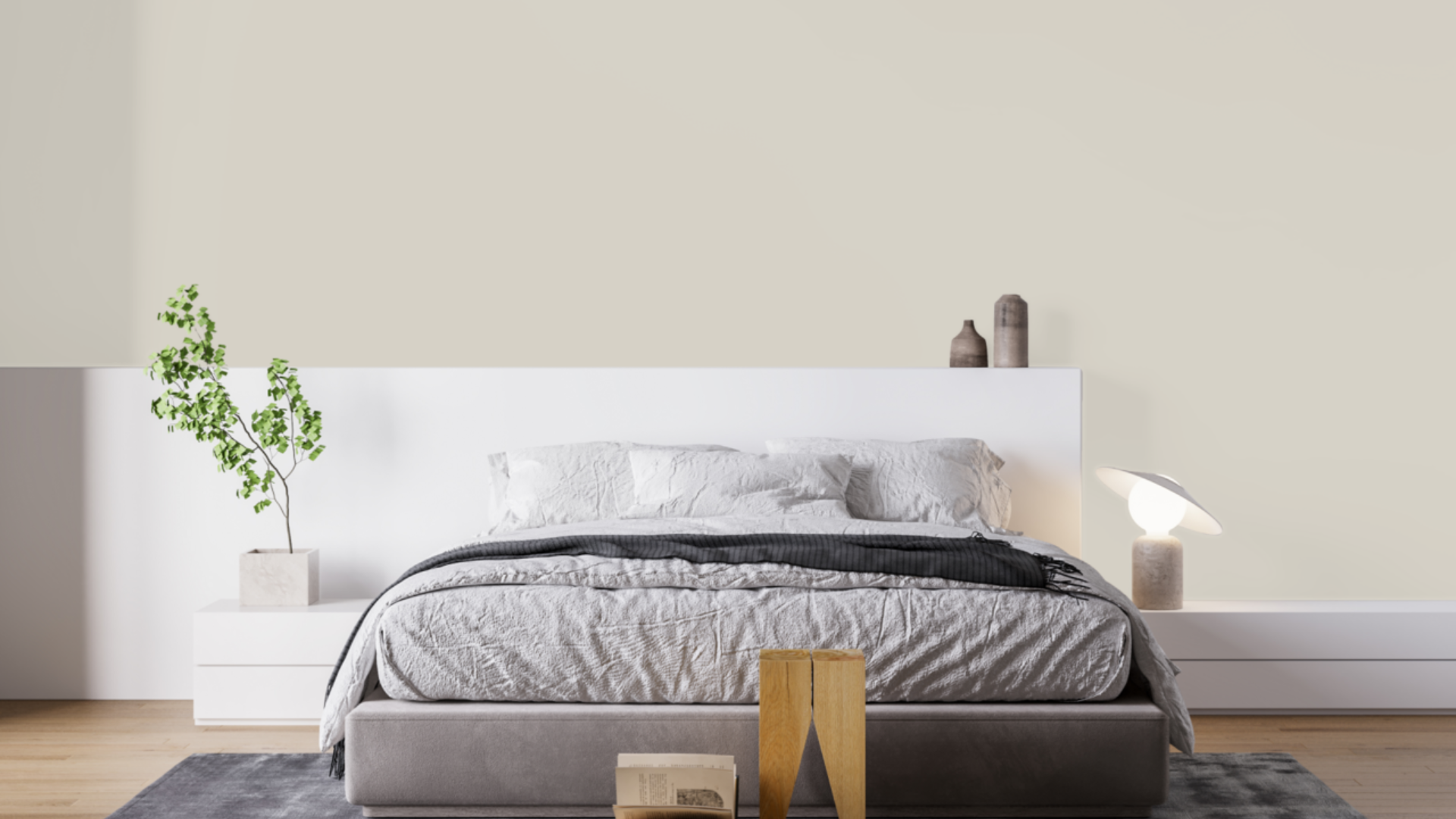
This balanced blue-green adds a touch of calm to personal spaces. I painted my guest bedroom in Sea Salt, and it feels both cool and cozy at the same time. It’s perfect for a space that should feel peaceful without being boring.
The color looks great with white bedding and natural wood elements. It provides just enough color without being too strong, making it an excellent choice for a room meant for rest and comfort.
Home Offices and Studies
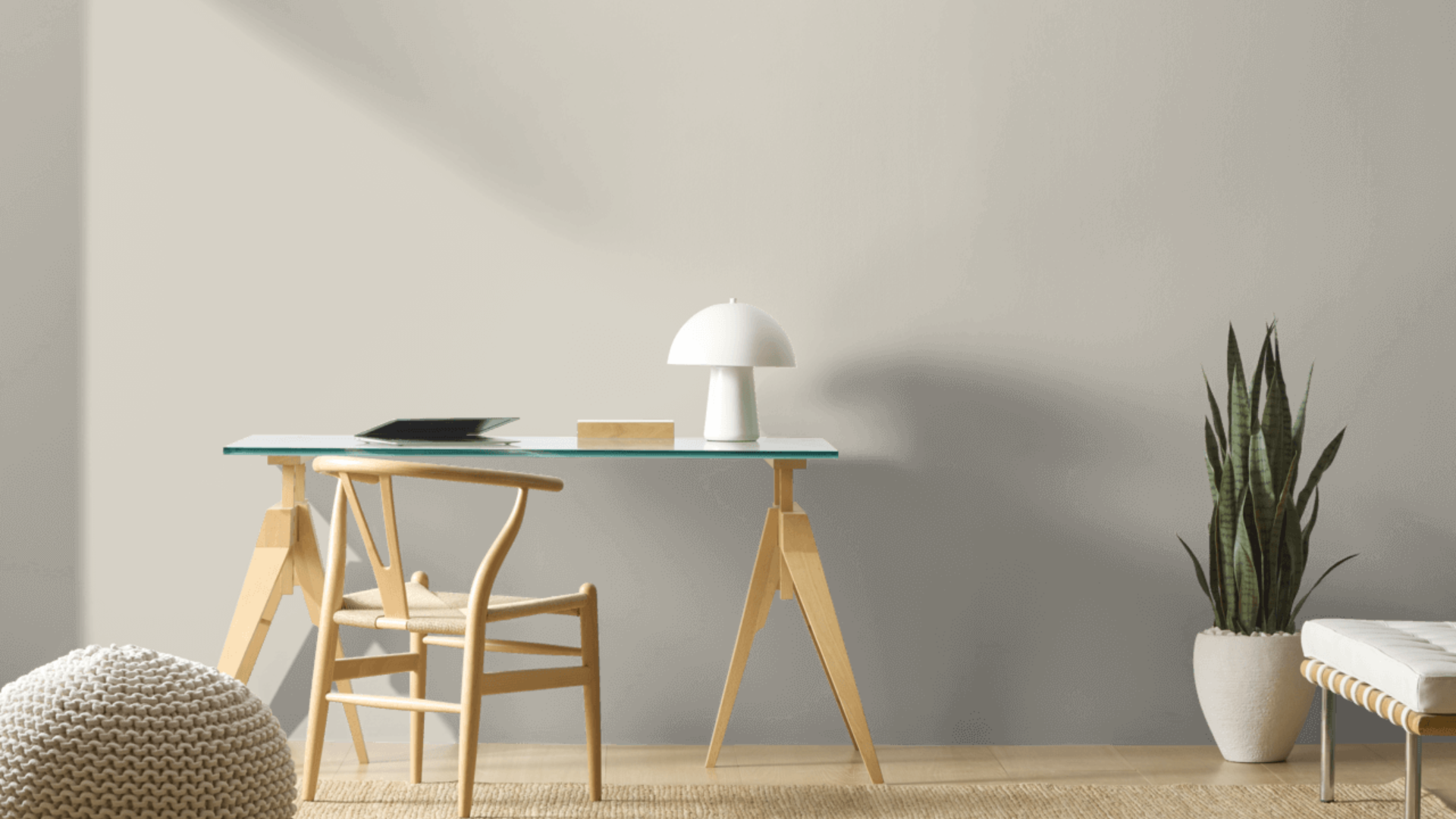
Sea Salt helps create a focused yet calm feeling in work areas. The balanced blue-green stays fresh yet comfortable during long work sessions. My small home office, painted in this shade, provides the perfect backdrop for productivity while keeping me relaxed and focused.
This color is particularly well-suited for spaces that require a clean yet comfortable atmosphere. It seems to reduce stress while helping concentration. I’ve noticed I feel more at ease working in my Sea Salt office compared to my previous plain white workspace.
Bathrooms
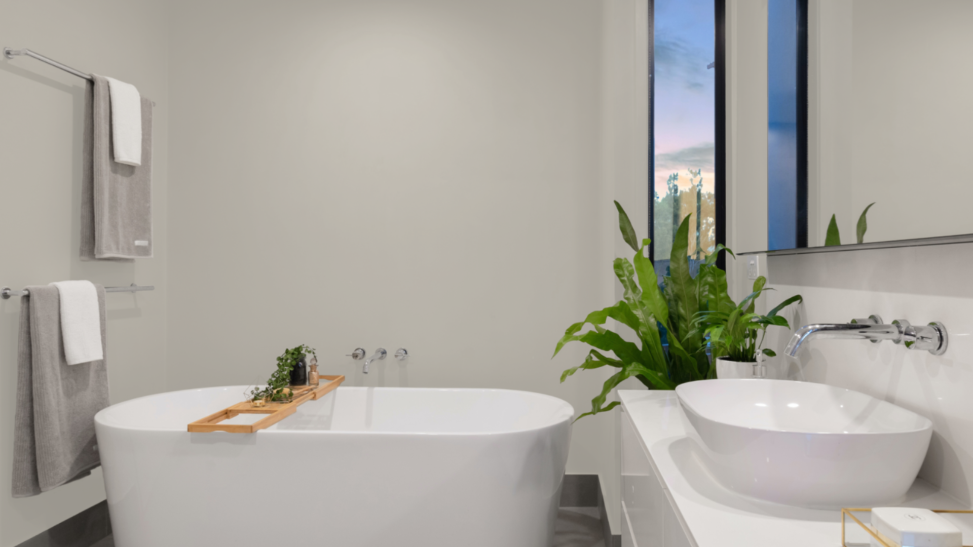
This light blue-green transforms bathrooms into peaceful retreats. I used it in my main bathroom, where it created a clean, cool feeling. The sea-inspired tone feels fresh and calm, perfect for a space meant for relaxation.
I was surprised by how well it works with different tile colors. My white subway tiles look crisp against the Sea Salt walls, and plants add life that helps balance the cool quality of the walls. The room feels special yet comfortable.
Sunrooms and Enclosed Porches
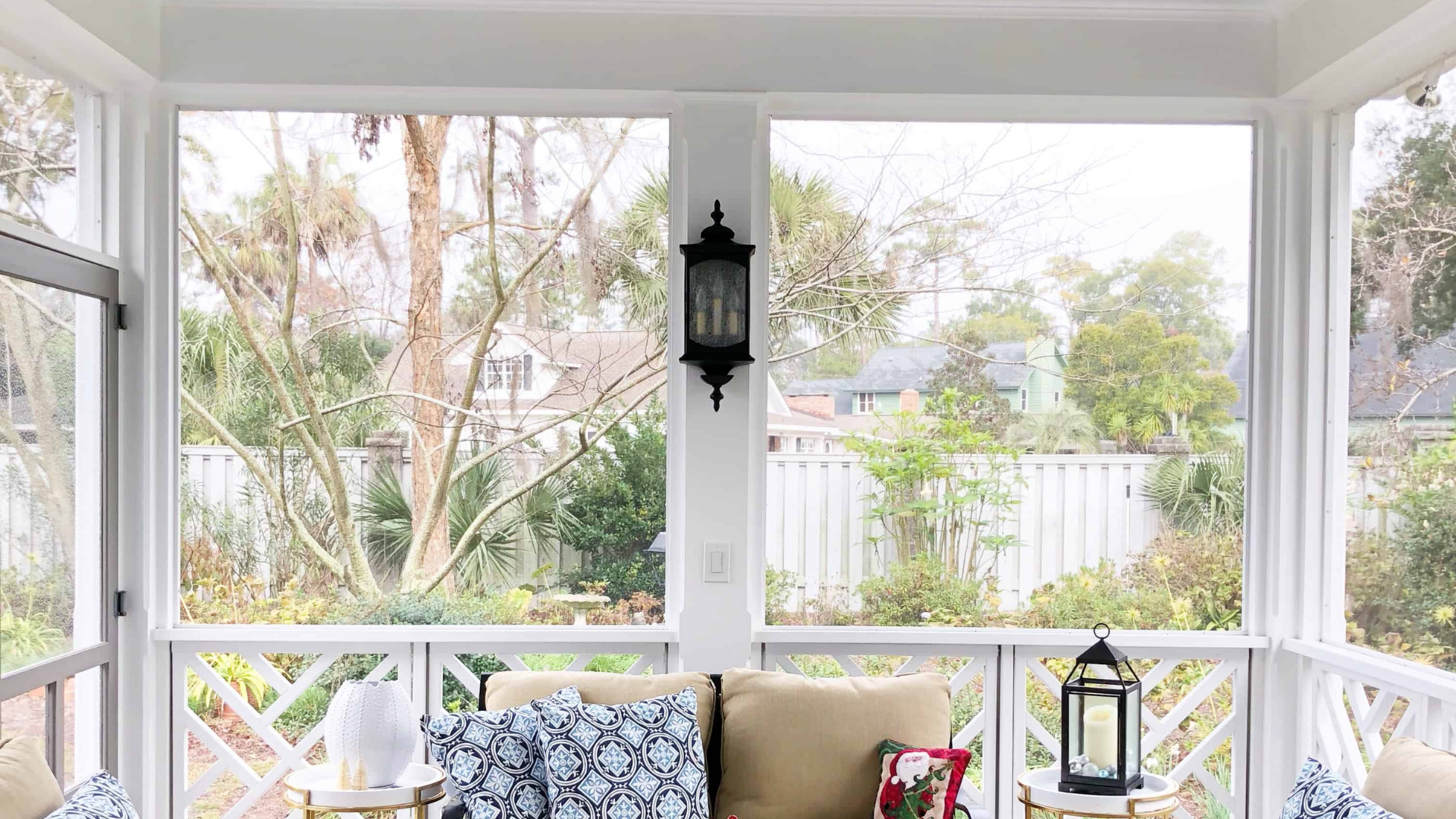
Sea Salt truly excels in spaces that connect to the outdoors. I painted my small sunroom with this color, and the way it changes with natural light throughout the day makes the space feel alive and connected to nature.
The color creates a smooth flow between indoor and outdoor areas. It feels natural and fresh without trying too hard to make a statement. My plants look amazing against this background, and the whole space feels open and airy.
What Colors Complement Sea Salt?
- Crisp whites: Create a clean contrast that feels fresh and balanced
- Soft creams: Offer a subtle contrast that feels unified and warming
- Medium to dark wood tones: Add natural texture and complementary warmth
- Navy blue accents: Form a cool combination that enhances the blue aspects
- Silver and chrome accents: Add brightness that complements the cool notes
For my living room, I combined Sea Salt walls with white trim and silver lighting. The combination feels both fresh and balanced.
What Style Works Well with This Color?
Sea Salt fits various design approaches. In modern homes, it makes a clean backdrop for simple pieces. For coastal spaces, it offers a cool quality that feels right and grounded. In traditional settings, it brings a fresh update while respecting classic elements.
Most impressively, Sea Salt helps homes that mix different styles by adding a calm presence to spaces that combine various elements.
My own home mixes contemporary items with more traditional ones, and this color creates the perfect background for both. This flexibility makes it a smart choice if you like to change your decor or mix elements from different styles.
Is It a Warm or Cool Color?

Sea Salt is definitely a cool color with subtle gray notes that balance its blue-green base. The blue-green gives it a clean, fresh feel, while the slight gray elements add depth.
I’d call it “softly cool” – the kind that makes a room feel refreshed rather than cold or stark. The balanced aspects keep it from feeling too cool. This balance enables it to function effectively year-round in most homes.
When used well, it creates spaces that feel both clean and comfortable. The depth keeps it livable for everyday spaces. In rooms with ample natural light, the balance allows it to showcase its true character throughout the day.
If you’re concerned that a space might feel too cool, I’ve found that incorporating warmer elements, such as wood tones, fabric textures, or brass fixtures, creates the perfect balance. In my bathroom, the Sea Salt walls look beautiful with my natural wood vanity and warmer metal fixtures.
Color Characteristics Table
| Characteristic | Sea Salt | What This Means For Your Space |
|---|---|---|
| Temperature | Cool | Creates a clean, calming atmosphere |
| Undertones | Blue-green with gray notes | Adds depth and sophistication |
| Light Reflectance Value | 61.09 | Reflects plenty of light, creating a bright, airy atmosphere |
| Seasonal Feel | Year-round | Works well in both summer and winter settings |
| North vs. South Rooms | Adaptable | Appears cooler in north-facing rooms, more balanced in south-facing rooms |
What Paint Finish Should You Choose?
- Flat: Good for ceilings and walls with texture issues
- Matte: My top choice for most walls – the color looks soft without glare
- Eggshell: This works in kitchens and bathrooms, where you need to clean walls
- Satin: Adds a slight sheen, could make the color look slightly brighter
- Semi-gloss: Too shiny for Sea Salt walls, but works for trim and doors
I used a matte finish in my bedroom and an eggshell finish in my kitchen and bathroom. The eggshell finish makes cleaning easier without adding too much shine that would alter the color’s appearance.
Mistakes to Avoid
- Using highly yellow artificial lighting – This can make Sea Salt appear muddy and dull. Choose balanced white bulbs (3000-4000K) to show their true beauty.
- Pairing with warm beige furniture – The cool tones of Sea Salt can clash with very warm beige. If possible, test a sample near your existing furniture before making a commitment.
- Not accounting for seasonal light changes – In summer versus winter, this color can look quite different. Test it during the season when you’ll be using the room most.
- Combining with too many other cool colors – This can make a room feel cold and unwelcoming. Balance with warm woods and textiles.
- Using in rooms with very little natural light – Without good light, Sea Salt can lose its dynamic quality and appear flat. Consider a slightly brighter shade for dark rooms.
Conclusion
Sea Salt creates spaces that feel both clean and cozy at the same time. After using this color in multiple rooms over several months, I remain satisfied with my choice. What makes it special is how it adds character while remaining very flexible with different furniture and decor styles.
It’s not a color for those who want very warm walls. Instead, it creates a foundation that supports your furniture and accessories while making a subtle statement of its own. This balanced presence explains why it remains a favorite choice year after year.
In a world full of stark whites and basic beiges, Sea Salt is ideal for those seeking to add color with purpose. It works with modern, coastal, traditional, and many other styles.
It’s a truly versatile color that creates beautiful, livable spaces that feel fresh and personal, which is what truly matters in a home.
Frequently Asked Questions
Will Sea Salt Make My Small Room Look Bigger?
Yes, with its LRV of 61.09, Sea Salt reflects enough light to make a space feel open while still adding more interest than plain white. The soft color adds depth without making the room feel closed in.
Does Sea Salt Work in Spaces with Limited Natural Light?
In spaces with limited natural light, Sea Salt maintains its character but appears slightly muted. Adding proper artificial lighting with daylight-balanced bulbs helps bring out its true color.
How Often Should I Repaint Walls with Sea Salt?
With quality paint, Sea Salt walls typically last 5-7 years before needing a refresh. Its middle tone helps hide minor scuffs and marks better than very light colors, making it practical for busy households.
Is Sea Salt Too “Trendy” to Last Long-Term?
No, Sea Salt has been popular for over a decade without becoming dated. Its balanced, subtle nature gives it staying power beyond trendy colors that quickly look outdated.
How Does Sea Salt Change with Different Types of Artificial Lighting?
With warm lighting (2700K), Sea Salt appears slightly more gray-green. With cool lighting (4000 K and above), it reveals more of its blue undertones. Daylight-balanced bulbs (3000-3500K) display their most balanced, true colors.