")
Looking for a paint color that feels both fresh and timeless? Benjamin Moore’s Stampede (979) might be your answer. This warm, earthy neutral has been quietly winning over homeowners and designers alike.
I’ve seen Stampede transform both modern apartments and classic homes with its versatile beauty. It’s no wonder it’s becoming a go-to choice for people who want color with staying power.
In this guide, you’ll find:
- What makes Stampede unique among neutrals
- How it shifts in different lighting conditions
- How it compares to similar Benjamin Moore shades
As someone who’s tested dozens of paint colors in real homes, I’ll help you decide if Stampede is right for your space. No more wasting money on sample pots for colors that won’t work.
Let’s find out if Stampede (979) deserves a place on your walls.
Why Stampede Is the Perfect Choice for Your Space?

Stampede offers an exceptional combination of durability, versatility, and classy appeal, making it the ideal solution for various spaces. This is why Stampede stands out as the perfect choice:
A Color that Feels Like Home
Stampede is a warm taupe-brown, like fresh coffee with cream. It’s neither too dark nor too light, creating a calm and inviting atmosphere.
It adds depth without being overwhelming, and it enhances your furniture and artwork without competing for attention.
Works in Every Room
I’ve used Stampede in bedrooms, living rooms, and kitchens, and it adapts beautifully. It creates a cozy reading nook or a classy dining room backdrop.
In small rooms, it feels intimate; in larger spaces, it gives a sense of definition. It blends seamlessly with both modern and traditional styles.
Plays Well with Light
Unlike some colors, Stampede won’t disappoint when the sun sets. Morning light brings out its warmth, afternoon light shows its balance, and evening lamps highlight its cozy depth.
Whether in north- or south-facing rooms, Stampede maintains its friendly vibe all day long.
The Rich Undertones of Stampede: What You Need to Know
Stampede by Benjamin Moore is a bold, earthy red that adds depth and warmth to any room.
With its rich, brownish-red undertones, it creates a cozy, grounded atmosphere while also injecting energy into the space.
This deep color works well in areas where you want to feel both comforted and energized, such as living rooms or dining areas.
Its boldness makes a statement, but when paired with neutral tones like whites, grays, or browns, it can be balanced and prevent the space from feeling overwhelming.
Stampede is perfect for those looking to add a touch of drama and vibrancy to their home, while still maintaining a welcoming vibe.
My Testing Tips
- Paint large swatches: Those tiny paint cards lie! Paint at least a 2′ x 2′ section.
- Check at different times: Look at your sample in morning, afternoon, and evening light. What looks perfect at noon might look muddy at sunset.
- Use your actual lighting: Turn on the lamps and fixtures you normally use. I once chose a paint that looked amazing in daylight but turned greenish under my warm kitchen lights!
Remember: Stampede’s undertones aren’t a problem to solve. They’re what give this color its depth and character. Embrace them!
The Psychology of Stampede: How It Affects Your Mood
Stampede by Benjamin Moore is a rich, earthy red that evokes warmth and energy. This color can have a strong impact on your mood and the overall feel of a room.
- Warmth: Stampede brings warmth and coziness, making spaces feel inviting and comfortable.
- Energy: Its deep red undertones can energize a room, perfect for social spaces like living rooms or dining rooms.
- Boldness: This color is attention-grabbing and can make a statement in any space.
- Balance: Pair it with neutral tones to balance its intensity and create a well-rounded, stylish atmosphere.
Stampede is ideal for creating a vibrant yet welcoming environment, but use it thoughtfully to avoid overwhelming the space
Where Is Stampede Best Used in An Interior?
I’ve seen Stampede work in almost every room of a home, but it truly shines in certain spaces. Let me walk you through where this versatile color makes the biggest impact.
1. Bedrooms for Better Sleep
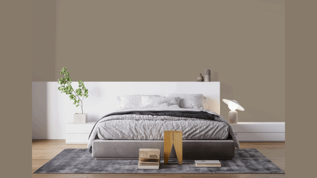
Want a bedroom that promotes restful sleep? Stampede might be the perfect choice.
Unlike stark whites that can feel clinical or dark colors that feel heavy, Stampede strikes the right balance. It’s warm enough to be cozy yet neutral enough to encourage calm.
I’ve used it in bedrooms facing both north and south. In north-facing rooms, it combats the cool light, while in south-facing rooms, it helps balance the intensity of sunlight.
Pair it with crisp white bedding for a clean look, natural linens for an organic feel, and deep blue accents for a hint of drama. The result is a space that feels thoughtfully designed without being overdone.
2. Kitchens with Character
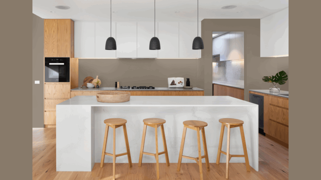
Kitchens don’t have to be white! Some of my favorite kitchen transformations feature Stampede.
This color pairs beautifully with natural wood cabinets, marble or quartz countertops, and brass or bronze hardware.
Have you ever noticed how food looks more appetizing against certain backgrounds? The warm undertones of Stampede enhance food presentation, making your meals look as delicious as they taste.
And unlike pure whites that show every splash, Stampede is more forgiving, helping to hide the mess that comes with real cooking.
3. Bathrooms that Breathe
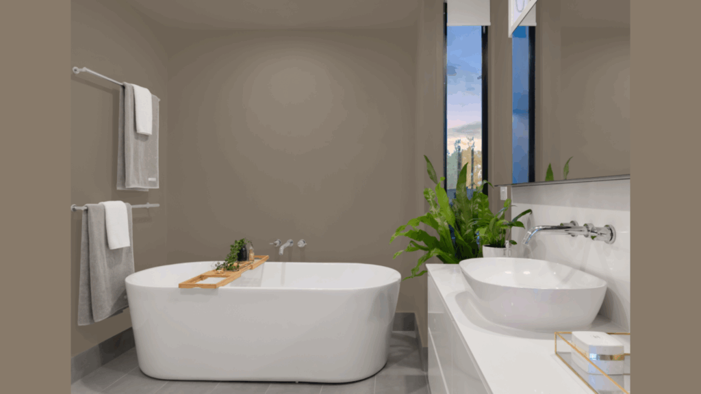
Tired of sterile-looking bathrooms? A stampede can bring warmth without making the space feel dark or closed in. I especially love it in bathrooms with limited natural light, as it prevents that cold, institutional feel.
The color pairs beautifully with white fixtures, natural stone, and warm metal finishes like brass or copper. A small powder room painted in Stampede feels more like a jewel box than just a closet.
In a master bath, it turns the space into a retreat, not just a functional room. Bathroom lighting can be tricky, so be sure to test your sample with both vanity lights and any natural light before making your final decision.
How to Incorporate Stampede Into Your Home Decor?
Stampede doesn’t have to be limited to your walls. This versatile color can work throughout your home in surprising ways. I’ve helped clients use it in both bold and subtle applications with beautiful results.
1. Beyond Just Walls
Stampede isn’t just for walls – it’s perfect for other areas too. I recently helped a client paint her kitchen island in Stampede while keeping the perimeter cabinets white. The island became the room’s anchor, drawing people in.
Don’t forget about furniture. An old bookcase painted in Stampede can go from forgettable to a stunning focal point. The same applies to console tables, coffee tables, or even dining chairs.
Have you thought about trim? While white trim is classic, painting both your trim and walls in Stampede creates a cozy, enveloping feel. I love this look in home libraries or dining rooms.
These small touches can bring a room together without requiring a major commitment.
2. Texture Makes the Difference
Stampede really shines when paired with the right textures. Natural materials, in particular, complement this color perfectly. The contrast between rough textures and the smooth painted surface adds depth to your space.
Wood tones are a great match. Medium to warm woods like walnut, cherry, and oak blend seamlessly with Stampede, making the color feel like an extension of the natural elements.
Stone works beautifully too, especially travertine, limestone, or marble with warm veining. I recently paired Stampede walls with a travertine coffee table, and the combination was stunning.
3. Lighting That Enhances
Lighting changes everything when it comes to Stampede. Have you ever noticed how a room can feel completely different from morning to evening? With Stampede, I use lighting to bring out its best features throughout the day.
During daylight hours, make sure you have enough natural light flowing in. Stampede absorbs more light than white, so good window coverage helps.
For the evening, focus on warm-toned bulbs like soft white bulbs, amber-tinted Edison bulbs, and candlelight and brass or gold lamps with warm-toned shades. I avoid cool white or daylight bulbs with Stampede – they fight against its natural warmth.
4. Art and Accessories
The right art and accessories can make Stampede truly shine in your space. I’ve found that artwork with these elements works beautifully in black and white photography, landscapes with earthy tones, abstract pieces with touches of rust or sage, and gold or bronze frames.
For textiles, look for patterns that include Stampede’s tone. Vintage rugs with worn terracotta and cream patterns look like they were made for Stampede walls.
Don’t forget plants! The green of plants pops against Stampede in the most refreshing way. Try plants with rounded, soft leaves, terracotta pots, brass planters, and natural baskets.
A large fiddle leaf fig or olive tree against a Stampede wall creates instant design magic in any room.
Benjamin Moore’s Stampede vs. Other Warm Neutrals: A Comparison
Choosing between similar neutrals can be tricky. I’ve used all these colors in different homes and can help you spot the subtle differences that make a big impact.
Let’s compare Stampede to some of Benjamin Moore’s other popular warm neutrals:
| Color | LRV | Undertones | Best For | You’ll Love It If… |
|---|---|---|---|---|
| Stampede (979) | 28 | Red and gray | Living rooms, bedrooms, dining rooms | You want a warm neutral with depth that doesn’t feel too beige or too gray |
| Grant Beige (HC-83) | 40 | Green and gray | Open floor plans, hallways, and offices | You prefer a lighter, more versatile beige that leans slightly cooler |
| Shaker Beige (HC-45) | 43 | Yellow and orange | Traditional homes, sunrooms, and kitchens | You want a classic beige with more yellow warmth and less complexity |
| Pashmina (AF-100) | 30 | Purple and gray | Modern spaces, bathrooms, bedrooms | You’re looking for a classy greige with subtle purple undertones |
What Makes Stampede Stand Out?
I find Stampede to be the most grounded of these options. While Grant Beige and Shaker Beige float toward the lighter end, Stampede has more substance.
Want to know why I reach for Stampede most often? It plays well with more colors than the others.
Those subtle red undertones create magic with blues, greens, and even purples in a way that Shaker Beige’s yellow undertones can’t match.
When to Choose the Others?
- Grant Beige when you need something lighter that still has depth. It’s my go-to for clients who say, “I want a neutral but not boring” and have lots of natural light.
- Shaker Beige is for spaces where you want a clear, straightforward beige without complexity. It’s simpler than Stampede and works well in traditional homes.
- Pashmina is when you’re creating a more modern space with cooler elements like chrome, glass, and crisp whites. Its subtle purple undertones create a cozy vibe.
Conclusion
After living with Stampede in various spaces, I’m still impressed by its unique magic. This warm neutral brings coziness to any room it touches.
What makes Stampede special? Its a perfect balance of warmth and depth without leaning too red or too gray. This versatility is why it works in so many homes, from modern apartments to century-old houses.
Don’t just take my word for it. Get a sample and live with it for a few days. Watch how it shifts from morning to evening, how it makes your furniture look, and how it makes you feel.
Remember: paint isn’t just about color – it’s about creating a feeling. The right shade can transform an ordinary room into a space that welcomes, calms, or inspires.
Stampede might just be that transformative color for your home.