")
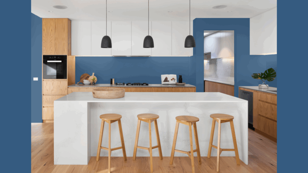
Prussian Blue by Benjamin Moore is a rich, deep blue that brings a bold and dramatic touch to any room.
I’ve found that this color adds a sense of sophistication and elegance, making it perfect for both modern and traditional spaces.
If you’re using it for an accent wall, cabinetry, or even an entire room, Prussian Blue stands out with its timeless appeal. It pairs well with neutrals, whites, or metallic accents, creating a stylish contrast.
I love how it can work in various settings, from living rooms to bedrooms, or even exterior applications like doors and shutters.
If you’re looking for a statement color that offers depth and versatility, Prussian Blue might be the perfect choice.
What Kind of Color Is Benjamin Moore’s Prussian Blue?

Benjamin Moore’s Prussian Blue is a deep, rich shade of blue with a hint of green. It’s a bold, dramatic color that can bring sophistication to any space.
The color has an LRV (Light Reflectance Value) of 6.74, which means it absorbs a significant amount of light, making it a darker, moodier choice.
Prussian Blue’s undertones are slightly green, giving it a more natural, earthy feel compared to other blues. This makes it a great option for creating a cozy, inviting atmosphere.
It pairs well with lighter neutrals or even metallic accents for contrast. Whether used on walls, cabinetry, or furniture, Prussian Blue adds depth and elegance to both modern and traditional designs.
You’ll find it works in places where you want:
- A sense of calm focus
- Rich color without overwhelming brightness
- A backdrop that makes wood tones and brass accents pop
If you want a striking, timeless color, Prussian Blue is a versatile option to consider.
Is Prussian Blue a Warm or Cool Color?
Prussian Blue is technically a cool color, but it doesn’t have that cold, distant feel some blues do. Its deep, rich tone gives it balance and warmth, making it cozy rather than stark.
While bright blues can feel chilly, Prussian Blue’s depth creates a welcoming, enveloping atmosphere in a room.
The way this color appears can change depending on the lighting. In low-light areas, like north-facing rooms, it may show more of its gray undertones.
Under natural sunlight, the true blue richness stands out, while warm artificial lighting can give it a slightly warmer, more mysterious look.
My biggest tip? Always test the color first. Lighting can make a huge difference.
Paint a 2-foot square on at least two walls, and observe it at different times of day. This step has saved me from paint regrets more times than I can count.
What Style Works Well with Prussian Blue?

Prussian Blue is a versatile and timeless color that works well in many different design styles.
While it’s perfect for traditional and historic homes, bringing Colonial, Victorian, or Craftsman spaces to life with authentic beauty, it’s also a great choice for modern interiors.
The deep, rich tone adds depth to contemporary rooms without feeling cold.
Where to Use Prussian Blue:
| Area | Description |
|---|---|
| Accent Walls | Adds drama without overwhelming the room. |
| Built-ins & Cabinetry | Creates architectural interest and highlights design details. |
| Front Doors | Makes a bold statement while remaining timeless. |
| Furniture Pieces | Refreshes furniture like dressers, sideboards, or bookcases. |
| Dining Rooms | Creates a perfect backdrop for intimate, candlelit dinners. |
What Paint Finish Should You Choose?
For most walls, I recommend either a matte or eggshell finish with Prussian Blue. Matte creates a soft, velvety look that enhances the color’s depth and coziness.
It’s my go-to for bedrooms, living rooms, and dining areas. Eggshell offers just a touch more durability while still keeping that rich, dimensional quality.
You’ll appreciate the subtle sheen when light hits it. It depends on how you use the room. For quiet spaces like formal living rooms or adult bedrooms, matte is perfect.
For places where kids hang out or guests gather often, eggshell gives you a bit more cleaning power.
Higher Sheens for Practical Areas
Satin finish works beautifully for high-traffic walls, like hallways or family rooms. I’ve used it countless times in these busy areas, and it stands up to occasional cleaning without looking too glossy.
For trim, doors, and cabinetry, semi-gloss is your friend. The contrast between matte walls and semi-gloss trim creates architectural interest, even in simple spaces.
How Sheen Affects Color Perception?
Did you know that the finish you choose can actually change how Prussian Blue looks? Higher sheens reflect more light, making the color appear slightly brighter and more intense.
A semi-gloss Prussian Blue cabinet will look a touch more vibrant than the same color in matte on a nearby wall. I learned this the hard way when I painted my office.
The matte walls looked perfectly moody, but the satin-finish built-ins appeared almost like a different color in certain light. Not bad, just different. This effect can work to your advantage.
Common Mistakes to Avoid
Prussian Blue from Benjamin Moore is a classy, deep navy blue with subtle historical undertones that can change any space into a classy sanctuary.
- Creating a Cave-Like Effect: One mistake I see often is pairing Prussian Blue with too many dark elements. When all your floors, furniture, and décor are deep-toned, the room becomes heavy and oppressive.
- Using Harsh Lighting: Fluorescent lighting brings out unpleasant gray undertones in Prussian Blue. You’ll get the best results with warm-toned LEDs or natural daylight that reveals the color’s true depth and richness.
- Skipping the Sample Test: Don’t trust the paint chip or online photos! I’ve made this mistake and regretted it. Prussian Blue shifts dramatically between spaces and lighting conditions.
- Overusing the Color: Using Prussian Blue on every surface creates an overwhelmed feeling rather than an impact. I find it works best as a focal point, perhaps one accent wall or built-in cabinetry.
- Choosing Clashing Accents: Some colors fight with Prussian Blue. Neon brights, primary colors, and cool pastels can create jarring combinations. Instead, look to nature for inspiration: amber, terracotta, cream, and natural wood tones.
Conclusion
After living with Prussian Blue in my own home for three years, I can honestly say it’s more than just another navy. There’s a depth and character here that keeps me noticing new things about it.
What makes it special?
It’s both timeless and current. It works in traditional settings but doesn’t feel stuffy. It’s bold without shouting. In a world of trendy colors that come and go, Prussian Blue has staying power.
But don’t just take my word for it.
Get a sample and live with it. Watch how it changes throughout the day. Trust your gut reaction – you’ll know if it’s right for your space.
Have you already used Prussian Blue in your home? I’d love to see photos in the comments!
Or if you’re on the fence, drop your questions below. I check back weekly and am happy to help you decide if this classic blue deserves a place in your home.