
Agreeable Gray by Sherwin-Williams is a color I always return to. It hits that rare sweet spot between warm and cool, making it one of the most versatile grays I’ve used.
When I first started testing gray paints, many of them felt too blue or looked dull under certain lighting conditions. Then I found SW Agreeable Gray, and it changed everything.
It gave my space a warm, fresh look without being too beige or stark. It’s the kind of neutral that quietly enhances a room without stealing the spotlight.
In this guide, I’ll walk you through everything I’ve learned about this popular shade, including its undertones, how it behaves in different lighting conditions, ideal color pairings, finishes to consider, and where to purchase it.
If you’re thinking of using this shade, I’ve got you covered.
What Is SW Agreeable Gray?
Sherwin-Williams Agreeable Gray (SW 7029) is a warm-toned gray paint color with soft beige undertones, often described as a “greige.”
Its most significant strength is its balance; it doesn’t lean too warm or too cool, making it a flexible choice across different lighting and design styles.
With a Light Reflectance Value (LRV) of 60, it reflects enough light to brighten a space while still feeling grounded. This makes it feel fresh and modern without drawing too much attention to itself.
Agreeable Gray pairs exceptionally well with transitional homes that feature a blend of traditional and modern elements. It doesn’t compete with furniture or finishes, instead creating a clean, cohesive look.
Because of this adaptability, it’s a favorite among designers, stagers, and homeowners seeking a timeless, fail-proof neutral backdrop that works well in almost any setting.
Agreeable Gray in Different Lighting Conditions
Lighting dramatically affects the appearance of Agreeable Gray in different rooms, with its undertones reacting uniquely to natural light.
- North-Facing Rooms: In north-facing spaces, Agreeable Gray appears cooler and more gray than beige. The lack of warm sunlight mutes its warmth, giving the room a calm, modern feel.
- South-Facing Rooms: Rooms with southern exposure bring out the beige in Agreeable Gray. The natural light all day enhances its warmth, making the space feel cozy and inviting.
- East-Facing (Morning): Morning sunlight in east-facing rooms makes Agreeable Gray look bright and fresh. It feels neutral and balanced, perfect for creating an energized start to the day.
- West-Facing (Afternoon): In afternoon light, Agreeable Gray softens into a warm taupe-gray. This warm tone works well for relaxed living areas and mellow evening settings.
Coordinating Colors That Work Well with Agreeable Gray
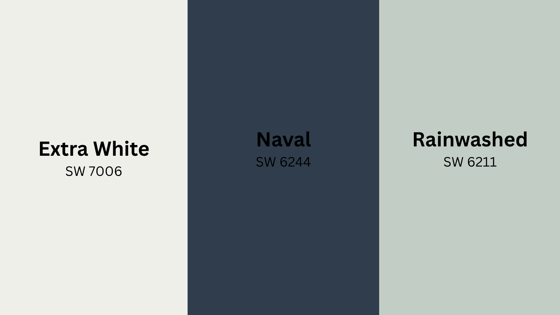
Agreeable Gray pairs well with various trim shades, bold accents, and decor colors. Choosing the right coordinating tones enhances cohesion. The table below shows reliable combinations that work beautifully with this popular greige.
| CATEGORY | COLOR NAME | DESCRIPTION |
|---|---|---|
| Trim & Ceiling | SW Extra White | Crisp, bright white that adds a clean, modern edge |
| SW Alabaster | Soft, warm white that provides a gentle, cozy contrast | |
| Accent Walls | SW Naval | Deep navy blue that offers bold contrast with a classic feel |
| SW Urbane Bronze | Rich charcoal brown that grounds the space and adds depth | |
| Decor Accents | SW Rainwashed | A muted blue-green that adds a touch of freshness and calm |
| SW Oakmoss | Earthy green that enhances warmth and natural wood elements |
Where Agreeable Gray Works Best
Agreeable Gray suits many home areas due to its versatile, warm, and fresh appearance. It adapts well to different lighting and decor styles, from shared spaces to private retreats. Let’s see where it excels.
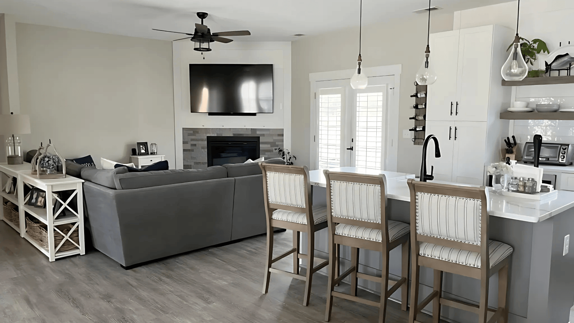
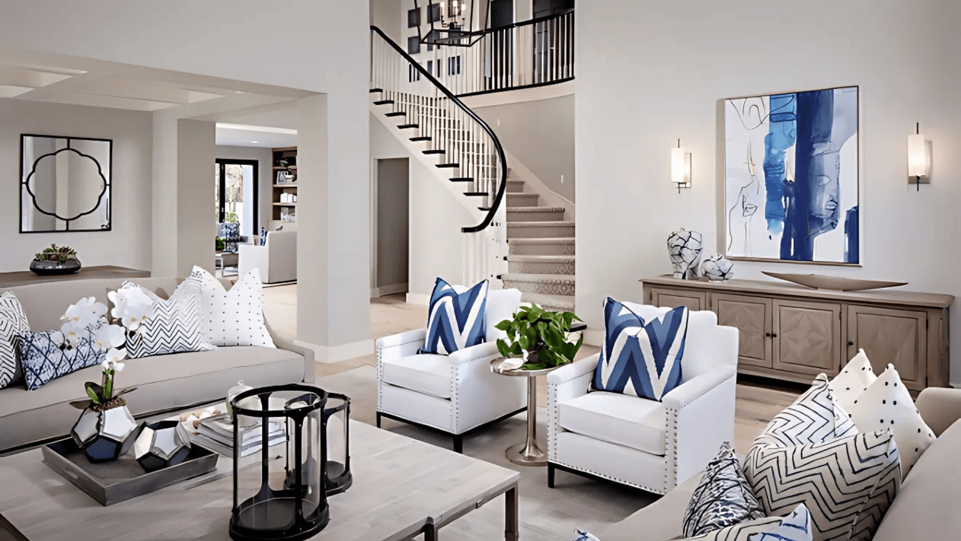
Living Rooms
Agreeable Gray creates a soft, inviting base in living rooms.
It pairs beautifully with both colorful accents and neutral decor. The warm undertone adds comfort without making the space feel dark.
It works well with natural light and complements wood floors, white trim, or bold furniture pieces, making it a flexible choice for many styles.
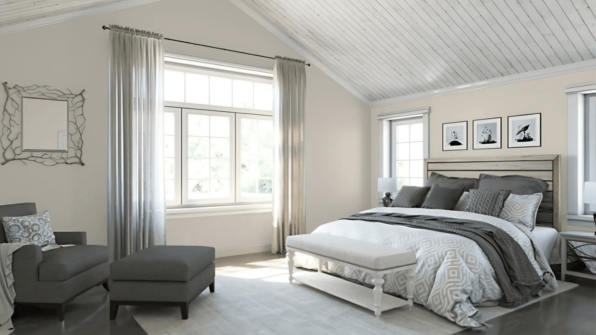
Bedrooms
In bedrooms, Agreeable Gray brings a calm, restful vibe.
Its warm gray tone softens the room and pairs easily with cozy textures, natural wood, and soft colors.
It provides a neutral base that works with changing bedding, artwork, or seasonal decor, making it perfect for both minimalist and layered looks.
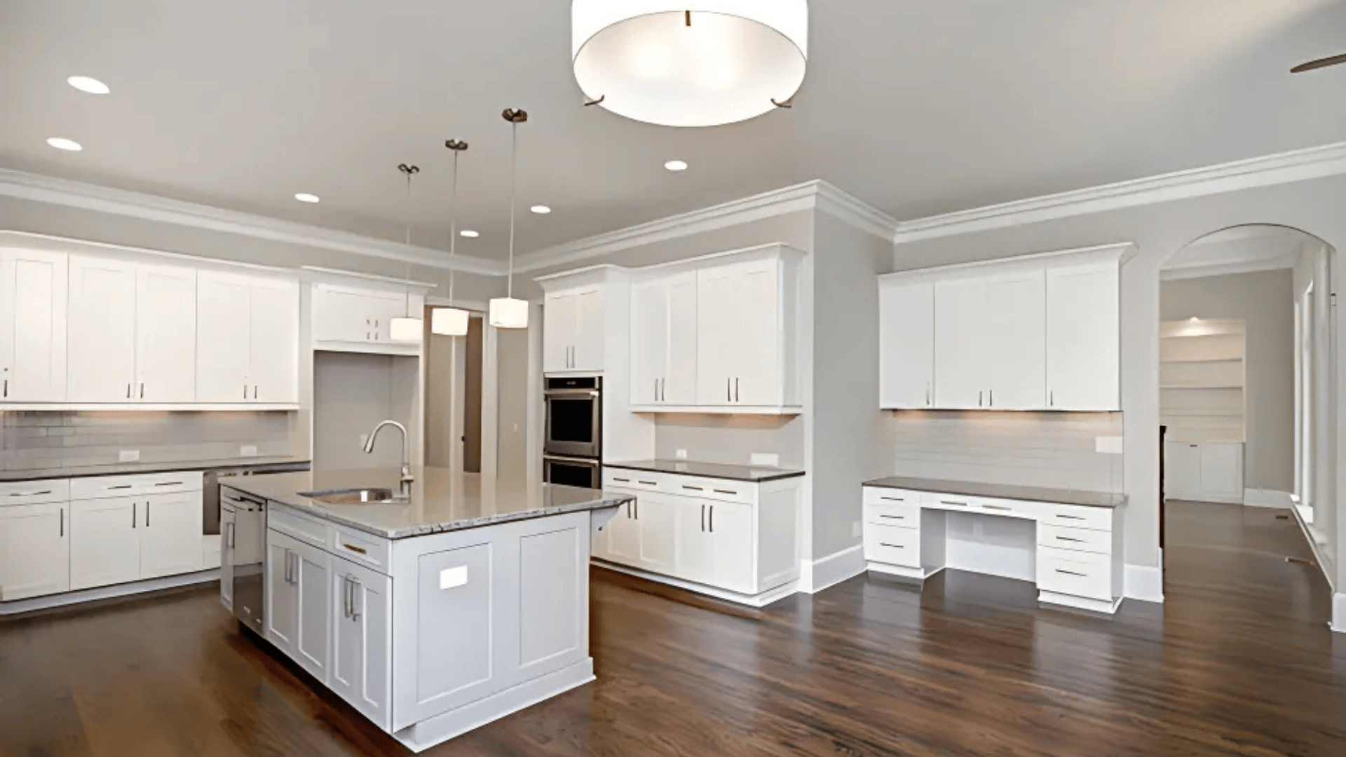
Kitchens
Agreeable Gray works well in kitchens with white cabinets, wood floors, or stainless steel appliances.
It adds a touch of warmth and color without overpowering the space.
The shade balances beautifully with brass or black hardware and ties in easily with butcher-block countertops or open shelving for a clean, cohesive feel.
Agreeable Gray Compared to Similar Colors
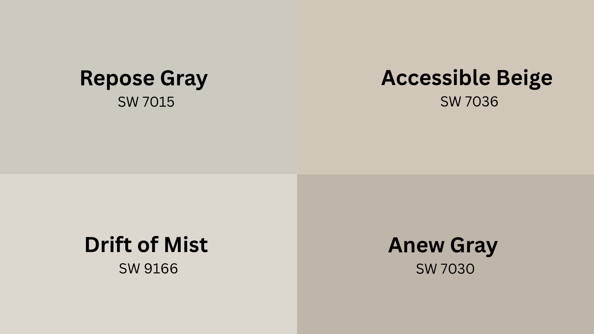
Agreeable Gray is a popular neutral between gray and beige. Sherwin-Williams offers other colors with cooler, warmer, or undertone variations. Comparing them helps see how LRV, undertones, and warmth influence your final look.
| Color Name | LRV | Undertone | Warm/Cool |
|---|---|---|---|
| Repose Gray SW 7015 | 58 | Cool violet | Cool |
| Accessible Beige SW 7036 | 58 | Beige/Taupe | Warm |
| Anew Gray SW 7030 | 47 | Warm greige | Warm |
| Drift of Mist SW 9166 | 69 | Soft warm gray | Warm |
Best Finishes for Agreeable Gray
The finish you choose affects how Agreeable Gray looks and performs. It can change the color’s depth, impact how much light reflects off the walls, and determine how easy it is to clean.
Understanding each option helps you pick the right one for every room in your home.
- Flat/Matte: This finish effectively conceals wall imperfections and features a very low sheen. Ideal for ceilings or adult bedrooms with infrequent cleaning, this creates a soft, cozy appearance with a slightly deeper tone.
- Eggshell: With a light sheen and easy maintenance, eggshell balances style and function. It’s great for living rooms, hallways, and standard bedrooms, offering smooth warmth and light reflection.
- Satin: Satin is highly durable, easy to clean, and reflects more light than eggshell. Ideal for kitchens, bathrooms, and trim, it makes Agreeable Gray appear slightly lighter and adds a polished look.
Agreeable Gray: What Works and What Doesn’t
Agreeable Gray has established a solid reputation as a reliable, go-to neutral. But every color has its highs and lows. This table provides a clear, side-by-side comparison of the key strengths and limitations of incorporating this Sherwin-Williams favorite into your home.
| CATEGORY | PROS | CONS |
|---|---|---|
| Versatility | Pairs well with nearly all colors and fits both traditional and modern interiors | It may look flat in bright rooms without contrasting elements |
| Undertone Balance | Stable greige that doesn’t shift too warm or too cool under different lighting | It can feel too safe or bland for those wanting bolder, more vibrant tones |
| Resale Value | Widely appealing to buyers, great for staging and open house presentations | Not ideal for those who want a strong statement color |
| Ease of Use | Works in every room, from kitchens to bedrooms, and matches with wood, metal, or fabric tones. | Requires decor layering to avoid looking overly neutral or dull in large open areas |
Where to Buy SW Agreeable Gray
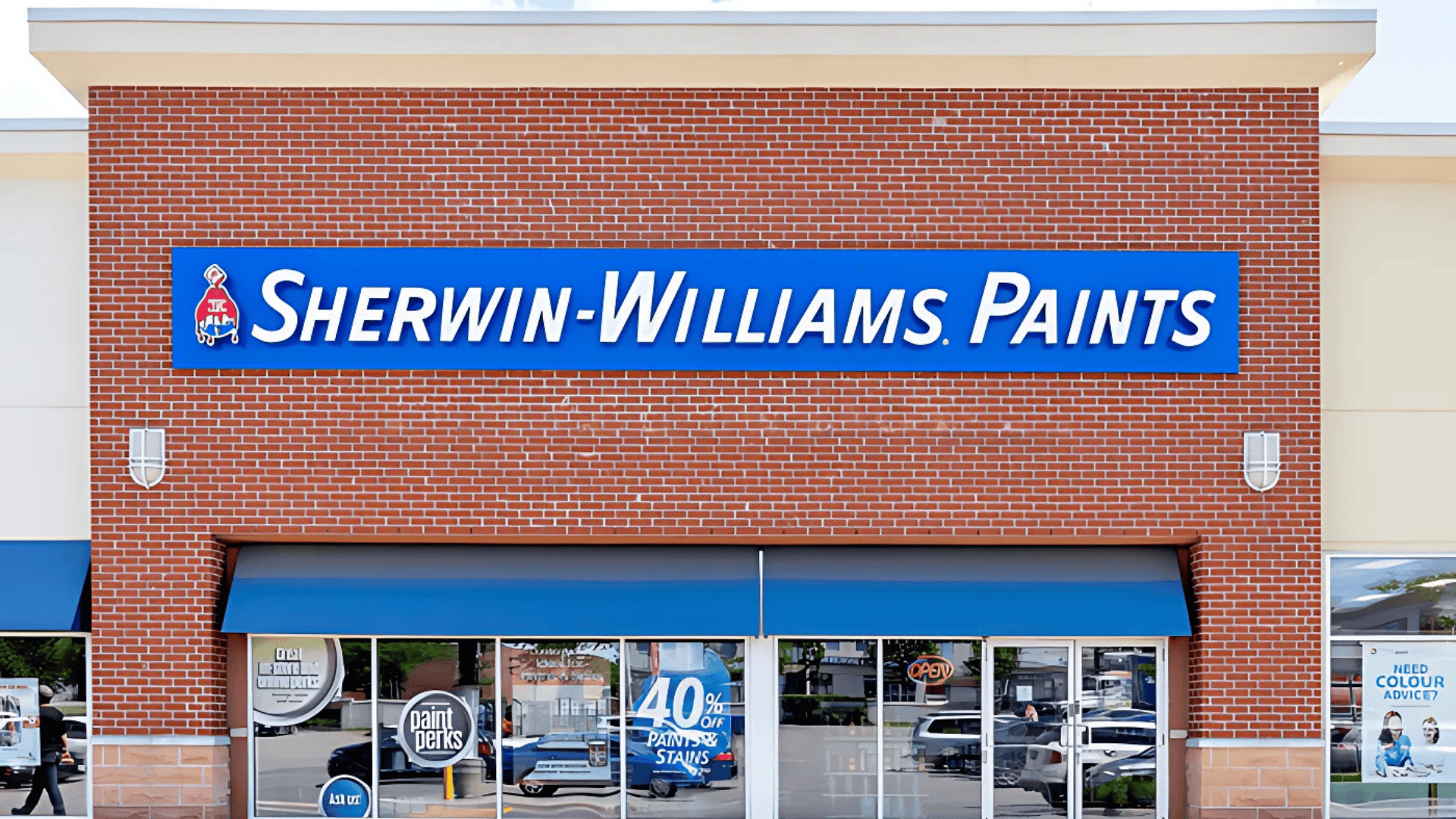
Finding Sherwin-Williams Agreeable Gray is easy online and in stores. Get expert help, exclusive deals, and tools. Sample sizes are available at partner retailers for testing. Here are the best places to find this popular neutral.
- Sherwin-Williams Stores: Get expert help with color matching, samples, and fan decks in a full-service environment. In-store lighting and seasonal discounts make this a great choice for hands-on planning.
- Sherwin-Williams Online: Order from home with free shipping on many purchases and access to helpful tools like the virtual color visualizer. You can also schedule delivery or in-store pickup.
- Retail Partners: Some home improvement stores carry sample sizes and gallons of Agreeable Gray. Extended hours make them convenient for quick visits or last-minute needs.
Always test Agreeable Gray on your walls with a sample pot. Lighting shifts throughout the day, and samples help you feel confident before committing to a full gallon.
The Bottom Line
When I first used Agreeable Gray in my hallway, I wasn’t sure how it would turn out. But once it was up on the walls, everything clicked.
The color tied together my floors, furniture, and lighting better than I expected.
What I love most is how it quietly supports the rest of the room. It’s not loud or flashy, but it makes everything else look better.
If you’re searching for a dependable, flexible neutral, this shade is worth considering.
Try a sample on your walls, check it in different lighting conditions, and give it a chance to reveal its charm. I hope this guide helped you get a clearer picture.
If it did, I’d really appreciate it if you could share it with someone who might be planning their next home project.