
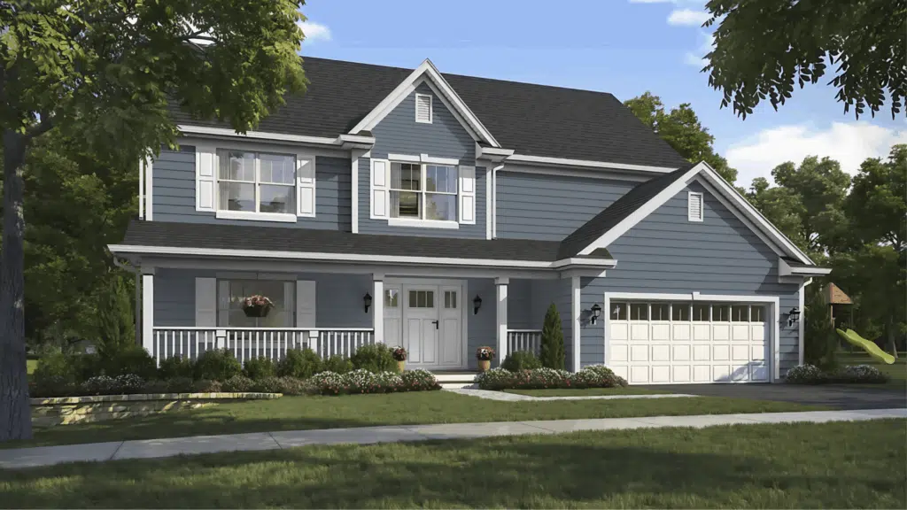
When it comes to choosing paint, I know the shades of blue and gray can feel overwhelming. Some look too bright, while others feel too cold. For me, Sherwin-Williams Storm Cloud (SW 6249) strikes the perfect balance.
It’s a deep blue-gray with just enough mood and depth to feel interesting, but not so dark that it takes over a space. I love that mix of versatility and character; it’s one reason designers and homeowners keep turning to it.
In this guide, I’ll walk you through everything about Storm Cloud: how it looks in different light, the best places to use it, colors that pair well, and how it stacks up against similar tones.
By the end, you’ll see if Storm Cloud is the right fit for your home, just like I did when I tried it.
All About Sherwin-Williams Storm Cloud

Sherwin-Williams Storm Cloud (SW 6249) is a deep, balanced blue-gray that sits between navy and slate. It’s dark enough to feel dramatic but not so heavy that it overwhelms a room.
Many people choose it because it delivers both mood and versatility, which is a rare mix in darker paint colors.
Features of SW 6249
- Color Code: SW 6249
- HEX: #717C84
- RGB: (113, 124, 132)
- LRV (Light Reflectance Value): 23
That LRV of 23 tells us Storm Cloud reflects only a small amount of light, so it naturally reads as a darker shade. Instead of bouncing brightness back into a space, it absorbs it, creating depth.
This is why Storm Cloud works so well as a backdrop color. It sets the tone without being harsh.
Think of it like a stormy sky right before the rain. It feels calm, steady, and timeless, which is exactly the kind of atmosphere it can bring into a home.
How Storm Cloud Shapes a Space
Storm Cloud is one of those colors that instantly changes how a room feels. It brings weight and mood, but in a way that feels steady rather than overwhelming.
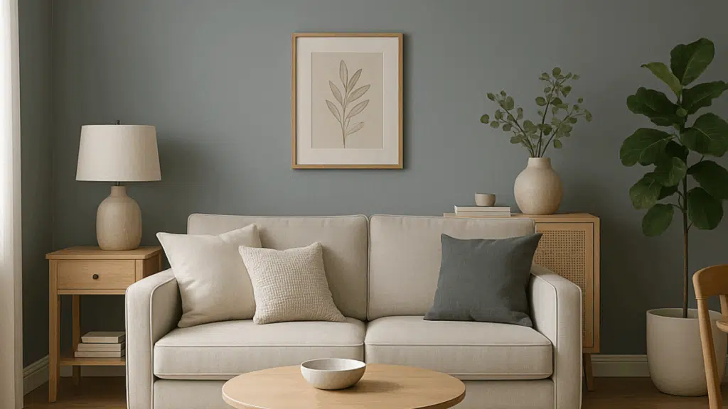
On the wall, it reads as a deep blue-gray that can anchor a space and make it feel more intentional. In living areas, it creates a grounded, classy backdrop that makes furniture and art stand out.
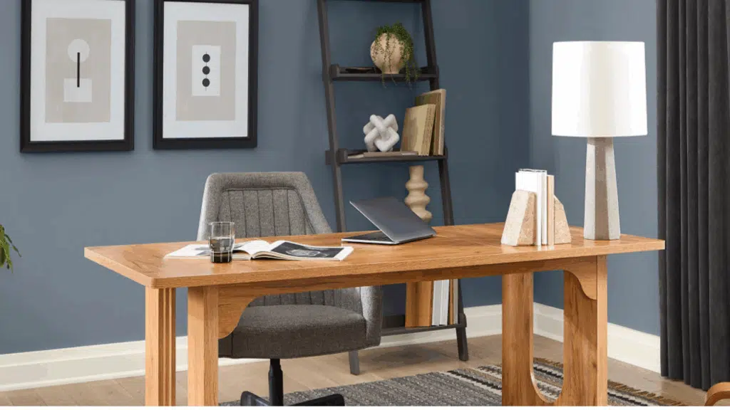
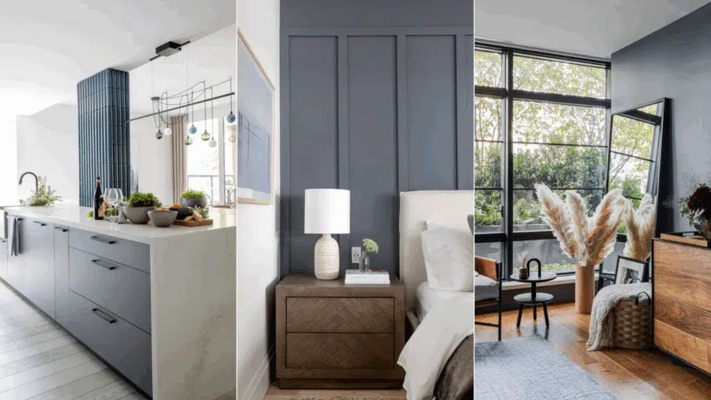
In bedrooms, it feels cozy and calm, almost like a cocoon, while still keeping a refined edge. When used on cabinets or an island, it adds drama and depth without taking the kitchen too dark.
What makes Storm Cloud different is its balance. It’s strong enough to carry a whole room but subtle enough to work as an accent or feature wall.
It shapes the mood by pulling everything together, and all sorts of designs can benefit from its depth.
How Storm Cloud Looks in Different Light?
Storm Cloud is a mix of blue and gray that shifts depending on lighting and direction. Its undertones can lean one way or the other, which makes testing it in your own space important. Take a look at these factors:
1. Undertones and Light Source
Storm Cloud isn’t a flat blue-gray. It changes more than you might expect. The shade has shifting undertones that react differently depending on the light in your space.
In some rooms, it feels calm and soft, while in others it can read much deeper and moodier.
This quality makes it versatile, but it also means the color won’t look the same from morning to evening or under different types of bulbs.
- Morning sunlight: softer, leaning more gray
- Evening light: deeper, with stronger blue tones
- Artificial light: warm bulbs add coziness, daylight bulbs make it sharper and cooler
2. Room Direction
The direction a room faces can make Storm Cloud shift in surprising ways. Natural light doesn’t just change brightness; it also affects the temperature of the color.
North-facing rooms tend to highlight the cooler, moodier side of Storm Cloud, while south-facing spaces pull out a softer and warmer look.
East- and west-facing rooms shift the most, with the color looking different from morning to evening.
- North-facing rooms: cooler and moodier
- South-facing rooms: warmer, softer blue-gray
- East-facing rooms: brighter in the morning, moodier by evening
- West-facing rooms: warm glow at sunset, neutral by day
3. Compared to Similar Colors
Storm Cloud sits close to other blue-grays in the Sherwin-Williams palette, but each shade brings a slightly different feel. Comparing it to nearby colors helps show where Storm Cloud stands out.
- Jubilee (SW 6248): lighter and more gray.
- Krypton (SW 6247): softer and cooler, with more brightness.
Storm Cloud lands deeper than both, offering more presence without going full navy.
Together, these factors show why Storm Cloud feels so dynamic. Its look will always depend on your light and setting, which is why testing it in your own space makes all the difference.
Where to Use Sherwin-Williams Storm Cloud in Your Home?
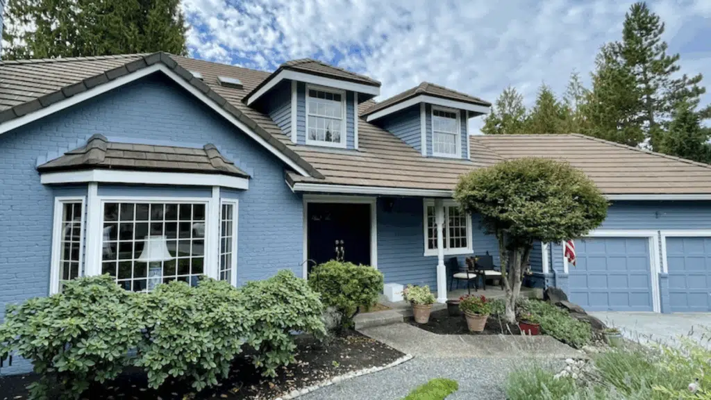
Storm Cloud is versatile enough to work in both interiors and exteriors. It adds depth indoors without overwhelming and brings character outdoors with strong curb appeal.
Paired with the right trims and finishes, it adapts to different styles like farmhouse, coastal, transitional, or modern.
| Area | Best Use | Effect Created |
|---|---|---|
| Bedrooms | Accent or full wall | Calm, restful, and cozy |
| Dining Rooms | Walls or feature wall | Adds drama and sophistication |
| Kitchens | Cabinets or islands | Stylish, modern focal point |
| Home Offices | All walls or backdrop wall | Focused and grounded |
| Siding | Full exterior | Bold yet classic |
| Shutters | Accent feature | Subtle contrast, refined detail |
| Front Doors | Statement color | Strong curb appeal and personality |
| Trim/Accents | Paired with whites, woods, or black | Crisp, warm, or modern contrast |
Storm Cloud’s strength is its flexibility. It works as a feature shade, a backdrop, or an exterior accent, depending on how bold you want your space to feel.
Colors That Go With Storm Cloud
Storm Cloud is flexible and works with a wide range of colors. Pair it with neutrals for balance, bold accents for contrast, or soft shades for a lighter, airy look.
The right combination depends on whether you want the room to feel dramatic, calm, or inviting.
| Category | Colors That Work |
|---|---|
| Neutrals | Extra White (SW 7006), Repose Gray (SW 7015) |
| Bold Accents | Mustard yellow, Coral, Brass, or gold finishes |
| Soft Pairings | Beige, Greige, Warm whites |
Sample Palettes:
- Bold: Storm Cloud + Mustard Yellow + Extra White
- Neutral: Storm Cloud + Repose Gray + Beige
- Soft & Airy: Storm Cloud + Extra White + Greige
These combinations show how Storm Cloud can shift from bold and dramatic to soft and subtle, depending on what you pair it with.
How Storm Cloud Looks in Real Homes?
In real homes, Storm Cloud shows its range without feeling heavy. On walls, it adds depth but stays balanced with light trim or soft finishes. Paired with light oak floors, it feels grounded and open.
With darker wood tones, it becomes richer and more dramatic. In kitchens, Storm Cloud looks great on cabinets or islands. Brass or matte black hardware makes the color stand out even more.
Outdoors, it’s a strong choice for front doors. Against white siding or lighter exteriors, it creates contrast without looking too harsh.
It pairs well with:
- Metallic finishes like brass, silver, or matte black
- Soft, muted fabrics and textiles
- Both light and dark wood flooring
Pros and Cons of Storm Cloud
Like any darker paint color, Storm Cloud has its strengths and challenges. Knowing both sides can help you decide if it’s the right fit for your home.
| Pros | Cons |
|---|---|
| Works across multiple design styles Adds richness and depth Suitable for interiors and exteriors |
Can feel heavy in small or dim spaces Doesn’t always blend well with warm, orange woods |
Tips to make it work:
- Pair with light trim to keep it balanced
- Test in your space before committing
Overall, Storm Cloud offers flexibility and character, but it needs the right setting to shine. With the right balance, it can transform a space without overwhelming it.
Storm Cloud vs. Similar Paint Colors
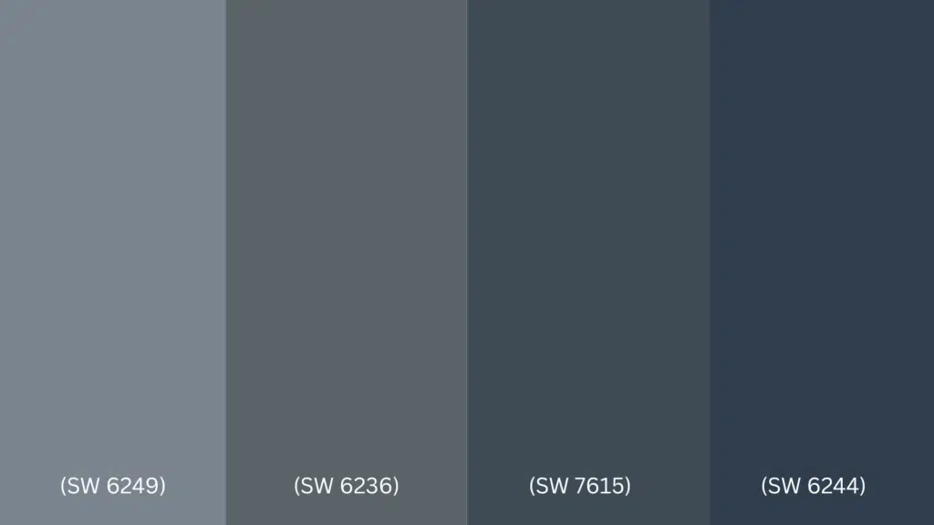
Storm Cloud is often compared with other dark blues and blue-grays from Sherwin-Williams. Each has its own undertones, depth, and best uses. Looking at them side by side makes the differences easier to spot.
| Color | Undertones | LRV | How It Differs |
|---|---|---|---|
| Storm Cloud (SW 6249) | Balanced blue-gray | 23 | A versatile mix of blue and gray; moody but not overpowering |
| Gray’s Harbor (SW 6236) | Navy with gray hints | 12 | Reads darker and more navy, less gray balance |
| Sea Serpent (SW 7615) | Deep blue with gray | 7 | Very dark and dramatic; heavily blue and bold |
| Naval (SW 6244) | True navy | 4 | A classic navy; sharper and more formal than Storm Cloud |
Storm Cloud stands out as the most balanced choice. It gives you the richness of blue with grounding gray undertones, making it more flexible than darker, navy-leaning shades.
Where to Buy Storm Cloud?
Getting Sherwin-Williams Storm Cloud (SW 6249) is simple, but it helps to know your options before you commit. You can order it directly or through retailers that offer color matching and sampling.
- Sherwin-Williams Website and Stores → Buy paint, sample sizes, or color chips directly. Staff in stores can also guide you with finishes and product types.
- Lowe’s → Many locations carry Sherwin-Williams paint lines and can color-match Storm Cloud.
- Home Depot → Some stores can match the color if you bring in the code (SW 6249).
- Samplize → Order 12×12 peel-and-stick samples that you can move around your walls.
Always test Storm Cloud in your own space before painting an entire room or exterior. Lighting, finishes, and surroundings can shift the way this shade appears.
Conclusion
If you’ve been searching for details on Sherwin-Williams Storm Cloud (SW 6249), this guide has covered everything you need. You now know its specs, how it shapes a room, and how it shifts with light throughout the day.
Storm Cloud stands out because of its balance. It’s moody without being overwhelming, versatile enough to work in bedrooms, kitchens, offices, and exteriors, and flexible with both bold and soft pairings.
It compares well against other dark blues, offering more depth than lighter grays but more softness than true navy shades.
The key is testing it in your own space. With the right samples and finishes, Storm Cloud adds depth and timeless style to any room.