")
SW Extra White (SW 7006) has taken over homes everywhere. Walk into any freshly painted space, and chances are, you’re looking at this color.
I have spent months testing SW 7006 in different rooms, and the results surprised me. Same paint, wildly different vibes.
The living room glowed with warmth, while the bathroom felt sterile and cold. Lighting, furniture, even the time of day changed everything.
This review breaks down how Extra White performs in each space. Real rooms, real conditions, honest opinions. Let’s see where this white shines and where it falls flat.
Sherwin Williams Extra White and its Color Properties
SW Extra White lives up to its name as one of the brightest, cleanest whites in the Sherwin-Williams collection.
It’s a crisp, cool white with minimal undertones, making it incredibly versatile. The high LRV means it reflects tons of light, which can work magic in dim spaces.
However, that same brightness can feel stark in rooms with harsh overhead lighting.
| Property | Value |
|---|---|
| Color Code | SW 7006 |
| Hex Code | #EEEFEA |
| Undertone | Slight cool gray |
| LRV | 86 |
| RGB | R: 240, G: 239, B: 233 |
How Lighting Changes Extra White Appearance
Lighting transforms SW Extra White dramatically.
In north-facing rooms, it can look icy and almost blue-gray, especially on cloudy days. The cool undertone becomes way more noticeable without direct sunlight.
South-facing spaces? Completely different story. The paint glows warm and inviting, reflecting all that natural light beautifully.
Artificial lighting matters just as much. Warm LED bulbs soften the starkness and add a cozy feel. Cool white bulbs amplify that crisp, modern vibe but can push it toward sterile territory.
When I tested it under fluorescent lights in a basement, it looked downright cold.
Time of day shifts the color too; morning light brings out subtle warmth, while evening shadows emphasize the gray undertones.
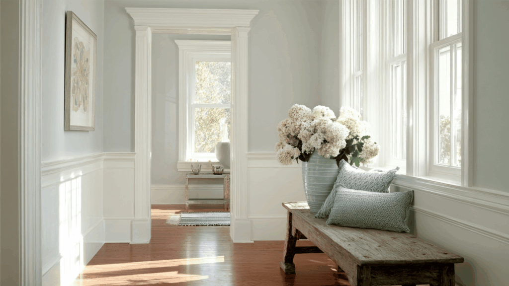
Best Room Applications for Sherwin Williams Extra White
Extra White by Sherwin-Williams shines in specific spaces where its brightness and cool tone work to its advantage rather than detract. Here’s where it performs best.
Living Room
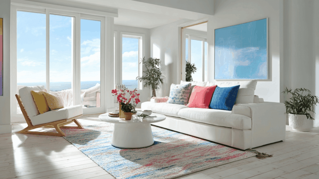
Living rooms with plenty of natural light are perfect for this color.
The high LRV bounces light around, making the space feel open and airy. It creates a clean backdrop for colorful furniture and artwork without competing for attention.
Works especially well in modern or minimalist designs where that crisp, gallery-like feel is exactly what you want.
Bedroom
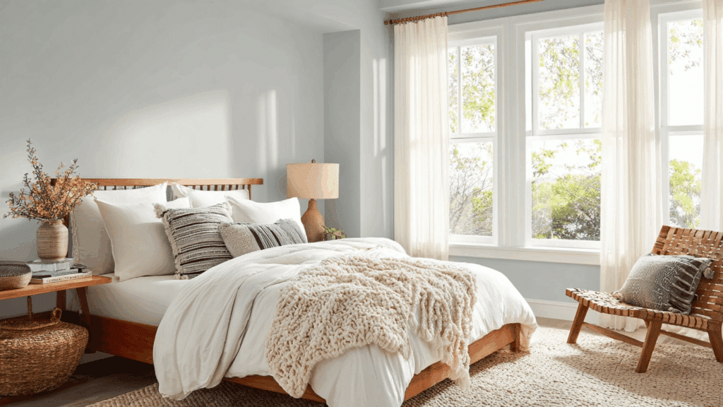
Bedrooms can handle Extra White if you balance it right. The brightness works in master bedrooms with large windows and soft textiles to warm things up.
Layer in cozy bedding, textured throws, and warm wood furniture to counter the cool undertone.
Morning light makes it feel fresh and energizing, though you’ll want blackout curtains or warm lamps for nighttime ambiance.
Kitchen
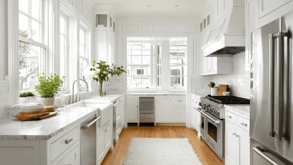
Kitchen benefits from SW Extra White’s clean, fresh appearance. It pairs beautifully with white cabinets, stainless steel appliances, and marble countertops.
The brightness makes the space feel sanitary and well-lit, which is crucial for food prep areas.
South or west-facing kitchens get the best results, where warm afternoon light softens any starkness.
Home Office
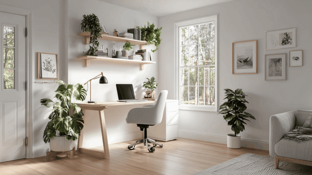
Home offices need clarity and focus, and this color delivers both.
The bright, neutral backdrop reduces visual distractions and makes the space feel professional. It photographs well for video calls, too.
Just make sure you have good natural light or warm task lighting to prevent the space from feeling too cold during long work sessions.
Trim and Molding
This color excels as trim paint throughout the house. It creates a sharp, clean contrast against colored walls without looking too bright or jarring.
The slightly cool undertone complements most wall colors beautifully.
It’s especially effective with gray, beige, or blue walls, adding that polished, finished look that makes rooms feel complete.
Pros and Cons of Using SW Extra White
Every paint has trade-offs, and Extra White by Sherwin-Williams is no exception. Understanding both sides helps you decide if it’s right for your space.
| Pros | Cons |
|---|---|
| Exceptionally bright with a high LRV of 86 | Can feel stark or sterile in certain lighting |
| Creates a clean, modern aesthetic | A cool undertone may look icy in north-facing rooms |
| Makes small spaces feel larger and more open | Shows dirt, scuffs, and imperfections easily |
| Versatile backdrop for any decor style | Requires frequent touch-ups in high-traffic areas |
| Reflects natural light beautifully | Can amplify imperfections in wall texture |
| Works well as both wall and trim color | May feel too clinical in cozy spaces |
| Pairs easily with other colors | Needs warm elements to avoid coldness |
| Timeless and won’t look dated | Not ideal for rooms lacking natural light |
Complementing Color Pairings with SW Extra White Paint
Extra White plays well with others, but some colors bring out its best qualities while others clash. Here are the pairings that actually work.
- SW Agreeable Gray (SW 7029): The warm greige softens Extra White’s coolness and creates a balanced, cohesive look throughout open floor plans.
- SW Naval (SW 6244): This deep navy blue creates stunning contrast with Extra White trim, perfect for accent walls or cabinetry in kitchens and bathrooms.
- SW Repose Gray (SW 7015): A cool gray that shares Extra White’s undertones, making transitions between rooms feel seamless and refined.
- Natural Wood Tones: Warm oak, walnut, or pine flooring and furniture balance the cool white and add much-needed warmth to prevent sterility.
- SW Tricorn Black (SW 6258): Creates dramatic, modern contrast. Works beautifully for doors, window frames, or kitchen island cabinetry against Extra White walls.
- Soft Blues and Greens: Colors like SW Sea Salt or SW Rainwashed pair nicely, keeping spaces light while adding subtle color interest.
- Warm Metallics: Brass, gold, and copper fixtures warm up Extra White’s coolness and add visual richness without competing for attention.
- Terracotta and Rust: These earthy accent colors in textiles or decor pieces provide warmth and prevent Extra White from feeling too cold or clinical.
Final Thoughts
SW Extra White isn’t a one-size-fits-all solution, despite what the hype suggests.
I tested it in five different rooms, and the results varied wildly. It changed the living room into a bright, gallery-like space but made the basement feel like a hospital corridor.
The key? Know your lighting situation before committing. South-facing rooms with warm wood accents? Go for it. North-facing spaces with minimal natural light? Think twice.
If you’re still unsure, grab a sample and paint large swatches on different walls. Watch how it changes throughout the day. That hour of testing will save you from repainting frustration later.