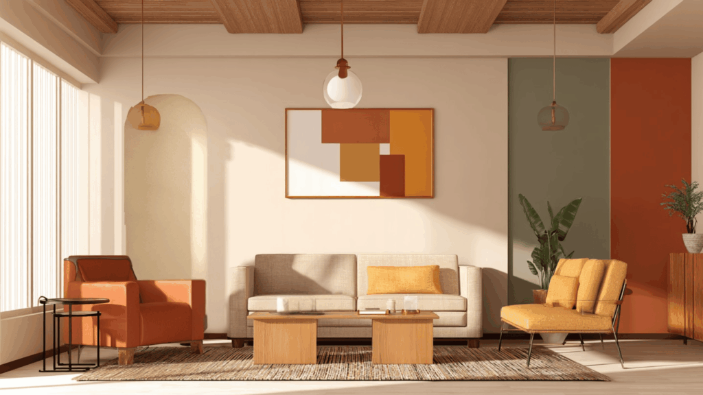
Color theory helps explain how colors mix and work together in art and design. It shows how different shades can create balance, mood, and visual appeal.
One key part of this idea is tertiary colors, the blended shades that connect the main hues on the color wheel.
These colors help make transitions smoother and designs more natural.
In home design, painting, or digital art, understanding tertiary colors can make a big difference.
Knowing how these colors interact helps create spaces and artworks that feel lively, balanced, and visually pleasing.
What are Tertiary Colors?
Tertiary colors are the result of mixing a primary color with a nearby secondary color on the color wheel.
They act as the in-between shades that fill the gaps between the main hues, creating smoother transitions and more variety.
There are six tertiary colors in total: red-orange, a warm and energetic mix; yellow-orange, bright and cheerful; yellow-green, fresh and natural; blue-green, cool and calming; blue-purple, deep and stylish; and red-purple, rich and romantic.
These colors help artists and designers create harmony, subtle contrast, and balance in their palettes, offering endless possibilities for visual creativity and emotional expression.
How Do You Obtain Tertiary Colors?
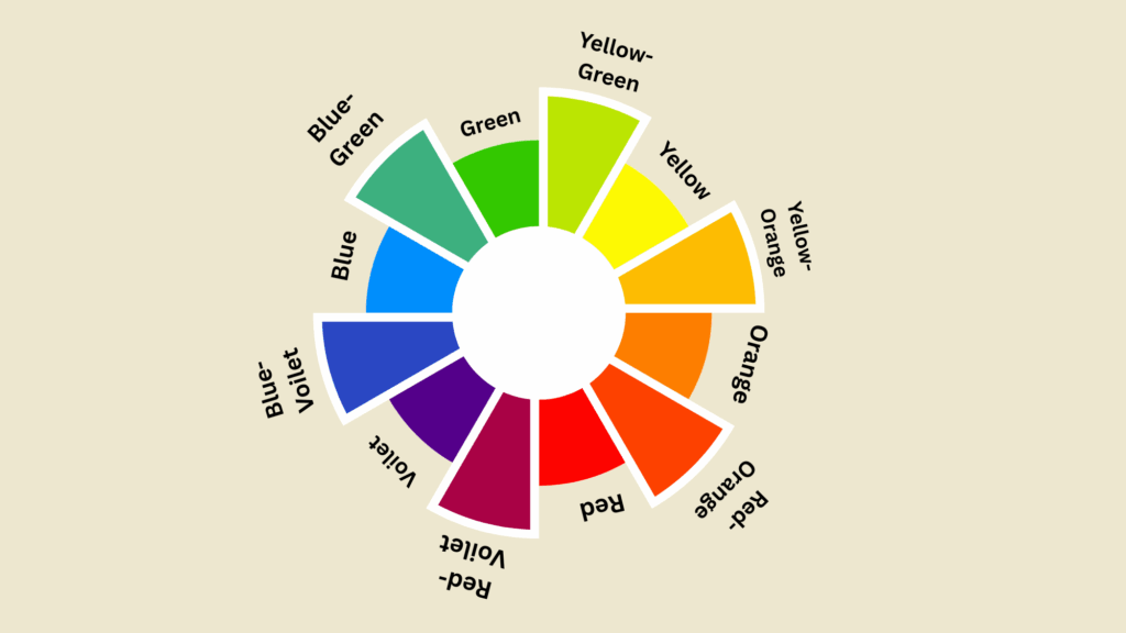
Tertiary colors are created by mixing a primary color (red, blue, or yellow) with a secondary color (orange, green, or purple) that sits next to it on the color wheel.
For example, mixing red and orange gives red-orange, while combining blue and green makes blue-green.
The key is to blend the colors carefully; using more of one color will shift the tone warmer or cooler. Equal parts create a balanced, vivid result.
In both art and digital design, this process allows for more natural transitions between shades, helping designers build rich, cohesive, and visually appealing color palettes.
Tertiary Colors in Interior Design
These colors add richness and harmony to interiors, making rooms feel more balanced, inviting, and full of character. They help create spaces that match different moods and design styles.
1. Red-Orange
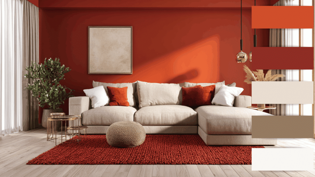
Red-orange adds energy and excitement to a room. It’s a bold choice for accent walls, cushions, or decor pieces.
This color works beautifully in social spaces like living rooms or kitchens, where it sparks warmth and creativity.
Pair it with neutral tones such as beige or white to balance its intensity while keeping the atmosphere inviting and lively.
2. Yellow-Orange
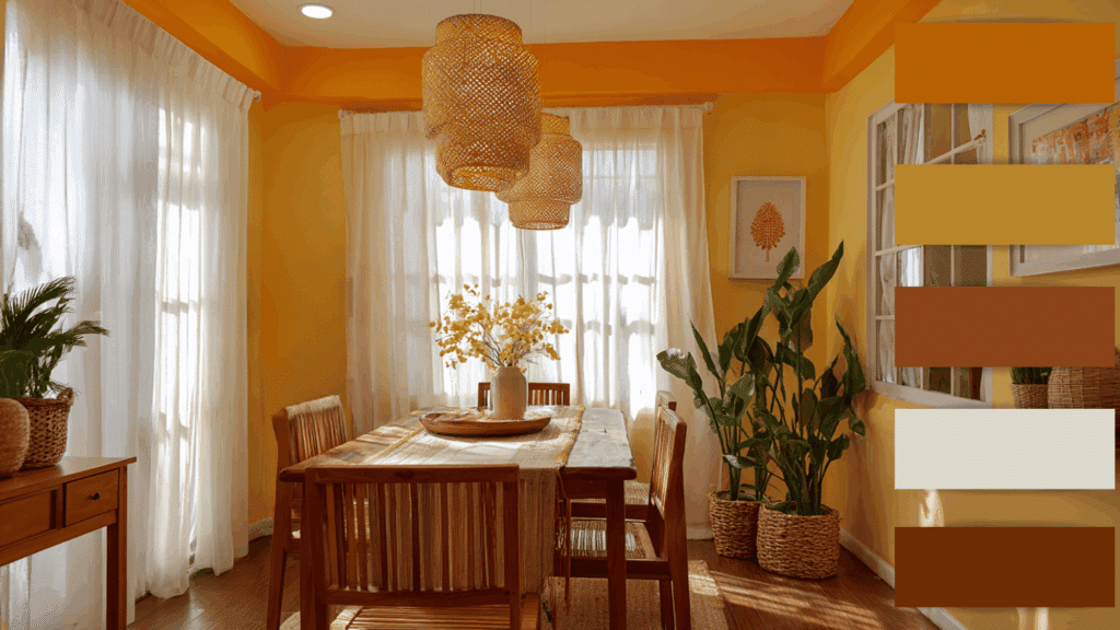
Yellow-orange radiates cheerfulness and light. It’s perfect for brightening up dim spaces like hallways or small rooms.
This shade brings a sunny, cozy feeling that complements wooden furniture and natural materials.
Designers often use it in dining areas or children’s rooms for a joyful, welcoming vibe. It pairs well with earthy tones or soft whites for a balanced, harmonious look.
3. Yellow-Green
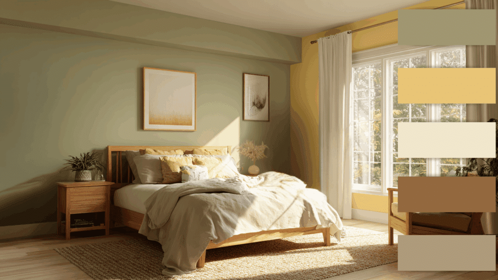
Yellow-green evokes freshness and a connection to nature. It works wonderfully in spaces meant for relaxation, like bedrooms or sunrooms.
The color’s lively yet calm quality makes interiors feel rejuvenated. It pairs beautifully with natural textures such as wood and linen.
Adding indoor plants alongside this shade enhances the organic feel, making the room airy, cheerful, and full of life.
4. Blue-Green
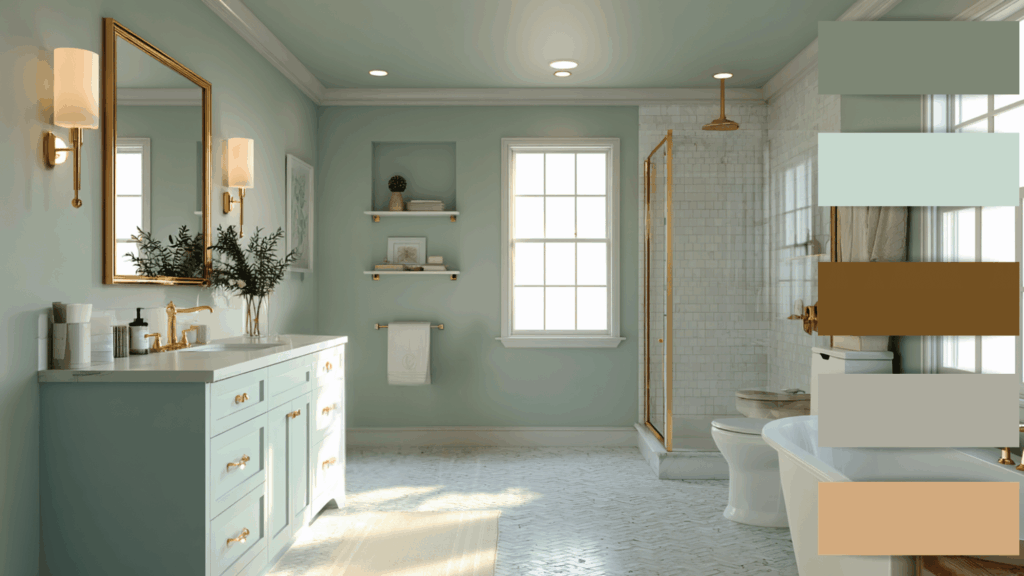
Blue-green, often seen as teal or turquoise, offers a refreshing and tranquil vibe. It’s perfect for bathrooms, bedrooms, or reading nooks where calmness is desired.
This color brings balance and modernity, especially when paired with metallic accents like gold or brass.
Blue-green also complements natural light beautifully, making spaces feel open, coastal, and effortlessly serene.
5. Blue-Violet
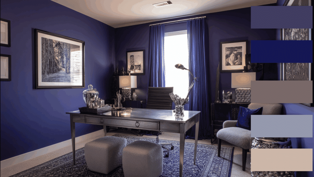
Blue-violet adds style and depth to interiors. It works beautifully in creative spaces, home offices, or bedrooms, where it inspires imagination and calm.
The color mix of cool blue and passionate purple creates a luxurious yet soothing atmosphere.
Paired with soft grays, silvers, or creamy neutrals, blue-violet gives rooms a refined, artistic flair that feels both modern and classic.
6. Red-Violet
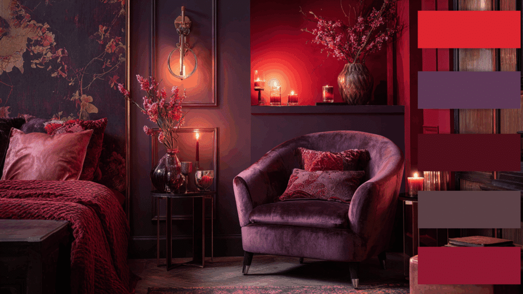
Red-violet exudes warmth, making it ideal for bedrooms or lounge areas.
This color blends the passion of red with the mystery of violet, creating a rich, romantic feel. It pairs well with plush fabrics like velvet and complements gold or rose-gold accents.
Used thoughtfully, red-violet turns any room into an inviting, luxurious retreat full of depth and personality.
The Role of Tertiary Colors in Design
Tertiary colors add richness and versatility to both art and web design.
In art, they help create depth, contrast, and emotion by blending vibrant tones with subtle shades, allowing artists to express complex moods and realism.
In web design, tertiary colors enhance visual hierarchy, strengthen branding, and draw attention to important elements like buttons or icons without overwhelming users.
For example, blue-green conveys calm and trust, red-orange radiates energy and excitement, and yellow-green feels fresh and natural.
By thoughtfully balancing these hues, designers can craft visuals that feel engaging, harmonious, and emotionally resonant across both traditional and digital spaces.
Tips for Using Tertiary Colors
Tertiary colors can change any design when used thoughtfully, adding balance, character, and visual flow to both art and interiors.
- Pair Opposite Tones: Combine warm and cool tertiary colors to create visual balance and add interest without overwhelming the design.
- Add Neutrals for Balance: Use whites, grays, or beiges alongside bold tertiary shades to soften intensity and maintain harmony.
- Use the Color Wheel: Tools like Adobe Color Wheel help designers find complementary or analogous tertiary combinations effortlessly and accurately.
- Consider Lighting: Different lighting conditions can alter how tertiary colors appear; always test palettes under real and digital lighting.
- Ensure Accessibility: Maintain strong contrast between text and backgrounds so all users, including those with vision impairments, can easily read content.
Conclusion
Understanding what tertiary colors are helps designers and artists elevate their creative work with greater harmony and emotional impact.
These colors bridge the gap between primary and secondary hues, offering endless possibilities for depth, contrast, and mood.
If used in a digital interface or a painted canvas, tertiary colors bring balance to every composition.
Knowing how to obtain tertiary colors also empowers creators to experiment confidently, resulting in color palettes that stand out while maintaining aesthetic unity and classic appeal.

