After using countless paint colors in my design career, I finally tried Farrow & Ball’s Setting Plaster (No. 231) in my guest bedroom, which completely changed my perspective on pink paint.
Named after that perfect blush tone you see on freshly plastered walls. This shade gives spaces a warmth that’s hard to find elsewhere.
I’ve discovered it’s one of those rare colors that manages to feel both historical and current – no small feat in the world of interior design.
This shade is special because it adapts to different spaces and lights. In my guest room, it shifts from a warm, welcoming tone in the morning to a cozy, intimate hue by evening.
If you’re curious about using this versatile color in your own home, let me share everything I’ve learned about what makes Setting Plaster unique and how to use it effectively.
Key Features Of Setting Plaster (No. 231)
Unique Dusty Pink Shade
Setting Plaster is a dusty pink inspired by the blush tones of freshly plastered walls. Yellow pigment adds softness, making it distinct from traditional pinks.
Response To Light
This color shifts beautifully with changing natural light, revealing different undertones. It pairs perfectly with antique furniture and complements modern mahogany finishes.
Finishes And Applications
- Modern Emulsion (7% sheen): Ideal for kitchens and bathrooms; washable and mold-resistant.
- Estate Emulsion (2% sheen): Classic chalky finish, perfect for traditional, low-traffic areas.
For best results, start with White & Light Tones Primer & Undercoat.
How To Use Setting Plaster In Your Home
1. Best Rooms For Setting Plaster
Having worked extensively with this color, I’ve found Setting Plaster creates magic in various spaces. It’s particularly stunning in bedrooms – I know this firsthand after using it in my guest bedroom.
The color creates this wonderfully warm, inviting atmosphere that’s perfect for a restful space.
In kitchens and bathrooms, I recommend using Setting Plaster in Modern Emulsion.
It’s super tough, easy to clean, and includes mold protection to keep moisture-prone spaces looking fresh. The 7% sheen level gives just enough durability without compromising that beautiful matte finish.
2. Trim And Ceiling Combinations
When it comes to trim colors, I’ve found School House White to be the perfect companion. It’s pared back, timeless, and lacks the cool undertones of more contemporary neutral groups.
For alternatives, Benjamin Moore’s Chantilly Lace, Oxford White, or Cloud White work beautifully for both ceilings (in flat) and trim (in satin). One crucial tip from my experience: avoid overly creamy whites – they can make Setting Plaster look dingy.
3. Exterior Applications
While Setting Plaster makes an amazing front door color (I’m actually planning this for my own house), consider that Farrow & Ball exterior paint only comes in one-gallon cans.
It’s a bold and beautiful choice if you can accommodate the cost.
Color Combinations and Design Tips
From my hands-on experience, Setting Plaster pairs beautifully with specific colors that enhance its unique character.
I’ve found muted grays with green undertones work particularly well – Benjamin Moore Chelsea Gray is a perfect example, as seen in my clients’ bathroom cabinets.
Perfect Pairings
For a balanced palette, I often recommend:
- Muted blues like BM Britannia Blue
- Blue greens like Benjamin Moore’s Raindance
- SW Evergreen Fog for a sophisticated contrast
One important caution I share with my clients: avoid using too many pastel colors with Setting Plaster. The combination can end up looking like Easter eggs – and not in a good way. Instead, I suggest choosing rich mid-tone colors to create depth and interest.
Sampling The Color

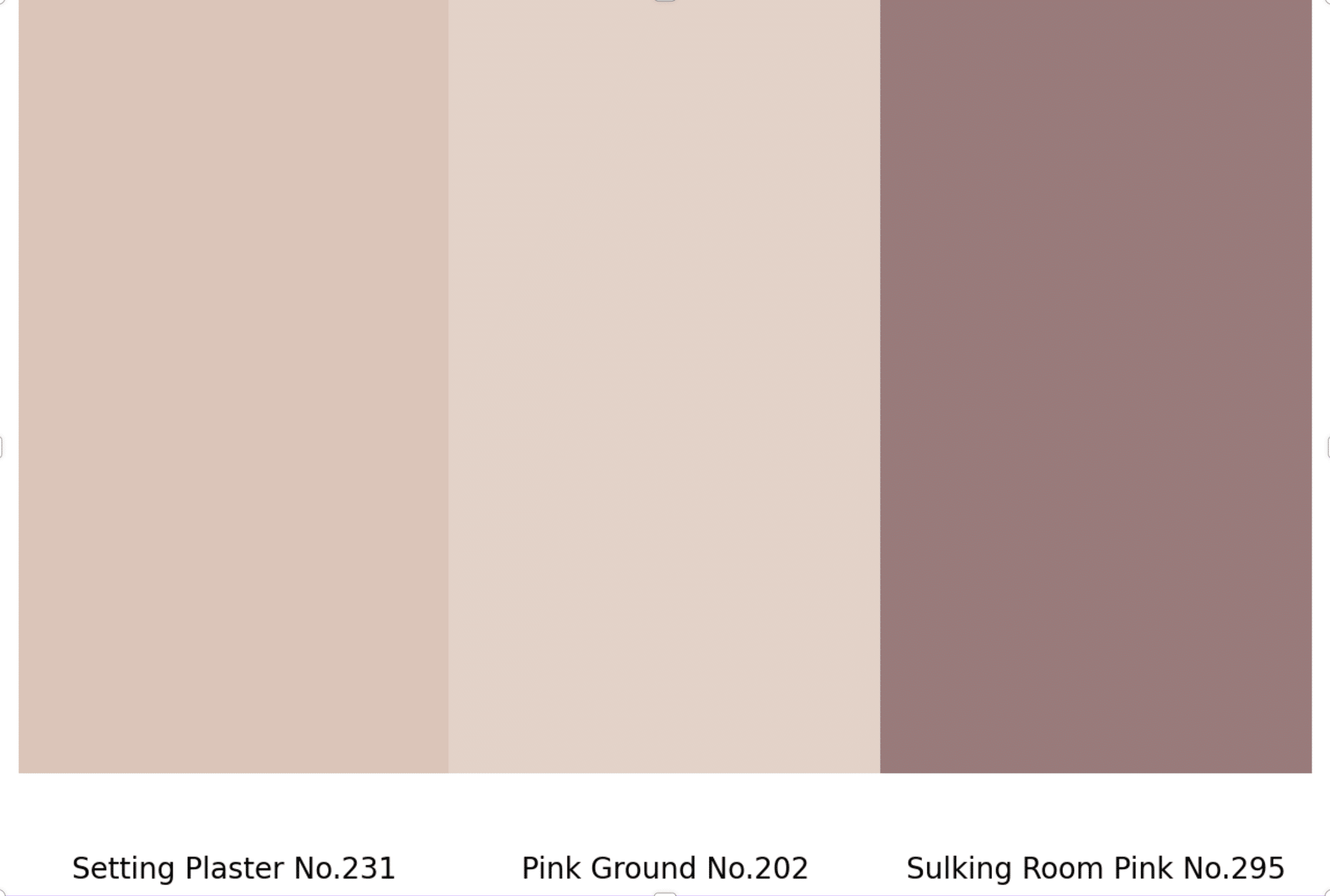
Before committing to Setting Plaster, I always recommend trying Farrow & Ball’s sample pots. They offer a curated selection that includes:
- Setting Plaster No.231
- Pink Ground No.202
- Sulking Room Pink No.295
This way, you can see how the color shifts in your specific lighting conditions throughout the day – something that’s crucial with Farrow & Ball’s uniquely pigmented paints.
Why Choose Farrow & Ball Setting Plaster?
The Quality Factor
| Feature | Farrow & Ball Setting Plaster | Standard Paint Brands |
|---|---|---|
| Pigment Concentration | High | Moderate |
| Base | 100% Water-Based | Solvent-Based |
| Light Reflectivity | Extraordinary | Basic |
| Longevity | Long-lasting | Fades Over Time |
What makes this painting special isn’t just the color – it’s what makes up the other 92% of the tin.
The quality minerals and high proportion of fine pigments create that extraordinary depth and glow that my clients love. And being 100% water-based, it won’t discolor over time like solvent-based paints can.
Coverage And Application

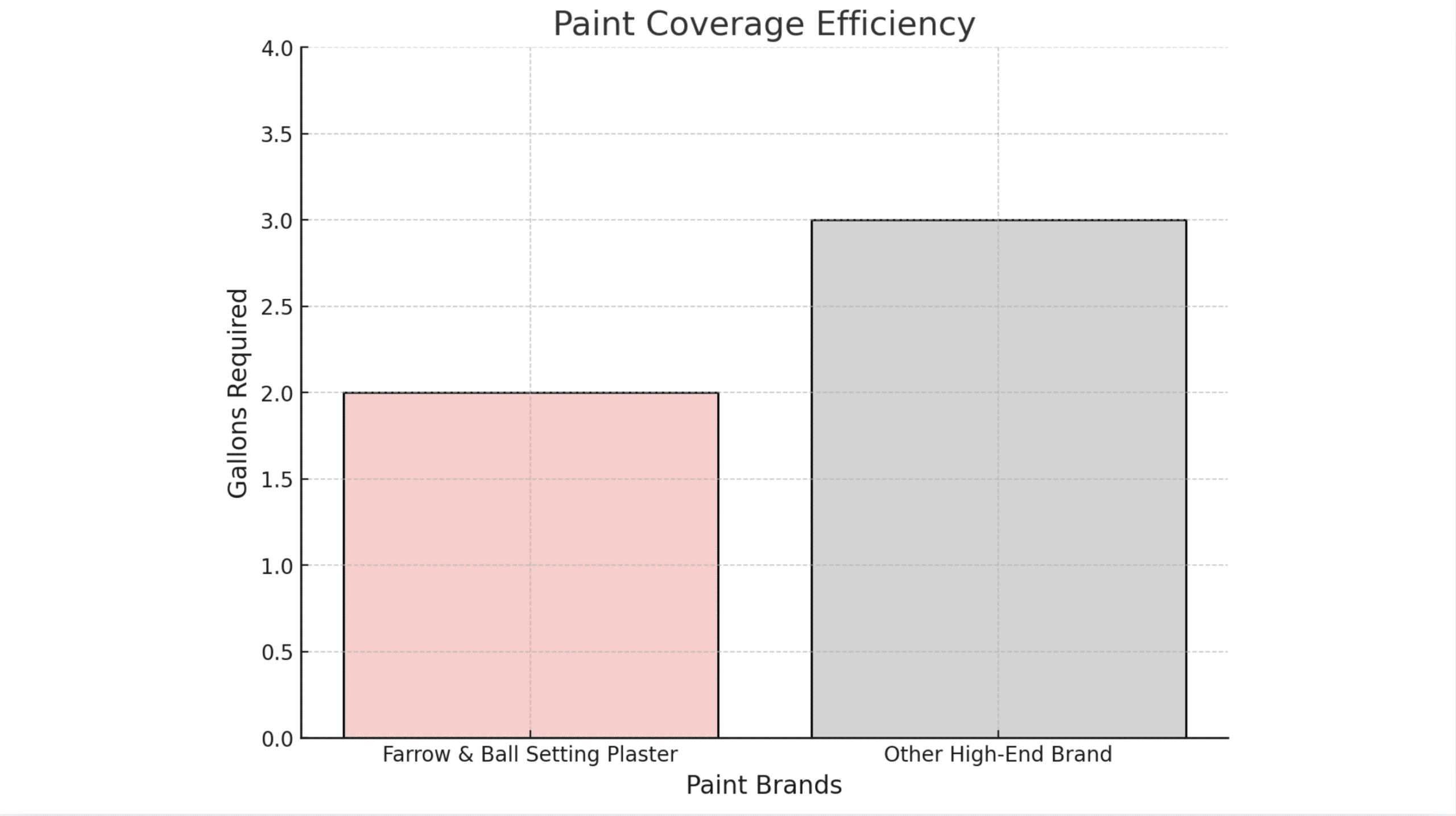
From my personal experience using Setting Plaster in my own home, I can share that while it’s more expensive up front, I’ve found I need less paint than expected.
When I painted over Agreeable Gray (LRV=60), I only needed two gallons for a room that typically would have required three.
A Note About Color Matching-
One question I often get: “Can we match this color with another brand?”.
The simple answer is no.
I’ve learned that asking to match Farrow & Ball colors misses the point – it’s not just about the color but the unique way their paints interact with light and create depth that other brands can’t replicate.
Application Tips And Best Practices
Through my experience with Setting Plaster, I’ve found that testing is crucial. Gone are the days of messy paint swatches on poster boards – I now recommend the SAMPLIZE 9X14″ peel-and-stick paint samples to my clients.
They’re a game-changer for previewing how the color will look in your specific space.
Why Testing Matters
I’ve learned this the hard way – whenever I test paint colors, they turn out perfect, but when I skip this step, surprises can happen. Setting Plaster, like all Farrow & Ball colors, has a unique response to light that you really need to see in your own space.
Final Recommendations
For the best results, I always recommend:
- Using White & Light Tones Primer & Undercoat for optimal coverage
- Never attempting to color match with other brands
- Testing in your space at different times of day
- Choosing complementary whites carefully (School House White is ideal)
Setting Plaster offers that rare combination of historical charm and modern sophistication.
Whether you’re considering it for a cozy bedroom, a sophisticated living room, or even a statement front door, this versatile shade brings a unique warmth and depth that only Farrow & Ball can deliver.
Ready to explore Setting Plaster in your own space? Start with a sample – it’s the best way to experience this remarkable color firsthand.
Conclusion
After working with Setting Plaster in countless homes, including my own, I can confidently say this isn’t just another pink paint.
Its ability to shift from a soft, welcoming hue in morning light to a cozy, intimate tone by evening makes it truly special. Whether you’re painting a bedroom, living room, or even a front door, this historic shade brings unexpected versatility to modern spaces.
While photos can showcase its beauty, they can’t capture the true magic of how Setting Plaster transforms a room.
The only way to truly understand its unique charm is to experience it yourself. I’d encourage you to order a sample and watch how it plays with light in your own space throughout the day.
Sometimes, the perfect color isn’t about following trends – it’s about finding that timeless shade that simply feels right.

