Hey there! If you’re looking at white paint colors, you know it’s not as simple as picking any white off the shelf.
White paints can make or break the look of your space.
After painting countless rooms and testing many samples, I’ve found that Benjamin Moore’s Atrium White OC-145 is worth your attention.
I spent weeks researching and testing different white paints before writing this guide.
As someone who has used Atrium White in real projects, I want to share what makes this paint stand out.
It’s not just another white – it has special qualities that make it work in many settings.
Think of this guide as a friend walking you through everything you need to know about Atrium White.
I’ll break down all the technical stuff into clear, useful information you can actually use when making your decision.
BM Atrium White OC-145
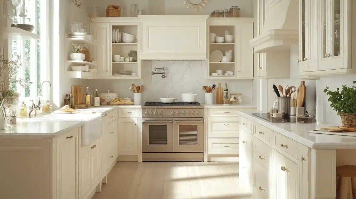
Benjamin Moore’s Atrium White OC-145 stands out among white paints for its clean but warm quality.
Many homeowners pick this color for their walls, trim, and cabinets because it creates a welcoming feel without looking too stark or cold.
This paint shows up fresh and bright, yet has a gentle softness that makes rooms feel comfortable.
What sets it apart is its ability to look clean and crisp while still feeling welcoming.
Think of it as that perfect white shirt that looks good but still feels cozy to wear.
The paint works well in many places – from kitchen cabinets to living room walls.
Its slight warmth helps it match well with other colors, making it useful for both modern and classic homes.
This flexibility explains why so many paint experts recommend it to their clients.
Undertone
The most important thing to understand about Atrium White is its subtle pink and peach undertones.
Don’t worry though – this doesn’t mean your walls will look pink!
These undertones give the paint a gentle warmth that stops it from feeling too cold or harsh.
In the morning light, you might notice a soft, warm glow.
As the day changes, these undertones help the walls stay looking white instead of turning grey or stark.
This subtle color depth makes Atrium White more forgiving than pure whites, which can sometimes look too bright or cold.
Hue Family
The yellow-red (YR) hue family of Atrium White helps explain how this paint behaves in different settings.
This color sits in what paint experts call the 9 YR range, which tells us it belongs to a group of whites that lean slightly warm rather than cool.
What this means for your walls is that the paint won’t give off cold or blue tints that can make a room feel unwelcoming.
Instead, the yellow-red base creates a soft, balanced white that maintains its warmth throughout the day.
This makes it different from pure whites that might look too bright or stark.
Value
The value of 9.49 puts Atrium White high on the brightness scale, close to pure white.
This high value number explains why the color looks clean and bright on your walls, while still having enough depth to not look flat or chalky.
When light hits your walls, this value level helps the paint reflect light well without being glaring.
The slight step down from pure white (which would be 10.0) gives the color more life and prevents it from looking too stark or artificial in your space.
Chroma
With a chroma of 0.52, Atrium White sits right on the edge between white and off-white.
This small but important detail explains why the color has more personality than a basic white paint.
The chroma level gives it just enough color to feel rich without looking too creamy or yellow.
Think of chroma as the color’s strength – at 0.52, it’s strong enough to add warmth but not so strong that it stops looking white.
This balance helps the paint look good next to both pure whites and warmer colors in your home.
LRV
The Light Reflectance Value (LRV) of 85.08 tells us how much light this paint bounces back into your room.
This number means Atrium White reflects a good amount of light without creating glare.
It’s bright enough to make rooms feel open but won’t wash out in sunny spaces.
In rooms that face north, this LRV helps keep the space feeling bright.
For south-facing rooms with lots of sunlight, it won’t become too intense.
This middle-ground LRV makes Atrium White work well in most lighting situations, from bright kitchens to cozy bedrooms.
Colorography
On the color wheel, Atrium White finds its place among other warm whites.
Its spot in the color system shows how it relates to nearby shades.
This helps explain why it works well with pure whites like Extra White and warmer choices like Chantilly Lace.
Understanding where it sits on the wheel helps you match it with other colors in your home.
The color’s position explains why it can look good with both cool and warm tones, making it easy to use in any room’s color plan.
Paint Blob
Testing paint colors in your own space is key to getting the right look. Paint stores now offer peel-and-stick samples that make this step much easier than it used to be.
These samples let you see how Atrium White looks in different parts of your room at different times of day.
Put samples on each wall and watch them throughout the day.
The morning light might bring out subtle warmth, while evening light could show different qualities.
This testing step helps you feel sure about your choice before buying gallons of paint.
Room-By-Room Application Guide
Kitchen
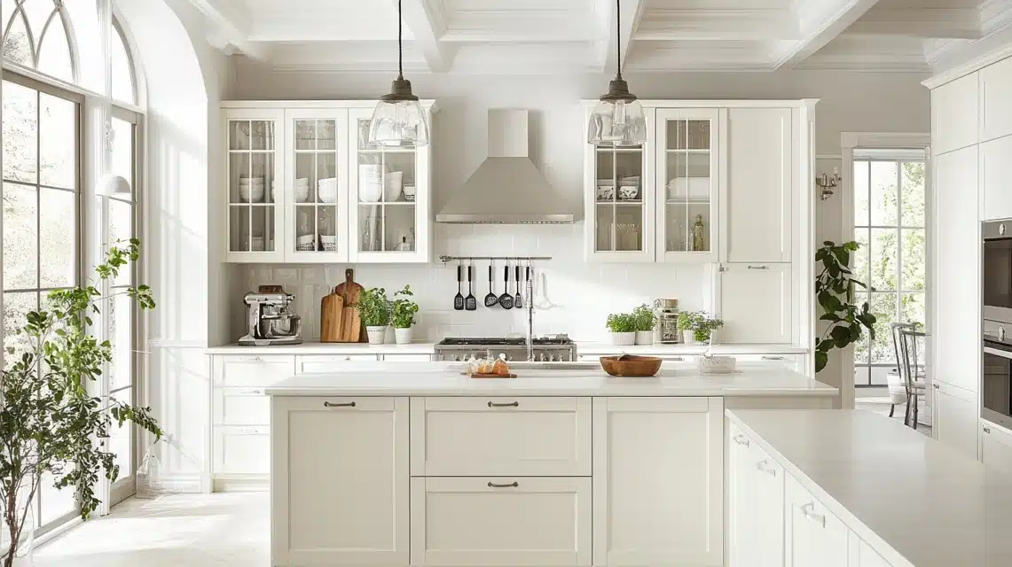
Atrium White makes kitchens look clean and bright while staying warm and welcoming.
On cabinets, it helps create a fresh look without feeling cold.
The paint works well with most counter materials – it makes dark counters pop while blending nicely with light stones.
For walls, it provides a good background for colored backsplashes or stainless appliances.
Under both natural and artificial lighting, it keeps its white look while adding subtle warmth.
This balance helps make kitchens feel like the heart of the home.
Bathroom
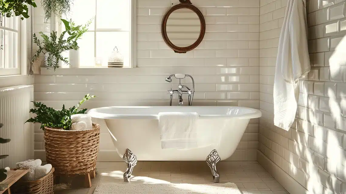
Atrium White works well in bathrooms because it keeps its color even with humidity and changing light.
These smaller spaces help make the room feel bigger while staying warm.
The paint looks good with both white and colored tiles, making it easy to match your bathroom’s style.
When paired with chrome or nickel fixtures, it creates a clean look that doesn’t feel cold.
In bathrooms with little natural light, this paint helps brighten the space without looking grey or dull.
It works equally well on walls, trim, or cabinets.
Living Room

In living rooms, Atrium White creates a bright, open feel while keeping the space cozy.
The paint gives you a good starting point for adding color through furniture and decorations.
Its warmth helps make large rooms feel more comfortable while keeping small rooms bright.
On walls, it makes art and photos stand out nicely.
With wood floors, it creates a clean look that still feels warm. When you add rugs and furniture, the paint helps tie everything together without competing with your other colors.
For accent walls, it pairs well with deeper colors while keeping the room balanced.
The gentle warmth of Atrium White means you can mix warm and cool colors in your living room without things looking off.
This makes it easier to change your room’s look over time without needing to repaint.
BM Atrium White as the best choice in winter for your home!

Atrium White shines during winter months when natural light gets scarce. Its gentle warmth helps fight against grey winter days, making your home feel cozy without looking dull.
Unlike cooler whites that might feel chilly, Atrium White keeps spaces feeling welcoming.
During winter, this paint works with both natural and artificial light to keep rooms bright.
Its pink hints help balance the blue cast of winter light, while its light-reflecting qualities help make the most of shorter days.
For best results, pair it with warm lighting and cozy textures to create a snug winter space.
The paint helps create a bright but comfortable setting that makes winter days more pleasant.
Colors You Can Pair With Atrium White

Let’s look at how to blend Atrium White with other colors to create rooms you’ll love.
For green pairings, Emerald Vapor makes a gentle match that brings nature inside.
Soft Fern adds more color while keeping things calm and balanced.
For warmer colors, Cherry Wine creates a rich contrast that makes both colors look better.
Pink Bliss works well for a softer look, playing nicely with Atrium White’s pink hints without making the room look too pink.
These pairings work because Atrium White’s gentle warmth helps tie everything together.
Dos And Don’ts For Using White In Small Vs. Large Rooms
In different-sized rooms, white paint acts differently. Here’s a clear guide to help you use Atrium White and other whites effectively:
| Room Size | Do | Don’t |
|---|---|---|
| Small Rooms | Use Atrium White to open up space | Pick cool whites in north-facing rooms |
| Small Rooms | Add mirrors to multiply light | Paint everything the same white shade |
| Large Rooms | Include different textures | Use too much cream in cool lighting |
| Large Rooms | Mix warm and cool whites | Leave walls plain without any contrast |
| Both Sizes | Test paint in the actual lighting | Rush into painting without samples |
Best Warm Whites
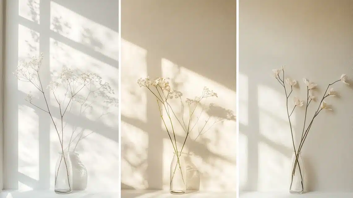
Picking a warm white paint helps to compare options side by side.
Warm whites add comfort to your space while keeping it bright.
Each warm white has its own traits that make it better for certain rooms or lighting situations.
Looking at warm whites next to Atrium White helps show what makes each one special.
While all these colors look white at first glance, putting them side by side shows their subtle differences.
This comparison can help you pick the right white for your home’s lighting and style.
Simply White
Simply White brings a clean look with a touch of warmth. The color stays white while adding enough softness to make rooms feel cozy.
This paint works well in rooms that get good natural light, where it shows its true color best.
Think of Simply White as the middle ground between bright and soft. It won’t look yellow, but it also won’t feel cold.
Many people use it in spaces where they want a fresh feel without the starkness of pure white.
Cloud White
Cloud White offers a classic, warm feel that many find perfect for traditional homes.
Its gentle warmth makes rooms feel welcoming and lived-in.
This paint creates a soft, bright look that works well in both sunny and shaded spaces.
In nurseries and bedrooms, Cloud White helps create a calm setting.
The paint stays true to its warm white nature without shifting too much as light changes during the day.
White Dove
White Dove creates a soft, balanced white that works well everywhere.
Unlike brighter whites, it never looks harsh or cold.
Its warmth shows up clearly when used on walls, trim, or cabinets, making spaces feel lived-in and comfortable.
Many painters picked the White Dove for its ability to stay true to its color in different lights.
It works well in both bright and dim rooms, making it a safe choice when you want warmth without too much yellow or cream.
Best Cool Whites
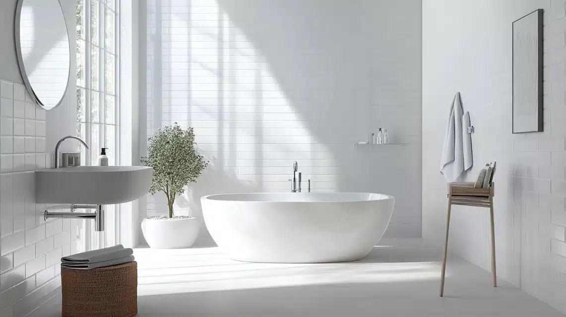
Cool whites bring a clean, fresh look to spaces.
They work well in rooms that need a sharp, clear white without warmth.
These whites help create modern looks and can make spaces feel bigger and brighter.
When choosing cool whites, think about your room’s existing colors and lighting.
South-facing rooms often do well with cool whites since the natural light adds some warmth back in.
These whites also work well with modern furniture and bold color choices.
Chantilly Lace
Chantilly Lace offers a pure, clean white without any warm tints.
It looks crisp and clear in most lights, making it great for modern spaces. This paint helps rooms feel open and bright without any yellow or cream tones.
In basements or rooms with less natural light, Chantilly Lace can help brighten the space.
Its clean look works well with modern styles and makes a good background for art or bold furniture.
Oxford White
Oxford White gives rooms a modern, clean look with hints of cool tones.
It works well in bathrooms and spaces where you want a clean, fresh feeling.
The paint helps create bright, open-feeling spaces without looking too stark.
This paint makes an excellent choice for trim and doors, where its cool tones create clear lines.
In bathrooms and spaces with lots of tiles, Oxford White helps tie everything together while keeping the space feeling fresh and clean.
Decorator’s White
Decorator’s White comes closest to what most people think of as “true white.”
It brings spaces a bright, clean look that works especially well on trim and doors.
The paint helps create clear, sharp lines that look good in any light.
Many designers use this paint when they want a white that stays true and clean-looking. I
t works well in spaces where you want white to look like white without any warm or cool shifts.
Tips For Choosing The Right White Paint
First, check which way your windows face. North-facing rooms get cooler light all day, while south-facing ones get warm light.
This affects how white paint looks in your space.
Take time to watch how light moves through your rooms throughout the day.
Put paint samples on each wall and look at them in morning, afternoon, and evening light.
White paints can look different on each wall of the same room.
For trim and walls, think about using different paint finishes – flat or eggshell for walls, satin for trim works well.
Maintenance And Durability Tips For White Paint
Keeping white walls looking fresh takes some care, but it’s simpler than you might think.
Clean marks right when you see them – a soft cloth with mild soap and water often does the job.
For tougher spots, use a magic eraser very gently to avoid making shiny patches.
To keep your white walls looking good longer, dust them regularly with a soft cloth or duster.
This stops dirt from building up and making the paint look dull.
In kitchens and bathrooms, good air flow helps stop moisture problems that can affect the paint over time.
Conclusion
Thanks for sticking with me through this deep look at Atrium White.
After spending so much time with this paint, I can tell you it’s a solid choice if you want a white that feels warm and welcoming without going too creamy.
Here’s what I want you to remember:
This paint works great in most rooms, handles different lighting well, and stays true to its color.
Its light-reflecting quality (LRV 85.08) makes rooms feel open and bright, while its tiny hint of warmth keeps spaces feeling cozy.
If you’re still unsure, grab a sample and test it out.
Watch how it looks throughout the day in your space. That’s the best way to know if it’s right for your home.
Do you have questions about using Atrium White in your space? Drop them in the comments below.
I’d love to help you make the right choice for your home!
Frequently Asked Questions
How does Atrium White compare to White Dove?
Atrium White has a softer pink hint, while White Dove shows more yellow warmth. Atrium White looks brighter and cleaner, while White Dove feels more traditional.
Can Atrium White be used for trim and ceilings?
Yes, Atrium White works well on trim and ceilings. It creates clean lines while staying warm and pairs nicely with other white shades on walls.

