")
Benjamin Moore Kennebunkport Green (HC-123) is a deep, earthy green with warm undertones that bring comfort, richness, and charm to any space.
It feels grounded and natural, with a quiet strength that works in both traditional and rustic styles.
If you’re looking for a bold green that feels classic and not trendy, Kennebunkport Green might be a perfect fit.
This color is ideal for accent walls, cabinetry, exteriors, or even full rooms if you want a cozy, bold look.
It pairs beautifully with warm woods, soft whites, and brass or black accents. In rooms with lots of natural light, it glows; in dimmer rooms, it feels moody and relaxing.
In this blog, we’ll take a closer look at Benjamin Moore Kennebunkport Green—its tone, best uses, matching colors, and why this deep green is still a favorite among homeowners and designers alike.
What Kind of Color Is Benjamin Moore Kennebunkport Green?
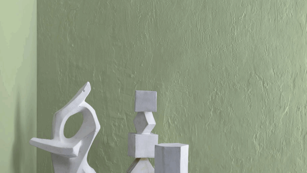
Kennebunkport Green is a rich olive-toned green. It leans warm and earthy, making it feel very natural. It’s the kind of green you might see in nature, like moss, leaves, or herbs. That’s why it brings a grounded and peaceful feeling to your home.
The Light Reflectance Value (LRV) is 31.32%, which means it reflects a moderate amount of light. It’s not too dark, but it does soak in more light than lighter shades. This gives the room a cozy, calm feel without making it feel closed in. It works especially well in rooms with some natural light or good artificial lighting.
The hex code is #959A81, showing a deep, muted green with brown and gray undertones. It’s not flashy or trendy, which is why it fits so easily into many homes.
Kennebunkport Green: A Cozy, Deep Color for Any Room
Kennebunkport Green brings depth and warmth wherever you use it. It works well in small spaces and large ones, too. You can use it as a main color or just on one wall to make a room feel special.
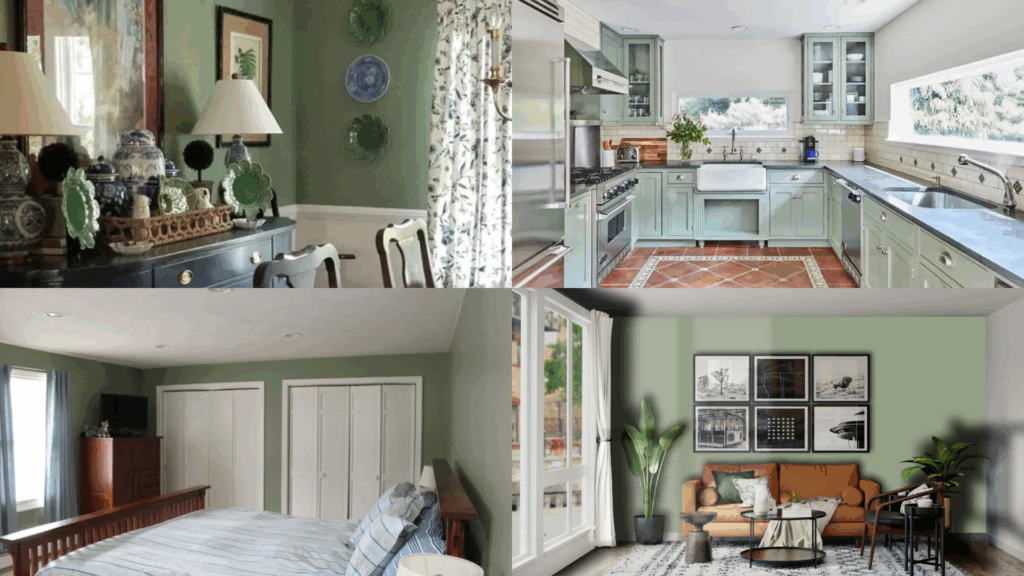
Living Room
This green gives a calm, cozy feel to living rooms. Use it on all the walls for a warm, inviting space, or on just one wall as a feature. It looks great with soft beige or cream furniture, wood coffee tables, and warm metal accents like bronze or brass.
Bedroom
Kennebunkport Green is a great color for a bedroom. It creates a peaceful mood that’s perfect for winding down. Try it with light bedding, wood nightstands, and soft lamps. It works well for both modern and traditional bedroom styles.
Kitchen
In the kitchen, this green adds richness to cabinets or kitchen islands. It stands out next to white walls, stone countertops, or warm wood shelving. Add brass or black hardware for a classic look. It works especially well in kitchens that lean farmhouse, cottage, or rustic.
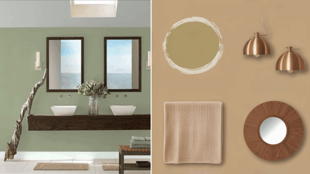
Bathroom
This color brings a cozy, spa-like feel to bathrooms. Pair it with white tile, wood vanities, and soft lighting. It works well in small bathrooms where you want color without making it feel too dark. Add natural textures like baskets or towels in soft cream to finish the look.
How to Use Kennebunkport Green in Small or Low-Light Spaces
With its LRV of 31.32%, Kennebunkport Green absorbs more light than it reflects. That means it’s best in rooms that have some natural light or strong lighting. But you can still use it in smaller or dim spaces with the right touches.
1. Accent Walls: Try it as an accent wall in a small room. It brings depth and interest without making the space feel too dark. Keep the other walls in a warm white or soft neutral so the room stays balanced.
2. Hallways and Entryways: In a hallway or entry, this color makes a great first impression. It feels calm and welcoming. Use mirrors, white trim, and warm lighting to help reflect light and brighten the space.
How to Pair Kennebunkport Green with Other Paint Colors and Accents
This color pairs well with warm, natural tones and cozy textures. You can mix it with light neutrals or bold accents, depending on your style.
Neutral Colors
Pair Kennebunkport Green with soft beige, creamy white, or light greige. These neutral tones keep the room feeling fresh and light. For trim or ceilings, use a warm white like Benjamin Moore White Dove.
Warm Accents
This deep green looks great with natural wood, rattan, leather, and brass. These warm materials bring out the cozy side of the color. You can also add soft textures like linen, wool, or cotton to make the room feel even more inviting.
Bold Colors
If you like contrast, try navy blue, charcoal gray, or deep mustard yellow. These shades stand out against the green and make the space feel stylish and layered. Use bold colors in art, pillows, rugs, or small furniture.
What Style Works Best with Benjamin Moore Kennebunkport Green?
Kennebunkport Green is very flexible. It looks great in many home styles:
In traditional homes, it feels timeless. Use it with white trim, crown molding, and classic furniture.
In farmhouse or cottage spaces, it adds a soft, vintage feel. Use it with open shelves, wood beams, and antique-style details.
In rustic or cabin-inspired homes, it blends perfectly with stone, wood, and cozy fabrics.
In transitional spaces, it helps tie modern and classic elements together in a natural way.
Is Benjamin Moore Kennebunkport Green a Warm or Cool Color?

Benjamin Moore Kennebunkport Green (HC-123) is a warm green. It has earthy undertones that lean toward olive and moss rather than blue or teal. These warm yellow-brown undertones give the color a grounded, natural feel. It reminds you of nature, like forest leaves, grass, or aged wood.
Because it’s a warm shade, Kennebunkport Green pairs well with warm materials like oak, walnut, rattan, and brass. It works beautifully with creamy whites, beige, and soft browns. It adds a sense of calm and coziness to any space.
In rooms with lots of sunlight, the warmth in the color really comes through, making it feel inviting and peaceful. In lower light, it deepens and becomes a bit more moody, but it never feels cold or sharp.
Color Characteristics Table
| Color Name | Kennebunkport Green |
|---|---|
| Color Code | HC-123 |
| Hex Code | #959A81 |
| RGB | 99, 111, 75 |
| Undertones | Olive, Earthy Warm Green |
| Mood/Effect | Cozy, Classic, Natural |
| Best Rooms | Bedrooms, Kitchens, Living Rooms, Bathrooms |
| Style Compatibility | Traditional, Farmhouse, Rustic, Cottage, Transitional |
| Light Reflectance Value (LRV) | 31.32% |
How to Test This Color in Your Space Before Painting
Always test before painting a full room. The light in your space can make any paint color look different.
1. Get a Sample: Buy a small sample from a Benjamin Moore store or online.
2. Paint Large Swatches: Try it on a few walls so you can see how it looks in different parts of the room.
3. Check in Different Light: Look at it in the morning, afternoon, and evening.
4. Compare with Decor: Test it next to your trim, flooring, furniture, and fabrics.
What Paint Finish Works Best for Kennebunkport Green?
Choose the paint finish based on the room and surface:
-
Matte or Flat Finish: Great for low-traffic areas like bedrooms. It hides wall flaws and gives a soft look.
-
Eggshell or Satin Finish: Ideal for living rooms, kitchens, and bathrooms. It’s easy to clean and has a slight shine.
-
Semi-Gloss or Gloss Finish: Best for trim, cabinets, and doors. It’s shiny and very durable.
Common Mistakes to Avoid
A few things to keep in mind:
-
Not Testing It First: The lighting in your room matters. Always test a sample first.
-
Using Too Many Cool Tones: Stick with warm whites, woods, and metals. Cool grays or icy whites may clash.
-
Forgetting to Add Light: This is a darker color, so balance it with soft lighting, mirrors, or white trim to keep the room from feeling too heavy.
Why People Love Benjamin Moore Kennebunkport Green
People love this paint color because:
-
It feels cozy and natural
-
It works in both old and new homes
-
It pairs well with warm accents and soft textures
-
It brings personality without being too bright or bold
It’s a trusted color for rooms that need warmth and charm.
Conclusion
Benjamin Moore Kennebunkport Green (HC-123) is a warm, earthy green that brings a cozy and natural feeling to any space. It’s deep without being too dark, and rich without feeling heavy.
With its warm undertones, it pairs nicely with wood furniture, brass accents, and creamy whites. You can use it as a bold wall color or a soft accent. It also works well with both classic and modern decor styles. It’s easy to match with natural textures and warm colors.
Kennebunkport Green has a timeless look that makes any space feel calm and inviting. It’s a great choice for anyone who wants to add color but still keep things soft and cozy. Try a sample and see how this warm green can bring your room to life.