")
Picking a paint color can be hard. There are so many shades to choose from, and they can look different in every room.
Illusive Green by Sherwin-Williams is one color that’s been getting a lot of attention. It’s soft, calm, and easy on the eyes.
I’ve seen it used in many different spaces, and it always adds something special. In this blog, I’ll go over what makes Illusive Green stand out and why people like it so much.
You’ll get a feel for the color and how it works in real homes. If you’re thinking about using it, this guide will help. Let’s keep it simple and go step by step.
What is Illusive Green by Sherwin-Williams?
Illusive Green (SW 9164) is a soft, muted green paint color made by Sherwin-Williams. It has a calm, quiet feel. This shade blends green with a touch of gray and a tiny bit of blue.
It’s not bright or bold. Instead, it creates a gentle, peaceful mood in a room. Illusive Green works well in many spaces because it doesn’t take over the room. It sits in the background, making everything feel more relaxed.
Color Code and Basic Info:
| Property | Details |
|---|---|
| Color Code | SW 9164 |
| Hex Code | #92948D |
| Undertone | Green with gray and soft blue |
| LRV | 29 |
| RGB | 146 / 148 / 141 |
LRV and Undertones of Illusive Green
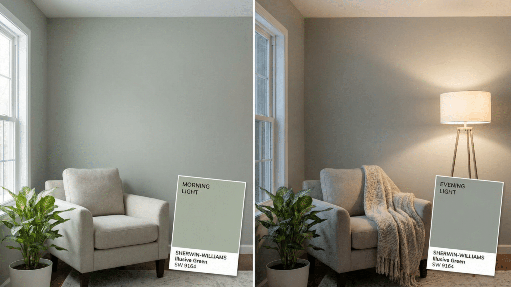
LRV stands for Light Reflectance Value. It tells us how much light a paint color reflects. LRV runs from 0 to 100. Zero is pure black, and 100 is pure white.
This means it is on the darker side, but not too dark. It absorbs more light than it reflects. Illusive Green can look deep and rich, especially in low-light rooms. In a sunny room, it feels lighter and fresher.
What makes Illusive Green special is its mix of undertones:
- Green is the main color.
- Gray gives it a calm, cloudy feel.
- Blue is very soft but adds a bit of coolness.
This mix keeps the color from looking too green or too dull. The undertones change based on the lighting and what’s around it. It may look greener during the day and a bit more gray at night.
Where Does Illusive Green Sherwin-Williams Work Best?
Illusive Green is a soft, flexible paint color. It can work in many different rooms and settings. Its cool tone and soft style make it easy to use without feeling overwhelming.
Bedroom
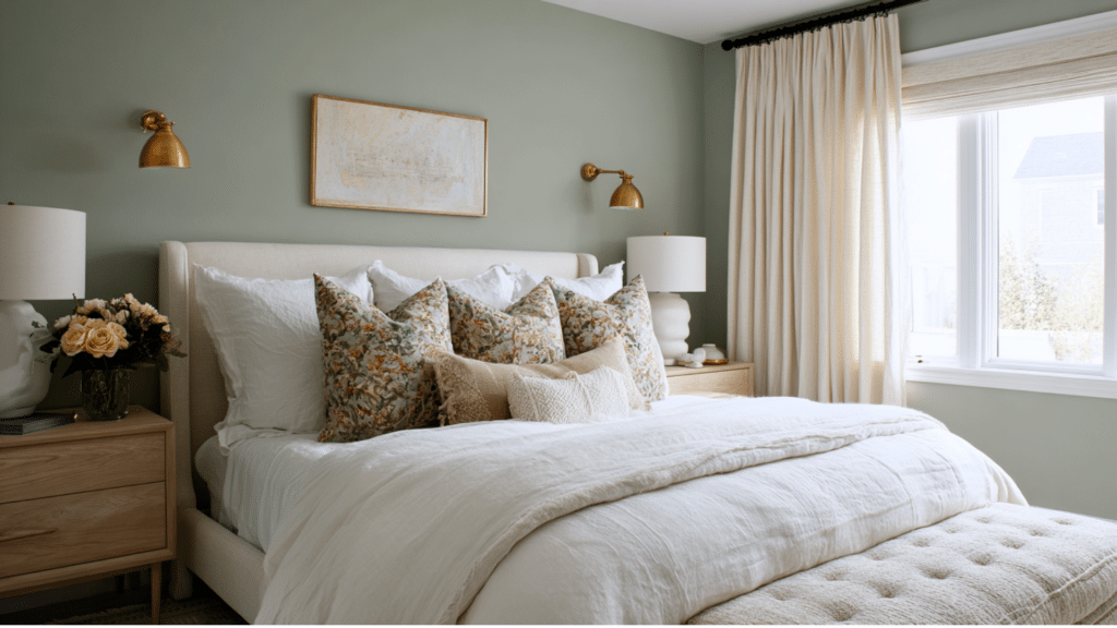
Illusive Green helps set a restful tone in bedrooms. The soft, cool color creates a peaceful backdrop that complements both light and dark decor.
I like it here because it adds calm without feeling cold, perfect for winding down at the end of the day.
- Preferred Furniture Styles: Upholstered bed frames, white or natural wood nightstands, woven baskets, and simple dressers.
- Fixtures and Accents: Warm white bedding, brushed brass lamps, linen curtains, and neutral rugs.
Living Room
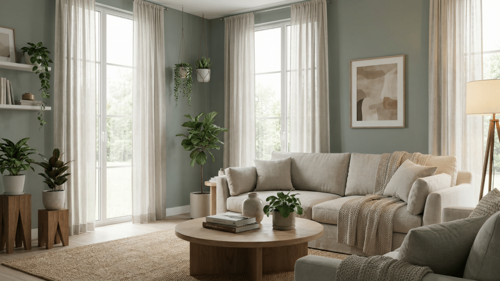
Illusive Green creates a cozy, calming base in living rooms. It brings out the beauty in natural materials and lets your decor shine without feeling too busy.
This pairing feels grounded yet fresh, making it easy to mix old and new furniture pieces.
- Preferred Furniture Styles: Mid-century modern chairs, linen or leather sofas, oak coffee tables, and open bookshelves.
- Fixtures and Accents: Matte-black floor lamps, cream throw pillows, light-wood frames, and textured curtains.
Bathroom
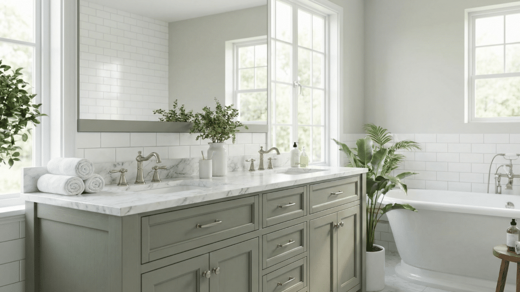
This color gives bathrooms a clean, spa-like feel. It works well with modern or classic design, especially when paired with crisp white elements.
I recommend it for a relaxing bathroom that still feels stylish and bright.
- Preferred Furniture Styles: White vanities, floating shelves, minimal storage units.
- Fixtures and Accents: Brushed nickel faucets, white subway tile, soft towels, natural woven mats, and glass jars.
Kitchen
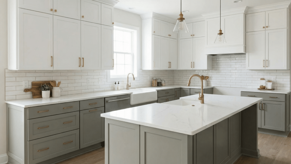
Illusive Green adds a fresh look to kitchens without feeling too bold. It brings warmth to modern designs and balances well with classic styles.
This is a great choice if you want soft color but still want your cabinets and fixtures to shine.
- Preferred Furniture Styles: Shaker cabinets, light wood bar stools, farmhouse tables, and floating shelves.
- Fixtures and Accents: Black or brass handles, stone countertops, white tile backsplashes, and soft pendant lighting.
Home Office
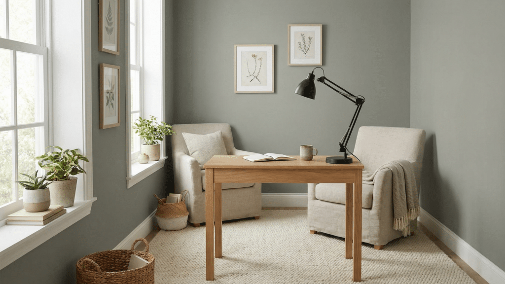
This color keeps your office space calm and focused. It’s easy on the eyes and works well with clean, minimal furniture.
I like it in work areas because it helps keep the space from feeling cluttered or too bright.
- Preferred Furniture Styles: Light wood desks, sleek shelving units, ergonomic chairs, and minimal decor.
- Fixtures and Accents: Desk lamps with matte finishes, woven bins, neutral area rugs, and framed wall art.
Hallways and Entryways
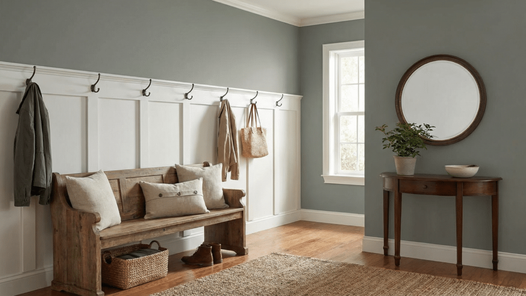
Illusive Green makes a great first impression. It adds quiet character without overwhelming smaller spaces.
This combination works well if you want a soft tone that blends easily into the rest of the home.
- Preferred Furniture Styles: Slim console tables, benches with storage, narrow side tables, and mirrors with wooden frames.
- Fixtures and Accents: Wall hooks, soft runners, glass lamps, white or wood trim, and potted plants.
Best Finish Types for Illusive Green Walls
Choosing the right finish helps you get the best look. Here’s how Illusive Green performs in different sheens:
- Flat or Matte: Hides wall flaws. Great for bedrooms and ceilings.
- Eggshell: Soft shine. Easy to clean. Works well in living rooms.
- Satin: Has more shine. Good for kitchens and bathrooms.
- Semi-gloss or Gloss: Best for trim, doors, and cabinets.
If you want a rich, deep look, go with matte. For more light reflection and durability, choose satin or semi-gloss.
Is it Good for Small Spaces?
Illusive Green works well even in small rooms. While it has a low LRV of 29, it doesn’t feel too dark or heavy when used the right way.
Pairing it with white trim, soft lighting, mirrors, and light floors helps open up the space and keep it feeling fresh. It adds color without making the room feel closed in.
This shade is also becoming more popular. People love that it feels soft and balanced without being too trendy.
It fits both modern and traditional homes. Many designers choose it for its quiet charm and lasting style.
How to Sample it First
Before painting a full wall, try these steps:
- Get a small paint sample from Sherwin-Williams.
- Paint it on a board or poster paper.
- Move the sample around the room.
- Look at it during different times of day.
- Compare it with your furniture and floors.
This helps you see the real color before making a big decision.
To Conclude
Choosing the right paint color can change the feel of your whole home. Illusive Green gives you a calm, cool backdrop that works with many styles.
It’s flexible, balanced, and easy to pair with furniture and finishes. From bold lighting to soft fabrics, this shade fits in without making things feel too dark.
It brings just the right amount of color without being loud. You don’t have to match everything perfectly; this color makes it easy.
Want to see how it looks in your space? Pick up a sample from Sherwin-Williams and test it on your wall before you decide.