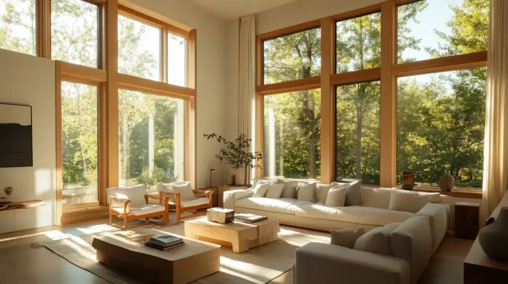
I’ve noticed how neutral paint colors stand out in home design. I see many clients drawn to colors that mix grays and beiges, but they often feel lost choosing the right one.
I want to tell you about Benjamin Moore’s Pale Oak. It’s a color I keep returning to, both in my clients’ homes and my own.
Many top designers feel the same way, in fact, House Beautiful recently featured it as a top pick.
I chose this color for good reasons, and I’m excited to share why it might be perfect for your home, too.
What is Benjamin Moore Pale Oak?
When I talk to my clients about paint, I always mention Benjamin Moore’s Pale Oak (OC-20). It’s a light color that sits between gray and beige, called a greige.
I’ve used it in homes with many different styles, from older houses to new builds.
What makes it special is how it changes with light during the day while staying soft and welcoming.
House Beautiful magazine agrees. They recently included it in their top paint picks.
It works well in small rooms and open spaces, making it a reliable choice for any home update.
Color Characteristics of Pale Oak
1. Undertone
I want to be clear about something important with Pale Oak, it has a slight pink hint underneath. This isn’t bad news!
In my experience, this subtle pink adds warmth that makes rooms feel more inviting.
But here’s my tip: look at how it plays with your existing colors. If you have green or blue items in your room, they’ll bring out more of the gray side.
If you have peach or orange items, you might notice more of that warm pink coming through.
2. LRV
Let’s talk about Light Reflectance Value (LRV) – it tells us how much light a color bounces back.
Pale Oak has an LRV of 69 out of 100, making it bright but not stark white.
This means it reflects a good amount of light while still having enough color to make a statement.
In my projects, this number has proven perfect for creating open and airy rooms without looking washed out.
Benefits of Painting With Pale Oak
1. Brightens in Dark Rooms
I’ve worked with many homes that don’t get much sunlight.
Pale Oak has become my go-to solution because its high light reflection really helps brighten these spaces.
I’ve seen it transform basements and north-facing rooms that used to feel dim and closed-in.
What I love most is how it maintains its warm feeling even when it’s working hard to reflect light.
If you’ve got a room that needs brightening, this might be your answer.
2. Compliments Warm Wood Tones
In my own home, I’ve tested Pale Oak with different wood finishes.
I’ve seen it work beautifully with light oak, medium-toned woods, and even dark espresso finishes.
What makes me keep using it is how it brings out the natural beauty of wood without fighting against it.
The only woods I avoid pairing it with are cherry and mahogany, as they can clash with the color’s undertones.
3. Works Well With Greenery
I’m always excited to see how Pale Oak interacts with plants.
In rooms that look out onto trees and gardens, I’ve noticed it helps create a smooth transition from inside to outside.
The warm tones in the paint actually help balance the green reflections from outdoor plants.
Inside, I’ve seen it make both small potted plants and large indoor trees stand out beautifully against the walls.
How to Use Pale Oak in Your Home
1. Living Room
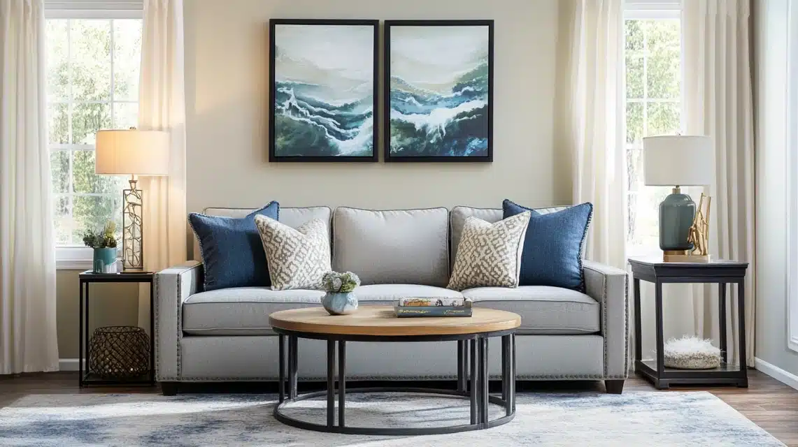
I’ve used Pale Oak in countless living rooms, and here’s what I’ve learned: it looks wonderful with blue and green furniture pieces.
In my experience, gray sofas also work well against these walls.
I often suggest adding white or cream curtains to keep the room feeling open to my clients.
I’ve found that bronze or brass items look particularly good for accent pieces.
Remember to add darker elements, like black picture frames or deep blue pillows, to create contrast.
2. Bedroom
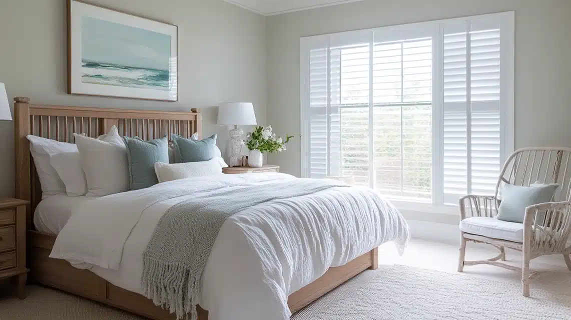
I tell my clients that bedrooms need to feel peaceful, and Pale Oak helps create that feeling.
I’ve paired it with white bedding to maximize the light, then added soft blue or green accents through pillows and throws.
From my projects, I’ve seen it work well with both light and dark furniture.
The key is to keep the room simple, I suggest limiting bold patterns and sticking to solid colors or subtle textures.
3. Kitchen
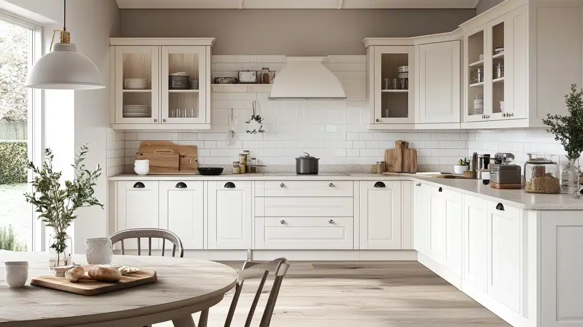
I’ve seen Pale Oak create magic in kitchens. It works well with white cabinets and stainless steel appliances.
I often recommend it to clients who have stone countertops with warm undertones.
Here’s a tip I’ve learned: pair it with a white subway tile backsplash to keep things clean and simple.
I’ve found that both silver and gold finishes look good against this color for cabinet hardware.
4. Bathroom
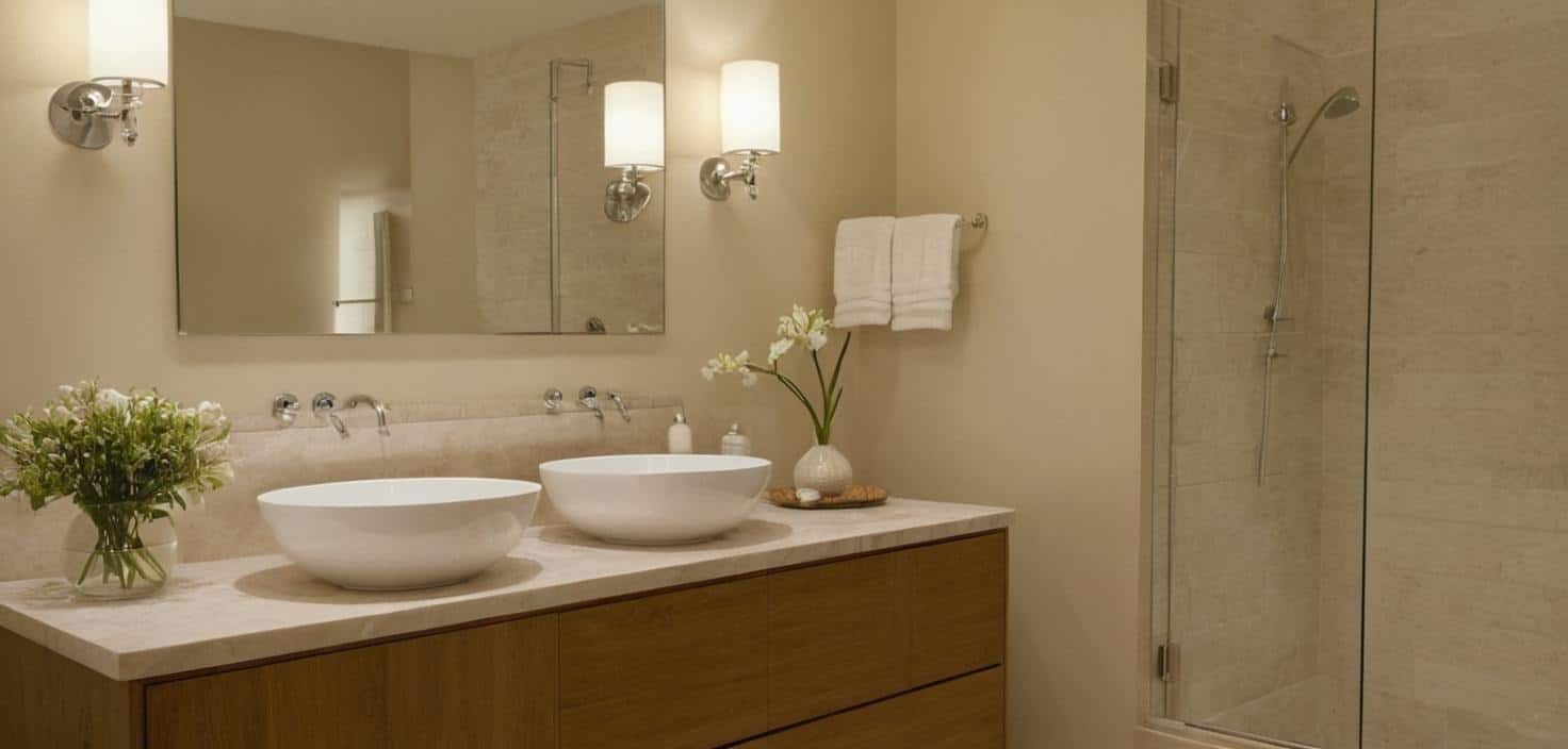
When I design bathrooms with Pale Oak, I focus on creating a calm space.
I’ve paired it with white tiles and fixtures to keep things bright. In my projects, chrome or nickel hardware stands out nicely against these walls.
From my experience, it works particularly well with marble or quartz countertops with gray veining.
I often add white towels and simple glass containers to complete the look.
5. Home Office
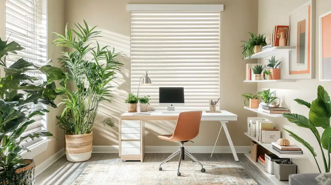
I’ve found Pale Oak perfect for home offices because it helps maintain focus without boredom.
In my designs, I pair them with white desks and bookcases to create a clean look.
I suggest adding a few plants—they really pop against these walls. Natural wood accents work well, too, based on my experience.
I recommend simple white or cream blinds for window treatments to control light while keeping the space open.
Top 5 Color Comparisons With Pale Oak
| Color | Comparison with Pale Oak | Recommended Use |
|---|---|---|
| Limewash | Slightly lighter, can appear flesh-like in low light, warmer than Pale Oak. | The closest Sherwin-Williams option to Pale Oak is good for similar uses but considers warmth. |
| City Loft | More violet-gray tones show warmer, pinker undertones than Pale Oak. | Choose when a cleaner, cooler appearance than City Loft is desired, especially in natural light. |
| Balboa Mist | It pulls more violet undertones and warmth and appears more muted compared to Pale Oak. | It depends on the room’s lighting and existing colors; check at different times of the day. |
| Fog Mist | Nearly identical, shares the same taupe undertones, but Fog Mist is slightly warmer. | Interchangeable depending on brand preference; consider the room’s lighting. |
| Collingwood | True violet-gray differs from Pale Oak’s light taupe-greige, which is not interchangeable in the same space. | Choose based on the room’s existing colors; Pale Oak is often better with warm tones. |
Pale Oak Application Tips
I always tell my clients to test paint colors properly before committing.
From my experience, I’ve learned to look at the color in the morning, afternoon, and evening.
I strongly recommend peel-and-stick samples – they’re much easier than painting wall swatches.
Place them on different walls in your room and watch how they change throughout the day.
This step saves both time and money. When testing, place samples near your furniture and fixed elements.
Conclusion
I’ve spent years working with different paint colors, and Pale Oak consistently stands out as a reliable choice.
It brightens spaces, works with most wood tones, and creates a welcoming feel in any room.
If you’re looking for a color that can adapt to different lighting and complement various design styles, I believe Pale Oak deserves your attention.
Make sure to test it in your space first, but from my experience, it’s a color that rarely disappoints.
Remember, the right paint color can transform your home, and Pale Oak might just be your desired transformation.
Frequently Asked Questions
Which is better, Pale Oak or Balboa Mist?
Neither is “better.” I find Pale Oak works best for cleaner, cooler spaces, while Balboa Mist suits rooms where you want more warmth and violet undertones.
Is Pale Oak suitable for small spaces?
Yes, I’ve found Pale Oak works very well in small spaces because its high light reflection (LRV of 69) helps make rooms feel bigger and brighter.

