
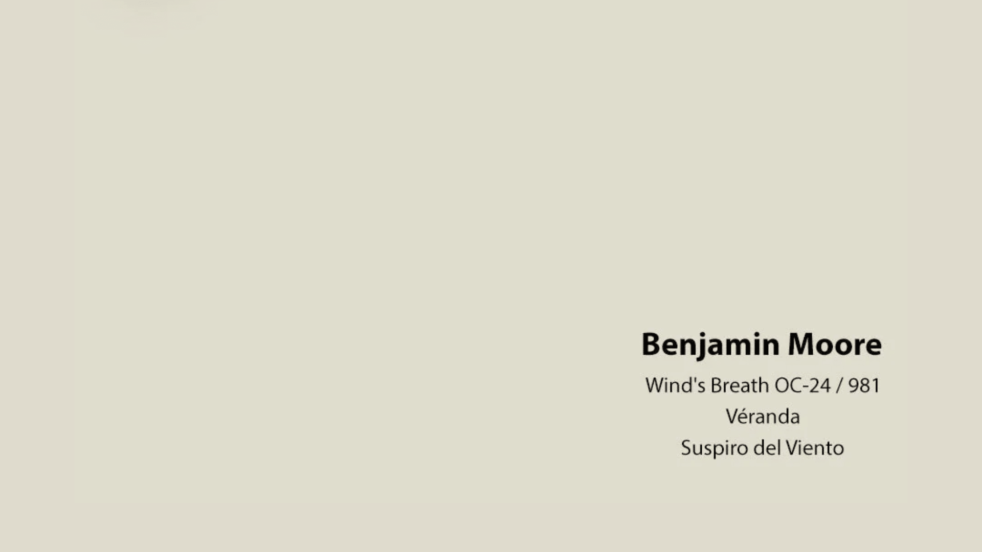
Something is calming about a soft, neutral color that doesn’t shout but still makes a statement. Benjamin Moore’s Wind’s Breath (OC-24) is one of those rare shades that feels gentle, light, and versatile making it the kind of color that fits almost any room, in any style, without overwhelming the space.
Whether you’re painting a sunlit living room, a cozy bedroom, or a hallway that needs to feel more open, Wind’s Breath has a quiet strength that transforms spaces.
In this blog, we’ll cover why Wind’s Breath has become a favorite for interior designers and homeowners alike.
We’ll talk about its undertones, how it changes in different lighting, where it works best, and how it compares to other popular neutrals. By the end, you’ll have a clear idea of whether this soft, airy color is the right fit for your home.
Understanding Wind’s Breath: What Color Is It Really?
Not Quite White, Not Quite Beige
Wind’s Breath sits somewhere between off-white and light greige. It’s part of Benjamin Moore’s Off-White Collection, but it’s much warmer than many of its cousins. The color has a soft beige tone, with a hint of gray and sometimes even a whisper of pink, depending on the light.
What makes Wind’s Breath special is its flexibility. It doesn’t read as cold or blue like some grays can. And it avoids the yellow or orange tones that make other warm neutrals feel outdated. Instead, it strikes a balance — warm, but not too warm. Clean but not stark.
The Role of Undertones
The subtle undertones in Wind’s Breath make it work well with a wide range of colors and materials. While the dominant feel is beige, the gray and pink undertones create a soft backdrop that reflects and responds to light beautifully.
In spaces with cool lighting or north-facing windows, Wind’s Breath leans slightly grayer. In rooms with warm, natural light, it picks up more of its beige warmth. This makes it a dynamic choice — one that never looks flat or dull.
Where Wind’s Breath by Benjamin Moore Works Best
Living Rooms and Common Areas
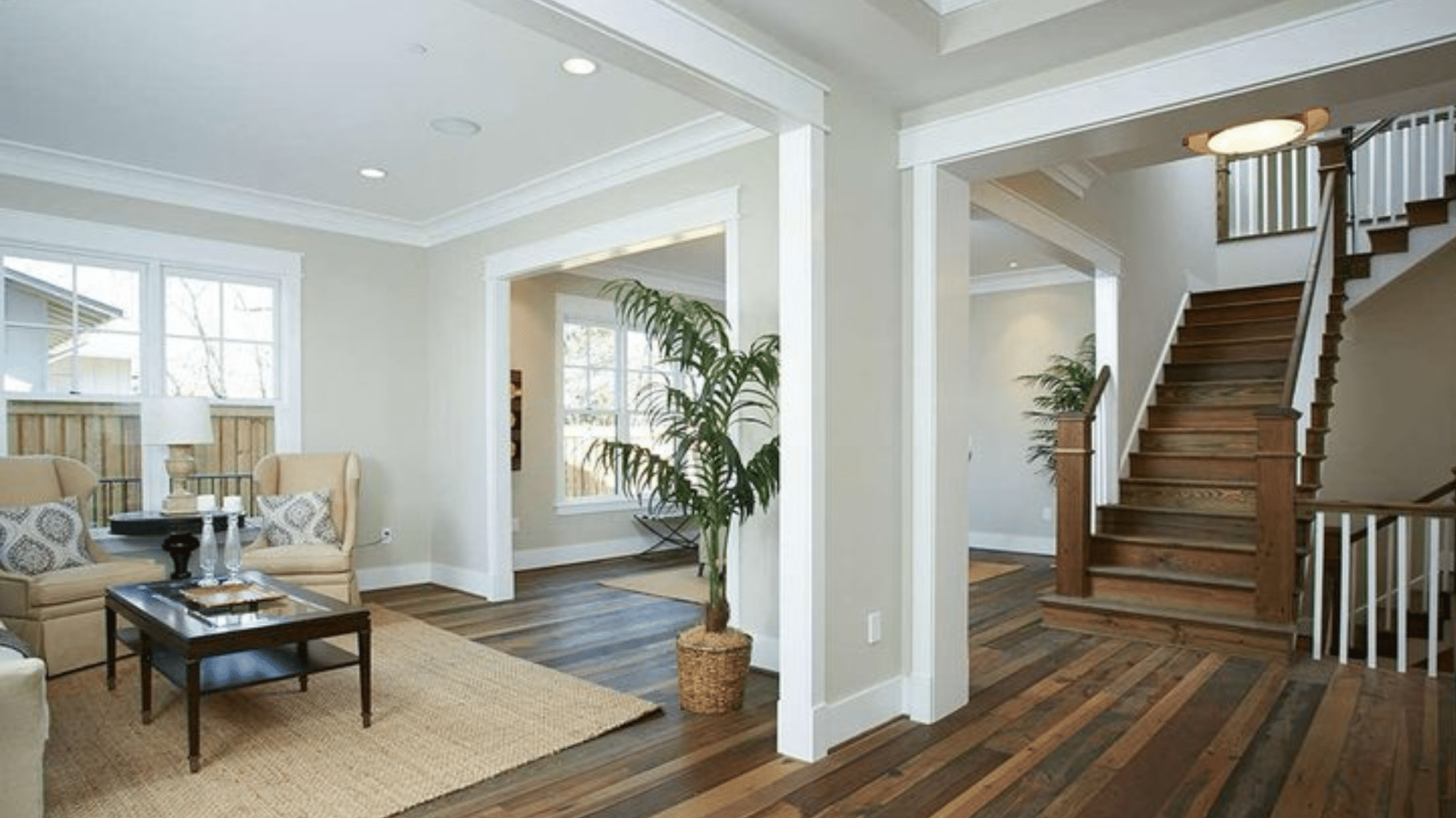
Wind’s Breath is a perfect choice for large, open spaces like living rooms and dining areas. It creates a cozy but clean atmosphere, especially when paired with natural wood, soft textiles, and layers of white or cream.
Because it’s a soft neutral, it doesn’t compete with art, furniture, or bold decor. Instead, it lets everything else shine while still holding its own. If your style leans modern, boho, traditional, or even farmhouse, Wind’s Breath adapts.
Bedrooms
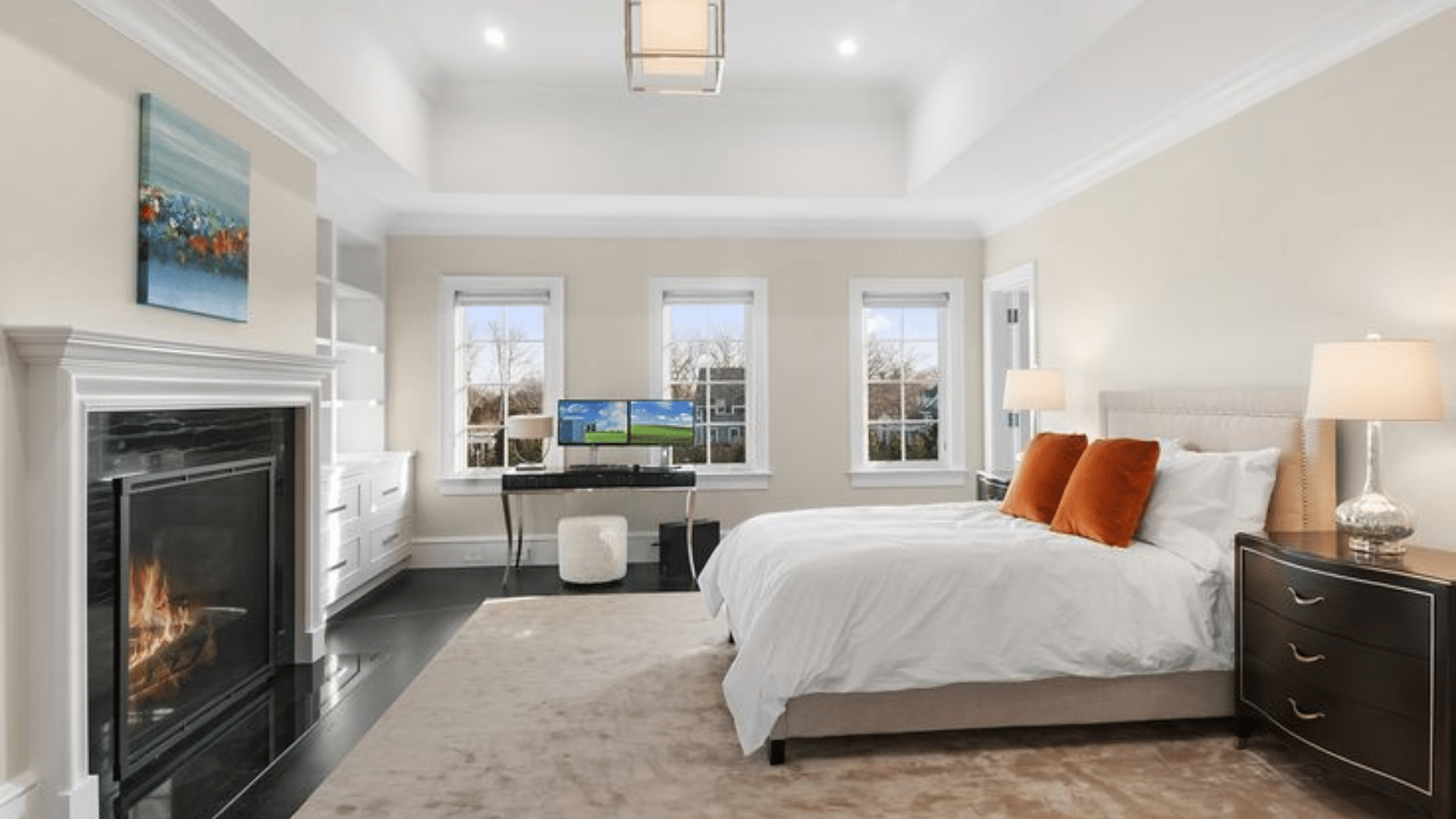
This color is calming and soft enough for bedrooms, too. It brings warmth without heaviness, which is great if you want a space that feels restful but not too dark. Try pairing it with warm whites, taupes, or muted pastels for a serene, spa-like vibe.
Kitchens
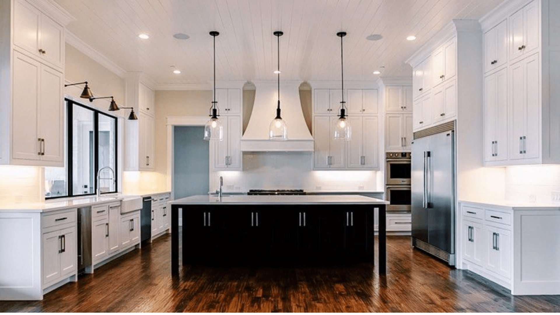
While many people go for crisp white in kitchens, Wind’s Breath is an elegant alternative. It pairs beautifully with white cabinetry and marble or quartz countertops. In kitchens with wood cabinetry or brass hardware, Wind’s Breath adds balance and softness.
Bathrooms
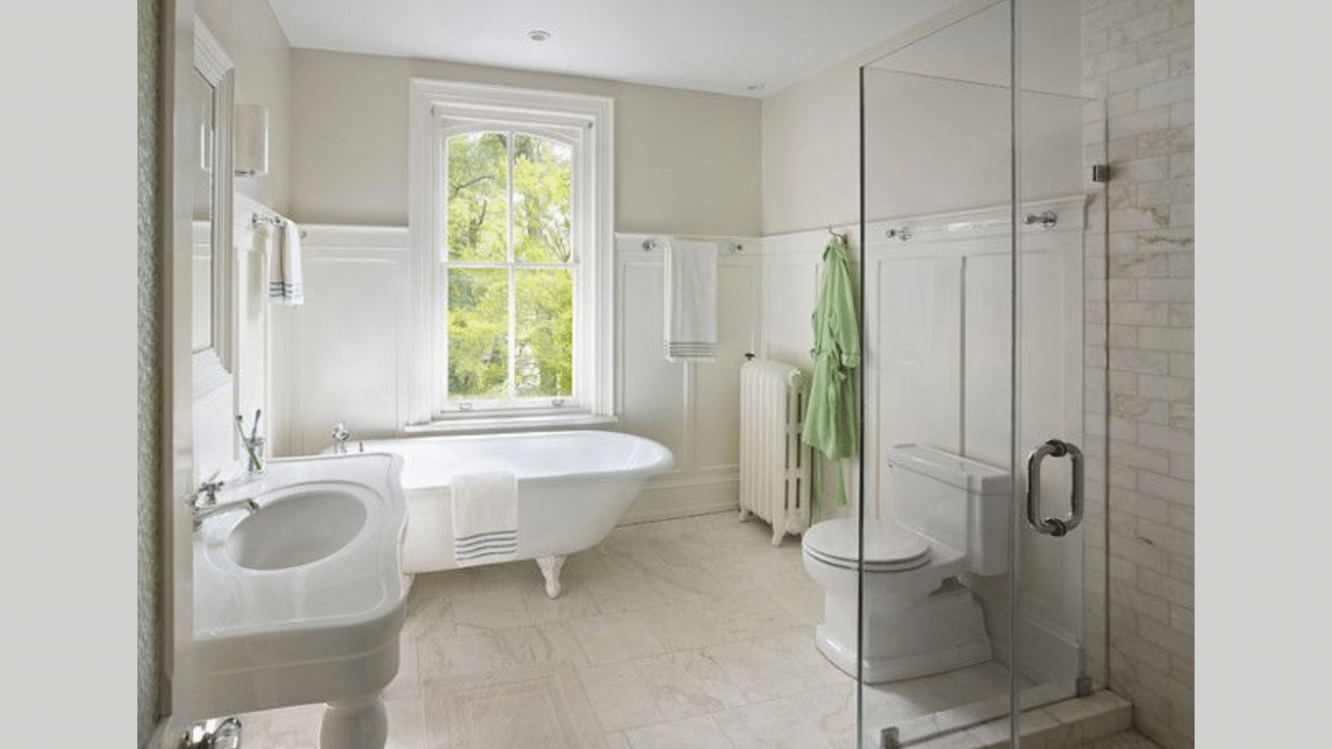
Bathrooms benefit from a light, neutral palette, and Wind’s Breath offers warmth without making the space feel small. This soft, airy shade creates a calm and inviting feel, perfect for everyday routines or spa-like moments. It works especially well with stone tiles, brushed gold or black fixtures, and soft white linens.
Hallways and Entryways
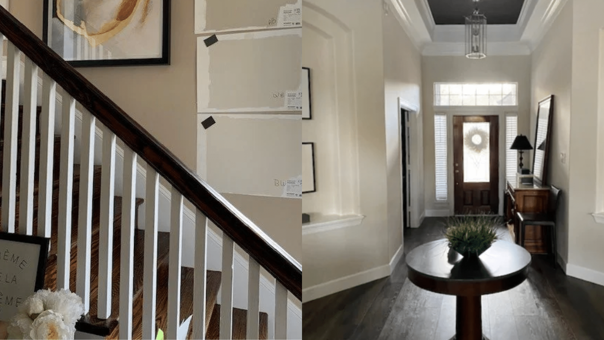
In transitional spaces like hallways or foyers, Wind’s Breath helps brighten the space without drawing too much attention. Its subtle warmth adds a welcoming touch while keeping things neutral and versatile. It’s great for creating flow between rooms, especially if you’re using different colors in adjacent areas.
How Wind’s Breath Reacts to Lighting
Light has a huge impact on how Wind’s Breath will look in your home. Because it sits in the middle of the off-white and greige spectrum, it shifts subtly throughout the day.
Natural Daylight: In bright, natural light, Wind’s Breath shows its warm beige side. It feels soft and cozy without turning yellow. This makes it ideal for sunrooms, breakfast nooks, or any room where daylight is abundant.
Cool or Artificial Light: In cooler light (like in a north-facing room or under LED bulbs), the gray and slight pink undertones become more noticeable. This can make the color feel more sophisticated and grounded.
Evening Light: At night, Wind’s Breath tends to look warmer, especially under incandescent or warm-toned bulbs. It helps create a cozy, comfortable ambiance, which is ideal for bedrooms and living spaces used in the evenings.
Comparing Wind’s Breath to Other Popular Neutrals
Wind’s Breath vs. Classic Gray
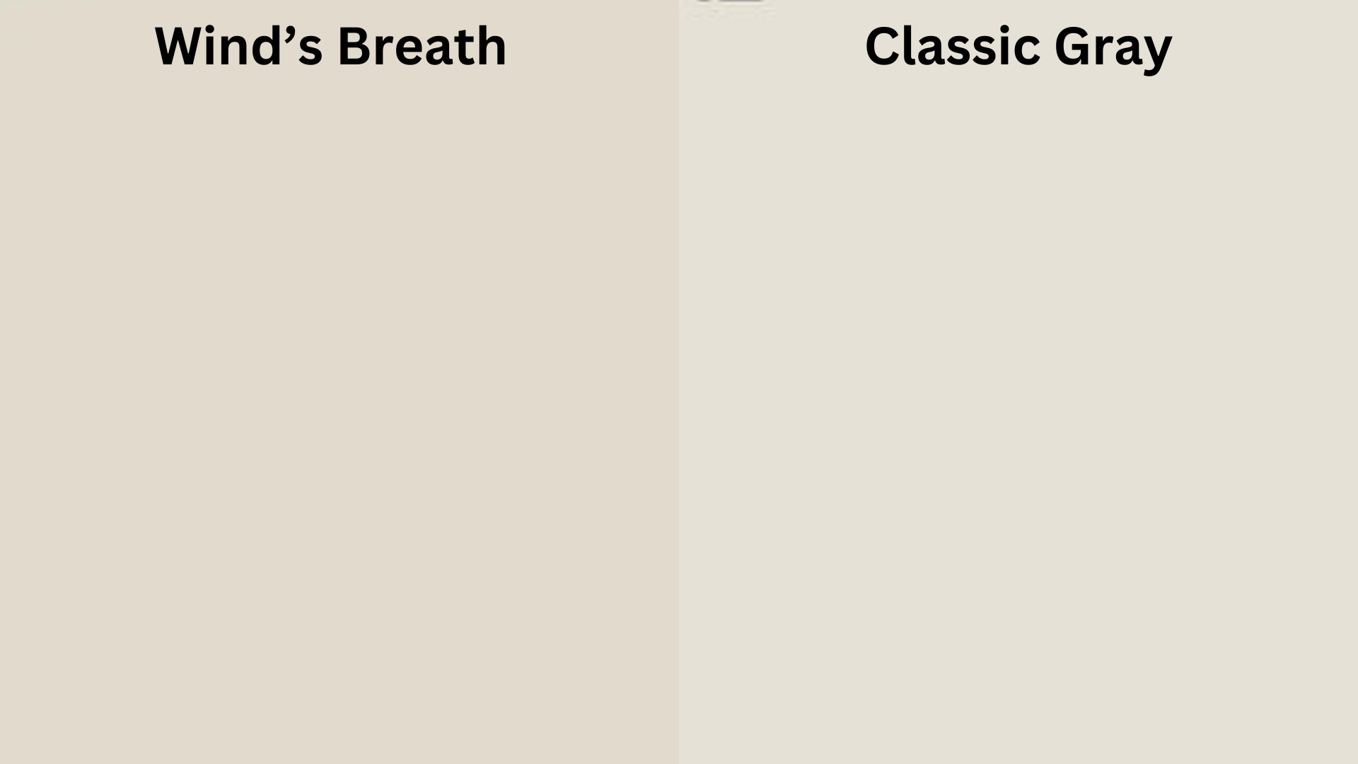
Classic Gray (OC-23) is a soft grey with a cooler feel. It works well if you want a room to look simple and fresh. It has a touch more grey than Wind’s Breath, which gives it a more modern look.
Wind’s Breath, on the other hand, has a warmer feel with soft beige hints. It feels more calm and homey. This makes it a good fit for bedrooms, living rooms, or other spaces where you want to feel cozy.
Use Classic Gray if you have cool-toned furniture or want a cleaner feel.
Use Wind’s Breath if your space has wood accents or if you want a softer, more lived-in look.
Wind’s Breath vs. Pale Oak
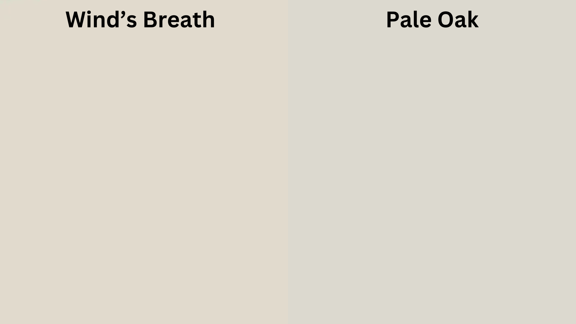
Pale Oak (OC-20) is also a mix of beige and grey, but it can sometimes show a pink or purple tint—especially in rooms with less light or with certain types of bulbs. It feels soft but more polished.
Wind’s Breath leans more earthy and balanced. It brings a warmer base, which makes rooms feel inviting and calm without looking too colorful. It’s a safer pick if you’re worried about strange undertones.
Use Pale Oak if you want a slightly cooler, cleaner look.
Use Wind’s Breath if you want something warmer that still looks fresh.
Wind’s Breath vs. Edgecomb Gray
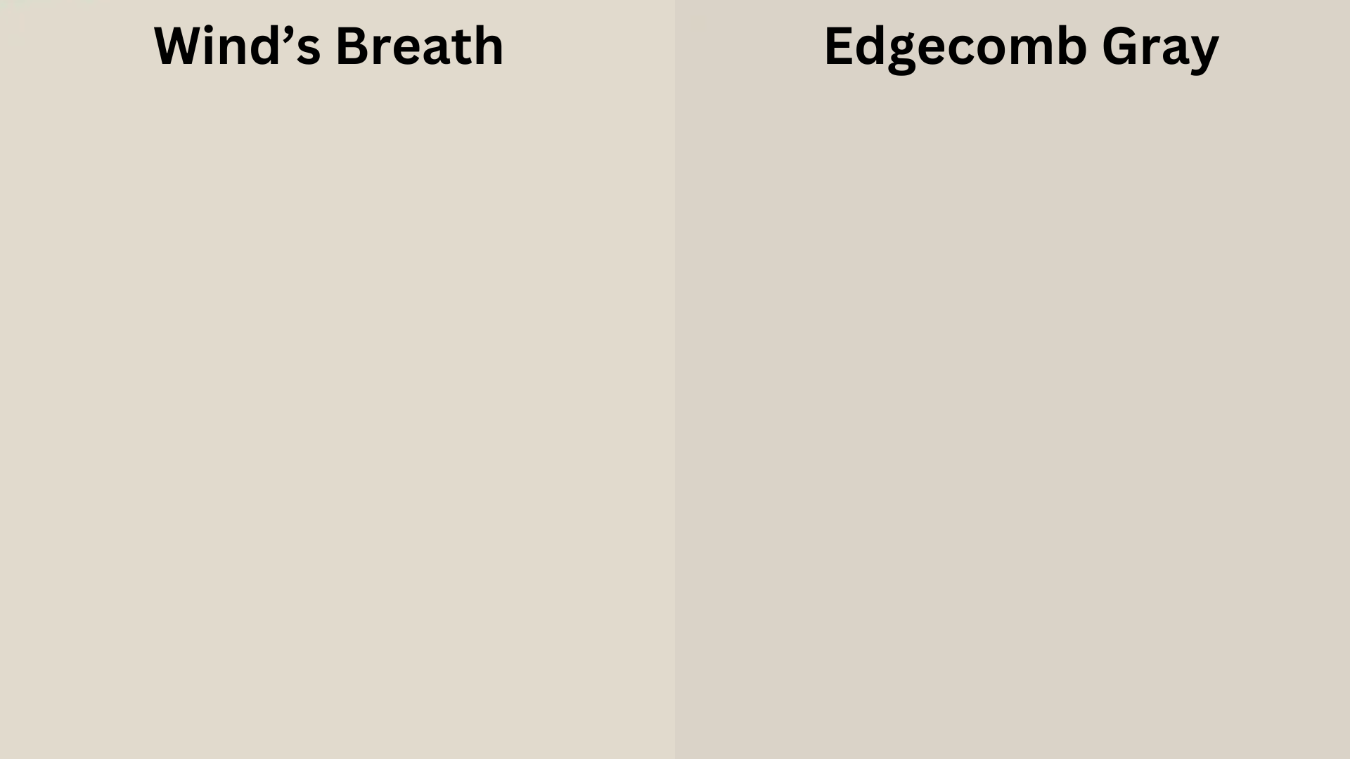
Edgecomb Gray (HC-173) is a popular paint that sits in the middle of grey and beige. It’s deeper and stronger in color than Wind’s Breath. This can help if you want a bit more contrast between your walls and trim.
Wind’s Breath is lighter, so it works better if you want your room to feel more open. It’s good in small rooms or spots with less natural light because it won’t feel heavy.
Use Edgecomb Gray if you want a bolder greige that still feels soft.
Use Wind’s Breath if you want a gentle color that stays in the background.
Wind’s Breath vs. Swiss Coffee
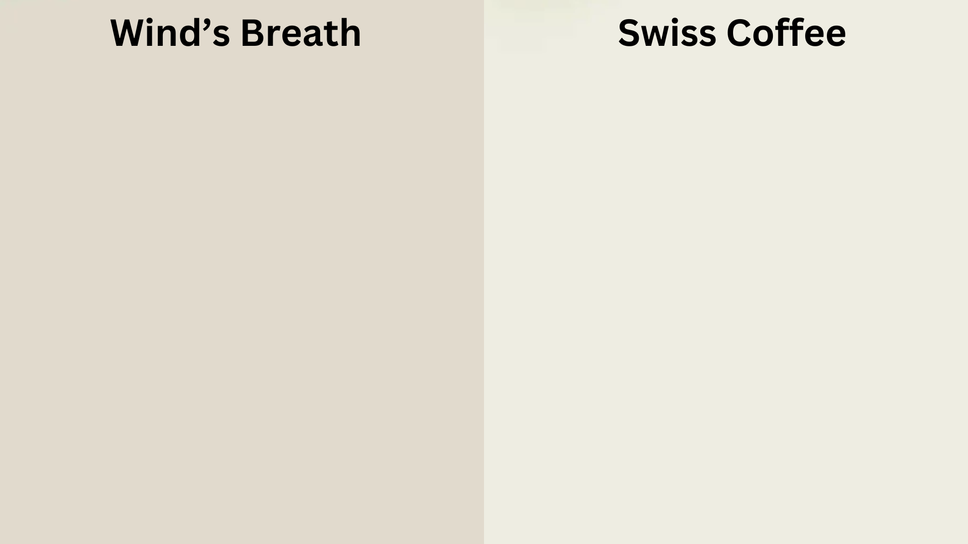
Swiss Coffee (OC-45) is a creamy white that leans toward yellow. It feels soft and warm but can sometimes look too yellow in bright daylight or next to cool-toned colors.
Wind’s Breath is more neutral. It doesn’t have the yellow base that Swiss Coffee does, which helps it look cleaner. It still feels warm, just without looking too creamy.
Use Swiss Coffee if you like richer, creamy walls and want a very soft white.
Use Wind’s Breath if you want a warm white that stays closer to beige without going too deep.
Trim and Accent Colors That Complement Wind’s Breath
Pairing the right trim color with Wind’s Breath can elevate the entire look of your space.
- Chantilly Lace (OC-65) offers a crisp, clean contrast that highlights Wind’s Breath’s softness.
- White Dove (OC-17) is warmer and blends gently for a more subtle look.
- For a bolder contrast, consider Chelsea Gray or Kendall Charcoal on interior doors or built-ins.
Accent colors that work well with Wind’s Breath include muted greens, terracotta, deep blues, and natural wood tones. It also looks great alongside warm metallics like brass, copper, or matte gold.
Painting Tips for Using Wind’s Breath
Before committing to a full room, always test a large swatch of Wind’s Breath on your wall. Paint at least a 2×2 foot section and check it in both natural and artificial light throughout the day.
Because it’s a light color, proper prep work is key. Make sure the surface is smooth and primed. Use a high-quality roller or sprayer to avoid streaking, especially if painting over darker colors.
Finish matters, too. An eggshell or matte finish works well in living spaces and bedrooms. For kitchens and bathrooms, consider a satin finish for easier cleaning.
Who Should Use Wind’s Breath?
If you’re someone who loves clean, calming interiors but doesn’t want stark white, Wind’s Breath is ideal. It’s especially good for people who like:
- A soft, layered color palette
- Transitional or classic decor
- Natural textures and light wood furniture
- A timeless look that won’t go out of style
It’s not the best pick if you want something super bright or ultra-modern. Wind’s Breath is all about subtle elegance, not bold statements.
Conclusion
Benjamin Moore’s Wind’s Breath is more than just a pretty neutral. It’s a thoughtful, adaptable paint color that brings comfort and warmth to any space. Whether you’re painting a single room or your entire home, Wind’s Breath creates a welcoming canvas that makes everything feel pulled together.
Its ability to shift gently with the light, its compatibility with a wide range of finishes and colors, and its soft, calming tone make it one of the most reliable off-whites on the market. If you’re looking for a hue that feels like a breath of fresh air every time you walk into the room, this might just be the one.
Frequently Asked Questions
Is Wind’s Breath a Warm or Cool Color?
It’s a warm off-white with soft beige and gray undertones. It stays warm, but it’s not yellow or overly creamy.
What Is the Lrv of Wind’s Breath?
Wind’s Breath has an LRV (Light Reflectance Value) of 69.59, which means it reflects a good amount of light and helps brighten spaces without feeling too bright.
Can I Use Wind’s Breath on Trim or Ceilings?
It’s best used on walls, but if you want a very monochromatic, soft look, it could work on trim or cabinetry. Just be sure to pair it with a contrasting sheen.
Does Wind’s Breath Work with Gray Furniture?
Yes. It works beautifully with light to medium gray furniture, especially those with warm undertones. Add in natural textures like rattan or wood to pull everything together.
Is Wind’s Breath Good for Resale?
Absolutely. It’s a safe, neutral choice that creates a clean, move-in-ready look that appeals to many buyers.