
The right wall and trim color combo can make a room look put-together. Or it can make it look like a total mess.
Most people pick a wall color they love and then just hope the trim works out. It usually doesn’t. The trim is not just a finishing touch. It sets the tone for the whole room.
So what colors actually work well together? What makes a room feel pulled together instead of patchy? The answers might be simpler than expected, but also a little surprising.
This blog covers wall and trim color combinations that actually work, and why they look so good together.
How to Choose the Right Wall and Trim Color Combinations
Picking the right wall and trim colors does not have to feel like a guessing game. This is what to look at:
- Understand the undertones: Every paint color has an undertone. Matching undertones between the wall and trim keeps the look tied together.
- Consider the room’s lighting: Natural and artificial light change how colors look. Always test paint samples before making a final call.
- Think about contrast levels: High contrast looks bold and sharp. Low contrast feels soft and calm. Pick based on the room’s mood.
- Look at the room’s fixed elements: Flooring, furniture, and cabinetry all affect color choices. The trim and wall should work with what’s already there.
- Start with the trim color: Most designers pick trim first. It narrows down the wall color options and makes the process easier.
Best Paint Finishes for Walls and Trim
The color is only half the decision. The finish matters just as much, and it is something a lot of people overlook completely.
A flat finish on the walls can look clean and modern. But put that same finish on the trim, and it will scuff and scratch within weeks. That is why walls and trim almost always need different finishes.
For trim, a semi-gloss or gloss finish works best. It holds up well to cleaning and gives the trim a crisp, defined look. For walls, eggshell or satin finishes are popular picks. They are easy to wipe down and still look smooth without being too shiny.
Getting the finish right makes the whole room look more polished.
The Best Wall and Trim Color Combinations
Thoughtfully curated wall and trim color combinations that create balanced contrast, depth, harmony, and timeless appeal in any space.
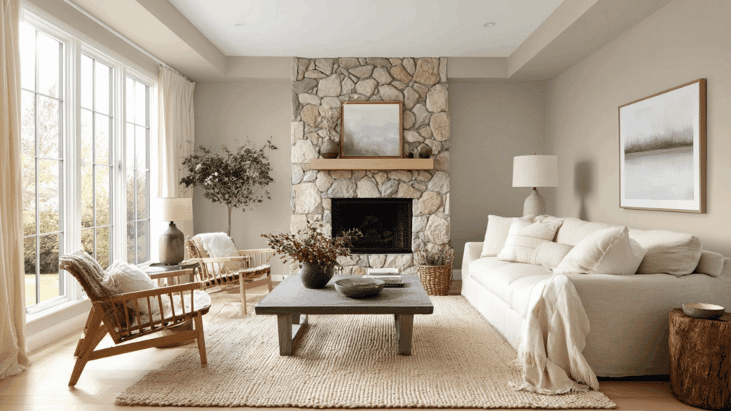
1. Warm Taupe Walls + Pure White Trim
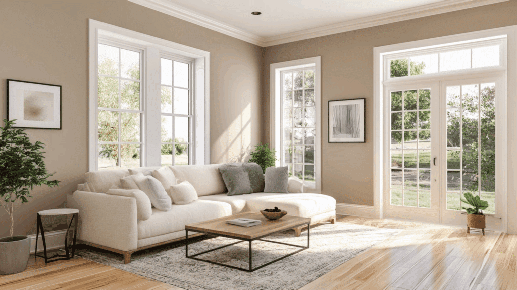
Warm taupe walls create a cozy, grounded backdrop, while pure white trim adds crisp definition and brightness.
This pairing balances warmth with clean contrast, making rooms feel inviting yet polished. It works beautifully in both modern and transitional interiors.
- Paired with: Natural wood floors, brushed brass accents
- Best for: Living rooms, hallways
- Recommended color: Sherwin-Williams Accessible Beige + Extra White
2. Soft Sage Green Walls + Bright White Trim
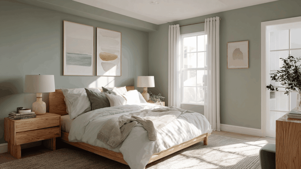
Soft sage green brings calm, organic freshness to a room. Bright white trim sharpens the look and prevents the green from feeling muted or dull.
The contrast highlights architectural details while maintaining a light, airy atmosphere.
- Paired with: Rattan decor, light oak furniture
- Best for: Bedrooms, bathrooms
- Recommended color: Benjamin Moore Saybrook Sage + Chantilly Lace
3. Dusty Mauve Walls + Crisp Off-White Trim
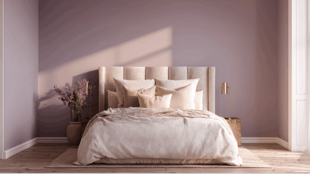
Dusty mauve walls offer subtle refinement with gentle warmth. Crisp off-white trim softens the contrast while keeping the palette refined and elegant.
The combination feels romantic yet modern without overwhelming the space.
- Paired with: Gold fixtures, velvet textures
- Best for: Guest bedrooms, reading nooks
- Recommended color: Sherwin-Williams Veiled Violet + Alabaster
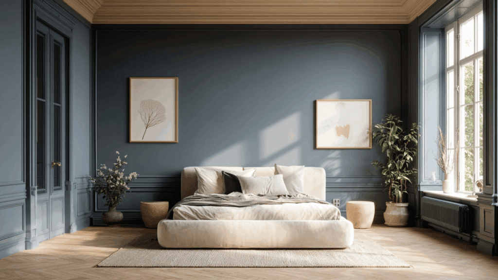
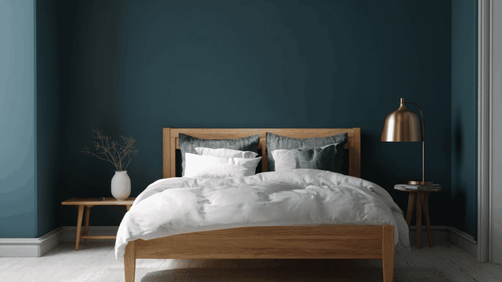
4. Deep Navy Walls + Snowy White Trim
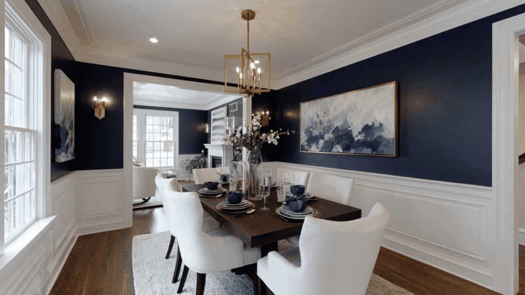
Deep navy creates dramatic depth and richness, while snowy white trim adds striking contrast and clarity. This pairing enhances molding, doors, and baseboards, giving the room a tailored, high-end appearance.
- Paired with: Brass lighting, white upholstery
- Best for: Dining rooms, home offices
- Recommended color: Benjamin Moore Hale Navy + Simply White
5. Mushroom Gray Walls + Creamy Ivory Trim
Mushroom gray delivers warmth with subtle earthy undertones. Creamy ivory trim complements without stark contrast, creating a seamless look. This combination feels timeless and versatile.
- Paired with: Stone accents, linen fabrics
- Best for: Living rooms, entryways
- Recommended color: Sherwin-Williams Shiitake + Creamy
6. Olive Drab Walls + Soft Gray Trim
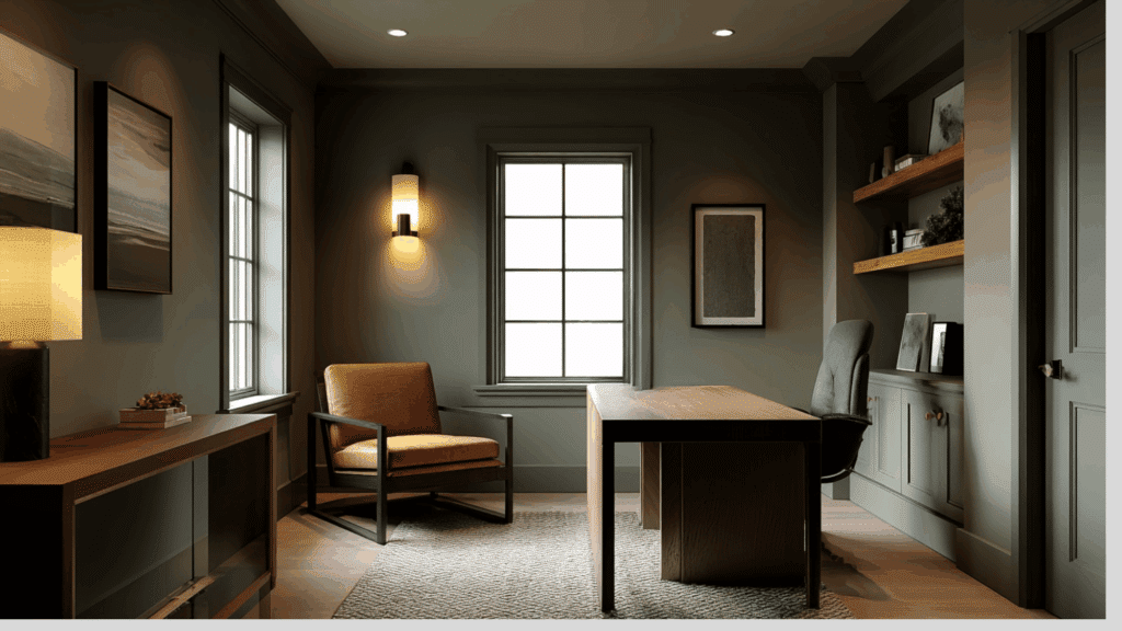
Olive drab adds depth and natural character. Soft gray trim tones down intensity while providing subtle definition. Together, they create a grounded, moody atmosphere that feels contemporary and cozy.
- Paired with: Black metal accents, leather furniture
- Best for: Offices, dens
- Recommended color: Benjamin Moore Vintage Vogue + Classic Gray
7. Blush Pink Walls + Alabaster White Trim
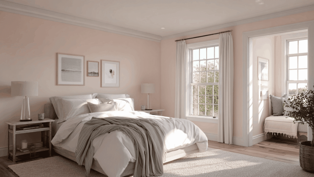
Blush pink brings gentle warmth and softness. Alabaster white trim keeps the look fresh and prevents it from appearing overly sweet. The pairing feels airy, elegant, and balanced.
- Paired with: Marble surfaces, soft gray textiles
- Best for: Bedrooms, nurseries
Recommended color: Sherwin-Williams Intimate White + Alabaster
8. Charcoal Walls + Warm Cream Trim
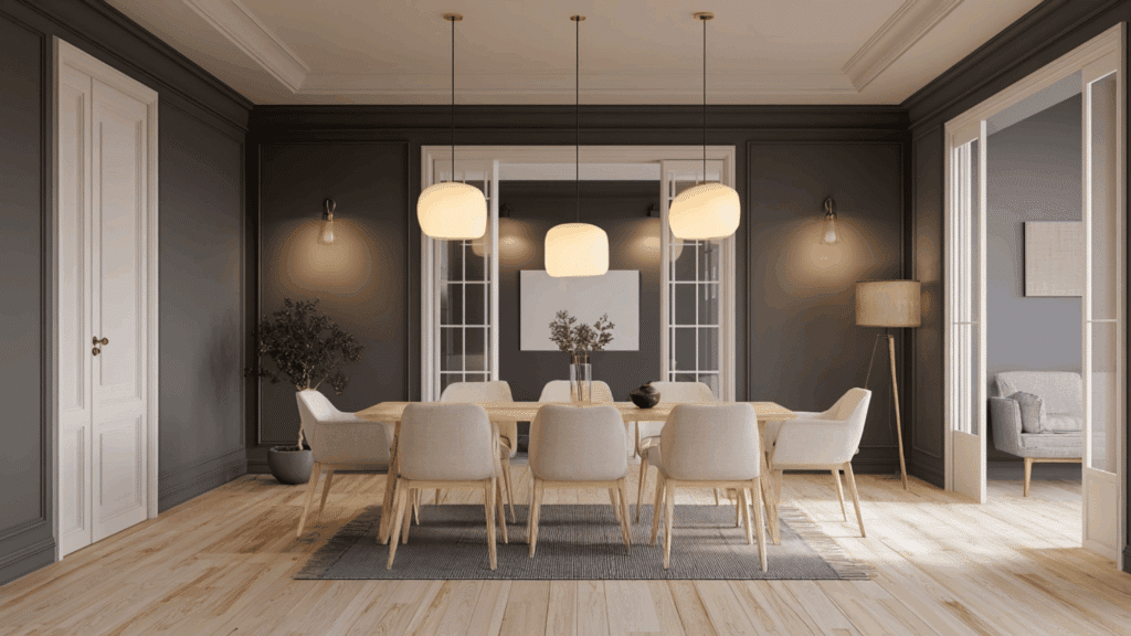
Charcoal walls create bold drama and depth. Warm cream trim softens the contrast while adding warmth, preventing the palette from feeling cold. This combination highlights architectural features beautifully.
- Paired with: Light wood flooring, warm metallics
- Best for: Accent walls, dining rooms
- Recommended color: Benjamin Moore Kendall Charcoal + Swiss Coffee
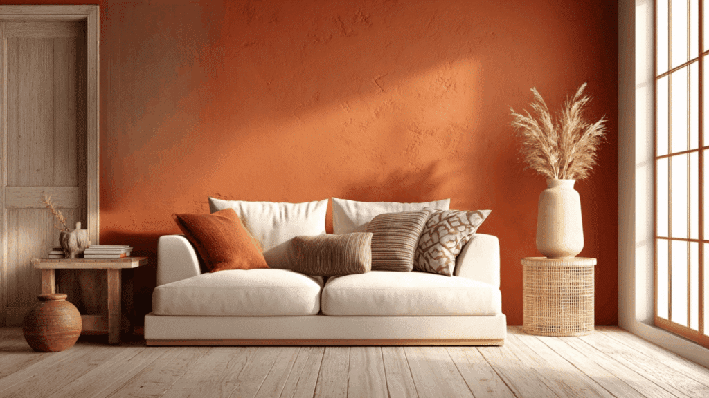
9. Terracotta Clay Walls + Light Beige Trim
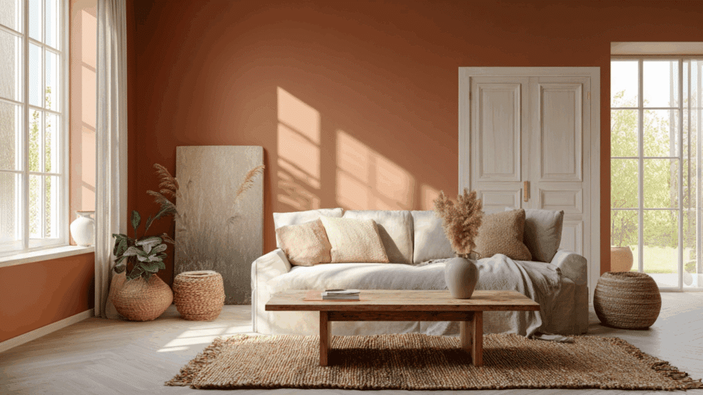
Terracotta clay adds earthy warmth and Mediterranean charm. Light beige trim harmonizes without stark contrast, keeping the palette cohesive and inviting.
- Paired with: Woven textures, warm wood tones
- Best for: Living rooms, kitchens
- Recommended color: Sherwin-Williams Cavern Clay + Natural Linen
10. Lavender Mist Walls + Bright White Trim
Lavender mist feels airy and serene. Bright white trim sharpens the pastel tone and enhances brightness. The pairing delivers subtle color without overwhelming the space.
- Paired with: Silver accents, white bedding
- Best for: Bedrooms, bathrooms
- Recommended color: Benjamin Moore French Lilac + Chantilly Lace
11. Buttery Yellow Walls + Dove Gray Trim
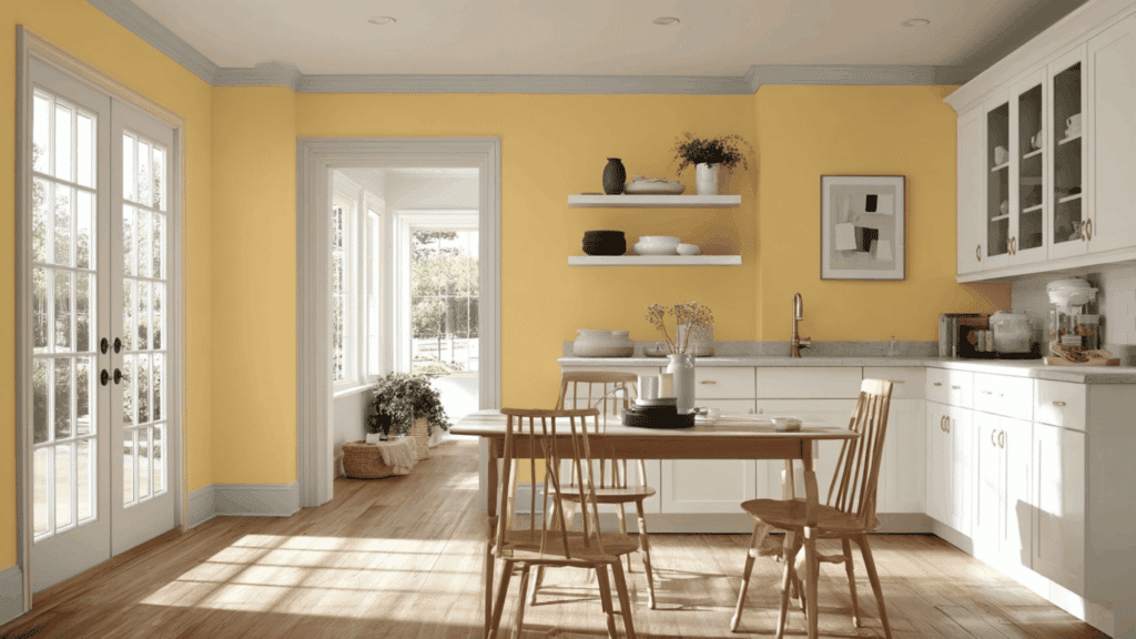
Buttery yellow radiates warmth and optimism. Dove gray trim grounds the vibrancy and adds soft sophistication, creating a balanced, cheerful atmosphere.
- Paired with: White cabinetry, brushed nickel
- Best for: Kitchens, breakfast nooks
- Recommended color: Sherwin-Williams Friendly Yellow + Passive
12. Forest Green Walls + Pearl White Trim
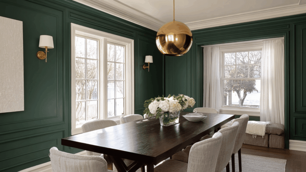
Forest green offers rich, moody elegance. Pearl white trim provides refined contrast while maintaining warmth. The result feels luxurious and timeless.
- Paired with: Gold accents, dark wood furniture
- Best for: Dining rooms, libraries
- Recommended color: Benjamin Moore Hunter Green + White Dove
13. Slate Blue Walls + Sandstone Trim
Slate blue introduces calm depth with subtle gray undertones. Sandstone trim adds warmth and softness, preventing the palette from feeling too cool.
- Paired with: Beige upholstery, natural fiber rugs
- Best for: Bedrooms, offices
- Recommended color: Sherwin-Williams Distance + Natural Choice
14. Mocha Brown Walls + Linen White Trim
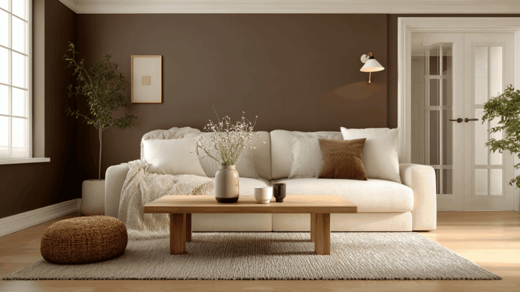
Mocha brown delivers warmth and depth. Linen white trim lightens the look and adds gentle contrast, keeping the room balanced and inviting.
- Paired with: Cream sofas, bronze hardware
- Best for: Living rooms, studies
- Recommended color: Benjamin Moore Tudor Brown + Linen White
15. Pale Aqua Walls + Charcoal Trim
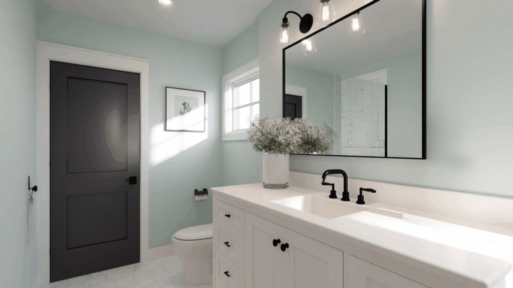
Pale aqua feels light and refreshing, while charcoal trim creates bold definition and a contemporary edge. The contrast makes architectural lines stand out dramatically.
- Paired with: Black fixtures, glass decor
- Best for: Bathrooms, modern bedrooms
- Recommended color: Sherwin-Williams Rainwashed + Iron Ore
16. Rusty Orange Walls + Vanilla Cream Trim
Rusty orange adds warmth and personality. Vanilla cream trim softens the intensity and amplifies coziness, resulting in an inviting, earthy palette.
- Paired with: Rustic wood, woven textiles
- Best for: Living rooms, creative spaces
- Recommended color: Benjamin Moore Audubon Russet + Navajo White
17. Smoky Teal Walls + Frost White Trim
Smoky teal blends blue and green for moody refinement. Frost white trim creates crisp contrast, highlighting trim details and brightening the overall look.
- Paired with: Brass fixtures, light oak floors
- Best for: Bedrooms, offices
- Recommended color: Sherwin-Williams Riverway + Pure White
Wall and Trim Color Mistakes to Avoid
Even a great color combo can fall flat when these common mistakes get in the way. Here is what to avoid:
1. Skipping the test patch: Never pick a color straight from a swatch. Paint a sample on the wall first.
2. Ignoring undertones: A white trim can look yellow or pink next to the wrong wall color. Always check undertones.
3. Using the same finish on walls and trim: It flattens the look and makes the trim blend in for all the wrong reasons.
4. Choosing color in the store: Store lighting is misleading. Always judge paint colors at home, in the actual room’s lighting.
5. Overmatching everything: When walls and trim are too similar, the room loses depth and looks flat.
To Conclude
Choosing the right wall and trim color combination comes down to a few simple things: undertones, contrast, finish, and lighting. Get those right, and the room starts to come together on its own.
The biggest takeaway? Trim is not an afterthought. It shapes how the entire room feels.
Start small. Pick one room, test a few combinations, and see what works. There is no single perfect formula; just what looks and feels right in the space.
Got a favorite wall and trim combo that worked out great? Drop it in the comments below; other readers would love the inspiration!