
Choosing a wall color isn’t easy, especially when you’re stuck between Colonnade Gray and Agreeable Gray. Both are top picks from Sherwin-Williams, and while they may look similar at first, their small differences can make a big impact on your room’s mood and light. If you’re unsure which way to go, you’re in the right place.
This blog will break it down clearly:
- How do they look in different lighting
- Undertones that affect the vibe
- Where each color works best
You’re here because you want the right shade, not just any gray. We get it—and we’re here to help. This guide was written to make your decision easier, without the fluff or confusing jargon.
You can trust the advice here. It’s honest, practical, and based on real use, not just paint chips. Let’s figure this out together. By the end, you’ll know exactly which gray is the better match for your space.
Colonnade Gray

Colonnade Gray (SW 7641) is one of those colors that surprised me the first time I used it. It’s a soft greige—that nice mix between gray and beige—but with subtle taupe undertones that give it a quiet, classy look. If you’re looking for a color that won’t lean too warm or too cool, this one walks the line really well.
It’s a bit on the cooler side, but not in a way that makes your space feel cold or flat. And here’s the thing: it has an LRV of 53, which means it reflects a moderate amount of light. Not too dark. Not super bright. Just right for a room where you want a bit of coziness without going full moody.
Now, a quick heads-up—don’t expect this color to show off. It’s not flashy. But if you want your walls to stay out of the way and let your furniture or décor shine, Colonnade Gray is a solid choice.
So if you want a paint that just works? This shade will be the one for you. And if your space gets a lot of natural light? Even better. It holds up beautifully without turning too yellow or too blue. Try a sample and watch it shift gently throughout the day.
Agreeable Gray

Agreeable Gray (SW 7029) is the kind of color I turn to when someone says, “I just want something warm, simple, and not too gray.” It’s a warm greige—more beige than gray—but still soft and neutral enough to fit almost anywhere. If you’re looking for that cozy, inviting feel without making things look too dark or yellow, this color might be just what you need.
Its LRV is 60, so it reflects more light than Colonnade Gray. That makes it a great choice for spaces where you want to keep things bright but still grounded. Think living rooms, bedrooms, even hallways—it works in all of them. Now, let me be honest. This isn’t a “look-at-me” color.
It’s more like a gentle hug for your walls. But what makes it so popular? Agreeable Gray doesn’t fight for attention. It plays well with warm woods, soft whites, and even muted blues or greens. It’s one of those rare colors that adapts to your space instead of taking it over. If you want a warm, easy backdrop you won’t have to second-guess, give this one a try.
Undertones and Color Depth
Undertones are where things get tricky. And honestly? They’re what trips most people up when choosing paint. I’ve been there, thinking I picked a nice neutral gray, only to watch it turn slightly green or even pink once it dried on the wall. That’s why this part matters more than you might expect.
Let’s start with Colonnade Gray. It has a taupe base that makes it feel grounded and just a bit cool. But here’s the kicker—it sometimes shows a soft green undertone, especially in rooms with cool light or lots of trees outside. It’s not obvious, but it’s there.
If you’re sensitive to that, you might want to sample it first. I’ve seen it look like a calm, balanced gray in one home and then lean slightly green in another. That shift? It all depends on your lighting and what’s around it—floors, trim, furniture, even what’s outside your window.
Now, Agreeable Gray is warmer overall. It leans beige, and in most rooms, that’s what you’ll notice first. But depending on the time of day or what bulbs you’re using, it can show a touch of pink or purple. It’s very soft, not a loud lavender or anything dramatic.
Still, if you weren’t expecting that hint of warmth, it might catch you off guard. I’ve had people tell me it looked perfect during the day, but then picked up a rosy tint at night. Again, that’s the undertones doing their thing.
How Does Lighting Affect Each Shade?
This is the honest truth: lighting changes everything. You can pick the perfect paint, but if you don’t consider your light source, it might look completely different once it’s on the wall.
I’ve learned (sometimes the hard way) that the same shade can shift wildly from room to room—or even hour to hour. So before you commit, let’s break it down clearly:
| Lighting Type | Colonnade Gray (SW 7641) | Agreeable Gray (SW 7029) |
|---|---|---|
| North-Facing Room | Feels a little cooler. The green and taupe undertones show up more. | Still feels warm and cozy. The beige keeps it from going cold. |
| South-Facing Room | Looks brighter. The gray softens and can feel slightly warmer. | Glows with warmth. The light pulls out the beige in a pleasant way. |
| Artificial Light | Stays pretty neutral. Doesn’t change much—just a bit muted. | Feels more beige. It can show hints of pink depending on the bulb’s warmth. |
Lighting is sneaky as it shifts with the time of day, weather, and bulb type. That’s why I always test paint swatches on more than one wall. And not just for five minutes.
Do this:
- Check them morning, noon, and night.
- Use both daylight and your lamps.
- Live with them for a few days.
It’s the best way to know what you’re really getting because the last thing you want is to regret your pick once the sun goes down.
Best Rooms for Colonnade Gray
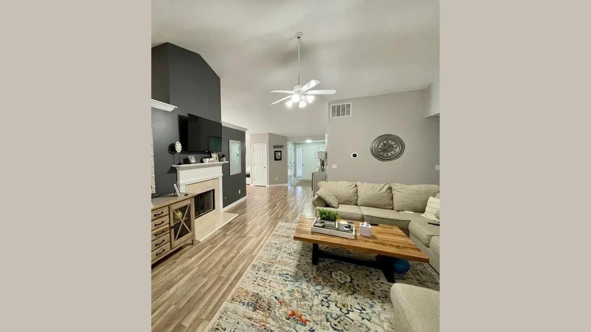
When I use Colonnade Gray, I usually reach for it in rooms where I want things to feel calm, clean, and not too warm. It works best in living rooms, dining rooms, entryways, and home offices—anywhere you want a more modern or balanced feel without going full-on cool gray.
Because it has that soft taupe base with a hint of green underneath, it stays neutral but still feels a little refined. If your space gets lots of natural light, Colonnade Gray looks especially good—it keeps its depth without getting washed out, which is something I’ve noticed not all colors can pull off.
In north-facing rooms, this shade gives a grounded vibe without turning icy. In more open spaces like hallways or great rooms, it helps tie everything together without stealing attention. Got wood floors or black fixtures?
This color plays nice with both. It also works with cooler-toned countertops, stainless appliances, and matte black or brushed nickel hardware. It’s a team player, not a scene-stealer.
Best Rooms for Agreeable Gray
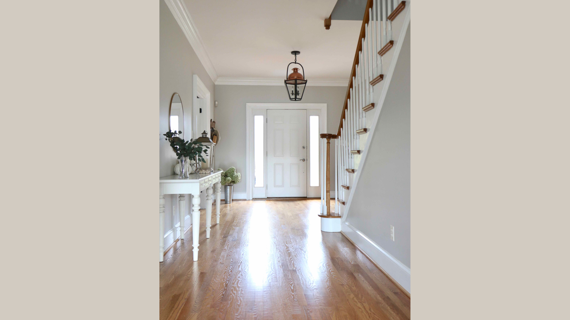
When I use Agreeable Gray, I usually turn to it for rooms where I want things to feel warm, soft, and easy to live with. It works especially well in bedrooms, family rooms, hallways, and open floor plans—spaces where comfort matters most.
The warmth in this color creates a welcoming backdrop without being too bold or too beige. It’s one of those shades that just settles in and makes a room feel finished, without shouting for attention.
In rooms with less natural light, Agreeable Gray helps keep things from feeling dark or dull. It reflects just enough light to lift the space but still adds a little depth. If you have warm wood floors, creamy trim, or tan furniture, this paint will blend in beautifully. Even in nurseries or guest rooms, it brings a soft, restful feel that isn’t too cold or too yellow.
I’ve found it also works really well in transition spaces, like hallways or staircases. It creates a nice flow from one room to the next, especially if you’re mixing different colors in other parts of the house.
Mood and Style: What Each Color Says
Choosing a paint color isn’t just about what looks good—it’s about how it feels. I always think about the mood I want a room to have before I pick up a brush.
Do you want calm and clean? Or cozy and warm? Both Colonnade Gray and Agreeable Gray can get you there, but they speak different languages. Let’s break it down simply:
| Paint Color | Mood | Best For | Pairs Well With |
|---|---|---|---|
| Colonnade Gray | Calm, grounded, fresh | A peaceful space with a neutral, modern backdrop | Cool-toned furniture, black metal, light woods |
| Agreeable Gray | Warm, soft, welcoming | A cozy, homey feel where comfort comes first | Warm woods, beige sofas, soft fabrics, layered textures |
Now here’s where style plays a part. The same paint can feel totally different depending on what you put in the room. A sleek white couch makes Colonnade Gray feel modern and airy. But toss in some warm wood and gold accents, and suddenly Agreeable Gray feels like a soft hug.
Conclusion
At the end of the day, there’s no wrong choice between Colonnade Gray and Agreeable Gray—just the one that feels right for your space and your style. If you’re leaning toward something warm, soft, and welcoming, then Agreeable Gray might be the better match for that cozy, lived-in feel you’re going for.
But if you prefer a color that feels clean, calm, and just a touch more modern, Colonnade Gray could be exactly what your room needs. What matters most is how the color looks in your actual space, not just on a screen or a paint chip.
That’s why I always suggest trying real swatches on your walls and living with them for a few days. Check them in morning light, evening shadows, and everything in between.
Trust what you see. Trust what feels good. That’s how you’ll know you’ve picked the right one. And once you do, your walls will thank you—quietly, of course.