")
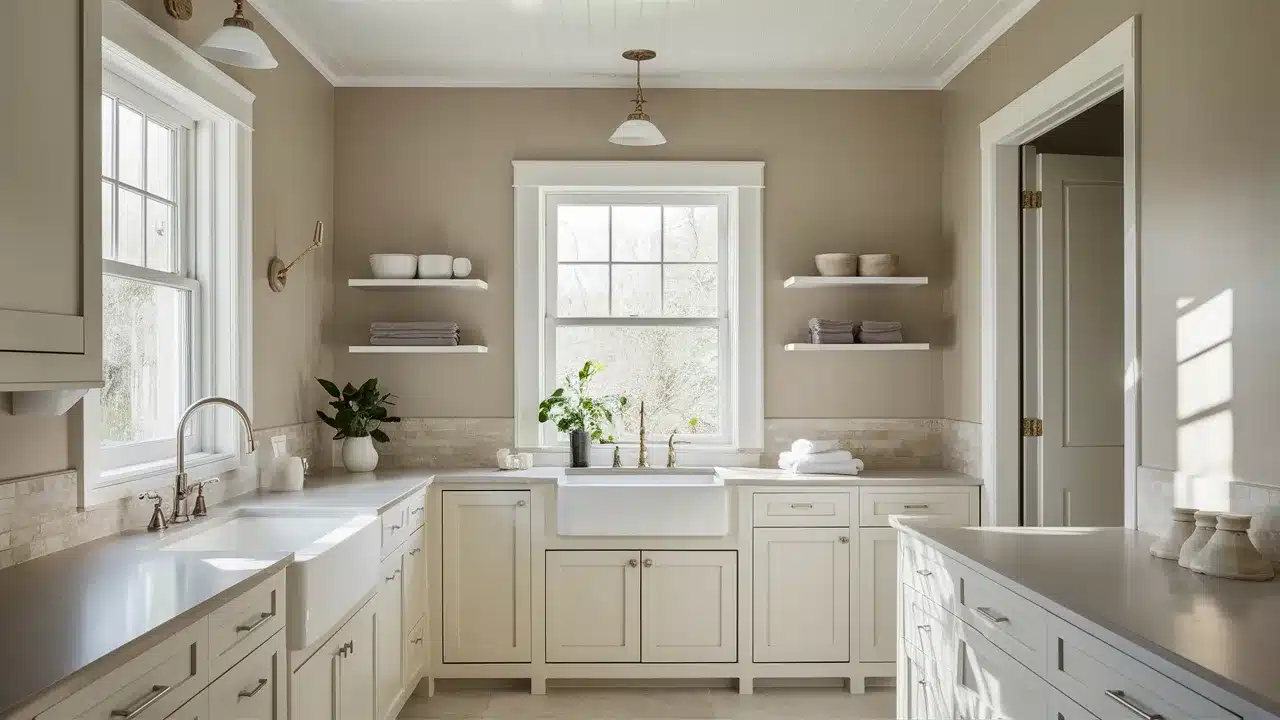
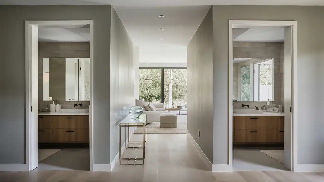
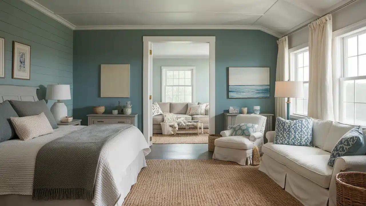
Benjamin Moore’s Hazy Skies (OC-48) is one of those paint colors that just works. It’s soft, calm, and easy to live with.
It’s not too gray and not too beige. Instead, it sits right in the middle—a true greige that brings warmth and balance to any space.
This color has a quiet beauty. It changes gently with the light. In the morning, it can feel light and airy. In the evening, it feels soft and grounded. That’s what makes it so easy to use. It plays well with other colors and fits into almost any room.
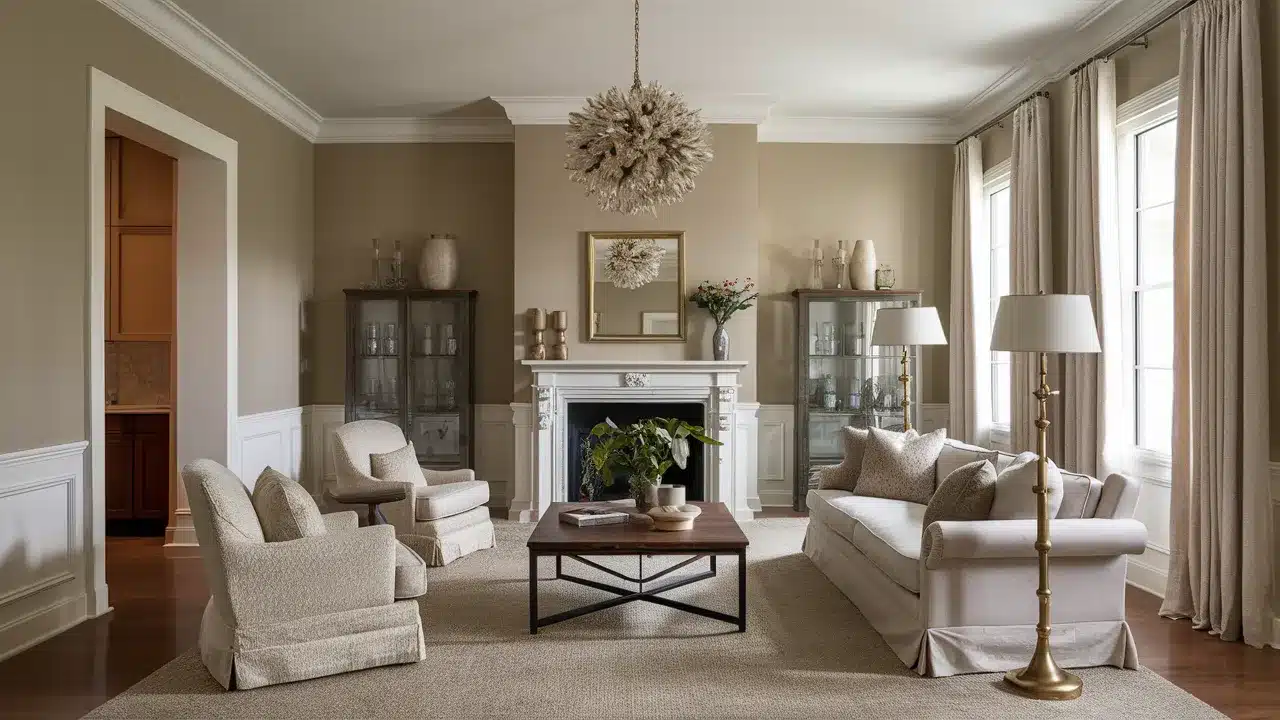
I’ve used Hazy Skies in all kinds of homes—modern, farmhouse, traditional, and everything in between. It never feels too bold or too plain. It always brings a peaceful feeling, no matter where it goes.
In this article, I’ll walk you through beautiful colors that pair perfectly with Hazy Skies.
These include choices for trim, cabinets, walls, exteriors, and even bold accents. No matter your style or project size, there’s something here that will help.
Whether you’re repainting one small room or pulling together a whole home, these color pairings will help you create a look that feels natural and well put together.
You’ll find ideas that feel fresh, timeless, and easy to live with.
By the end, you’ll feel ready to use Hazy Skies with confidence. And you’ll have plenty of color inspiration to help bring your space to life—one wall at a time.
Why Choose Hazy Skies
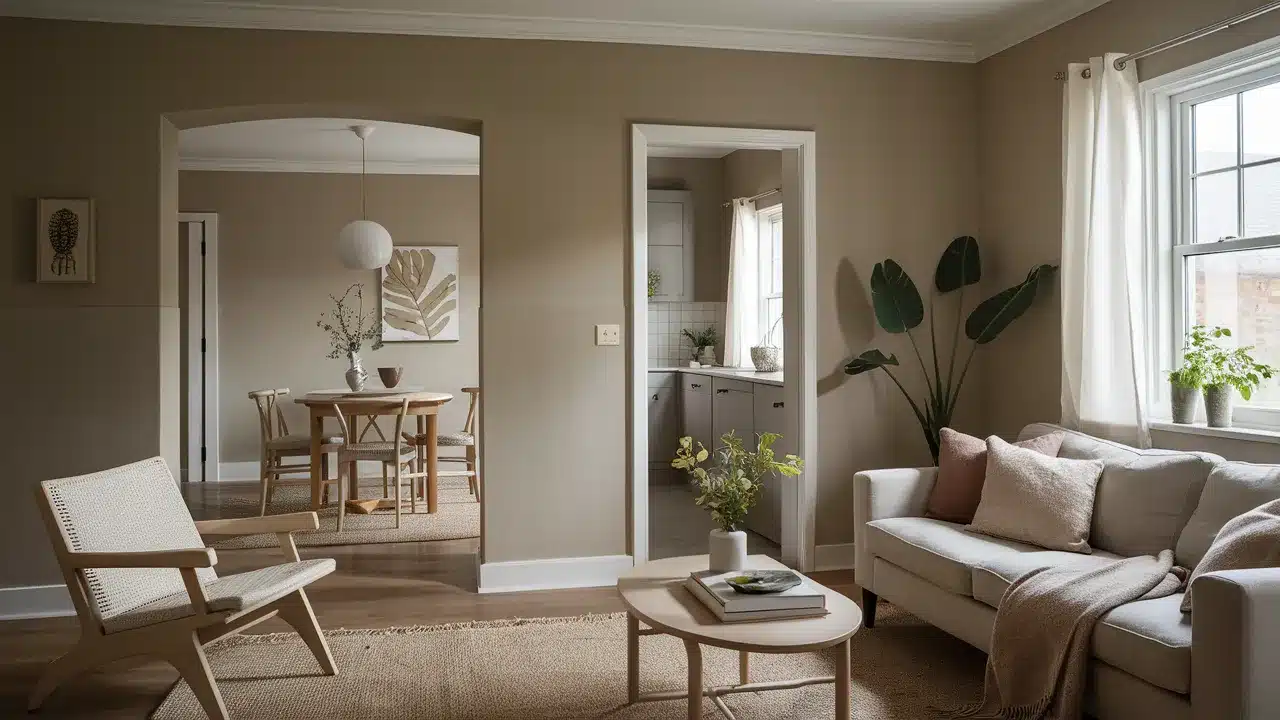
Hazy Skies is a designer favorite for good reasons. This chameleon-like neutral adapts to different lighting conditions beautifully.
In north-facing rooms, it shows more of its gray undertones. In sunny spaces, the warm beige notes become more prominent.
The color works in any room of your home. It’s soft enough for bedrooms, wordly enough for living spaces, and neutral enough for open floor plans.
Hazy Skies creates a perfect backdrop for both colorful accessories and other neutrals.
Unlike some grays that can feel cold or some beiges that can look dated, Hazy Skies maintains a timeless quality.
It’s neither too warm nor too cool, making it incredibly versatile for coordinating with other colors.
Even better, Hazy Skies pairs well with both cool and warm tones. This flexibility means you can use it as part of a whole-house color scheme without limiting your other color choices.
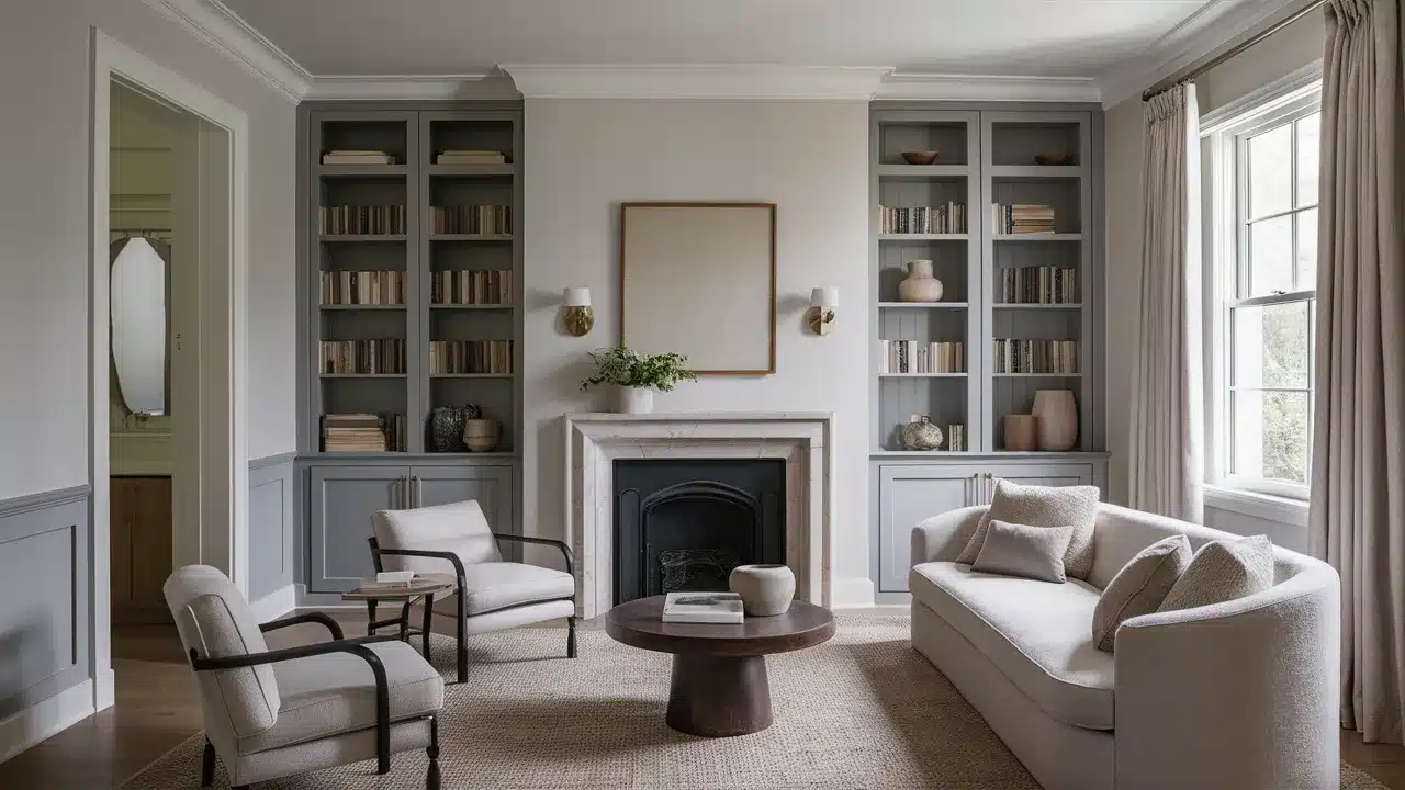
Color Combinations for Benjamin Moore Hazy Skies
Finding the perfect companion colors for Hazy Skies can turn your space from ordinary to extraordinary.
Each of these combinations creates a different mood and style while maintaining harmony with your Hazy Skies base.
Let’s look at these versatile pairings that will help you create your dream space.
1. Benjamin Moore White Dove
White Dove (OC-17) is a soft, warm white that pairs beautifully with Hazy Skies. Use Hazy Skies on walls with White Dove trim for a clean, fresh look.
This combination works especially well in kitchens and bathrooms where you want a light, airy feel without stark contrasts.
The gentle warmth in both colors creates a soothing atmosphere that never feels clinical or cold.
2. Edgecomb Gray
Edgecomb Gray (HC-173) is slightly lighter than Hazy Skies with similar undertones. These two create a subtle layered look when used in adjoining spaces.
Try Hazy Skies in your living room with Edgecomb Gray in the hallway or dining area.
The colors flow beautifully together while providing just enough distinction between spaces in an open floor plan.
3. Classic Gray
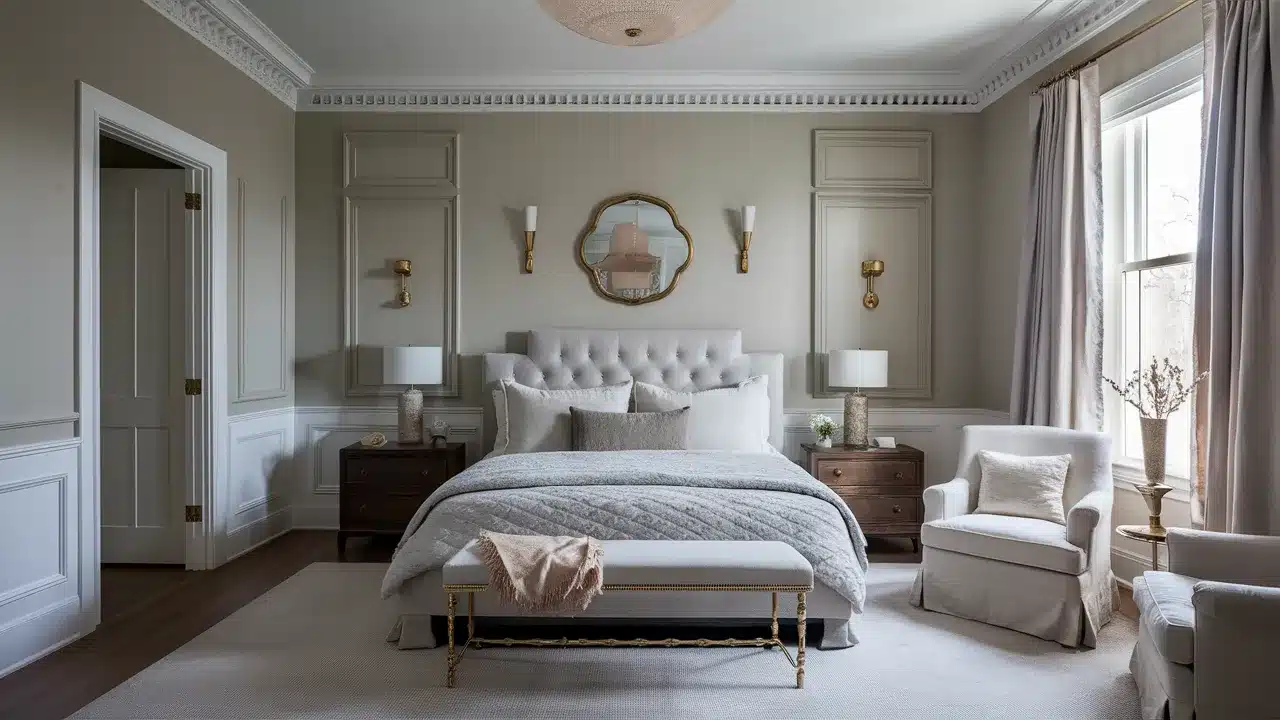
Classic Gray (OC-23) has cooler undertones than Hazy Skies. This pairing creates a wordly contrast that feels both modern and timeless.
Use Classic Gray on your walls with Hazy Skies for trim and doors for an unexpected twist on traditional white trim.
This combination feels especially elegant in bedrooms and formal living spaces.
4. Pale Oak
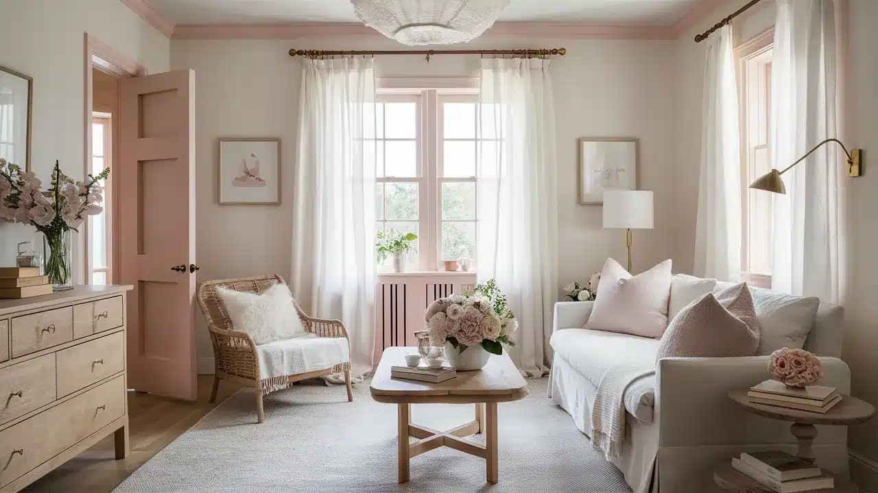
Pale Oak (OC-20) is a lighter neutral with pink undertones that complement the gray in Hazy Skies.
This gentle pairing creates a soft, feminine space without becoming overly sweet. It’s perfect for bedrooms and sitting rooms where you want to create a peaceful retreat.
Add natural wood elements to ground this ethereal combination.
5. Balboa Mist
Balboa Mist (OC-27) is a light gray with subtle warmth that creates a beautiful tone-on-tone effect with Hazy Skies.
Use Balboa Mist on walls with Hazy Skies for cabinetry or built-ins. This subtle contrast adds dimension without drawing attention to architectural elements.
It’s a designer trick for spaces where you want quiet wordliness.
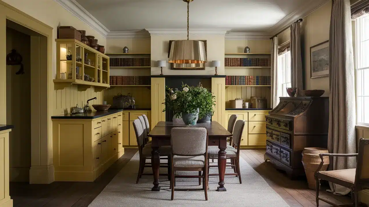
6. Manchester Tan
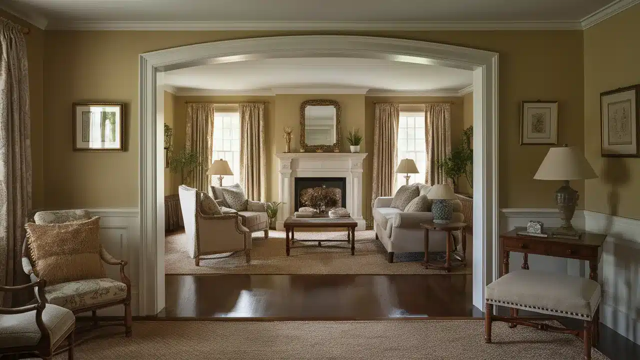
Manchester Tan (HC-81) pulls out the beige undertones in Hazy Skies. This combination creates a warm, inviting space that feels grounded and traditional.
Try Manchester Tan in living areas with Hazy Skies in adjacent hallways or dining spaces. This pairing works beautifully with traditional furniture and rich wood tones.
7. Lenox Tan
Lenox Tan (HC-44) is a deeper, more golden beige that creates a rich contrast with Hazy Skies. This combination feels warm and inviting, perfect for creating cozy living spaces.
Use Hazy Skies on walls with Lenox Tan for an accent wall or built-in bookshelves. This pairing complements traditional decor and antique furniture beautifully.
8. Grant Beige
Grant Beige (HC-83) has more depth than Hazy Skies while sharing similar undertones. This creates a subtle but noticeable contrast that adds dimension to your space.
Use Grant Beige for lower cabinets with Hazy Skies for upper cabinets in a kitchen. This combination feels grounded yet light, creating visual interest without bold contrasts.
9. Rustique
Rustique (AF-935) is a deeper, more saturated neutral that creates a beautiful contrast with Hazy Skies.
This earthy combination feels warm and natural. Try Rustique on an accent wall or for furniture against Hazy Skies walls.
This pairing works wonderfully in spaces where you want to create a cozy, intimate atmosphere.
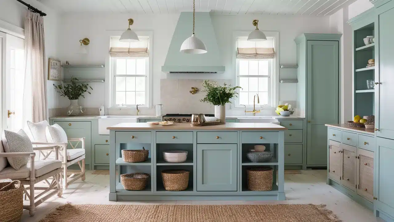
10. Cedar Key
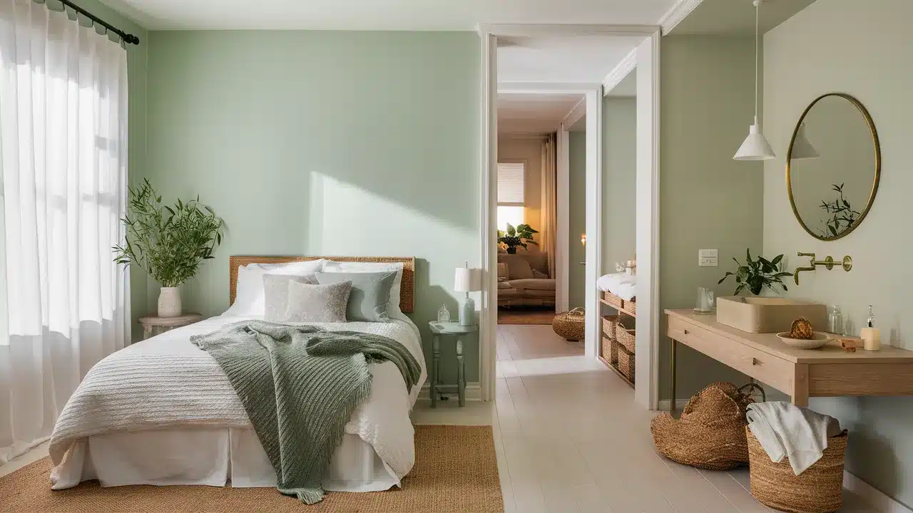
Cedar Key (AF-405) is a muted sage green that brings out the subtle green undertones in Hazy Skies.
This combination connects to nature and creates a peaceful, organic feeling. Use Cedar Key for cabinetry or furniture pieces against Hazy Skies walls.
This pairing feels especially fresh in kitchens, sunrooms, and spaces with plenty of natural light.
11. Swiss Coffee
Swiss Coffee (OC-45) is a creamy off-white that pairs beautifully with Hazy Skies. Use Swiss Coffee for trim and ceilings with Hazy Skies walls for a soft, classic look.
This combination creates a space that feels bright without the harshness of pure white. It works in any room and complements both traditional and contemporary furnishings.
12. Nimbus
Nimbus (1465) is a deeper gray that creates a wordly contrast with Hazy Skies. This combination feels contemporary and urban.
Try Nimbus for an accent wall or built-ins with Hazy Skies as your main wall color. This pairing works especially well in home offices, media rooms, and modern living spaces.
13. Gray Owl
Gray Owl (2137-60) has cool blue-green undertones that contrast beautifully with the warmth in Hazy Skies. This combination creates a balanced, tranquil space.
Use Gray Owl in bedrooms or bathrooms with Hazy Skies in adjacent hallways or dressing areas. This pairing feels fresh and contemporary while remaining soothing and livable.
14. Cloud Cover
Cloud Cover (855) is a light gray with blue undertones that creates an airy contrast to Hazy Skies.
Use Cloud Cover for ceilings with Hazy Skies walls to draw the eye upward and create the feeling of more space.
This combination works beautifully in rooms with lower ceilings or spaces that need to feel more expansive and open.
15. Chantilly Lace
Chantilly Lace (OC-65) is a bright, clean white that creates a crisp contrast with Hazy Skies. This combination feels modern and fresh.
Use Chantilly Lace for trim, doors, and ceilings with Hazy Skies walls for a contemporary look that highlights architectural details.
This pairing works in any style home but feels especially current in modern spaces.
16. Seapearl
Seapearl (OC-19) is a soft white with subtle warm undertones that complement Hazy Skies beautifully.
This gentle combination creates spaces that feel luminous and inviting. Use Seapearl for trim and cabinetry with Hazy Skies walls.
This pairing works especially well in kitchens and bathrooms where you want a clean look without starkness.
17. Moonshine
Moonshine (2140-60) is a light silvery gray that creates a cool contrast with Hazy Skies. This combination feels contemporary and slightly unexpected.
Try Moonshine in bedrooms or bathrooms adjacent to Hazy Skies living spaces. This pairing creates a subtle transition between rooms while maintaining a cohesive whole-house color scheme.
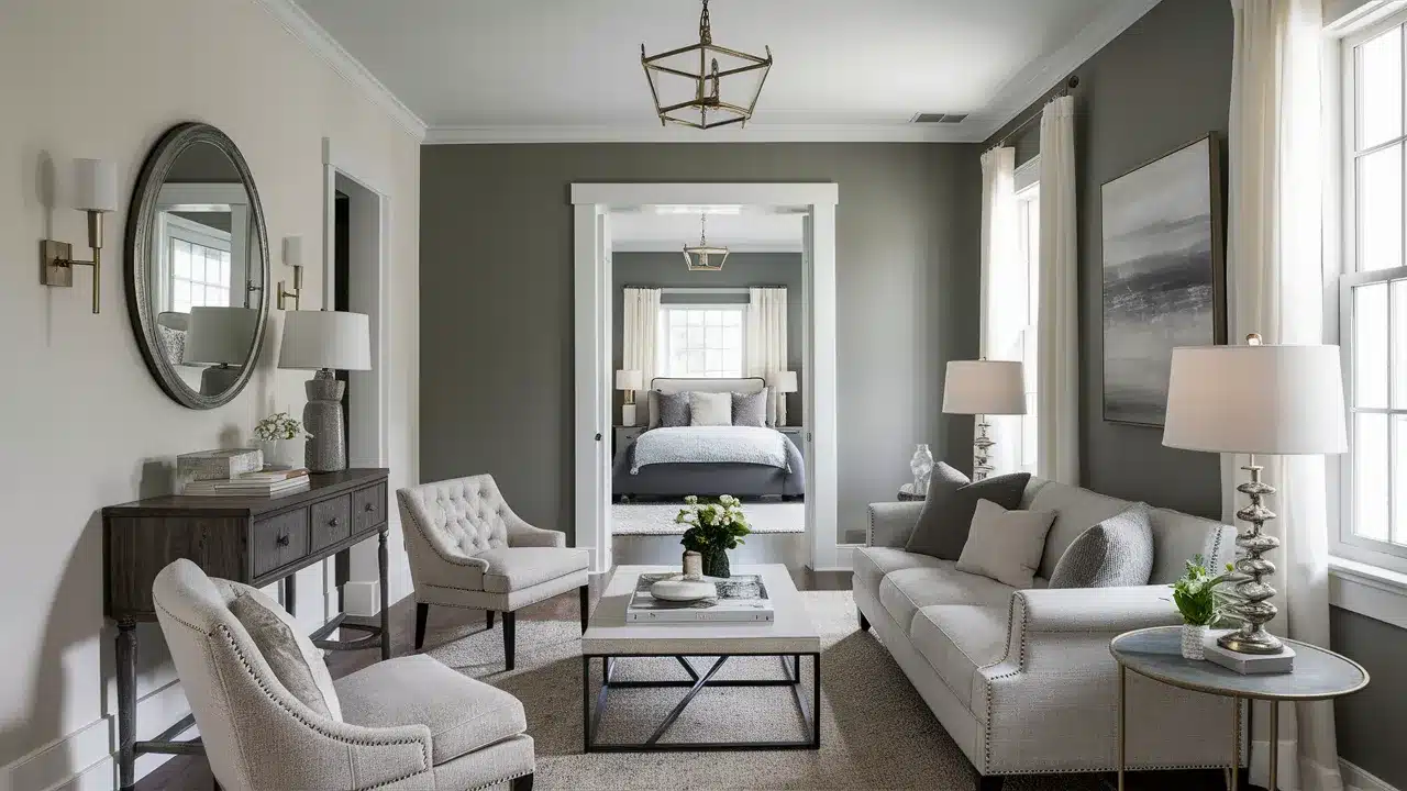
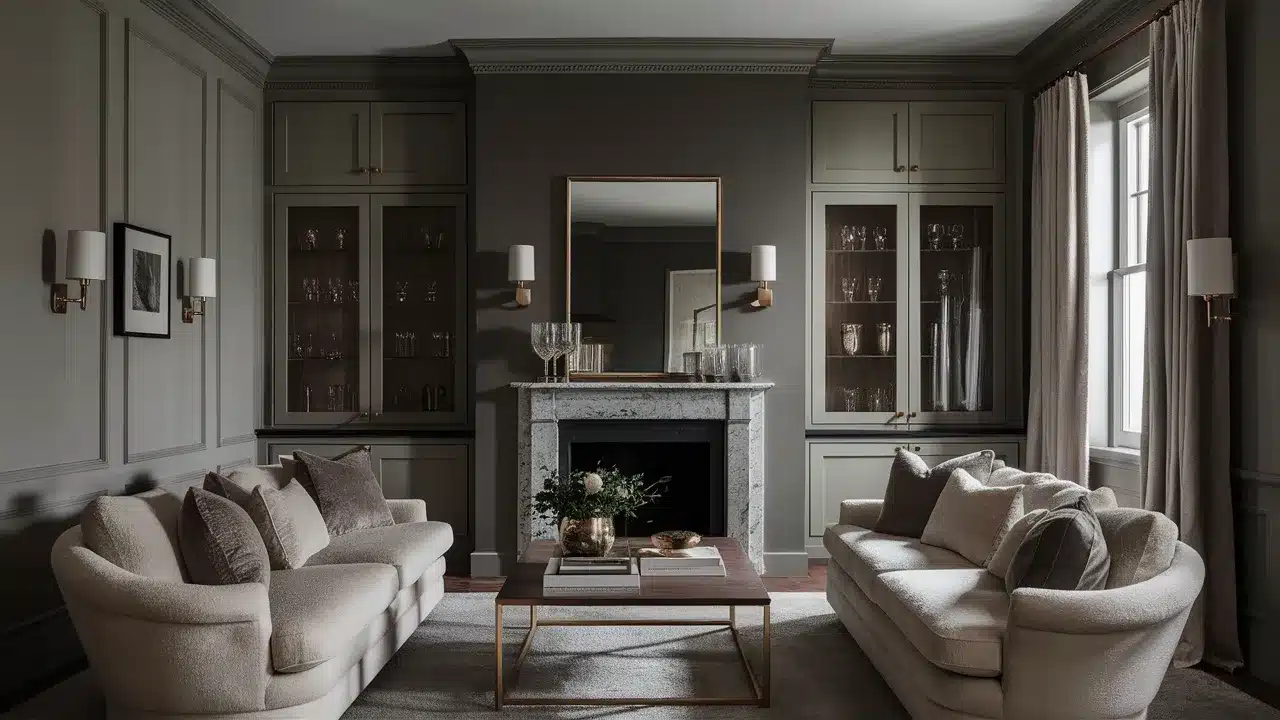
18. Revere Pewter
Revere Pewter (HC-172) is slightly deeper and warmer than Hazy Skies. This combination creates a layered neutral look that feels wordly and timeless.
Use Revere Pewter for an accent wall or in an adjacent room to Hazy Skies. This pairing works beautifully in transitional style homes and open floor plans.
19. Silver Satin
Silver Satin (OC-26) is a pale gray with subtle warmth that creates a beautiful tone-on-tone effect with Hazy Skies.
Use Silver Satin for trim and ceilings with Hazy Skies walls for a soft, monochromatic look.
This combination works especially well in spaces where you want a serene, cohesive design without strong contrasts.
20. Winter White
Winter White (OC-21) has subtle green undertones that create an interesting dialogue with Hazy Skies. This combination feels fresh and nature-inspired.
Use Winter White for trim and ceilings with Hazy Skies walls. This pairing works beautifully in spaces with views of the outdoors where you want to connect interior and exterior.
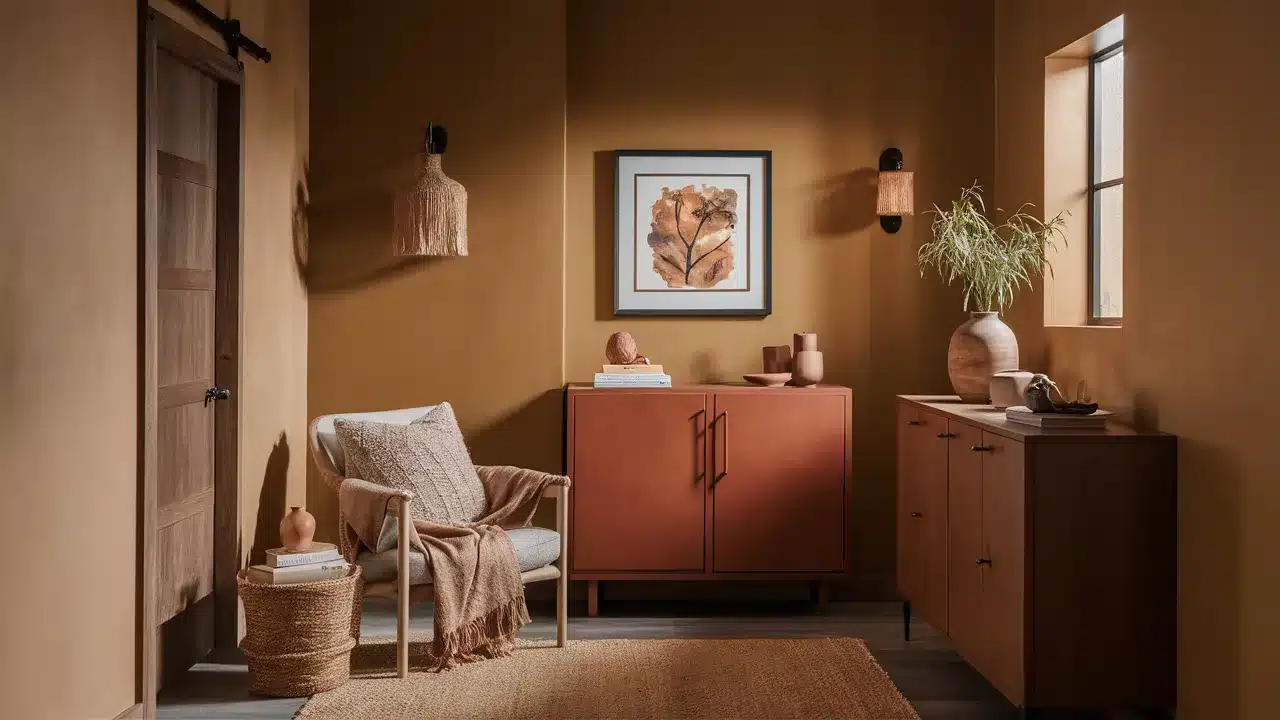
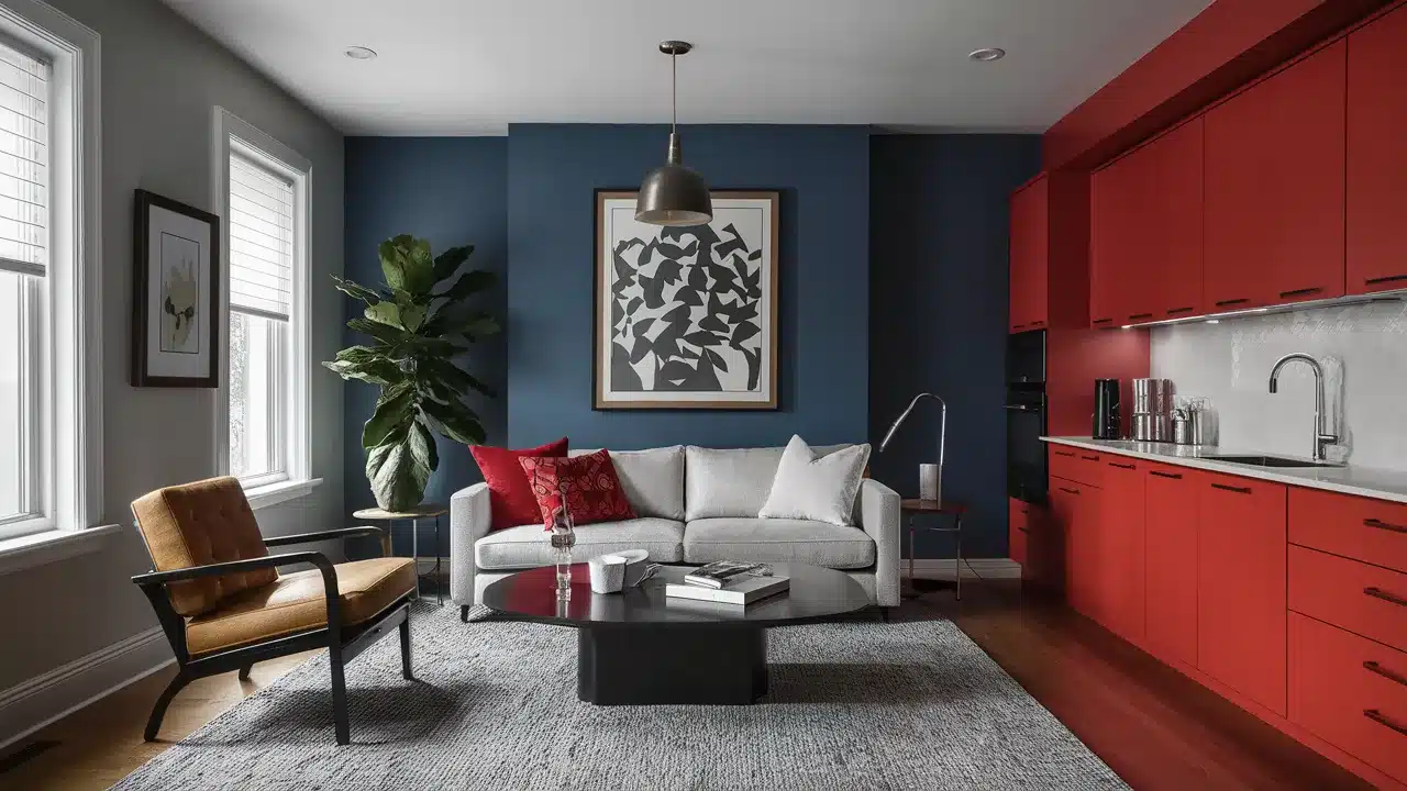
21. Cottage Red
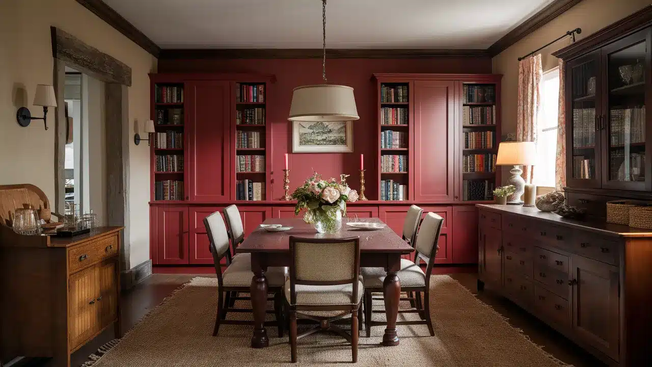
Cottage Red (AF-285) creates a warm, dramatic contrast with Hazy Skies. This combination feels classic and traditional with a touch of country beauty.
Use Cottage Red for accent pieces or a single wall against Hazy Skies. This pairing works beautifully in dining rooms, libraries, or any space where you want to create a cozy, intimate feeling.
22. Abingdon Putty
Abingdon Putty (HC-99) is a deeper, more yellow-toned neutral that creates a warm contrast with Hazy Skies.
This combination feels traditional and established. Use Abingdon Putty for lower cabinets or furniture with Hazy Skies walls.
This pairing complements antiques and traditional architectural details beautifully.
23. Indian River
Indian River (985) is a soft blue-gray that creates a cool, refreshing contrast with Hazy Skies. This combination feels coastal and relaxing.
Try Indian River in bathrooms or bedrooms adjacent to Hazy Skies hallways or living spaces. This pairing creates a sense of retreat and tranquility in private spaces.
24. Shaker Beige
Shaker Beige (HC-45) pulls out the warm undertones in Hazy Skies while adding more depth. This combination creates spaces that feel grounded and timeless.
Use Shaker Beige for an accent wall or built-ins with Hazy Skies as your main wall color. This pairing works wonderfully with traditional furnishings and natural materials.
25. Kingsport Gray
Kingsport Gray (HC-86) is a deep, rich neutral that creates a dramatic contrast with Hazy Skies. This combination adds polish and depth to your space.
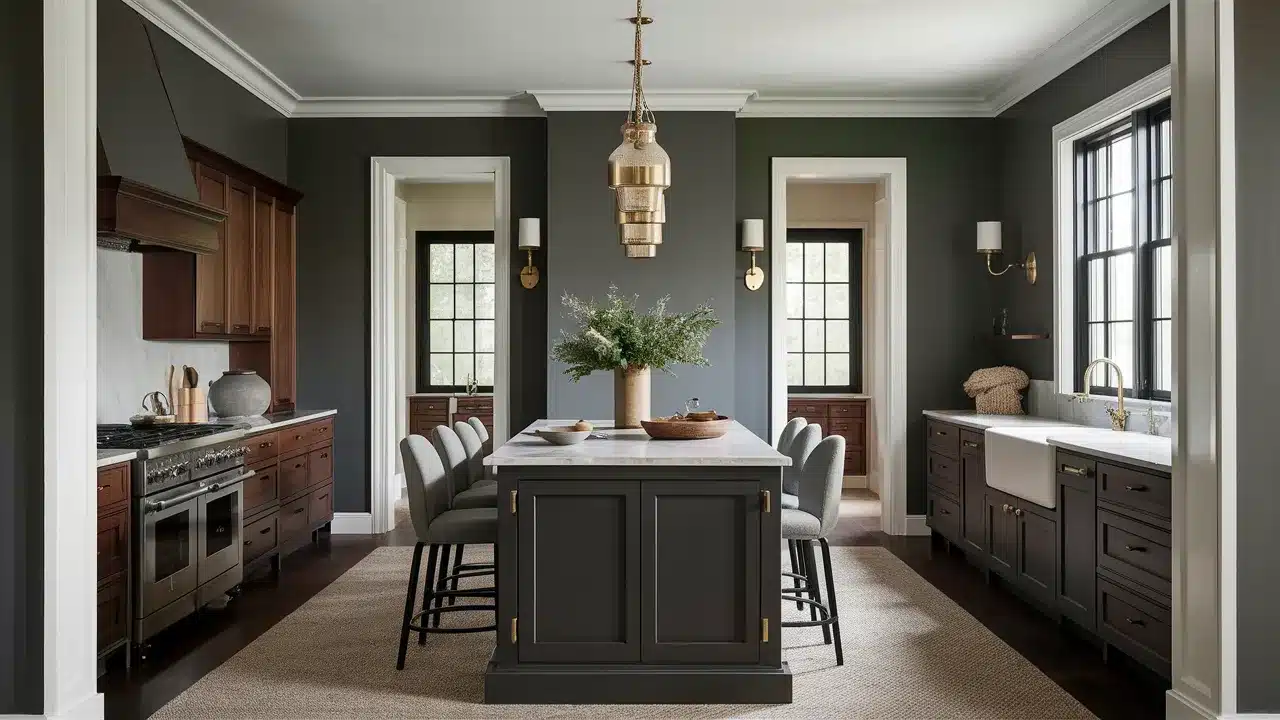
Use Kingsport Gray for an accent wall, furniture pieces, or kitchen island with Hazy Skies walls. This pairing creates focal points and adds architectural interest.
26. Monroe Bisque
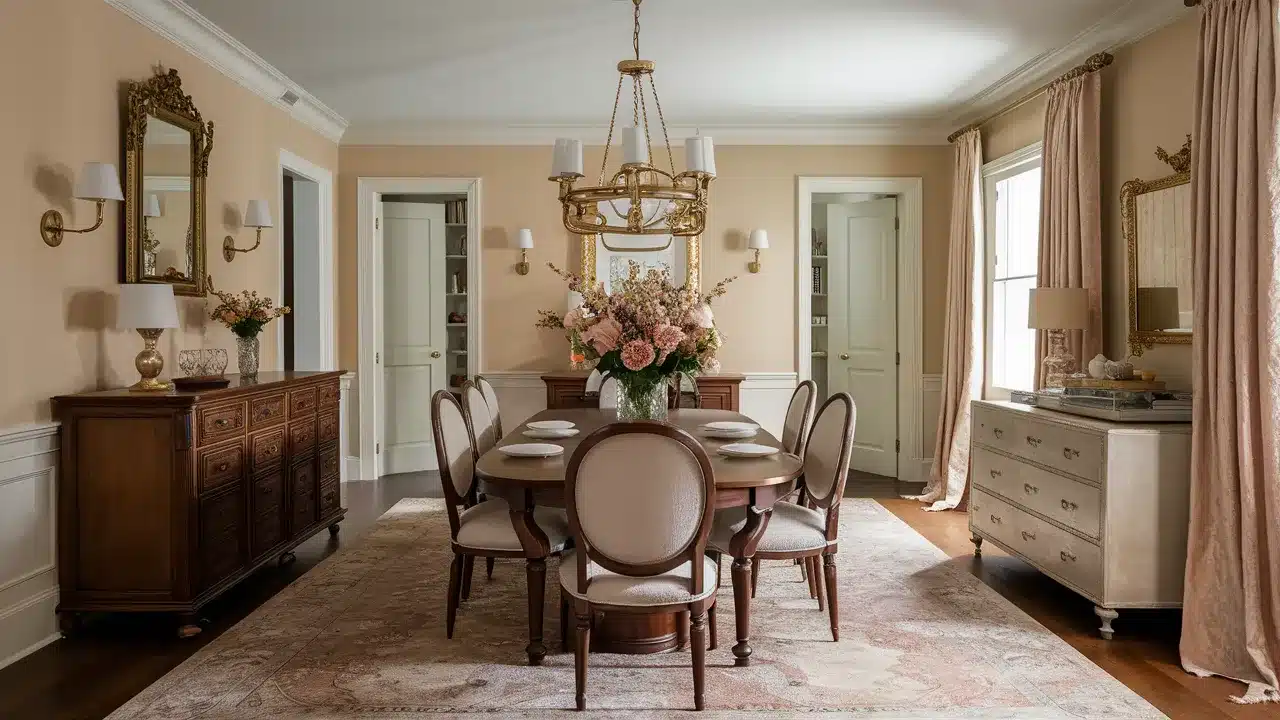
Monroe Bisque (HC-26) is a warm beige with peach undertones that creates a soft, flattering contrast with Hazy Skies.
This combination feels elegant and timeless. Try Monroe Bisque in dining rooms or bedrooms with Hazy Skies in adjacent spaces.
This pairing works beautifully with brass fixtures and rich textiles.
27. Chestertown Buff
Chestertown Buff (HC-9) is a golden beige that creates a warm, sunlit contrast with Hazy Skies. This combination feels traditional and welcoming.
Use Chestertown Buff in south-facing rooms with Hazy Skies in north-facing spaces to balance light throughout your home.
This pairing creates a beautiful flow between rooms with different lighting conditions.
28. Palladian Blue
Palladian Blue (HC-144) is a soft, gray-blue that creates a refreshing contrast with Hazy Skies. This combination feels spa-like and serene.
Try Palladian Blue in bathrooms, bedrooms, or any space where you want to create a peaceful retreat. This pairing works beautifully with white linens and natural textures.
29. Beach Glass
Beach Glass (1564) is a soft blue-green that creates a coastal-inspired contrast with Hazy Skies. This combination feels fresh and relaxing.
Use Beach Glass for furniture pieces, accent walls, or cabinetry with Hazy Skies walls. This pairing brings a touch of the seaside into your space without being theme-y or obvious.
30. Quiet Movements
Quiet Movements (1563) is a misty gray-green that creates a subtle, nature-inspired contrast with Hazy Skies. This combination feels balanced and peaceful.
Try Quiet Moments in bedrooms or reading nooks with Hazy Skies in adjacent spaces. This pairing creates a gentle transition between rooms while maintaining a serene atmosphere.
31. Woodlawn Blue
Woodlawn Blue (HC-147) is a soft, historical blue that creates a beautiful contrast with Hazy Skies. This combination feels traditional yet fresh.
Use Woodlawn Blue for bedrooms or powder rooms with Hazy Skies in connecting spaces.
This pairing works wonderfully in homes with traditional architecture and in rooms with plenty of natural light.
32. Silver Marlin
Silver Marlin (2139-50) is a blue-gray with green undertones that creates a cool, wordly contrast with Hazy Skies.
This combination feels contemporary and elegant. Try Silver Marlin in home offices or dining rooms with Hazy Skies in adjacent spaces.
This pairing creates distinct room identities while maintaining a cohesive whole-house palette.
33. Wythe Blue

Wythe Blue (HC-143) is a medium blue-green that creates a refreshing, historical contrast with Hazy Skies.
This combination feels timeless yet current. Use Wythe Blue for furniture pieces, accent walls, or cabinetry against Hazy Skies walls.
This pairing brings color into your space in a way that feels intentional and wordly.
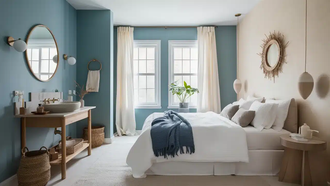
34. Healing Aloe
Healing Aloe (1562) is a pale mint green that creates a spa-like contrast with Hazy Skies. This combination feels fresh and rejuvenating.
Try Healing Aloe in bathrooms or bedrooms with Hazy Skies in adjacent spaces. This pairing creates a sense of wellness and tranquility in private spaces.
35. Smoke
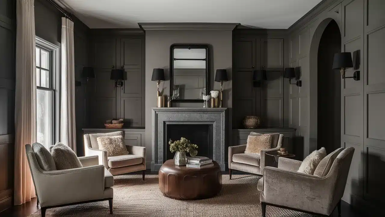
Smoke (2122-40) is a deep blue-gray that creates a dramatic, moody contrast with Hazy Skies. This combination adds depth and polish to your space.
Use Smoke for an accent wall, built-ins, or furniture pieces against Hazy Skies walls. This pairing creates focal points and adds architectural interest to simple spaces.
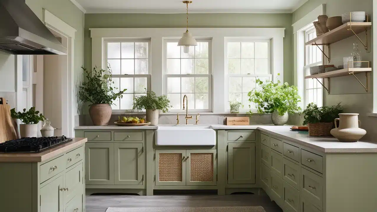
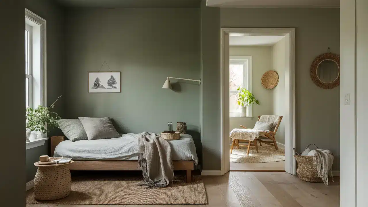
36. Hollingsworth Green
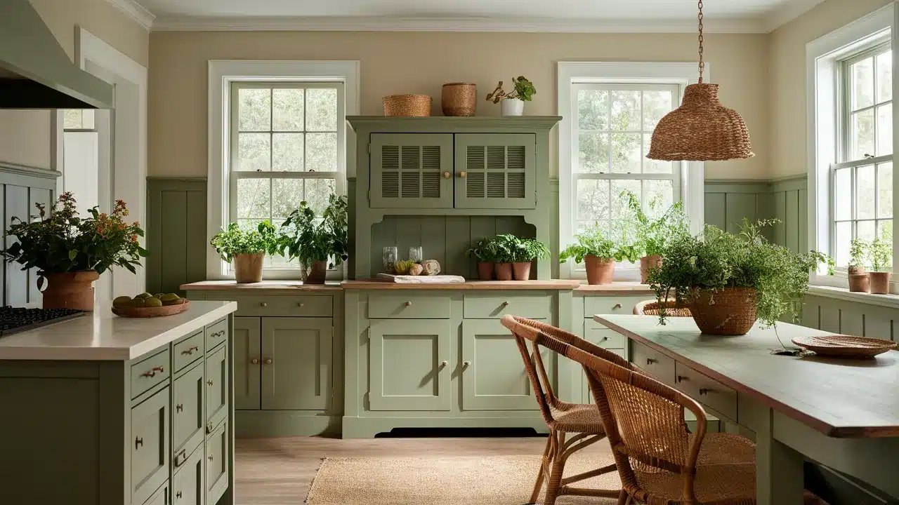
Hollingsworth Green (HC-141) is a historical sage green that creates a natural, organic contrast with Hazy Skies. This combination feels timeless and connected to the outdoors.
Try Hollingsworth Green for cabinetry or furniture with Hazy Skies walls. This pairing works beautifully in kitchens, dining rooms, and spaces with garden views.
37. Coventry Gray
Coventry Gray (HC-169) is a true medium gray that creates a clean, contemporary contrast with Hazy Skies. This combination feels modern and wordly.
Use Coventry Gray for an accent wall or in adjacent spaces to Hazy Skies. This pairing works well in homes with a transitional style that blends traditional and contemporary elements.
38. Boothbay Gray
Boothbay Gray (HC-165) is a blue-green gray that creates a coastal-inspired contrast with Hazy Skies. This combination feels relaxed and inviting.
Try Boothbay Gray in living spaces or bedrooms with Hazy Skies in connecting areas. This pairing creates a sense of retreat and connection to nature without being overly theme-y.
39. Nimbus Gray
Nimbus Gray (2131-50) is a deeper cool gray that creates a wordly contrast with Hazy Skies. This combination feels urban and contemporary.
Use Nimbus Gray for accent walls, furniture pieces, or cabinetry with Hazy Skies walls. This pairing adds depth and architectural interest to modern spaces.
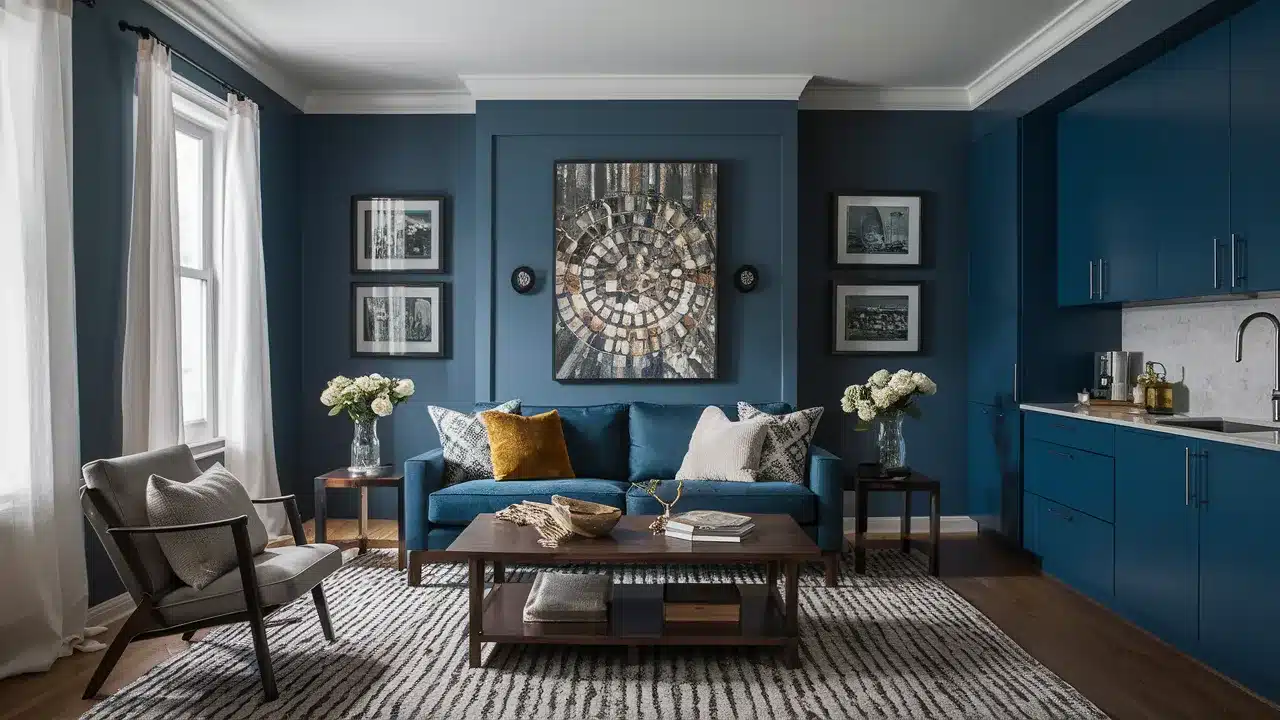
40. Hale Navy
Hale Navy (HC-154) is a deep, rich navy that creates a dramatic, classic contrast with Hazy Skies. This combination feels timeless and wordly.
Try Hale Navy for kitchen islands, built-ins, or accent walls with Hazy Skies as your main color. This pairing creates striking focal points that anchor your space.
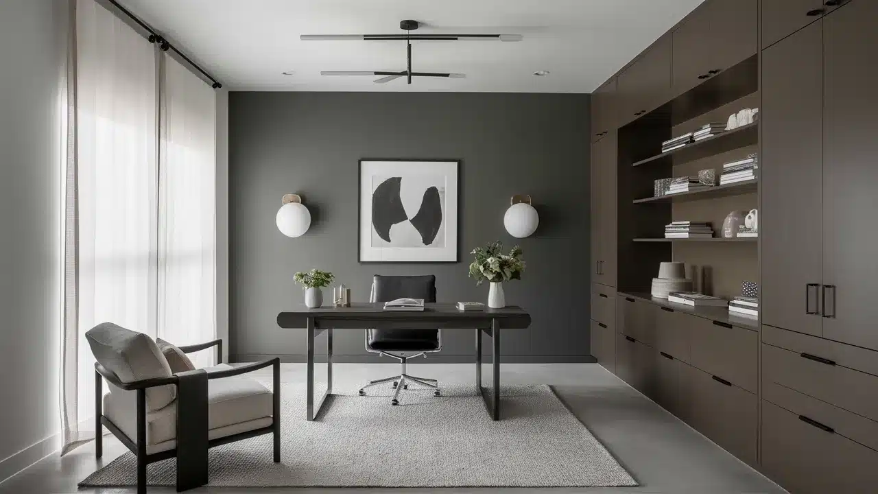
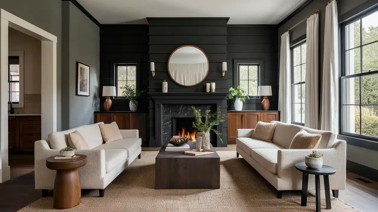
41. Wrought Iron
Wrought Iron (2124-10) is a soft black with undertones of brown and gray that creates a dramatic contrast with Hazy Skies. This combination feels modern and edgy while remaining livable.
Use Wrought Iron for doors, window frames, or furniture against Hazy Skies walls. This pairing creates architectural definition and visual interest.
42. Onyx
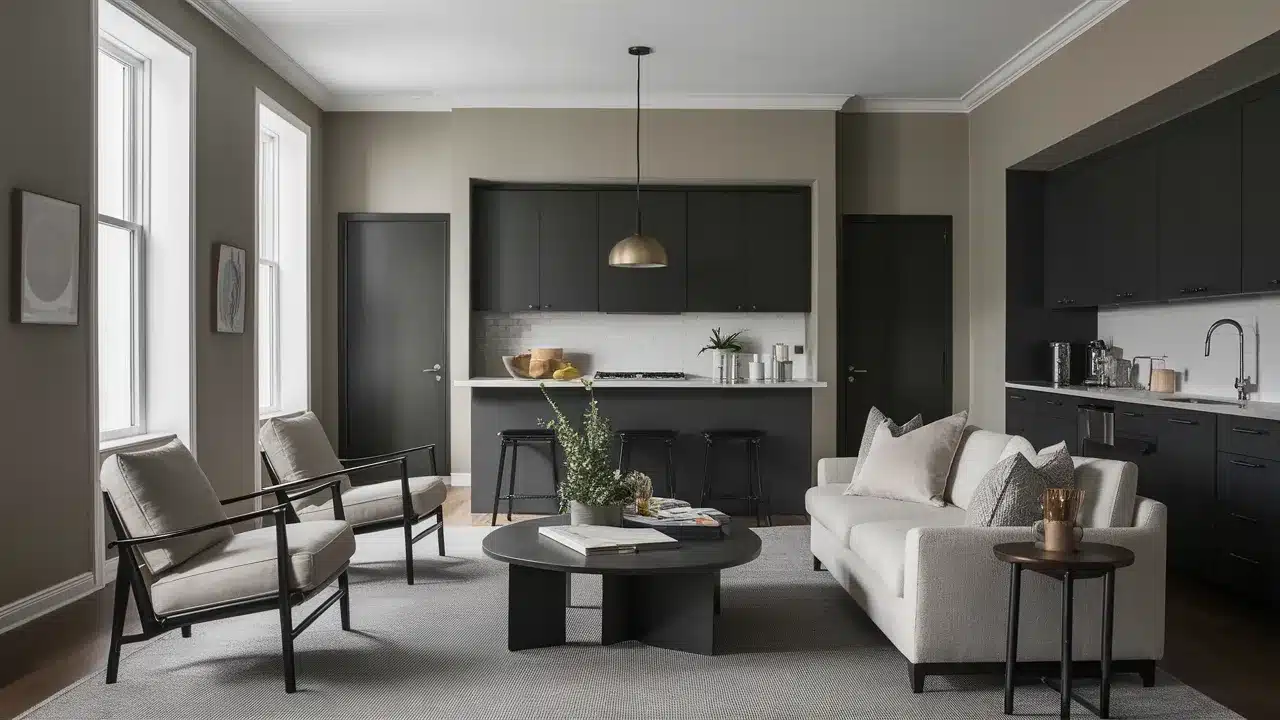
Onyx (2133-10) is a deep black that creates a bold, high-contrast look with Hazy Skies. This combination feels contemporary and striking.
Try Onyx for hardware, lighting fixtures, or small furniture pieces against Hazy Skies walls. This pairing creates definition and drama without overwhelming your space.
43. Caliente
Caliente (AF-290) is a vibrant red that creates an energetic contrast with Hazy Skies. This combination brings warmth and excitement to your space.
Use Caliente sparingly as an accent color against Hazy Skies walls. This pairing works beautifully in dining rooms, living spaces, or anywhere you want to create a focal point.
44. Hunter Green
Hunter Green (2041-10) is a deep, classic green that creates a traditional, library-like contrast with Hazy Skies. This combination feels established and timeless.
Try Hunter Green for built-ins, furniture pieces, or an accent wall with Hazy Skies as your main wall color. This pairing works wonderfully in home offices, dens, and traditional spaces.
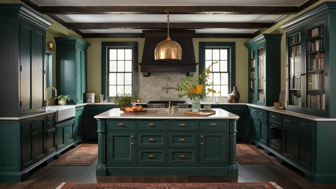
45. Black Forest Green
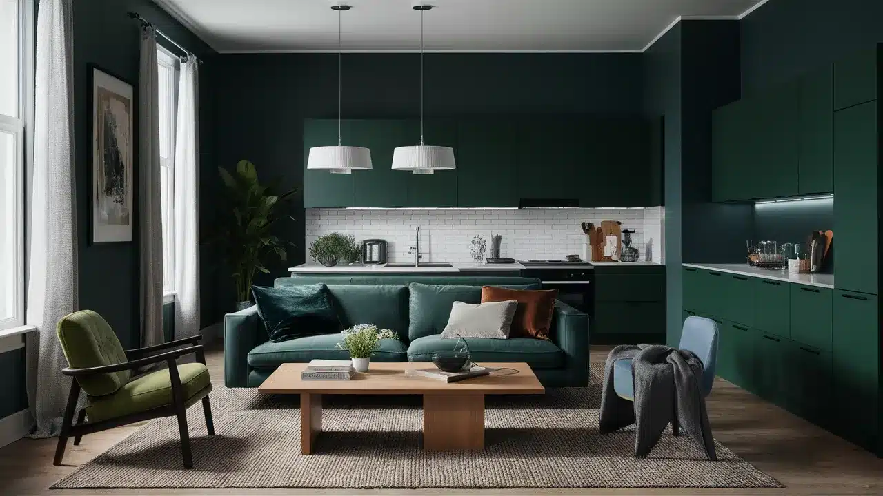
Black Forest Green (2047-10) is a deep, mysterious green that creates a dramatic contrast with Hazy Skies.
This combination feels rich and natural. Use Black Forest Green for cabinetry, islands, or accent furniture against Hazy Skies walls.
This pairing adds depth and polish to kitchens and living spaces.
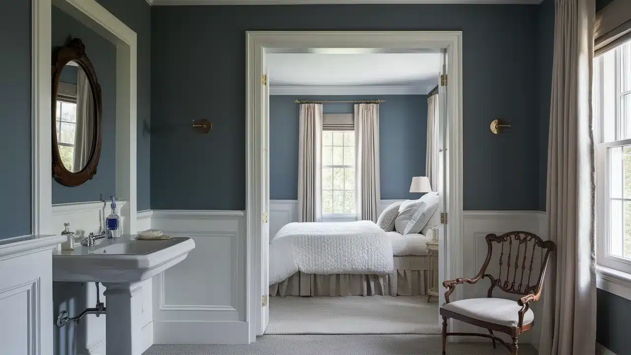
46. Deep River
Deep River (1582) is a moody blue-gray that creates a wordly contrast with Hazy Skies. This combination feels current and elegant.
Try Deep River for an accent wall or built-ins with Hazy Skies as your main wall color. This pairing creates dimension and visual interest without feeling busy or chaotic.
47. Newburyport Blue
Newburyport Blue (HC-155) is a historical medium blue that creates a classic contrast with Hazy Skies. This combination feels timeless yet fresh.
Use Newburyport Blue for furniture pieces, cabinetry, or accent walls against Hazy Skies walls. This pairing works beautifully in traditional homes and spaces with good natural light.
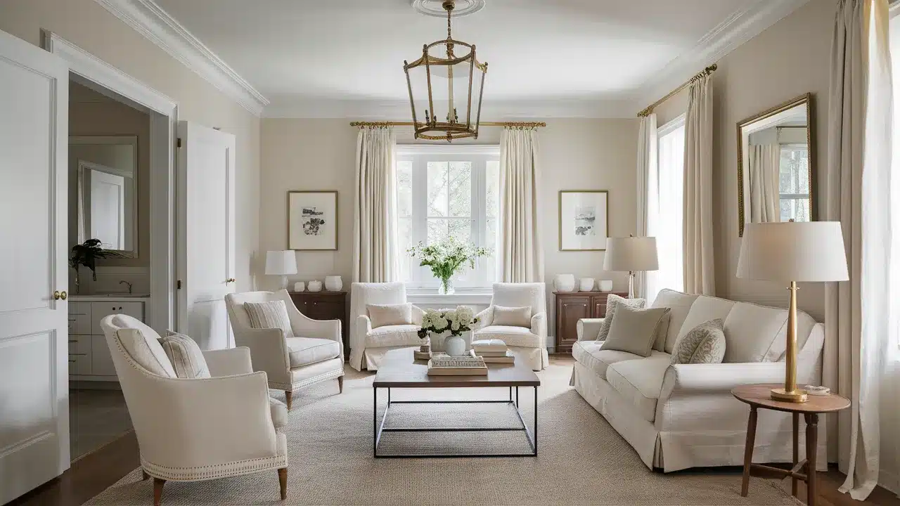
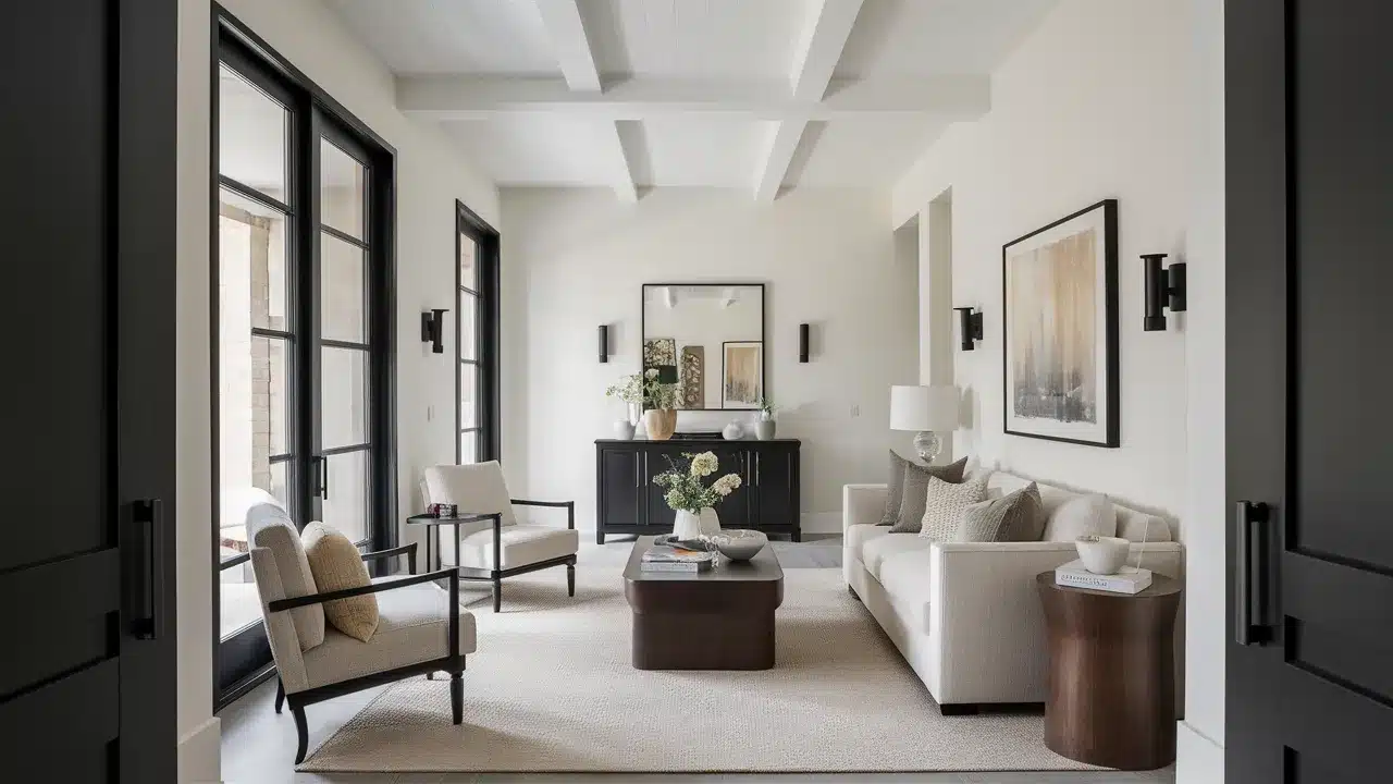
48. Simply White
Simply White (OC-117) is a clean, bright white that creates a fresh contrast with Hazy Skies. This combination feels modern and crisp.
Try Simply White for trim, ceilings, and millwork with Hazy Skies walls. This pairing highlights architectural details and creates a bright, airy feeling in any space.
49. Kendall Charcoal
Kendall Charcoal (HC-166) is a deep, rich gray that creates a dramatic contrast with Hazy Skies. This combination feels wordly and grounding.
Use Kendall Charcoal for accent walls, furniture pieces, or exterior trim with Hazy Skies as your main color. This pairing adds architectural interest and depth to your space.
50. Essex Green
Essex Green (HC-188) is a deep, historic green that creates a traditional contrast with Hazy Skies. This combination feels timeless and established.
Try Essex Green for built-ins, kitchen islands, or furniture pieces against Hazy Skies walls. This pairing works beautifully in spaces with traditional architecture and natural materials.
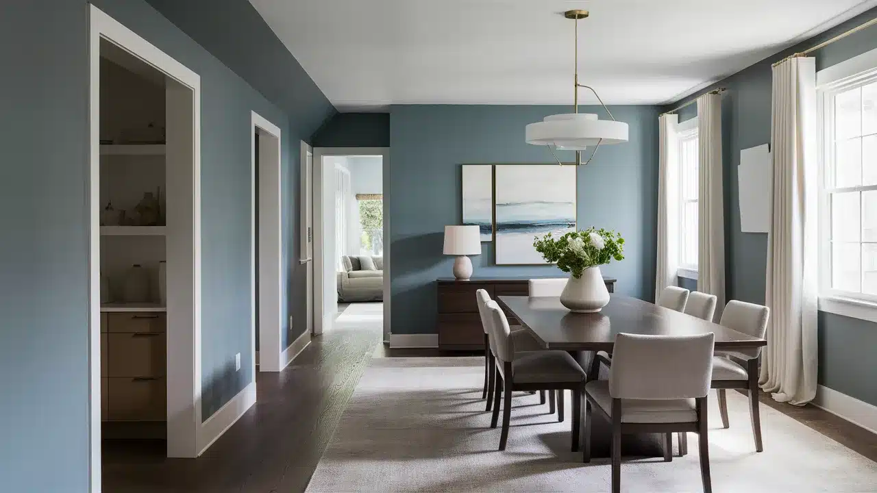
51. Stormy Sky
Stormy Sky (1616) is a deep blue-gray that creates a moody, dramatic contrast with Hazy Skies. This combination adds depth and worldliness to your space.
Try Stormy Sky for accent walls, furniture pieces, or cabinetry with Hazy Skies walls. This pairing creates focal points and adds architectural interest to simple spaces.
52. Black Satin
Black Satin (2131-10) is a soft black with subtle warmth that creates a dramatic contrast with Hazy Skies. This combination feels modern and wordly.
Use Black Satin for interior doors, window frames, or furniture against Hazy Skies walls. This pairing creates architectural definition and visual interest without feeling harsh.
How to Use These Colors in Your Home
Now that you’ve seen the beautiful colors that pair with Hazy Skies, let’s talk about how to use them. Designing with these combinations is easier than you might think.
1. Start with a plan. Decide which rooms will feature Hazy Skies and which will showcase companion colors.
For a cohesive look, use Hazy Skies in main living areas and transition to other colors in bedrooms or bathrooms.
2. Consider the 60-30-10 rule. Use your main color (often Hazy Skies) for about 60% of the space.
Add a secondary color through furnishings or accent walls for about 30%. Then, incorporate a third accent color through accessories and small details for the remaining 10%.
3. Test before committing. Paint large sample boards that you can move around the room at different times of day. The way these colors interact changes dramatically with lighting conditions.
4. Create flow between spaces. In open floor plans, use Hazy Skies as a unifying element while introducing companion colors in defined areas.
This creates both cohesion and interest throughout your home.
5. Don’t forget about finishes. The same colors can look different in flat, eggshell, satin, or semigloss. Generally, walls look best in flat or eggshell, while trim looks best in satin or semigloss.
Conclusion
Benjamin Moore’s Hazy Skies is one of the most flexible paint colors you can choose.
Its soft beige tone works with many other colors. It can look cool in one room and warm in another, depending on the light. That’s part of what makes it so useful.
It pairs well with crisp whites, deep blues, soft greens, and even warm browns. No matter your style, there’s likely a color that will match Hazy Skies and make your space feel complete.
Before you settle on your final picks, be sure to test paint samples at home. The paint looks different in every room.
Things like natural light, shadows, and even the direction your windows face can change how a color feels.
Try painting a few sample boards. Move them around your space during the day. Look at them in both daylight and evening light. That’s the best way to know for sure what will work.
If you’re still unsure or feeling stuck, don’t be afraid to ask for help. A color expert can give you helpful advice and save you time and stress.
They’ll look at your space, your lighting, and your goals—and help you pull it all together.
Have you used Hazy Skies before? What colors did you pair it with? Did you find a favorite combo?
Feel free to share in the comments. I’d love to hear what worked for you, and your tips might help someone else make their space feel just right.