
Can’t decide between Pale Oak and Revere Pewter? I’ve got you covered. In this guide, I’ll help you choose the perfect color for your walls.
I’ll walk you through:
- What each color really looks like
- The main differences between them
- Which rooms they work best in
- Common mistakes to avoid
As a home decorator who’s used both colors in different spaces, I understand your struggle. The wrong paint choice can be costly and frustrating, while the right one can transform your home.
I’ve spent countless hours testing these paints in various lighting conditions and room types. You won’t need to make the same mistakes I did.
By the end of this article, you’ll know exactly which color suits your space, style, and lighting situation – no more guesswork.
What Is Pale Oak?

Pale Oak is a soft, light neutral with warm gray and beige tones. It’s part of Benjamin Moore’s popular neutral line.
When I first used Pale Oak in my guest room, I noticed how it shifts throughout the day. In morning light, it looks more beige, while evening light brings out its gray side.
Its light reflectance value (LRV) is around 68.64, making it a fairly bright option that nicely bounces light around a room.
What makes Pale Oak special is its subtle warmth without being yellow. It’s a clean neutral that works as a background color for almost any design style.
What Is Revere Pewter?

Revere Pewter is a classic greige (gray + beige) that’s been a top seller for Benjamin Moore for years. It’s deeper and more saturated than Pale Oak.
I painted my living room with Revere Pewter five years ago, and it still looks current. That’s because it has a timeless quality that doesn’t chase trends.
With an LRV of about 55.05, it absorbs more light than Pale Oak, creating a cozier feel in a space.
The color has strong gray tones but stays warm thanks to its beige base. It’s rich without being dark and adds substance to walls without feeling heavy.
How They’re Different?
Let me break down the main differences between these two popular paint colors:
| Feature | Pale Oak | Revere Pewter |
|---|---|---|
| Color Family | Warm neutral with beige-gray mix | Greige (stronger gray influence) |
| LRV (Light Reflectance Value) | ~68.64 (lighter) | ~55.05 (medium) |
| Depth | Light and airy | More body and weight |
| Mood | Soft and quiet | Grounded and substantial |
| Room Size Effect | Makes rooms feel larger | Adds coziness |
| Color Pairings | Works best with pastels and light colors | Pairs well with deeper, richer colors |
| Prominence | Acts as a neutral backdrop | Makes more of a statement |
| Undertones | Subtle pink/violet undertones | Green undertones |
When I tested both in my home, I found that Revere Pewter creates more definition in a space, while Pale Oak blends more seamlessly with surroundings.
What Rooms They Work Best In?
Pale Oak shines in:
- Bedrooms where you want a calm, peaceful vibe
- Small spaces that need to feel bigger
- North-facing rooms that need warming up
- Bathrooms where you want a clean, bright look
- Home offices that need a fresh but not distracting background
Revere Pewter works better in:
- Living rooms that need substance
- Dining rooms where a cozy feeling helps
- South-facing rooms with lots of natural light
- Open floor plans where you want definition
- Hallways and transition spaces
I used Pale Oak in my master bedroom and Revere Pewter in my family room. The bedroom feels airy and peaceful, while the family room feels welcoming and grounded.
Light Matters — Here’s How
Your lighting changes everything about how these colors look.
In my north-facing office, Pale Oak looks more gray and can feel a bit flat without enough lamps. But in my south-facing kitchen, it warms up beautifully.
Revere Pewter can look almost taupe in strong southern light. In my west-facing dining room, it shifts dramatically from cool in the morning to quite warm in evening light.
Consider these lighting factors:
- Natural light direction (north, south, east, west)
- How many windows you have
- Your lightbulb color temperature (warm vs. cool)
- Time of day you use the room most
I always test paint in different spots and check at other times of day before deciding.
Paint Undertones: Don’t Skip This
Undertones can make or break your color choice.
Pale Oak has subtle pink/violet undertones that aren’t obvious until you pair it with pure white. This can make it feel soft and sophisticated but might clash with yellow-toned furnishings.
Revere Pewter has green undertones that come out when paired with true grays. This gives it depth but might not work with blue-toned fabrics.
I learned this the hard way when my “perfect” gray clashed with my sofa. Don’t skip testing undertones by:
- Comparing the paint to a white sheet of paper
- Looking at it next to your flooring and large furniture
- Check how it looks with your existing trim color
Your Home’s Style Plays a Role
Your home’s overall style should guide your choice.
Pale Oak works better in:
- Modern spaces
- Minimalist designs
- Scandinavian-inspired homes
- Places with lots of white trim and accents
Revere Pewter feels right in:
- Traditional homes
- Farmhouse or rustic spaces
- Transitional designs
- Rooms with wood tones and natural elements
My craftsman-style home looks better with Revere Pewter in the main areas, while my more modern bedroom suite works with Pale Oak.
How to Test Both Before You Decide?
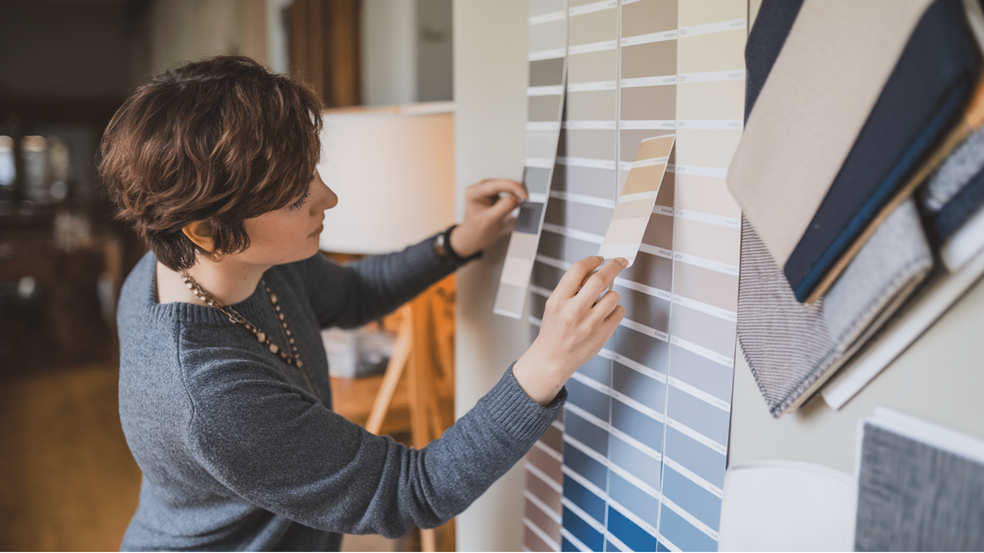
Never skip testing! I’ve made this mistake and regretted it. Let’s see my testing method:
- Buy sample pots of both colors
- Paint 2’x2′ squares on multiple walls
- Look at them during morning, afternoon, and evening
- Place fabric swatches from your furniture near the samples
- Take photos to see how they look in pictures
I also recommend getting peel-and-stick paint samples. I used them last time and could move them around to different walls, which was super helpful.
What People Often Regret?
From my experience and talking with friends, here are common regrets:
With Pale Oak:
- It can look too light and washed out in very bright rooms
- Sometimes appears too beige when paired with cool white trim
- May not provide enough contrast with white cabinets or furniture
With Revere Pewter:
- Can feel too dark in rooms with limited natural light
- Sometimes looks muddy in north-facing rooms
- Might feel too traditional in very modern spaces
I regretted using Pale Oak in my powder room because it didn’t provide enough definition in the small space.
Which One Should You Go With?
Here’s a simple guide to help you decide:
Choose Pale Oak if:
- You want a lighter, airier feel
- Your space gets limited natural light
- You have smaller rooms
- Your style leans toward modern or minimalist
- You want a quiet backdrop
Choose Revere Pewter if:
- You want more definition and substance
- Your rooms get good natural light
- You have larger spaces
- Your style is traditional or transitional
- You want a color with more presence
I ended up using both in different rooms in my home, and that might be your best solution, too!
Conclusion
Choosing between Pale Oak and Revere Pewter doesn’t have to be stressful. They’re both excellent neutrals with different strengths.
For light, bright, and airy spaces, Pale Oak is your friend. It works wonders in smaller rooms, bedrooms, and modern homes with lots of white.
When you want more definition and warmth, Revere Pewter delivers. It shines in living areas, traditionally styled homes, and spaces with good natural light.
The most important step is to test in your actual space. Paint samples on different walls and check them throughout the day.
Trust your eyes and your gut feeling. The right color will feel “right” when you see it in your home.
I’ve found that many homeowners (myself included) end up using both colors in different areas. This strategy might work perfectly for you too!
Frequently Asked Questions
Do Pale Oak and Revere Pewter Work with Colored Trim?
They both pair best with white or off-white trim for a clean look. If you have colored trim, Revere Pewter is more flexible and can handle the contrast better.
Will These Colors Still Be in Style in Five Years?
Both are considered “forever neutrals” that transcend trends. They’ve been popular for over a decade and work with most design styles, making them solid long-term investments.
How Do These Colors Photograph in Real Estate Listings?
Pale Oak photographs beautifully and makes spaces look larger in photos. Revere Pewter adds warmth and definition but can sometimes appear darker in pictures than in real life.
Can These Colors Work in Basement Spaces?
Pale Oak is usually better for basements with limited natural light. Revere Pewter can work if you have good artificial lighting, but it might feel too heavy otherwise.
What’s the Biggest Mistake People Make with These Colors?
Not testing them in their actual space first. Many people choose based on photos online, but both colors change dramatically depending on your specific lighting conditions and surrounding elements.