 by Farrow & Ball")
After months of staring at my living room walls, I finally decided to repaint them. The walls were plain white, and I wanted something with more character.
I picked Pigeon (no.25) because it looked like a soft, muted green-gray in the catalog.
When I brought home the sample pot, I worried it might turn out too dark or too green for my small space. The paint cost more than I usually spend, which added to my concern.
In this blog, I’ll tell you exactly how Pigeon looks in different lights, how it pairs with my furniture, and if it’s worth the price tag.
You’ll find out if this color works for your space before spending your money. I’ve tested it for three months now, so you can trust this isn’t just a first impression.
Looking for the perfect gray-green? Let’s see if Pigeon is your answer.
A Closer Look at Farrow & Ball’s Pigeon Undertones
Pigeon by Farrow & Ball isn’t just one flat color – it’s a mix of three tones that show up differently depending on the light.
At its base, it’s a soft gray. It’s not a cold or harsh gray, but more of a comfortable, lived-in shade.
When the sunlight hits it, you’ll notice a green tone underneath. It’s not a bright green – more like the muted color you’d see on the back of an olive leaf.
There’s also a bit of blue in it, which tends to come out more on cloudy days. That small hint of blue keeps the color from looking too warm or muddy.
These shifts matter because they make Pigeon look different from room to room. In my north-facing study, it leans toward blue-gray and feels cool and calm.
In my west-facing kitchen, the afternoon sun brings out the green and makes the space feel natural and grounded.
The biggest surprise comes in the evening. When the lights are on, Pigeon looks softer and more relaxed. It doesn’t feel flat or dull, it keeps changing, which makes it more interesting to live with
Is Pigeon by Farrow & Ball Warm or Cool?
Pigeon sits right on the fence between warm and cool, which confused me at first.
It’s not clearly one or the other; it’s both, depending on what’s around it. In my office with oak furniture, Pigeon pulls warmer than I expected.
The green tones play nicely with the wood, creating a cozy feel that makes me want to stay and work.
This shade doesn’t lean so cool that it feels cold, nor so warm that it turns muddy or beige. My navy blue couch looks richer against these walls. The brass lamps shine brighter.
When I placed a cream rug down, the walls instantly looked greener and warmer above it. If you have lots of warm elements (leather, brass, gold), Pigeon will act as a cool counterbalance.
With cool items (silver, glass, white), it warms things up just enough to feel welcoming.
Best Places to Use Pigeon by Farrow & Ball
Pigeon by Farrow & Ball is a soft gray-green with a warm, calming feel. It works great in many parts of the home because it changes with the light and feels cozy without being too dark. Here are some of the best places to try it.
- Living Room Walls: Pigeon creates a calm, welcoming vibe in the living room. It pairs well with warm wood floors, cream fabrics, and brass accents. It’s perfect if you want a space that feels peaceful but not boring.
- Kitchen Cabinets: Using Pigeon on kitchen cabinets gives your kitchen a vintage look without going over the top. It works especially well with marble countertops, subway tiles, or natural wood shelves.
- Hallways and Entryways: These spots often get forgotten, but Pigeon adds interest and depth here. In natural light, it looks greener. In dimmer areas, it feels more gray. It’s a great choice for transitional spaces.
- Bathrooms: Pigeon gives bathrooms a spa-like feel. Try it with white tiles, black fixtures, or aged brass. It’s especially nice for vintage or farmhouse-style bathrooms.
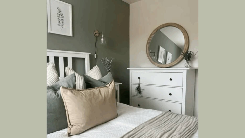
- Bedrooms: For a cozy and relaxed bedroom, paint the walls in Pigeon. It works beautifully with soft whites, dusty pinks, and linen bedding. You can also use it just behind the bed as an accent wall.
- Home Office: This color helps create a quiet, focused space. Add natural wood furniture and soft lighting, and you’ve got a perfect setup for reading or working from home.
- Exteriors: Yes, you can even use Pigeon outside. It works well on doors, shutters, and garden furniture. Against greenery or brick, the color stands out just enough.
Pigeon looks different in every room depending on the light, so test it first with a sample. You might be surprised how warm and versatile it feels once it’s on the wall.
Pigeon No.25 vs Other Farrow & Ball Colors
I chose Pigeon because it has more depth than plain gray but isn’t as strong as some other colors. The other options are nice, but they don’t work as well with different lighting and decor styles.
| Color | What It Looks Like | When I’d Use It | Why You Might Like It |
|---|---|---|---|
| Pigeon No.25 | A balanced gray-green with blue hints | I chose this for my living room for its calm but not boring feel | Perfect if you want a color that works with both warm and cool items |
| French Gray | Warmer gray with brown undertones | I’d pick this for a dining room, it looks good in candlelight | Better for you if you have lots of wood and want a cozier look |
| Mizzle | Lighter gray-green that feels misty | I tested this in my bathroom, but found it too pale | Good choice if Pigeon seems too dark or you have a small space |
| Cromarty | Blue-green that leans more blue | I almost used this, but it felt too cool with my furniture | Works well if you have warmer light or want a slightly more modern feel |
| Lamp Room Gray | True gray with slight purple hints | I tried this in my hall but switched to Pigeon for more color | Choose this if you want neutral but not boring white walls |
| Treron | Darker, more olive-toned green | Too dark for my rooms, but lovely on a small accent wall | Great if you want something with more color punch than Pigeon |
Conclusion
After living with Pigeon for six months, I’m happy with my choice. It’s not perfect; no color is, but it exceeded my expectations for creating a calm, interesting space.
Would I use it again? Yes, but not in every room.
It shines in spaces with good natural light and works best with mixed furniture styles. I’d skip it for very small, dark rooms where it might feel too heavy.
For those spaces, try its lighter shade, Mizzle. My suggestion to you is to buy a sample pot first.
Paint a large piece of poster board and move it around your room at different times of day. What looks good at noon might not feel right in the evening.
Your lighting, furniture, and even the sky outside your windows will change how Pigeon looks in your home.
In the end, this color will give you what you want: walls with depth and character without taking over the room.