When I first heard of Pale Oak, I thought it was a Sherwin-Williams color. Turns out, it’s from Benjamin Moore.
If you’re here trying to figure out what Pale Oak looks like, how it feels in a room, or if you can find something close in Sherwin-Williams, you’re in the right place. I’ve been through this same rabbit hole.
In this article, I’ll talk about what Pale Oak is really like, how it compares to Swiss Coffee, and what you can use from Sherwin-Williams that looks close enough.
I’ll also show you how it plays out in real rooms, what finishes matter, and which colors pair well.
You’ll learn about undertones, lighting, how it changes through the day, and why it’s still popular this year, too.
If you’re stuck picking a neutral paint color, this might be what helps you move forward.
What Kind of Color Is Benjamin Moore’s Pale Oak?

Benjamin Moore’s Pale Oak is a soft, warm neutral that sits between beige and greige (gray-beige).
It has subtle pink and purple undertones, which give it a gentle warmth without looking yellow or too cool.
Its Light Reflectance Value (LRV) is 69, meaning it reflects a fair amount of light and can brighten up a space, especially in rooms with natural sunlight.
In bright light, it can appear more off-white, while in darker rooms, the taupe and mauve undertones may become more noticeable.
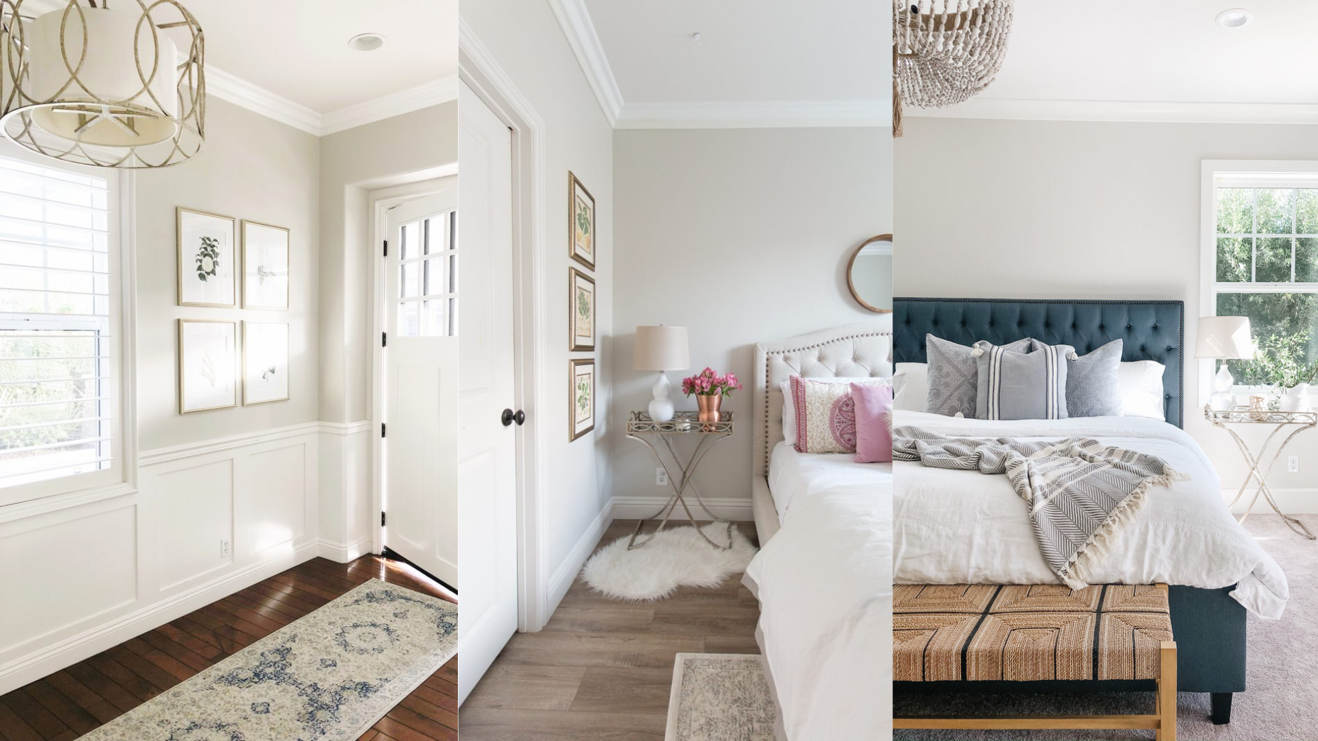
Pale Oak works beautifully as a wall color in living rooms, bedrooms, or hallways where you want a soft, calming backdrop.
It pairs well with whites, muted blues, and natural wood tones for a cozy and timeless look.
Pale Oak vs Swiss Coffee

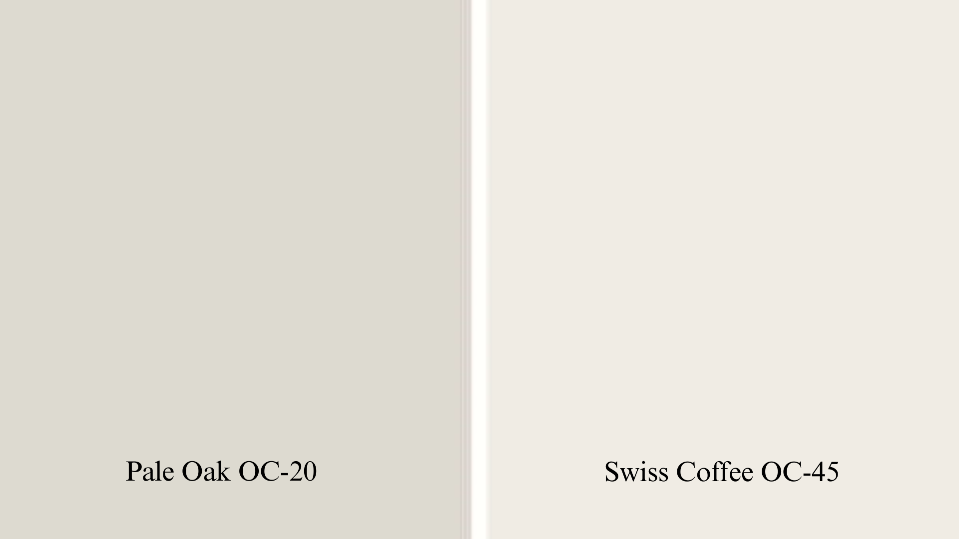
I tested both of these on my hallway wall. At first glance, they’re both light and neutral. But the longer you stare, the more different they become.
Swiss Coffee is warmer, creamier, and has more yellow in it. Pale Oak feels more muted and earthy. It’s subtle, where Swiss Coffee is soft but a bit louder.
| Feature | Pale Oak (Benjamin Moore) | Swiss Coffee (Benjamin Moore/Behr) |
|---|---|---|
| Tone | Soft, calming greige | Warm, cozy off-white |
| Undertones | Taupe with pink/violet hints | Yellow-beige with golden warmth |
| Light Reflectance (LRV) | ~69.89 | ~83–85 (varies by brand) |
| Vibe | Neutral, muted, understated | Creamy, slightly bold in brighter rooms |
| Best for | Modern, transitional, Scandinavian spaces | Farmhouse, cottage, cozy interiors |
| Works well with | Cool or warm accents, light oak, black/brass hardware | Warmer palettes, gold fixtures, creamy trims |
| Lighting behavior | Shifts from grayish to warm depending on light | Stays consistently warm, may read yellow in sunlight |
| Best in homes with | Mixed or indirect natural light | Lots of natural light |
Pale Oak fits better if you want something neutral and quiet. Swiss Coffee stands out more, especially on trim or in brighter rooms.
I ended up going with Pale Oak in a guest room because I didn’t want anything that would cast too yellow or feel overly creamy. It kept the space soft and neutral.
Where Does Pale Oak Work Best?

Benjamin Moore’s Pale Oak is incredibly versatile and works well in many spaces thanks to its soft, warm undertones and neutral base.
1. Living Rooms
Pale Oak is a beautiful choice for living rooms, offering just the right amount of warmth and softness. It creates a welcoming atmosphere without feeling dark or heavy.
This color works especially well with natural elements like wood beams, linen curtains, and cozy textiles.
If your living room gets lots of natural light, Pale Oak may appear lighter and more neutral, almost like an off-white with character. In lower light, it takes on a more grounded, warm feel.
2. Bedrooms
For bedrooms, Pale Oak provides a calming, serene backdrop that promotes relaxation. It’s not stark like white, but also not bold like deeper grays or beiges. Instead, it offers a soft wash of color that feels cozy yet clean.
Because of its warm undertones, it pairs beautifully with soft bedding, upholstered headboards, and light wood accents.
Whether your style is modern farmhouse, transitional, or classic, Pale Oak can anchor the room without overpowering it.
3. Hallways and Entryways
Hallways and entry spaces can often feel cramped or dark, but Pale Oak helps solve that. With an LRV of 69, it reflects a good amount of light, making narrow or shadowy areas feel more open and bright.
It’s an excellent neutral for connecting different parts of your home while maintaining a consistent color flow. In spaces with minimal natural light, Pale Oak won’t turn too gray or muddy—it holds its softness well.
When paired with crisp white trim or soft beige runners, it creates a polished and inviting first impression.
4. Open Floor Plans
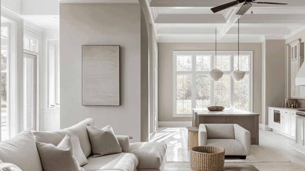
Pale Oak really shines in open-concept homes. Its balanced mix of warmth and neutrality allows it to transition smoothly across multiple zones, like the kitchen, dining, and living areas, without feeling disjointed.
If you’re looking for a color that ties everything together effortlessly, Pale Oak is a dependable and timeless choice
Pale Oak Finishes That Work
I’ve seen Pale Oak used in all kinds of homes. This is what I noticed in different finishes:
- Eggshell: My personal pick for walls. It hides tiny wall flaws and looks soft. It reflects just enough light without being shiny.
- Satin: Nice in kitchens or bathrooms. A bit of sheen but not too much. Easier to wipe down.
- Semi-gloss: Works for trims, but makes Pale Oak feel brighter and less cozy. It can bring out undertones more clearly.
Complementary Colors & Palettes for Pale Oak
You can build a whole palette around Pale Oak if you want that soft, natural look. It plays well with other warm neutrals but can also stand next to cooler tones.
| Category | Options That Work Well |
|---|---|
| Trim Colors | Chantilly Lace (BM), Simply White (BM), High Reflective White (SW) |
| Accent Colors | Soft blush pink, dusty blue, warm taupe, mushroom brown, navy blue, forest green |
| Flooring | Light oak flooring – adds warmth and complements Pale Oak’s soft undertones |
| Metal Finishes | Brushed Gold, Aged Bronze, Matte Black – all add contrast without clashing |
| Wood Tones | White Oak, Walnut, Ash, or Pine (with a light stain) – keep it soft and natural |
| Style Vibe Example | Pale Oak + light oak floors + matte black hardware in a small room = grounded + modern |
Is Pale Oak Still in Style This Year?
Yes. It’s still going strong. People are moving away from cooler grays and going toward warmer neutrals. Pale Oak fits that middle ground. You see it a lot in homes that want to feel relaxed but not washed out.
The whole organic modern trend favors colors like this. It works in Organic modern homes, Transitional spaces, Light Scandinavian-inspired rooms, and Minimalist homes that still want warmth.
The vibe now is soft and natural. Pale Oak fits right in without being trendy. It feels timeless without trying too hard.
Designers still recommend it. I’ve even seen it show up in rental units where they want something easy to decorate around. It’s quiet but not bland.
Tips for Sampling Pale Oak
If you’re thinking about Pale Oak, don’t just rely on a paint chip. It won’t tell you what the color really looks like in your space.
This is what I’d suggest:
- Use a peel-and-stick sample (like from Samplize)
- Stick it on different walls, at different times of day
- Try it next to your trim and flooring.
- Compare it to colors like Gossamer Veil or Drift of Mist if you’re thinking Sherwin-Williams.
Try to look at the sample when your lights are on, and when they’re off. Natural and artificial light make a huge difference. Also, don’t paint it on cardboard. That trick never worked for me.
Put it straight on the wall or use those large removable swatches. Once you’ve narrowed it down, paint a larger section. Live with it for a day or two. You’ll know pretty quickly if it’s right or not.
The Bottom Line
If you came here trying to figure out what Pale Oak looks like, what it feels like in a room, and how it compares to Sherwin-Williams shades, I hope this helped clear things up.
Now you know its undertones, where it fits best, and what other colors to look at if you’re sticking with Sherwin-Williams. You’ve seen how it compares to Swiss Coffee and how real people use it.
We also looked at finishes, lighting, palettes, and tips for sampling.
Picking paint is tough.
But with what you’ve learned here, you can make a call that feels more confident and a lot less random. If you go with Benjamin Moore, Sherwin-Williams, or something in between, you now have the info to get it right.

