")
Are you looking for the perfect gray paint that works in almost any room? I’ve tested lots of paint colors over the years, and Benjamin Moore’s Cromwell Gray (LRV-19.62) is one of the best.
This shade is super flexible. It has a mix of warm and cool tones, so it works with many styles. Whether your space is modern, classic, or something in between, Cromwell Gray fits right in.
In this guide, I’ll show you where this color works best. I’ll also share how to pair it with what you already have at home.
Many designers love this gray because it looks good in both bright and low light. But there are a few mistakes to avoid—and I’ll help you steer clear of them.
Picking the right gray can really change how your room feels. Cromwell Gray might be the color that ties everything together. It could be just what your space needs.
Why is Cromwell Gray (HC-103) the Perfect Choice for Your Space?

When I found Cromwell Gray, I was searching for a gray that wasn’t too cold or too warm. This color solved that issue perfectly.
Cromwell Gray is a mid-tone gray with soft green undertones. It’s part of Benjamin Moore’s Historic Collection, known for its timeless, flexible shades.
The color changes throughout the day. In the morning, it feels soft and calm. In the afternoon, the green comes through more. At night, it feels warm and cozy.
It’s just the right depth—not too light or dark. It pairs beautifully with white trim (like White Dove), dark floors, stone, and even metals. Silver and gold both stand out against this gray.
Where is Cromwell Gray (HC-103) best used in an interior?
Cromwell Gray shines in many different rooms and applications throughout your home. Each space can be changed by this versatile color in unique ways.
These are the top places where Cromwell Gray works exceptionally well:
1. Living Room
Cromwell Gray adds quiet style to living rooms. It works especially well in spaces with lots of natural light. The color stays warm while still reading as a true gray. Its green undertones pair well with both modern and classic furniture.
It looks great next to cream or white fabrics and natural wood pieces. For a polished look, paint built-in shelves in the same shade. This makes the room feel more connected and complete.
Cromwell Gray’s soft tone lets your furniture and décor stand out without making the space feel too busy or dark.
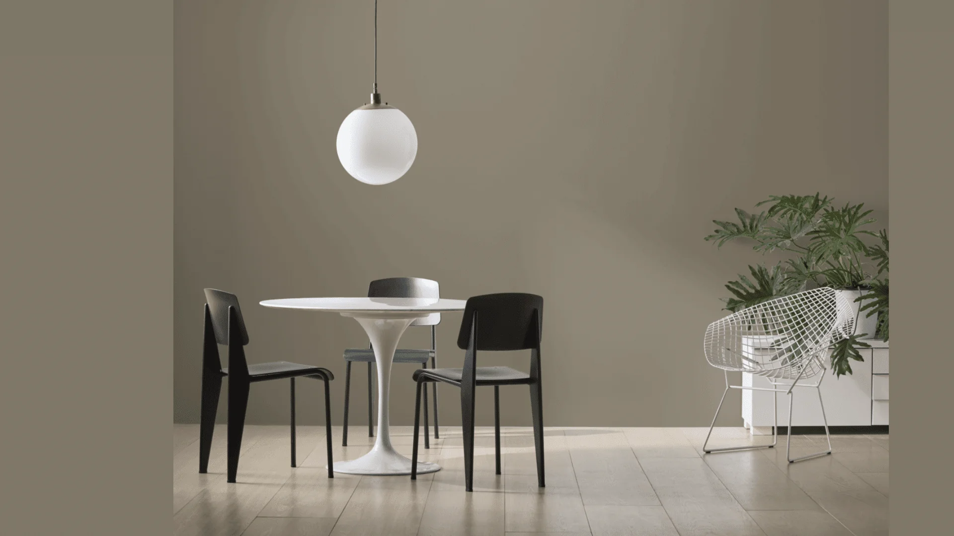
2. Dining Room
In dining rooms, Cromwell Gray sets a stylish tone that feels calm but rich. It shines in the evening under warm lighting, like chandeliers or sconces.
This makes meals feel more relaxed and special. The color looks great with dark wood tables and light chairs. That contrast creates balance and keeps the room from feeling too dark. Cromwell Gray helps create a formal space that still feels welcoming.
It pairs well with gold or brass accents and simple artwork. Together, these elements make the dining room a cozy spot for gathering and conversation.
3. Bathroom Walls
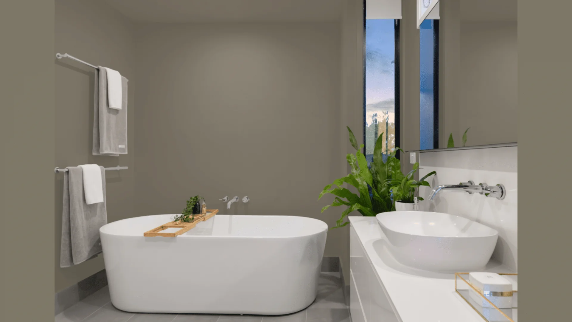
Bathrooms painted in Cromwell Gray feel calm and clean. The color works well with white sinks and bathtubs. It also looks great with marble tiles and natural wood vanities.
Even in rooms with little light, Cromwell Gray stays warm and balanced. It doesn’t feel too dark or cold. For a spa-like look, add bamboo or soft towels in natural tones.
You can even paint the ceiling the same color or one shade lighter for a modern touch. This gray helps small bathrooms feel more inviting and stylish without being overpowering.
4. Bedroom
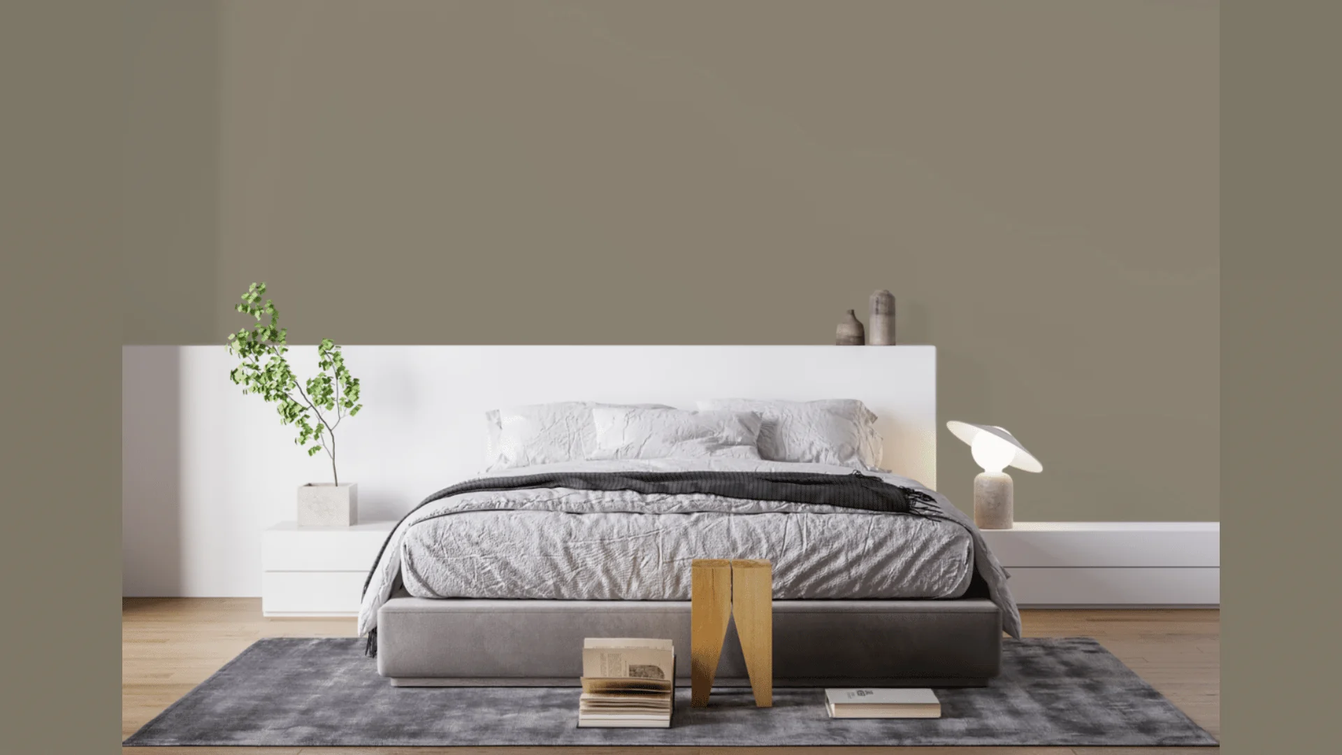
In bedrooms, Cromwell Gray creates a cozy and relaxing feel. It’s not too dark or too light, which makes it perfect for restful spaces.
The green undertones give the room warmth without feeling heavy. It pairs well with many bedding choices. White sheets look crisp, while darker colors like navy or burgundy create a rich contrast.
Use soft textures like linen curtains or wool blankets to boost comfort. Keep the room simple with a few personal touches. Cromwell Gray helps turn the bedroom into a quiet retreat that still feels fresh and modern.
5. Entryway
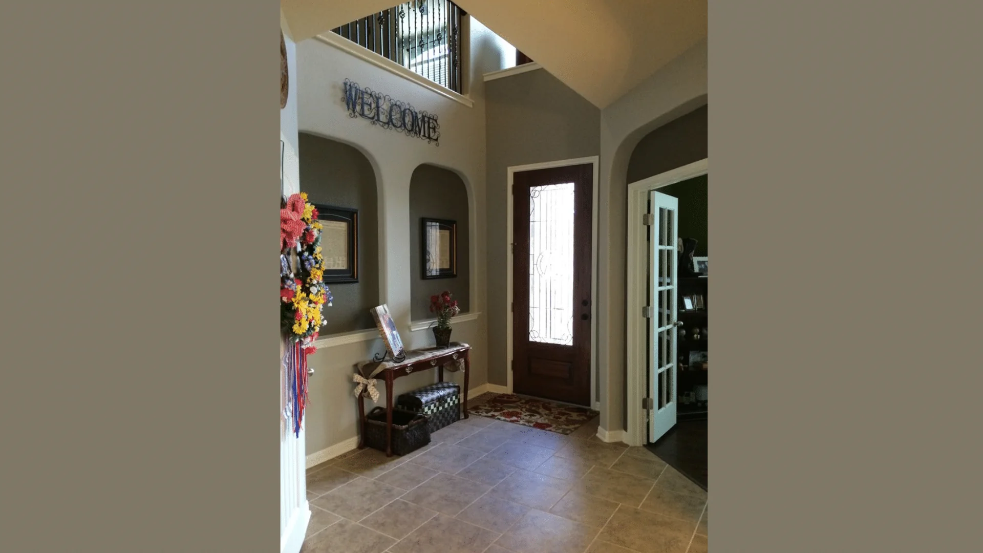
An entryway painted in Cromwell Gray feels both welcoming and stylish. It sets a calm, classic tone right when you walk in.
This color makes a great first impression and blends easily into nearby rooms. It pairs well with wood or metal furniture, making it easy to decorate. Add a mirror, table, and some lighting to brighten the space.
Cromwell Gray also helps artwork stand out. You can carry the color into hallways or stairs for a smooth flow. It’s a smart pick for a space that often gets overlooked but matters a lot.
How to Incorporate Cromwell Gray Into Your Home Decor?
When I first used Cromwell Gray, I was amazed at how it changed the room. It felt calm, warm, and balanced. If you’re planning to use it, here are a few tips to help it look its best.
Pair Cromwell Gray with clean whites like White Dove for trim and ceilings. Add navy blue, warm woods, black fixtures, and green plants for contrast and balance.
Light affects this color a lot. It feels cooler in north-facing rooms and warmer in south-facing ones. Always test a large sample and check it throughout the day.
In small rooms, keep things light with mirrors and good lighting. In open spaces, Cromwell Gray works as a soft, smooth backdrop.
Use eggshell for living spaces, satin for kitchens and baths, and matte for ceilings. Avoid pairing it with whites that have yellow undertones. Stick with crisp whites to keep the look clean and fresh.
Conclusion
Benjamin Moore’s Cromwell Gray proves that choosing the perfect gray doesn’t have to be stressful.
It has just the right mix of warmth and style, making it a great fit for almost any space in your home.
If you’re updating a single room or painting the whole house, Cromwell Gray adapts easily to different lighting and styles.
This color works beautifully with both modern and traditional decor. It feels soft and grounded without looking dull or cold. It brings calm to bright spaces and adds comfort to darker ones.
I hope this guide helped you see how flexible and timeless Cromwell Gray really is. Remember to test your paint on a few walls. Look at it during different times of day and next to your furniture and flooring.
Trust your instincts and how the color makes you feel. With Cromwell Gray, you’re picking a color that stays fresh, stylish, and easy to live with for years to come.