")
Are you struggling to find the perfect black paint for your home? I’m here to help you with everything you need to know about Benjamin Moore’s Black Panther.
In this guide, you’ll learn:
- What makes Black Panther different from other blacks
- Which rooms it works best in
- Color combinations that make it shine
- How it changes in different lighting
I’ve used Black Panther in over 25 homes, and these aren’t just theories – they’re real results from actual projects.
Finding the right black is tricky. Some look too harsh, others fade to gray, and many show unwanted undertones. Black Panther solves these problems with its balanced depth and subtle blue undertones.
Let me help you decide if this versatile black is right for your space.
The True Character of Black Panther: What You Should Know
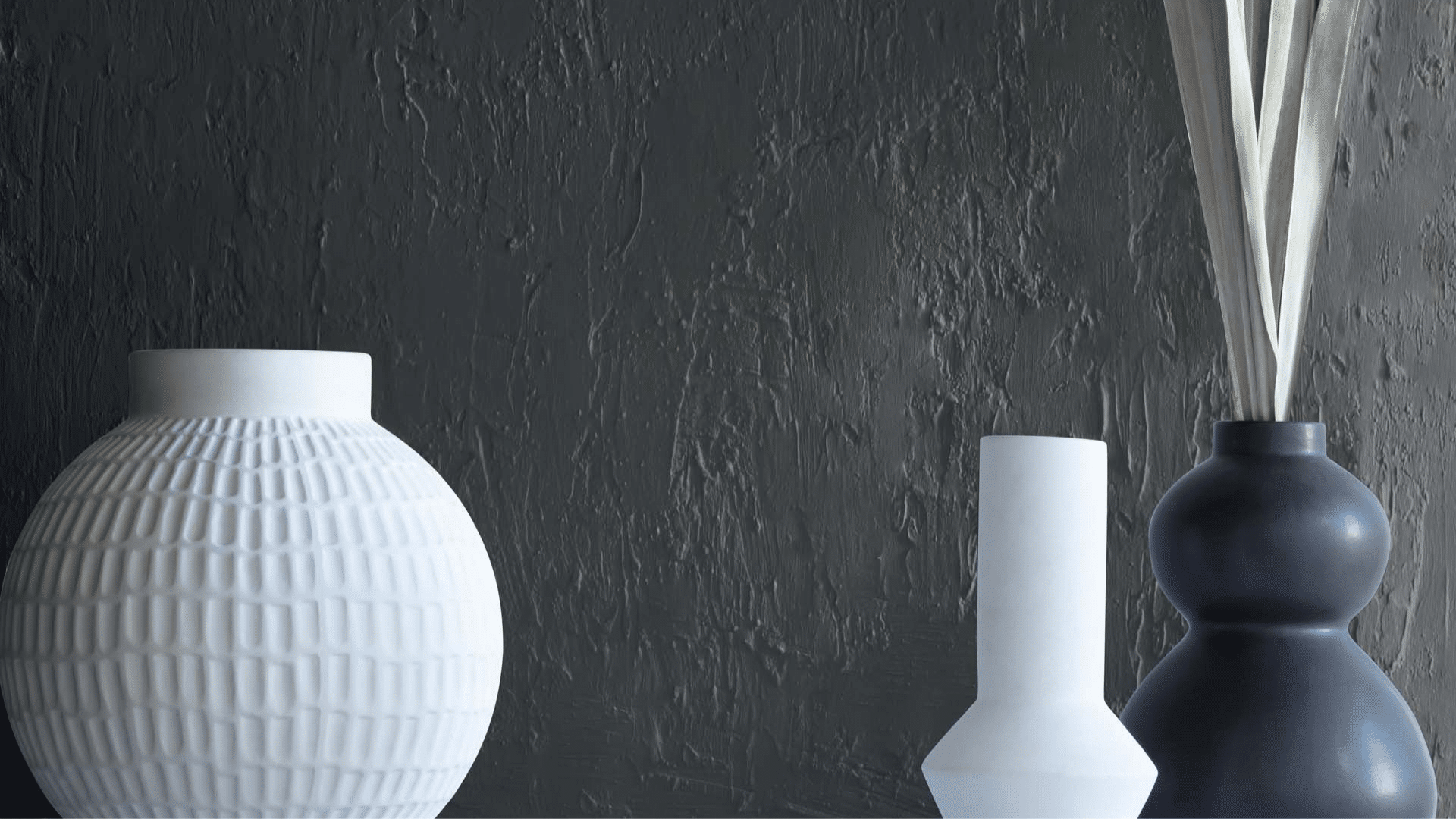
Black Panther (2125-10) is a soft black with slight blue undertones. It’s not harsh or flat. Instead, it has a subtle depth that adds character to any room.
The color reminds me of a night sky just after sunset – dark but with hidden complexity. Unlike some blacks that look too stark or fade to gray, Black Panther keeps its rich quality in various lighting situations.
This paint has excellent coverage and typically needs two coats. It works well on walls, trim, cabinets, and furniture, creating a smooth, rich finish on each surface.
The Mood of Black Panther: How This Rich Color Changes a Space

Black Panther creates a feeling of comfort mixed with drama. When I painted my dining room with this color, the space felt both cozy and special.
This black makes spaces feel:
- Rich without being gloomy
- Grounded and solid
- Refined without feeling cold
- Calm and focused
Large rooms with Black Panther walls feel more balanced and contained, while small spaces gain interest and drama rather than feeling smaller. Black Panther is a color that makes rooms feel thoughtful and intentional.
Where to Use Black Panther in Your Home for A Refined Look?
I’ve found Black Panther works best in these areas:
- Dining rooms: Make evening gatherings feel extra special
- Kitchen islands: Create a focal point with dramatic contrast
- Home offices: Helps with concentration and creates a focused space
- Doors and trim: Add striking contrast to white or light walls
- Powder rooms: Adds bold drama in a small space
This color also looks fantastic on built-in shelving, where it makes displayed items stand out. I once painted a client’s fireplace wall with Black Panther, and it transformed the living room into a magazine-worthy space.
What Flooring Looks Best with Black Panther Walls?
From my projects, these floors pair nicely with Black Panther:
- White oak: Creates clean contrast without being harsh
- Walnut: Brings warmth that balances the cool black
- Light maple: Offers bright contrast that lifts the space
- Terra cotta tile: Adds warmth and texture against the smooth black
- Concrete: Creates a modern, clean look
I avoid very dark floors with Black Panther walls unless you want a very dramatic space. Light floors work well to balance the depth of this color and keep spaces feeling open.
Color Combinations that Go Well with Black Panther
Black Panther is a luxurious deep black with remarkable depth and subtle undertones that make it far more complex than a standard black.
Its rich character creates a dramatic foundation that can transform spaces and serve as an exceptional backdrop for a wide range of color pairings.
1. Benjamin Moore’s Chantilly Lace (OC-65)

This clean, bright white creates a sharp contrast with Black Panther. I like using it on trim, ceilings, and adjacent walls. The combination feels modern and clean while letting the black show its full character.
2. Benjamin Moore’s Swiss Coffee (OC-45)

This soft, warm white creates a less stark contrast with Black Panther. It feels more livable and comfortable while still providing nice definition between surfaces.
3. Benjamin Moore’s First Light (2102-70)

This unexpected pairing creates an interesting balance. The softness of the blush makes Black Panther feel less intense. I’ve used small touches of blush in artwork or accessories against Black Panther walls with great results.
4. Benjamin Moore’s October Mist (1495)

Green and black create a natural, grounded palette. This light sage provides relief from the black while maintaining a calm, cohesive feel. This works well in spaces where you want a bit of color without brightness.
5. Benjamin Moore’s Stonington Gray (HC-170)

This versatile gray creates a tonal palette with Black Panther. It’s less expected than white but creates the needed contrast. The combination feels modern and clean while still being very livable.
6. Benjamin Moore’s Camel (2165-10)

This warm neutral brings needed warmth to Black Panther. The combination feels rich and layered. I’ve used this in living spaces where the camel in furniture or textiles adds life to black walls.
7. Benjamin Moore’s Hale Navy (HC-154)

Two deep colors create a subtle distinction. I’ve used this combination in libraries and offices where the navy accents add depth without stark contrast. It makes a rich, layered look.
8. Benjamin Moore’s Rose Accents (1177)

Not a paint color, but brass or gold metals look amazing with Black Panther. The warmth of these metals stands out beautifully against the cool black, adding life and interest to the space.
9. Benjamin Moore’s Sienna (2092-20)

Terracotta and Black Panther work wonderfully together for an earthy, warm palette. The warmth balances the cool black, and this pairing works especially well in spaces with natural materials and textures.
10. Benjamin Moore’s Boothbay Gray (HC-165)

This light, airy color creates breathing room next to Black Panther. The subtle blue tones in both colors create harmony while providing contrast. I’ve used this in bedrooms where the light blue walls with Black Panther trim or furniture feel both cohesive and interesting.
Simple Ways to Use Black Panther in Your Home
You don’t need to paint a whole room to enjoy this color. Here are some quick ways to use it:
- Paint just one wall as an accent
- Use it on interior doors for subtle interest
- Try it on kitchen lower cabinets with light uppers
- Paint a piece of furniture like a side table or console
- Use it for window trim to frame your views
In my own home, I painted a vintage console table with Black Panther. It became a standout piece that anchors my entryway.
Black Panther vs. Other Blacks: What Sets It Apart
I’ve worked with many black paints. Let’s see how Black Panther compares to other popular blacks:
| Color | Undertones | Depth | Best Uses | Room Types | What Makes It Different |
|---|---|---|---|---|---|
| Black Panther (Benjamin Moore) | Blue-black | Soft deep | Accent walls, trim, furniture | Dining rooms, offices | Soft quality without feeling gray, balanced in various lights |
| Onyx (Benjamin Moore) | True black | Very deep | Modern spaces, doors | Accent walls, exterior | More stark and flat than Black Panther |
| Soot (Benjamin Moore) | Gray-black | Medium-deep | Full rooms, cabinetry | Kitchens, libraries | Much grayer, reads as charcoal in many lights |
| Tricorn Black (Sherwin Williams) | Neutral black | Very deep | Bold spaces, doors | Dining rooms, exteriors | More true black with less undertone than Black Panther |
| Iron Ore (Sherwin Williams) | Brown-black | Medium-deep | Modern farmhouse | Exteriors, trim | Warmer and more brown than Blue-based Black Panther |
| Off-Black (Farrow & Ball) | Green-black | Medium | Traditional spaces | Studies, built-ins | Much more green, less blue than Black Panther |
What makes Black Panther special is its softness without looking washed out. It has character but isn’t tricky like some blacks with strong undertones. I’ve seen homes where this color has looked good for many years without feeling too trendy.
How Black Panther Changes with Lighting Throughout the Day
This color shifts subtly with light. I’ve observed it in my north-facing office:
- Morning: Shows its blue undertones more clearly
- Midday: Appears as a true soft black
- Afternoon: Deepens and becomes very rich
- Evening: Under lamps, becomes very deep with subtle depth
In rooms with lots of natural light, Black Panther maintains its rich character. In darker spaces, it can read as very deep. I always test it in different parts of a room before committing.
Design Styles That Work Well with Black Panther
Black Panther is versatile across many styles:
- Modern: Perfect with clean lines and minimalist spaces
- Transitional: Adds depth to neutral palettes
- Traditional: Works with classic elements for contrast
- Industrial: Complements raw materials like brick and steel
- Farmhouse: Creates contrast with white and natural textures
I wouldn’t use it in spaces where you want a very light, airy feeling, but it’s excellent for adding depth and interest.
Conclusion
After living with Benjamin Moore’s Black Panther (2125-10) for several months, I’m convinced it’s one of the most versatile deep blacks on the market.
Its subtle depth creates a classy backdrop that works in both traditional and contemporary spaces, while its unique undertones prevent it from feeling flat or harsh like many standard blacks.
Whether you’re using it for an accent wall, cabinetry, or even a bold entire room, Black Panther delivers dramatic impact without overwhelming your space. It pairs beautifully with everything from vibrant jewel tones to crisp whites and natural elements.
For best results, sample it in your specific lighting conditions and consider using Benjamin Moore’s Aura or Regal Select formulas for optimal coverage and finish.
Black Panther isn’t just another black paint—it’s a design statement that continues to impress me with its depth and versatility each day.
Frequently Asked Questions
What’s the LRV of Black Panther?
Black Panther has an LRV of around 4, making it a deeply saturated color. This low LRV means it absorbs more light than it reflects, creating that rich, enveloping feeling in rooms.
How Does Black Panther Compare to Sherwin Williams’s Tricorn Black?
Black Panther is softer and has more blue undertones than Tricorn Black, which is a truer, neutral black. Black Panther feels more nuanced, while Tricorn Black is more stark and bold.
Can I Use Black Panther on My Home’s Exterior?
Yes, in the right setting, Black Panther works well for exterior doors, trim, and even full siding. I’ve seen it used on modern homes, where it creates a striking, clean look.
Does Black Panther Work Well with Wood Tones?
Yes, especially medium to light woods. The contrast between warm wood and cool black creates beautiful tension. Oak, maple, and walnut all pair nicely with Black Panther.
How Does Black Panther Look with Silver or Chrome Hardware?
The combination is clean and modern. Silver or chrome against Black Panther creates a crisp, contemporary contrast. The coolness of both materials creates a cohesive look that feels fresh and clean.