")
Some paint colors help a room feel more gentle and easy to live in. Gentle Butterfly by Benjamin Moore is one of those shades. Its soft pink tone brings warmth without feeling too bold or too flat.
This blog will give you a full look at Gentle Butterfly. You’ll learn what it looks like in different lighting, its undertones, and which colors and finishes pair well with it. We’ll also talk about where it works best, how it compares to similar colors, and how to decorate with it.
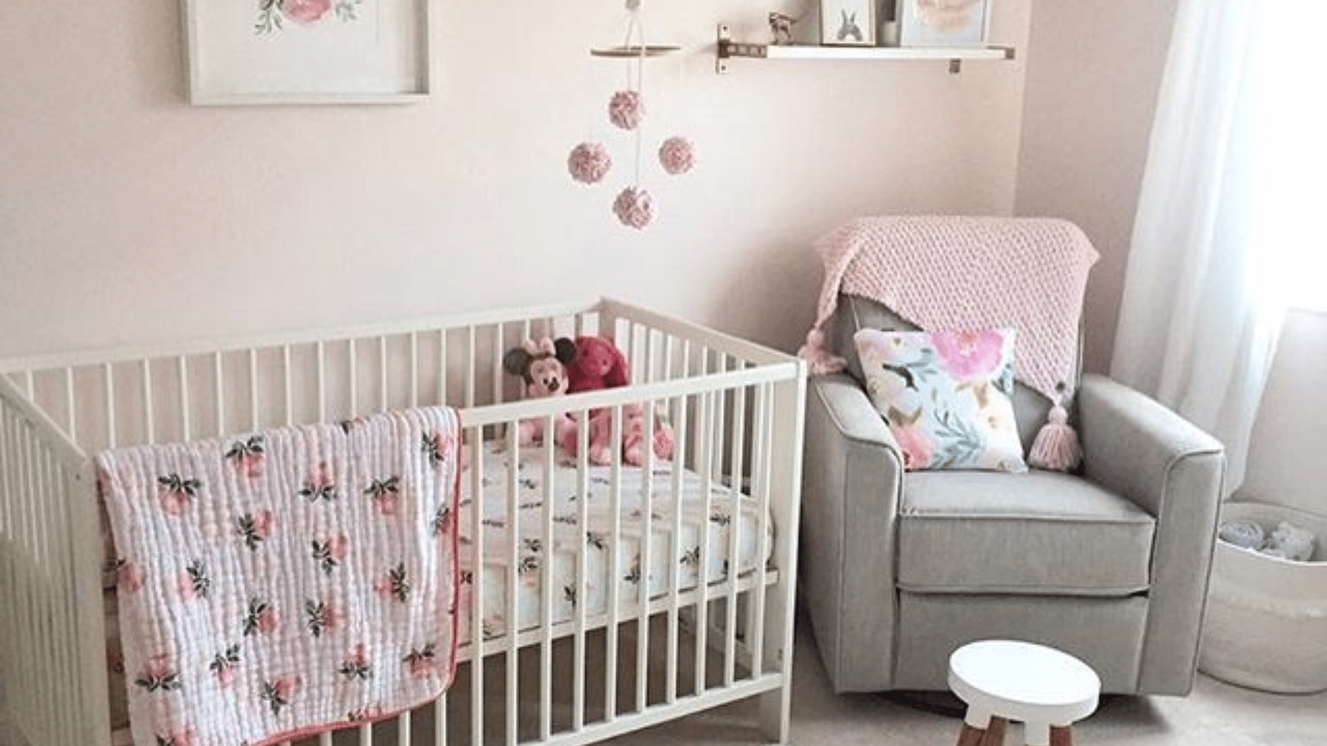
Gentle Butterfly is a good choice if you want a room that feels calm and steady. It’s often used in bedrooms, nurseries, and bathrooms. The color brings a light touch without making a space feel empty or cold.
By the end of this post, you’ll have a better idea if Gentle Butterfly fits the mood and look you want for your home.
Why Gentle Butterfly (2173-70) Is a Great Choice?
Gentle Butterfly by Benjamin Moore is a soft pink shade that fits well in spaces where comfort and calm are important. It has enough warmth to add color, but it’s not too bold or strong. This makes it easy to use in rooms where you want a soft, gentle mood.
- Soft pink tone: It gives the space a warm, welcoming feel without looking too colorful.
- Not too bright: Gentle Butterfly doesn’t reflect too much light, which helps it stay smooth and easy to live with.
- Creates a calm mood: This shade adds softness that feels safe and relaxed, perfect for winding down.
- Works in cozy settings: It’s often used in nurseries, bedrooms, and spaces meant for reading, resting, or quiet time.
This shade offers a warm and balanced middle ground for homes that need a softer touch without going too neutral.
The Undertones of Gentle Butterfly
Gentle Butterfly is more than just a basic pink. Its creamy undertones give it a soft, warm base, making it feel smooth rather than bold. These undertones help it blend into many room styles without feeling too bright.
Lighting plays a big role in how this color looks. In daylight, the pink feels light and airy, while in the evening, the cream tones come forward more. Both natural and artificial lighting can shift how the color appears throughout the day.
Because of these changes, it’s important to test this paint before using it in a full room. A small sample on your wall helps you see how it looks in your lighting. This simple step can help you feel more confident in your choice.
Gentle Butterfly’s Light Reflectance Value Explained
The LRV of Gentle Butterfly is 81.64, which means it reflects a lot of light. On a scale from 0 to 100, this is a high number, so that the paint will brighten most spaces. It’s especially helpful in rooms that don’t get much sunlight.
In well-lit areas, the pink looks lighter and more open. In darker rooms, the cream base softens the color, helping it avoid looking too cold. This makes Gentle Butterfly a strong pick for both sunny and shaded rooms.
Because it reflects so much light, it can help smaller spaces feel more open. It’s also a good match for ceilings, trim, or rooms that need a lift without using stark white. Use it to keep the space light while still adding some soft color.
How Gentle Butterfly Affect the Mood of A Room?
Gentle Butterfly has a calm and quiet feel that helps people feel more at ease. It brings warmth into a space without making it feel busy or bold, making it a natural fit for peaceful rooms.
Unlike brighter pinks, this shade won’t steal the focus or make the walls feel too loud. Instead, it creates a soft background that helps the whole room feel balanced. It supports rest, focus, or simple comfort.
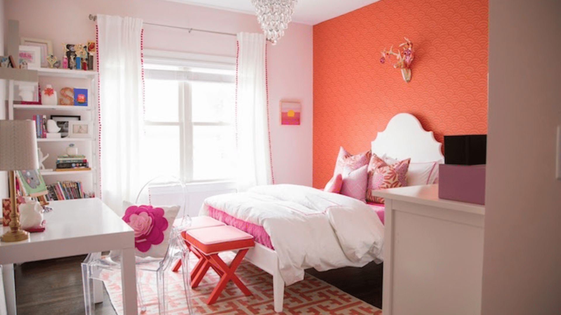
This color works well in places where you want to feel relaxed. Bedrooms, reading areas, and even soft-toned bathrooms can benefit from its steady feel. If you want a room that feels calm and easy to enjoy, this color can help set the tone.
Ideal Rooms for Gentle Butterfly by Benjamin Moore
Some colors are hard to place, but Gentle Butterfly finds its way into many types of rooms. It works well in both large open areas and small, private spaces. You can paint a full room or just one wall, and this shade will still hold its soft look.
- Bedrooms: It brings a quiet, restful tone that makes it easier to relax
- Nurseries: The soft pink color is gentle enough for a baby’s room without feeling too bright
- Bathrooms: In a small space, this shade helps the room feel warm and clean
- Accent walls: A single wall in this color adds interest without overwhelming the space
- Full-room use: When used throughout a room, it brings a smooth, even tone that doesn’t feel too heavy
- Any size room: From small guest rooms to open master suites, it adjusts well with light and space
This paint color fits in nicely when you want a peaceful backdrop that blends well with your furniture and decor.
Flooring and Furniture that Pair Well with Gentle Butterfly
Once you choose a paint color, the next step is to think about what goes around it. Gentle Butterfly pairs best with soft, light-toned flooring and simple furniture styles. Together, they help keep the room feeling calm and balanced.
- White oak flooring: The soft, light wood adds warmth and stays neutral.
- Light beige wood floors: A gentle color that blends in and supports the pink without standing out.
- Soft cream carpet: Adds comfort and keeps the look smooth and clean.
- Light wood furniture: Natural wood finishes like birch or maple help the color feel relaxed.
- White or off-white pieces: These bring a clean contrast that still feels soft.
- Simple decor styles: Rounded shapes, woven baskets, and soft throws add to the easy feel.
- Rugs and textiles: Go with tan, pale pink, cream, or gray to support the main wall color.
The goal is to create a room that feels quiet and soft, and the right pieces will help achieve this.
How to Incorporate Gentle Butterfly Into Your Home Decor?
Gentle Butterfly works well as a wall color in cozy rooms like bedrooms, nurseries, and bathrooms. It brings a soft, warm look that doesn’t feel too strong. Pair it with white or off-white trim for a clean finish.
Light wood furniture and simple shapes help balance the color in the room. Soft fabrics like cotton or linen in pale shades keep the space feeling calm. Add metal touches like brushed brass or matte silver for a bit of contrast.
This color fits best in rooms where you want quiet, comfort, and light. Keep the decor simple and the textures soft.
Gentle Butterfly vs. Similar Benjamin Moore Colors
Benjamin Moore offers a few soft pink shades that look close to Gentle Butterfly. But when you compare them side by side, you can see the small differences in tone and feel. The chart below breaks down how Gentle Butterfly stacks up against Pink Bliss, First Light, and Pink Moiré.
| Paint Color | Undertones | Feel in a Room | When to Use |
|---|---|---|---|
| Gentle Butterfly | Light pink with cream | Warm, soft, and calm | Great for bedrooms and quiet spaces |
| Pink Bliss | Light pink with a cool tone | Airy and clean | Best in modern or bright rooms |
| First Light | Rosy pink with slight gray | Fresh but slightly cooler | Good for daylight rooms or accents |
| Pink Moiré | Pink with peach tones | Warmer and a bit brighter | Use for more color and warmth |
Each of these shades has a place, but Gentle Butterfly is best when you want a soft, warm pink that brings quiet energy to a space. It blends easily into many decor styles and works well in both large and small rooms.
Conclusion
Gentle Butterfly by Benjamin Moore is soft, warm, and easy on the eyes. It’s not too bright, but it still brings light into a room. This pink shade works in many spaces without feeling out of place.
It goes well with white trim, light flooring, and natural wood finishes. You can pair it with soft whites, creams, or light tan colors. It also holds up well in both sunny and shaded rooms.
Try it in bedrooms, bathrooms, and nurseries—any space that needs a gentle touch. You can use it on all the walls or just as an accent. It helps build a quiet, peaceful look.
Before making a final decision, test a sample on your wall. See how it looks in both day and evening light. A test patch will help you feel sure and ready to paint your space with confidence.
Frequently Asked Questions
Can Gentle Butterfly Be Used on Kitchen Cabinets?
Yes, it can be used on cabinets if paired with the right primer and finish. It brings warmth to small kitchens or pantry areas. Use satin or semi-gloss for better durability.
Does Gentle Butterfly Work with Dark Wood Trim?
It can work with dark trim, especially if the wood has a warm undertone. The soft pink creates contrast while still feeling balanced. Test a sample to see how the tones play together.
Is Gentle Butterfly Too Light for Exterior Use?
Gentle Butterfly may appear washed out in strong sunlight. It’s better for interiors, but it could work on covered porches or trim. Always sample it in outdoor light before painting.
What Finish Is Best for Gentle Butterfly in High-Traffic Areas?
Use eggshell or satin if the room gets a lot of use. These finishes are easier to clean and hold up better over time. Avoid flat finishes in areas with frequent contact.
Can Gentle Butterfly Be Paired with Wallpaper?
Yes, it pairs well with soft floral or striped wallpaper in similar tones. Use it on surrounding walls or trim for a balanced look. Keep patterns subtle for the best match.