
I’ve used Benjamin Moore’s Imperial Gray in my home for over six months, and now I want to share everything I’ve learned about this beautiful color.
In this article, you’ll learn:
- What Imperial Gray actually looks like in real homes
- Which rooms work best with this color
- Colors that pair perfectly with it
- How to test it properly before buying
I’ve used this paint in both north and south-facing rooms and watched how it changes from morning to evening. I’ve made the mistakes so you don’t have to.
My walls have been Imperial Gray for more than half a year now. I know how it holds up and how it feels to live with every day. Let’s see if this classic, medium-toned gray is right for your home.
What Kind of Color Is Imperial Gray (1571)?
Imperial Gray (BM 1571) is a medium-toned, true gray with very subtle blue undertones. It’s a balanced color that adds a solid, grounded feeling without seeming too dark or heavy. I think of it as the color of clean stone with just a touch of softness.
I’ve noticed it stays fairly consistent throughout the day. In morning light, it maintains its true gray quality with minimal shift. By afternoon, it might show the slightest hint of its blue undertones in certain light.
The color has an LRV (Light Reflectance Value) of 46.79, placing it in the medium-light range. This means it reflects a good amount of light while still providing enough depth to give spaces substance. The balanced nature of Imperial Gray makes it great for creating rooms that feel both solid and comfortable.
What makes Imperial Gray stand out is its stability. In most spaces, it remains a true gray without dramatic shifts toward blue, green, or purple like many other grays can do. This reliability helps it work well in many settings and with various home styles.
What Rooms Work Best with Imperial Gray?
I’ve found that Imperial Gray works wonderfully in spaces where you want a solid, grounded look with timeless appeal. Based on my experience, here are the spaces where Imperial Gray performs best:
Living Rooms
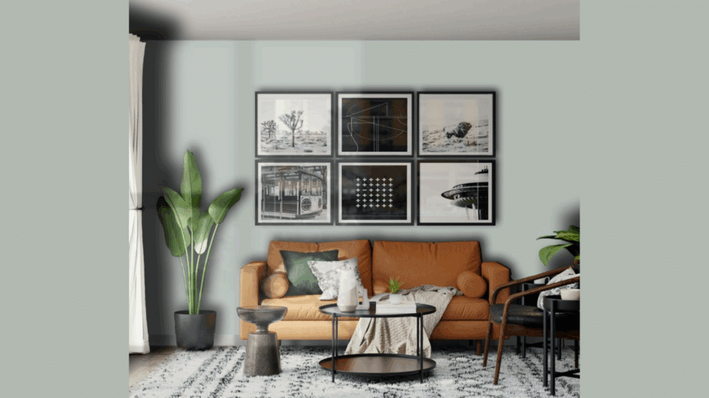
This color makes living areas feel classic and comfortable without being too dark. It creates a strong background that allows furniture and art to shine.
In my living room, Imperial Gray walls make the space feel finished while highlighting my white sofa and brass accent pieces. The color works especially well in both small and large living spaces.
In larger rooms, it adds enough substance to prevent the space from feeling empty. In smaller rooms, it adds character without making the space feel closed in when paired with the right lighting.
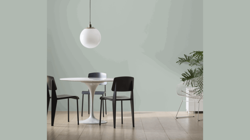
Dining Rooms
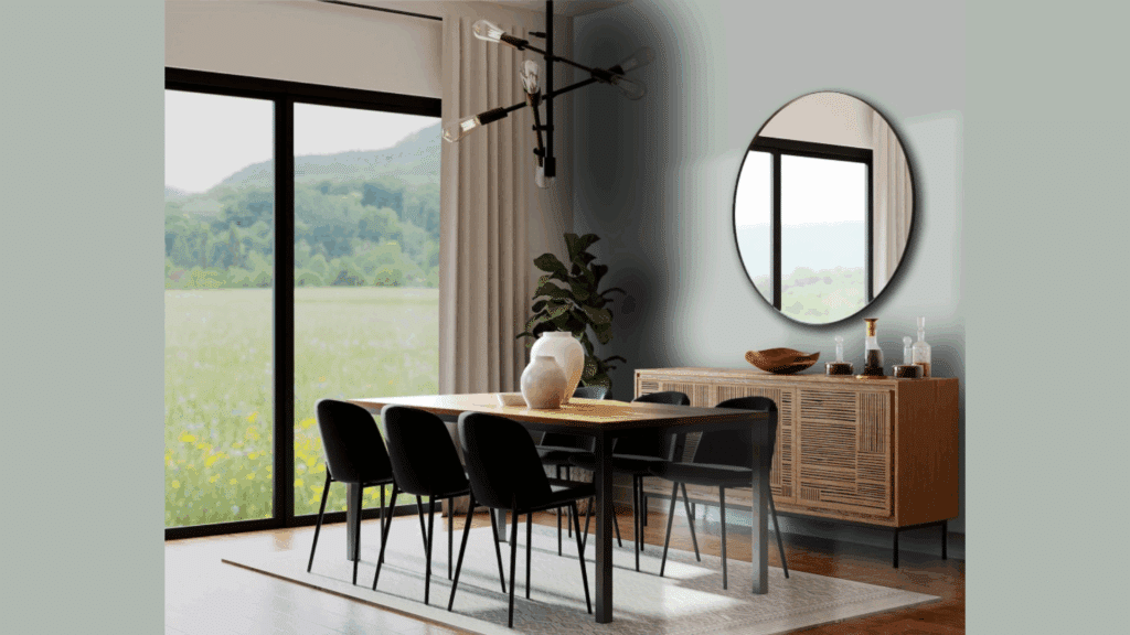
The medium tone makes dining rooms feel formal yet relaxed. This color creates a nice backdrop for meals and gatherings.
In my dining room, I paired Imperial Gray with a crystal chandelier and white curtains for a look that feels both classic and current. The color also tends to make dining rooms feel more intentional and put-together.
The subtle undertones create a sense of refinement that many people find great for entertaining spaces. Since painting my dining room this shade, I’ve found that it feels more special and thoughtful.
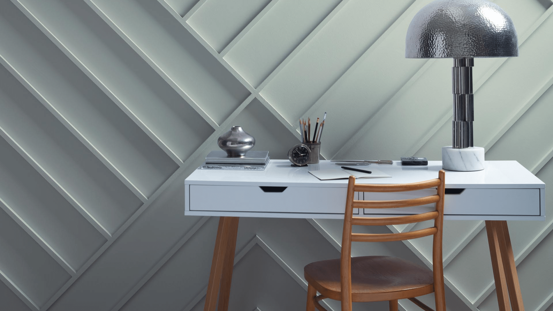
Home Offices
Imperial Gray helps create focus and concentration without feeling too dark or heavy. The true gray feels professional yet approachable during work hours.
I painted my home office in this shade and find it creates the perfect background for video calls while keeping me focused. Imperial Gray is particularly useful in offices that need to feel put-together and professional.
The color seems to add structure and organization to the space. I’ve noticed I feel more productive in my Imperial Gray office compared to my previous beige workspace.
Bedrooms
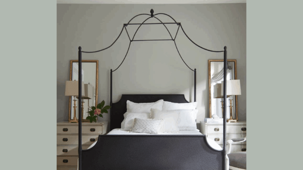
The medium gray tones make bedrooms feel cozy and secure. This color creates a wrapped-up feeling that helps with rest without being too dark.
In my guest bedroom, I paired Imperial Gray with white bedding and natural wood tones for a retreat that feels both substantial and restful.
The color also works well in master bedrooms, where it adds enough weight to feel grounding without being too heavy for a sleep space. I’ve found that this shade creates a nice cocoon-like feeling that’s perfect for bedrooms.
Kitchens
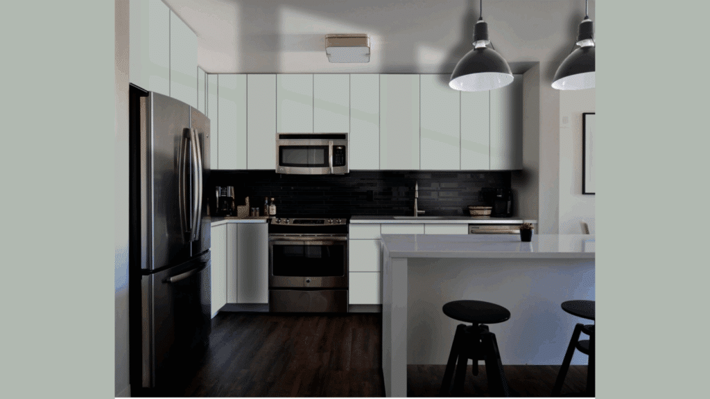
Imperial Gray adds substance to kitchens without taking center stage. It creates a solid feeling that still looks clean and sharp. My neighbor painted her kitchen this color with black appliances, creating a modern look that still has warmth.
The color works well with stainless steel appliances and both white and dark cabinets, making it very flexible for most kitchen styles. It adds just enough color to feel interesting without taking away from other kitchen elements.
What Colors Go Well with Imperial Gray?
- Crisp whites: Creates a clean, classic contrast
- Navy blue: Offers a rich complement that feels timeless
- Soft yellows: Adds warmth that balances the cool gray
- Natural wood tones: Add organic texture and warmth
- Black accents: Add definition and depth to the balanced gray
For my living room, I combined Imperial Gray walls with white trim and brass lighting fixtures. The combination feels both classic and fresh.
What Style Works Well with This Color?
Imperial Gray adapts to many design styles. In modern homes, it brings in a clean base that feels substantial. For traditional spaces, it creates a timeless backdrop that complements classic furniture.
In industrial settings, it offers a solid color that works well with metal and wood elements. Most impressively, Imperial Gray works well in transitional homes by bridging the gap between traditional and modern pieces.
My own home mixes contemporary items with more classic ones, and this color creates the perfect background for both. This flexibility makes it a smart choice if you like to change your decor or mix elements from different styles.
Is It a Warm or Cool Color?

Imperial Gray is a balanced neutral that leans slightly cool. The subtle blue undertones give it that cool, structured feeling. I’d describe it as “softly cool” – not the kind that makes a room feel cold or unwelcoming.
The balanced aspects keep it from feeling too cool. This stability makes it work well year-round in most homes. Despite being slightly cool, it doesn’t feel too blue like some cool grays can. The medium value balances the coolness, making it more livable for everyday spaces.
In rooms with lots of natural light, especially north-facing rooms, the balanced nature helps maintain its true gray appearance throughout the day.
If you’re worried about a space feeling too cool, I’ve found that adding warm elements like wood tones, cream textiles, or brass fixtures creates the perfect balance. In my living room, the Imperial Gray walls look beautiful with my brass floor lamp and cream sofa.
Color Characteristics Table
| Characteristic | Imperial Gray | What This Means For Your Space |
|---|---|---|
| Temperature | Slightly Cool | Creates a solid, refined atmosphere |
| Undertones | Subtle blue | Adds slight depth without being too cool |
| Light Reflectance Value | 46.79 | Medium-light tone that provides substance while maintaining brightness |
| Seasonal Feel | Year-round | Works well in both winter and summer settings |
| North vs. South Rooms | Adaptable | Appears more true gray in south-facing rooms, slightly cooler in north-facing rooms |
How to Test This Color in Your Space?
- Buy a sample: Get a small container of Imperial Gray
- Paint a board: Use a 2×2 foot piece of white poster board
- Move it around: See how it looks in different locations at different times of day
- Live with it for 3 days: Your first impression might change
When I tested Imperial Gray, I was surprised by how consistent it looked from morning to evening. In my north-facing office, it appeared slightly cooler, while in my south-facing living room, it maintained its true gray quality all day.
What Paint Finish Should You Choose?
- Flat: Good for ceilings or very smooth walls
- Matte: My top choice for most walls – the medium color looks rich without glare
- Eggshell: This works in kitchens and bathrooms where you need to clean walls
- Satin: Adds a slight sheen, could make the color look slightly lighter than expected
- Semi-gloss: Too shiny for Imperial Gray walls, but works for trim and doors
I used matte in my living room and eggshell in my kitchen. The eggshell finish makes cleaning easier without adding too much shine that would change how the color looks.
Real Home Ideas Using Imperial Gray
- Full room: Imperial Gray on all walls creates a consistent, substantial feeling
- Accent wall: Used on one wall with white walls for a focal point
- Trim: Using it on trim with white walls creates an unexpected, custom look
- Furniture: A bookcase or cabinet painted this shade adds a solid touch
- Exterior: Works beautifully as an exterior accent color with white siding
My friend painted all her interior doors Imperial Gray with white walls, creating a custom look that feels both fresh and grounded. It looks amazing and has inspired me to think about using it in more areas of my home.
Common Mistakes to Avoid
I’ve made some mistakes with this color. Learn from my experience:
- Using very yellow lighting with Imperial Gray – Warm bulbs can make this color look muddy. Stick with balanced white bulbs (3000-4000K) to showcase its true beauty.
- Not testing in your actual space – This color can look different in various lighting conditions. I was surprised how it appeared in my north-facing office versus my south-facing living room. Always test a large sample in your own space.
- Using too many cool accessories – This can make the room feel too cold. Mix in some warm woods, creams, or brass accents for balance.
- Expecting it to look exactly like online photos – Every screen shows colors differently, and professional images are often edited. The only way to know how it will look in your home is to test it yourself.
- Using it in very dark rooms without adding extra lighting – In rooms with minimal natural light, Imperial Gray needs proper lighting support to show its true color.
Why People Like Imperial Gray
Imperial Gray has become popular among many homeowners, and I understand why. Its balanced quality creates spaces with substance while still feeling very livable. People like it because it’s not a trendy gray—it has staying power without being hard to use.
The color creates solid spaces that still feel fresh. It works with many decorating styles and doesn’t date quickly like more specific colors might. Whether in natural or artificial light, it maintains its character while shifting only subtly throughout the day, keeping spaces consistent.
Is Imperial Gray Right For Your Home?
Imperial Gray creates spaces that feel both substantial and balanced at the same time.
After using this color in multiple rooms over several months, I’m still happy with my choice. What makes it stand out is how it adds solid structure while remaining very flexible with different furniture and decor styles.
It’s not a color that wants all the attention. Instead, it creates a foundation that supports your furniture and accessories. This balanced presence explains why it remains a classic choice season after season.
In a world of whites and trendy grays, Imperial Gray offers stability and flexibility. It works with modern, traditional, transitional, and everything in between.
Is it subtle? Yes. But it creates beautiful, livable spaces that feel solid and personal—and that’s what truly matters in the end.
Frequently Asked Questions
Does Imperial Gray Work with A White Trim?
Yes, it pairs beautifully with white. The medium gray creates a nice contrast with the pure white trim without seeming too stark.
Is Imperial Gray Too Dark for Small Rooms?
Not necessarily. When paired with proper lighting and lighter furnishings, it can make small spaces feel cozy rather than cramped.
How Does It Compare to Other Gray Paints?
Imperial Gray is more stable with minimal undertones, making it less likely to shift to blue, green, or purple like many other grays can.
Will This Color Show Dirt More than Other Neutrals?
It actually hides dirt quite well. The medium tone helps mask minor smudges better than very light colors would, without being as harsh as very dark tones.
Can I Use Imperial Gray in An Open Floor Plan?
Absolutely. Its balanced quality makes it perfect for open concepts, creating flow between spaces while still offering more substance than plain white.