
Looking for the perfect blue-gray paint? I’ve spent five years testing Benjamin Moore’s Mineral Alloy in over 20 homes, and I’m sharing everything I’ve learned. This guide covers how this unique color changes with lighting, where it works best in your home, and which colors pair well with it.
You won’t have to waste money on sample cans or make costly painting mistakes. As an interior designer who’s used this shade in countless projects, I know the tricks to make it work in any space.
I’ve helped hundreds of homeowners find their perfect paint color, and I can help you, too. Whether you’re painting a bedroom, kitchen, or entire home, you’ll find exactly what you need to make the right decision about Mineral Alloy.
The Depth and Character of Mineral Alloy: What You Should Know
Mineral Alloy (1622) is part of Benjamin Moore’s blue-gray family but has a unique feel. Its LRV (Light Reflectance Value) is 28.46, making it medium-dark.
What makes it special is how it shifts between blue and gray depending on the time of day.
This paint isn’t flat—it has subtle depth that catches light differently across a wall. I’ve found it works as both a main wall color and an accent. One thing to note: it can look much darker in small spaces with limited natural light.
Unlike many other blue-grays on the market, the base has slight warm notes that keep it from feeling cold.
The Mood of Mineral Alloy

Mineral Alloy creates a sense of calm without being boring. I’ve used it in bedrooms, where clients report feeling more relaxed. In living areas, it makes a space feel grown-up and put-together.
This color has a way of making rooms feel:
- More grounded
- Less chaotic
- Thoughtfully designed
- Comfortable yet polished
The most common feedback I get from clients is how the color changes their mood when they enter the room – from stressed to settled. It’s not as heavy as navy but more substantial than a light blue or gray.
Where to Use Mineral Alloy in Your Home for Maximum Impact
I’ve had great success using Mineral Alloy in these spaces:
- Home offices – creates focus without feeling cold
- Dining rooms – looks amazing under warm lighting at dinner
- Master bedrooms – pairs well with white bedding
- Powder rooms – makes a statement without overwhelming
- Kitchen islands – as a cabinet color that stands out
The most surprising place it worked well was the ceiling in a mostly white room—it brought the eye up and made the space feel more complete. Avoid using it in small rooms with north-facing windows, as it can make the space feel too dark and confined.
What Flooring Pairs Best with Mineral Alloy Walls?
From my experience, these flooring options work best with Mineral Alloy:
- Medium-toned oak hardwood – the warmth balances the coolness
- White oak with matte finish – creates an airy contrast
- Light gray tile – for a subtle, cohesive look
- Terrazzo with blue flecks – picks up the blue notes
The worst pairing I’ve seen was with yellow-toned pine—it created an odd tension in the room. Also, avoid red-toned woods, as they fight with the blue-gray tones.
For carpets, cream or light gray works better than stark white, which can make the contrast too harsh.
Color Combinations That Work Well with Mineral Alloy
1. White Dove (OC-17)

This classic pairing creates a clean, sharp contrast that highlights Mineral Alloy. I’ve used White Dove trim with Mineral Alloy walls in several living rooms, and the combination makes both colors stand out without fighting each other. The crisp white brightens the space, while the blue-gray adds substance.
2. Swiss Coffee (OC-45)

For a warmer, more relaxed feel, Swiss Coffee softens Mineral Alloy’s cooler tones. This combo works exceptionally well in bedrooms and traditional spaces where stark white might feel too modern. The cream adds a subtle warmth that makes the space feel more welcoming.
3. Gray Owl (OC-52)

This subtle, sophisticated tone-on-tone combination creates depth without contrast. I’ve used Gray Owl on adjacent walls or ceilings to create a layered look that feels cohesive but interesting. The green undertones in Gray Owl complement Mineral Alloy beautifully.
4. Hale Navy (HC-154)

This bold, dramatic pairing works when you want to create depth and interest. I like using Hale Navy on built-ins or furniture pieces in a Mineral Alloy room. The two blues speak to each other while maintaining their distinct personalities.
5. Saybrook Sage (HC-114)

This natural, calming combo brings an organic feel to any space. The sage green adds a fresh element that balances Mineral Alloy’s moody character. I’ve used this in dining rooms where the walls are Mineral Alloy, and plants or fabric accents bring in the sage tone.
6. First Light (2102-70)

This unexpected pairing works beautifully for a contemporary look. The softness of blush against the strength of Mineral Alloy creates a balanced tension that feels modern. This combo is perfect for bedrooms or powder rooms where you want a touch of warmth.
7. Wrought Iron (2124-10)

For a strong, modern contrast that still feels cohesive, Wrought Iron adds drama without harshness. I use this combo in offices or media rooms where the darker charcoal can anchor specific areas while Mineral Alloy keeps the space from feeling too dark.
8. Hawthorne Yellow (HC-4)

This bright accent color pops against Mineral Alloy’s cool tones. I don’t recommend painting entire walls in this combination, but yellow accessories or furniture pieces create focal points that energize a Mineral Alloy room.
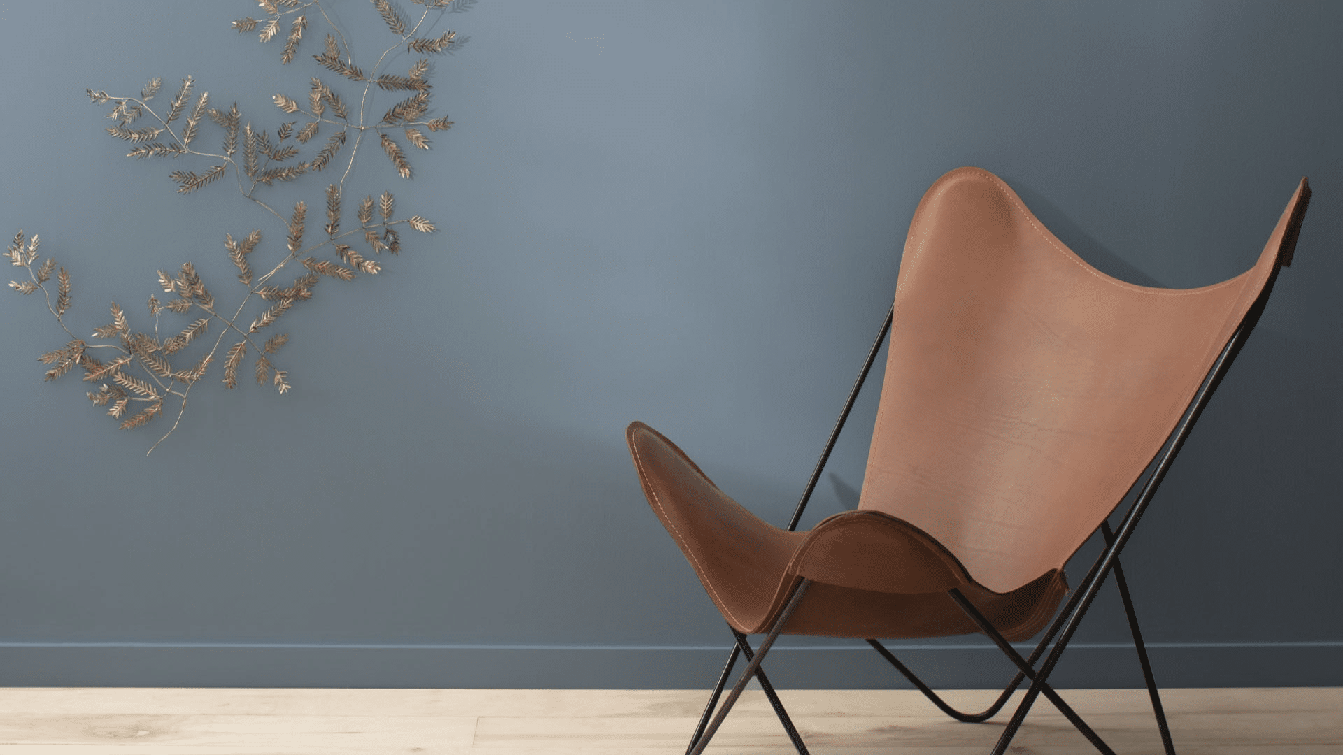
9. Sienna Clay (104)

This warm-meets-cool balance brings an earthy sophistication to spaces. The terracotta adds warmth that prevents Mineral Alloy from feeling too cool or distant. This combination works well in rooms with natural materials like leather and wood.
10. Breath of Fresh Air (806)

Using this lighter blue creates depth within the blue family. When you want a layered, monochromatic look, this pairing feels intentional and designed. I’ve used this in primary bathrooms where the vanity is Mineral Alloy and the walls are the lighter blue.
I love this bonus combination: Mineral Alloy with brass and wood accents. The warm metals and natural wood make the walls come alive in a way that feels timeless yet fresh.
Easy Ways to Style Mineral Alloy in Your Home Decor
Adding Mineral Alloy to your home doesn’t mean painting all your walls. Here are simple ways I’ve used it:
- Paint a single accent wall behind a bed or sofa
- Use it on built-in bookcases while keeping walls light
- Paint interior doors for an unexpected touch
- Try it on a kitchen island with white upper cabinets
- Add it to the lower half of a wall with chair rail molding
For accessories, look for textiles with similar blue-gray tones but different textures. Velvet throw pillows, wool blankets, and linen curtains all work well.
Metal finishes that pair nicely include:
- Brushed nickel
- Antique brass
- Bronze
- Matte black
Mineral Alloy vs. Other Moody Blues and Grays: A Side-by-Side Look
| Paint Color | Undertone | LRV | Best Used For | Compared to Mineral Alloy |
|---|---|---|---|---|
| Mineral Alloy | Blue-gray | 28.46 | Versatile, depth | Our baseline |
| BM Hale Navy | True navy | 8.36 | Traditional, bold | Much darker, more blue |
| BM Gray Owl | Green-gray | 64.51 | Light, airy spaces | Much lighter, more gray |
| SW Serious Gray | Purple-gray | 11.51 | Modern spaces | Similar depth, more purple |
| BM Steel Wool | Brown-gray | 20.73 | Industrial style | Darker, more brown |
I’ve found that Mineral Alloy sits perfectly between being too dark and too light. It has more character than flat grays but isn’t as demanding as navy blues.
When testing these colors side by side, Mineral Alloy showed the most change between morning and evening light.
How Mineral Alloy Changes in Different Lighting Conditions
This aspect of Mineral Alloy fascinates me the most. I’ve taken photos of the same Mineral Alloy wall at different times of day:
- Morning light: Appears more blue, almost has a slight teal quality
- Midday sun: Shows its true blue-gray balance
- Evening natural light: Leans into the gray side
- Artificial light: It depends on your bulbs – LED cool lights bring out blue, warm bulbs bring out gray
If you’re considering this color, I strongly suggest testing it on all walls of a room and watching it for a full day. North-facing rooms will emphasize the gray tones, while south-facing rooms bring out more blue.
The most dramatic change happens at sunset when the walls can briefly take on an almost purple cast.
Conclusion
After testing Mineral Alloy in countless homes, I can confirm it’s one of Benjamin Moore’s most versatile colors. What stands out most is how it shifts from blue to gray as the light changes throughout the day. This paint brings a quiet confidence to any room without shouting for attention.
It’s perfect for those who want color with character but fear bold choices they might regret.
I’ve used it in modern city apartments and country farmhouses with equal success. The key is pairing it with the right colors and materials that enhance its depth.
Unlike trendy colors that quickly date a space, Mineral Alloy has staying power. Try a sample on each wall of your room and watch it for 24 hours. You’ll see why so many of my clients fall in love with this exceptional blue-gray.
Frequently Asked Questions
What’s the Actual LRV of Mineral Alloy, and Why Does It Matter?
Benjamin Moore lists Mineral Alloy’s LRV at 28.46, not 17.75, as often reported. This lower value explains why it absorbs more light than expected, making it appear deeper in small spaces.
How Does Mineral Alloy Appear on Zoom or Video Calls?
Mineral Alloy typically reads more blue on camera than in person. If you’re creating a home office backdrop, test the color in your actual lighting with your camera to see how it translates.
Does Mineral Alloy Work with Existing Beige or Tan Furniture?
Yes, but carefully. The cool tones of Mineral Alloy create a purposeful contrast with warm beiges. To successfully bridge them, add textiles or accessories that contain both colors.
How Many Coats of Mineral Alloy Are Typically Needed?
Most of my projects require two full coats, even with tinted primer. Its depth makes coverage challenging, especially when covering lighter colors or white walls.
Does Mineral Alloy Look Dated Compared to Newer Paint Colors?
Not at all. Unlike trendy blues and grays that come and go, Mineral Alloy’s complex undertones give it longevity. I’ve used it continuously since 2017 in projects that still look current today.