")
Looking for a gray that feels calm but still fresh? Benjamin Moore’s Moonshine could be the right choice.
This paint color is a light gray with soft undertones. It has just enough color to stand out but stays easy on the eyes. It doesn’t feel too warm or too cool, which helps it work in many kinds of rooms.
Moonshine reacts well to natural and indoor light. In bright spaces, it looks crisp and clean. In shaded rooms, it softens and brings a quiet feel.
This shade gives walls a light and open look. It fits in homes where you want a soft color that doesn’t feel dull or flat.
In this blog, you’ll learn what makes Benjamin Moore Moonshine a steady pick, where it works best, and how to style it in your space.
Why Benjamin Moore’s Moonshine Is the Perfect Choice for Your Space?
Moonshine by Benjamin Moore is a soft gray that works well in many homes. It gives your space a clean, open feel without looking cold, making it a strong pick for both large and small rooms.
This is why Moonshine fits so well:
- It looks clean in natural light and soft in low light.
- The tone feels steady, not too warm or too cool.
- It helps walls feel open, even in small rooms.
- Works well with light floors and white trim.
- It supports simple decor without pulling too much focus.
If you want a wall color that feels calm and easy to live with, Moonshine offers that quiet support in any part of your home.
The Rich Undertones of Moonshine
Benjamin Moore Moonshine is more than just a basic gray. It has soft green and blue undertones that give it a quiet and cool feeling. These undertones are not strong, but they do help shape how the color looks in different spaces.
In rooms with a lot of natural light, Moonshine can look brighter and a little cooler. Depending on the time of day, you might notice a slight blue or green touch. In low or warm lighting, the gray may look softer and a bit warmer.
The way Moonshine shifts makes it interesting without being bold. That’s why it’s helpful to test it on your walls first. It will look slightly different from room to room, which gives it a gentle, lived-in look.
How Lighting Affects Moonshine’s Look?
Lighting has a big effect on how Moonshine looks in your home. This soft gray shifts slightly depending on the time of day and the kind of light in the room.
In natural daylight, Moonshine appears cooler and a little brighter. You may notice hints of blue or green, especially in rooms with big windows or in early morning light.
Under warm indoor lights, the color softens. The green in the undertone may show more, giving the room a calm and cozy feel.
In shaded rooms or areas with less light, Moonshine looks a bit warmer and more muted. It still keeps its soft gray base but feels less cool.
Because it shifts with the light, it’s smart to test Moonshine in different parts of the room before painting the whole space. This helps you see how it will really feel throughout the day.
The Psychology of Moonshine: How It Affects Your Mood
Soft grays like Moonshine have a quiet effect on how we feel in a space. This paint color can help bring calm and stillness to your home. It doesn’t draw attention but instead supports the room in feeling clear and settled.
Moonshine is a good choice for rooms where you want to focus or rest. It helps your eyes relax and your mind feel at ease, which is why it works well in bedrooms, offices, and quiet corners.
It also works in shared spaces. The light, steady feel of Moonshine helps everyone feel more at home. If you want a space that stays calm but is not too plain, this shade is a smart pick.
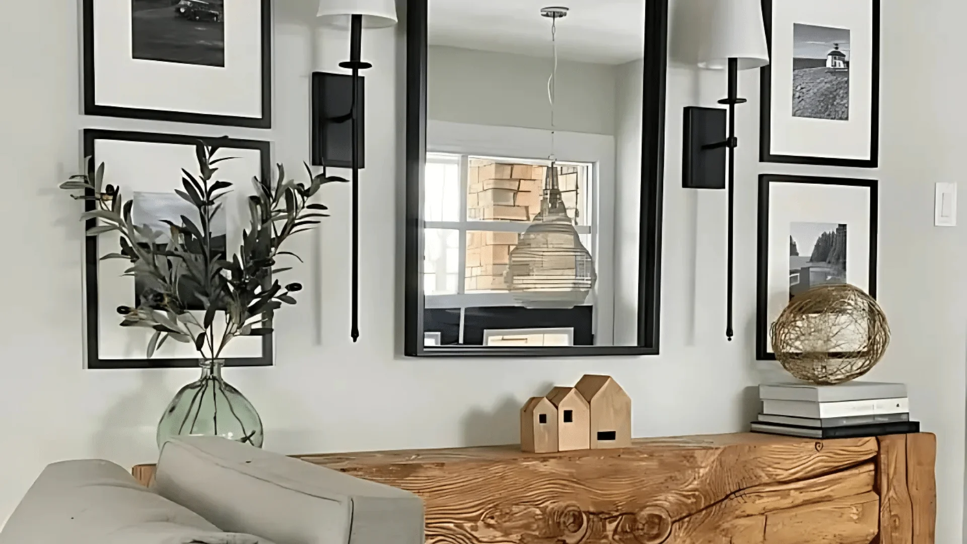
Where Is Moonshine Best Used in an Interior?
This soft gray shade is easy to use across your home. Its quiet color helps each space feel lighter, clearer, and more relaxed.
Try Moonshine in rooms like:
- Living Rooms: Keep the space feeling open and soft, especially with light fabrics and wood.
- Bedrooms: Make the room calm, fresh, and easy to relax in.
- Kitchens: Looks clean on walls or cabinets, especially with white or wood accents.
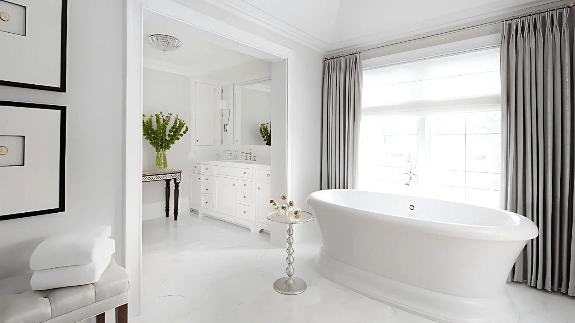
- Bathrooms: Adds a soft tone that works well with tile and mirrors.
- Hallways or Entryways: Help smaller spaces feel bigger and brighter.
Moonshine works in both bright and shaded areas. It’s easy to use in shared or quiet rooms, helping the space feel clean and balanced.
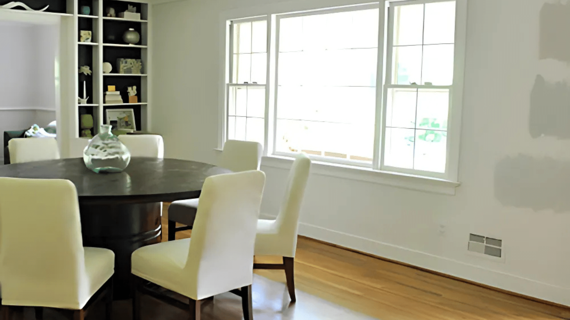
What Kind of Floors Would Look Best with Moonshine?
Picking the right floor helps bring out the best in Moonshine. Since the color is light and cool, the floors should balance the look without feeling too dark or too warm.
Good floor options include:
- Light Oak or Soft Maple: Brings in warmth without overpowering the soft gray.
- Whitewashed Wood: Adds a light, breezy feel that works in coastal or modern rooms.
- Soft Gray or Cream Tile: This keeps the room looking clean and simple, great for bathrooms or kitchens.
- Natural Stone: This works well in mudrooms or entryways for a grounded, quiet look.
- Light Beige Carpet: Adds comfort while blending in with the gray tone of the walls.
Moonshine pairs best with light and natural tones underfoot. This keeps your space feeling fresh, open, and easy to enjoy.
How to Incorporate Moonshine Into Your Home Decor?
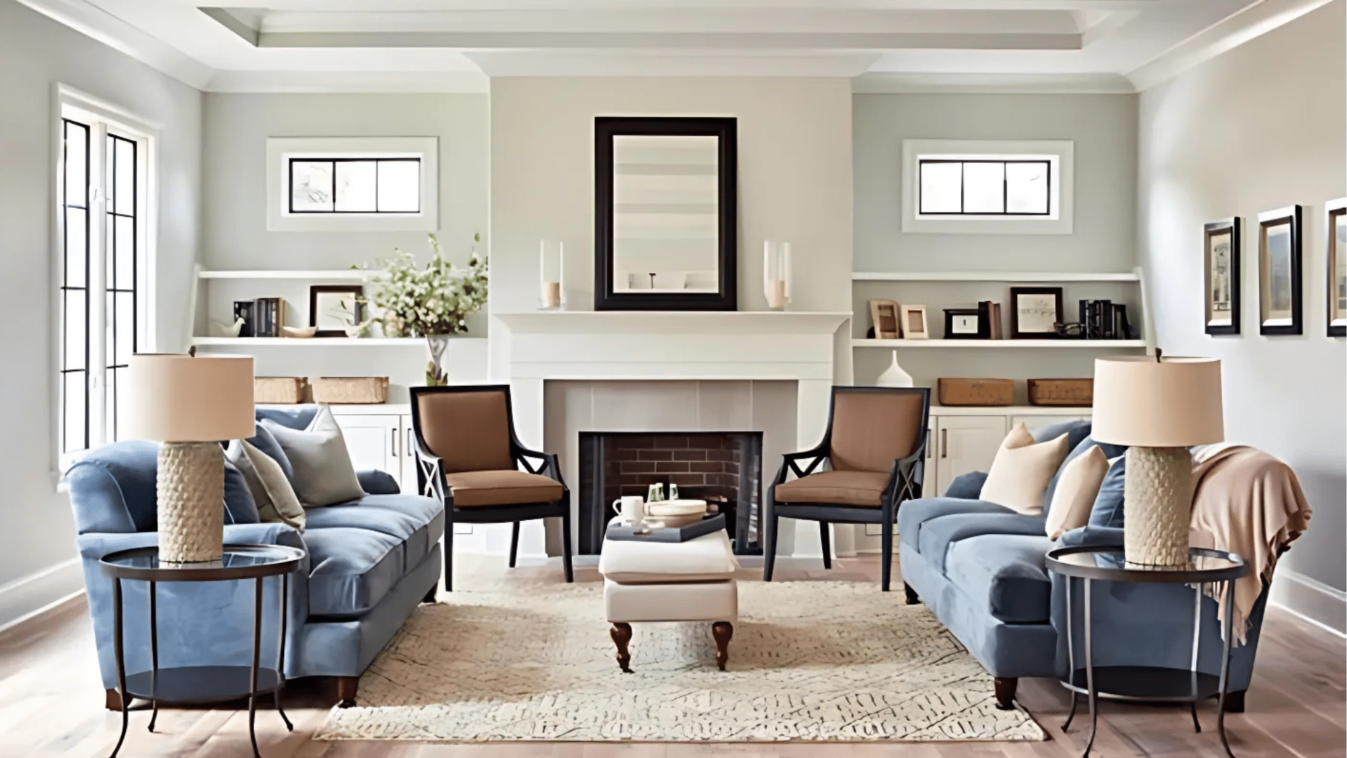
Moonshine works best when paired with soft, clean pieces. Since it’s a light gray, the color fits in easily without feeling flat or too sharp. The goal is to keep things calm, clear, and easy to enjoy.
Start with light wood or white furniture. These tones help keep the room open and airy. Avoid heavy dark pieces, which may feel too strong next to such a light color.
Use fabrics in light beige, soft gray, or cream. These work well for curtains, rugs, or pillows. You can also bring in small touches of blue or green to echo Moonshine’s undertones.
Brushed metal finishes like nickel or black also match well. Try these in lighting, handles, or mirror frames for a clean and balanced feel.
Keep things simple and natural. When everything else stays soft, Moonshine helps your home feel neat, quiet, and put together.
Moonshine vs. Other Light Grays
Moonshine is one of several soft gray paints in the Benjamin Moore collection. To understand what makes it different, here’s a simple comparison with other light grays like Gray Owl and Classic Gray.
| Paint Color | Tone | Undertone | Best Used In | Look and Feel |
|---|---|---|---|---|
| Moonshine 2140-60 | Light cool gray | Green, blue | Bedrooms, kitchens, living rooms | Calm, soft, slightly cool |
| Gray Owl OC-52 | Light cool gray | Blue, green (more vivid) | Offices, modern rooms | Crisp, slightly sharper |
| Classic Gray OC-23 | Light warm gray | Beige | Hallways, traditional spaces | Warm, soft, barely gray |
Moonshine sits between the cooler look of Gray Owl and the warmer feel of Classic Gray. It stays soft and steady, which helps it work in many types of rooms without feeling too strong.
Conclusion
Benjamin Moore’s Moonshine is a calm, light gray that fits into many homes with ease. We looked at how this shade brings balance to a space. It feels clean without being cold and soft without being boring. Its slight undertone helps it shift gently in different lighting.
I’ve also covered how it works in living rooms, bedrooms, kitchens, and more. It pairs well with wood tones, light floors, and soft fabric choices.
This paint doesn’t take over a room—it supports the space and helps it feel clear and put together. It’s simple to match and easy to live with.
If you want a gray that keeps things light, quiet, and steady, Benjamin Moore’s Moonshine is a color worth trying in your next paint update.
Frequently Asked Questions
Can Benjamin Moore’s Moonshine Be Used on Trim or Doors?
Yes, Moonshine can be used on trim or doors for a soft, subtle contrast against deeper wall colors. It works well in rooms where you want a quiet, blended look without stark white trim.
Does Moonshine Work Well on Ceilings?
Moonshine can be used on ceilings if you want a very light and soft gray overhead. It adds a touch of tone without the brightness of white, but be sure to test it in your lighting first.
Is Moonshine a Good Exterior Paint Color?
Moonshine can work outdoors, but its subtle undertones may look cooler or flatter in strong sunlight. It’s best used on shaded parts of the home or under covered porches for a more even appearance.
How Does Moonshine Look with Bold Accent Colors?
Moonshine is a quiet background color, so it pairs well with bold accents like navy, black, or deep green. Just be sure to balance the room with light elements so it doesn’t feel too dark.
What White Paint Goes Best with Benjamin Moore’s Moonshine?
Soft whites with a neutral or slightly cool tone work best with Moonshine. Look for whites like Benjamin Moore Chantilly Lace or Simply White to keep the palette clean and balanced.