Looking for the perfect paint color can be tough. I know the struggle. After testing over 50 paint colors as a home decorator, I can honestly say October Mist is something special.
Are you trying to find a calm but not boring color? This post will help you find one.
In this article, I’ll show you:
- What makes October Mist different from other greens
- Which rooms it works best in
- What colors and styles match it perfectly
Over the past two years, I’ve used this paint in my own home and on many client projects. The results speak for themselves. My clients often ask, “How did you know this would look so good?”
This guide will answer all your questions about Benjamin Moore’s October Mist so you can decide if it’s right for your home.
The Soft Look of October Mist: What You Should Know

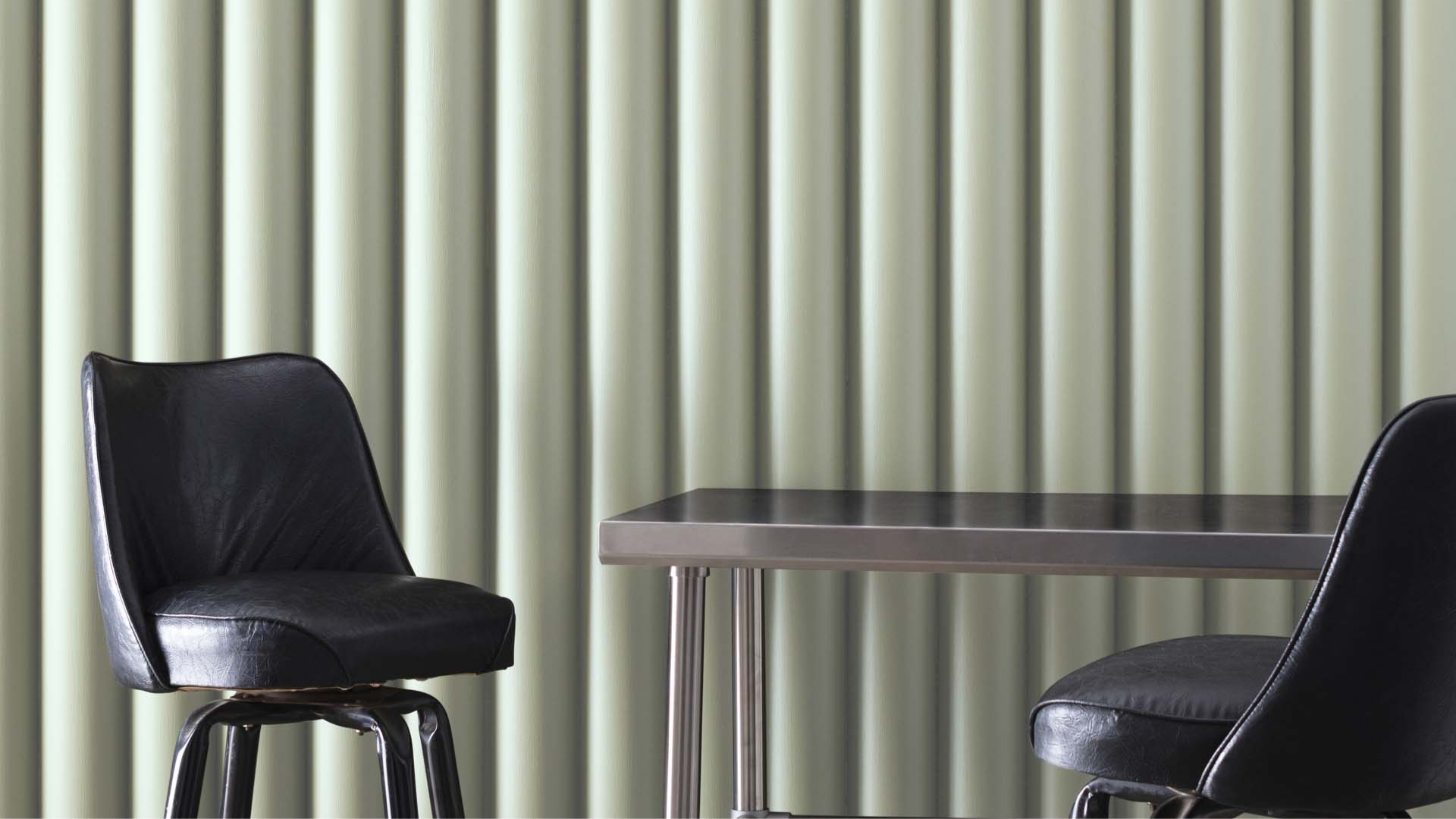
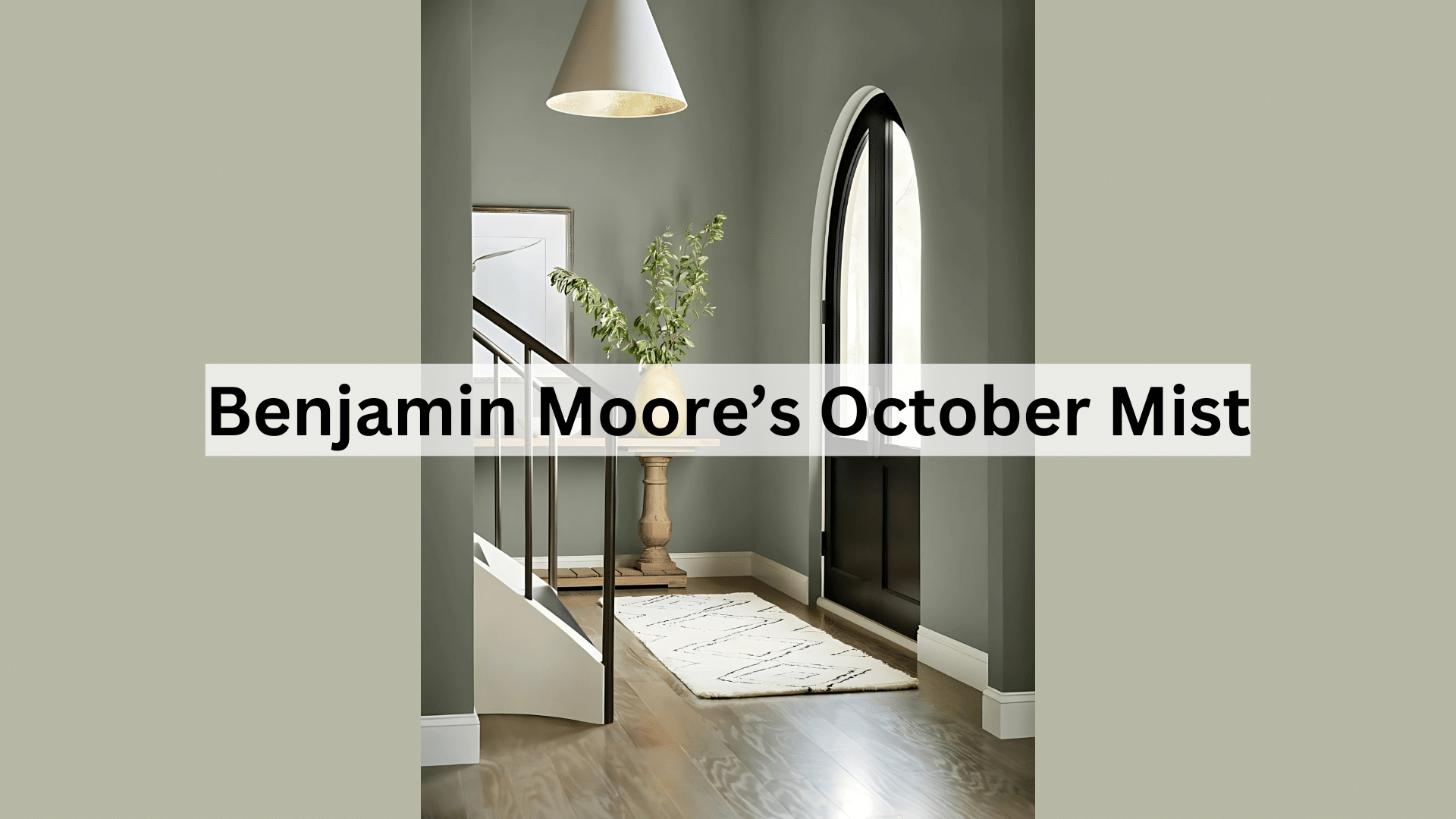
October Mist (1495) is a light sage green with gray hints. It’s part of Benjamin Moore’s Color Trends 2022 palette. What makes this color stand out?
It’s subtle but not boring. Many light greens can seem too bright or too dull. October Mist has just enough color to make a statement without being loud.
I’ve noticed it changes slightly during the day. In morning light, it looks more green. By evening, the gray tones become clearer. The paint has a smooth finish. One coat may work on light walls, but I suggest two coats for best results.
How Does October Mist Impact a Room’s Mood?

Colors affect how we feel. October Mist creates a sense of:
- Calm – Its soft tone lowers stress
- Welcome – It makes spaces feel open and friendly
- Balance – Not too warm, not too cool
I painted my office with October Mist last year. The change was amazing! My clients often comment on how relaxed they feel in the space.
You know how some colors can make a room feel cold or too hot? This isn’t one of them. It stays balanced in all seasons. Have you ever walked into a room and just felt good without knowing why? That’s what this color does.
Where to Use October Mist in Your Home for The Best Effect?
Not all colors work in every room. But October Mist is flexible. I’ve seen it work well in:
- Living rooms
- Bedrooms
- Home offices
- Kitchens
- Bathrooms
It looks best in spaces with good natural light, which brings out its subtle green tones. Small rooms with less light can still use this color, but it may appear more gray than green.
I think it shines most in rooms where you want to relax. My bedroom walls in October Mist help me wind down after long days.
What Flooring Works Best with October Mist Walls?
The right floor can make October Mist look even better. Based on my projects, these floors match well:
- Medium wood tones
- White tile or marble
- Light gray stone
- Natural fiber rugs (jute, sisal)
Dark floors create a nice contrast but can make the room feel more formal. I wouldn’t pair them with very red-toned woods like cherry, as the clash can make both look off.
My living room has oak floors with October Mist walls. The combo feels both modern and classic at the same time.
Color Combinations that Pair Perfectly with October Mist
Finding colors that go with October Mist (1495) isn’t hard. These are my top picks with actual Benjamin Moore colors and codes:
1. Simply White (OC-117)

This classic pairing makes rooms feel clean and fresh. I use Benjamin Moore’s White Dove (OC-17) or Chantilly Lace (OC-65) trim with October Mist in most projects for a timeless look that makes the sage green pop just enough.
White ceiling paint like Simply White (OC-117) creates a perfect frame for October Mist walls. This combo works in any room but looks especially good in kitchens and bathrooms.
2. Swiss Coffee (OC-45)

Ivory softens the look even more. When used with October Mist on adjacent walls or as trim, it creates a gentle, cozy feel. I love Benjamin Moore’s Swiss Coffee (OC-45) or Mascarpone (AF-20) with October Mist for a slightly aged, comfortable look.
This combination feels more relaxed than using pure white and works well in bedrooms and living spaces where you want to create warmth.
3. Edgecomb Gray (HC-173)

This combo keeps things neutral but interesting. The warmth of beige perfectly balances the cool undertones in October Mist.
For a soft, cohesive palette, try Benjamin Moore’s Manchester Tan (HC-81) or Edgecomb Gray (HC-173) as companion colors. I recently used this combination in a sunroom with lots of plants, and the result was a natural, earthy space that felt both modern and timeless.
4. Boothbay Gray (HC-165)

For a serene, spa-like feel, pair October Mist with a light blue-gray. I’ve used this in bathrooms with amazing results. Colors like Benjamin Moore’s Smoke (2122-40) or Boothbay Gray (HC-165) create a cool but harmonious palette that feels sophisticated.
This combination also works wonders in a home office where you want to create a focused, calm environment with minimal distractions.
5. Caldwell Green (HC-124)

Using a darker sage as an accent color creates depth. Try this on a single wall or through accessories for a layered look. Benjamin Moore’s Saybrook Sage (HC-114) or Caldwell Green (HC-124) make perfect deeper companions to October Mist.
In my dining room, I used October Mist on the walls with Caldwell Green on the built-in cabinets—the monochromatic scheme feels cohesive yet interesting.
6. Audubon Russet (HC-51)

The warmth of terracotta creates a perfect contrast. Small pops of this color in pillows or artwork balance the cool green beautifully. Benjamin Moore’s Audubon Russet (HC-51) or Warm Sienna (1201) work well as accent colors.
Rather than painting walls, I suggest bringing terracotta in through pottery, textiles, or furniture pieces. The earthy orange-red tone makes October Mist look even more sophisticated and intentional.
7. Hale Navy (HC-154)

This creates a classic, slightly coastal vibe. The depth of navy makes October Mist feel even more sophisticated. Try Benjamin Moore’s Hale Navy (HC-154) or Van Deusen Blue (HC-156) as an accent wall or on kitchen islands paired with October Mist walls.
I’ve also used navy blue upholstery in rooms with October Mist walls for a balanced, relaxed look that feels decidedly grown-up but not stuffy.
8. First Light (2102-70)

Unexpected but lovely. The gentle contrast between cool green and warm pink creates a fresh, modern space. Try Benjamin Moore’s First Light (2102-70) or Tissue Pink (2008-60) for subtle touches that don’t feel too feminine.
I recently added soft pink throw pillows to a client’s October Mist bedroom, and they were surprised by how well the colors complemented each other. The key is keeping the pink muted rather than bright.
9. Black Satin (2131-10)

For dramatic contrast, add black accents. Door hardware, light fixtures, or picture frames in black make October Mist look crisp. Benjamin Moore’s Black Satin (2131-10) or Iron Mountain (2134-30) in matte finish works better than glossy with this color.
In my kitchen, I painted October Mist walls with black cabinet hardware and light fixtures. The contrast is striking but not harsh, giving the room a modern edge while maintaining its softness.
Simple Ways to Style October Mist in Your Home Decor
You don’t need to be a pro to make October Mist look great. Here’s what works:
- Textiles: Add cream, white, or tan throw pillows and blankets. Textured fabrics like linen or cotton look best.
- Plants: Green plants pop against the soft walls. Try snake plants, pothos, or peace lilies.
- Art: Black and white photos or simple line art stand out well.
- Metals: Brass and matte black look amazing with this shade.
I changed my living room to October Mist last fall. I kept my cream sofa but added new throw pillows in deeper green and tan. The room felt new without buying much.
How does October Mist Look in Different Lighting?
Light changes everything with paint. October Mist shifts during the day:
- Morning: Bright and more green
- Midday: Balanced sage with gray hints
- Evening: Softer, more gray than green
- Artificial light: It depends on your bulbs – warm bulbs bring out green, and cool bulbs enhance gray
North-facing rooms make it look cooler and grayer, while south-facing rooms bring out the warmer green tones. Before making my decision, I painted sample boards and moved them around my house, which helped me visualize how it would look in each space.
Design Styles that Pair Naturally with October Mist
Some colors only work with certain styles. October Mist is more flexible. It works with:
- Modern Farmhouse – Pairs well with white trim and natural textures
- Scandinavian – The light tone fits with this clean style
- Mid-Century Modern – Works with wood tones and clean lines
- Coastal – Creates a soft backdrop for blue accents
- Minimal – The subtle color adds interest without being too much
I first used it in a modern farmhouse project. Later, I used the same color in a more mid-century space. It worked in both! You don’t need to change your style to use this color; it adapts to your existing style.
Conclusion
After using October Mist in countless spaces, I’m still impressed by its versatility. This color strikes a rare balance—it’s current without being trendy and subtle without being boring.
What makes it stand out? It’s the way it changes throughout the day while always staying pleasant. It’s how it works with almost any style, from modern to traditional. It’s the calm feeling it creates without trying too hard.
Before you commit, grab a sample pot. Paint a board and move it around your home for a few days. See how it looks in your morning coffee spot and your evening reading nook.
The best paint color is one that makes you happy each time you see it. For me and so many of my clients, October Mist does exactly that. It might just be your perfect match, too.
Frequently Asked Questions
Is October Mist Too Trendy or Will It Still Look Good in 5 Years?
October Mist has staying power because it’s not too bold or specific to one style trend. It has classic qualities that will look good for many years, similar to how certain grays and beiges have remained timeless.
Does October Mist Work with Existing Beige Furniture?
Yes, October Mist pairs beautifully with beige furniture, creating a calm, cohesive look. The subtle contrast between the cool green walls and warm beige upholstery creates pleasant visual interest.
How Does the October Mist Photograph for Social Media or Real Estate Listings?
October Mist photographs extremely well because it’s neither too dark nor too light. It creates a clean backdrop that looks fresh and modern in photos while letting furniture and decor stand out nicely.

