")
Are you searching for the perfect paint color that can breathe new life into your room? Province Blue might be exactly what you’re looking for.
In this guide, I’ll break down everything you need to know about this unique shade from Benjamin Moore.
I understand how challenging it can be to choose the right color. Paint isn’t just a color; it’s a mood, a statement, and an investment in your home.
That’s why I’m here to help you:
- Understand the true character of Province Blue
- How does it look in different lighting
- Learn where this color works best
I have carefully researched and tested this color, so you can trust my insights. Even if you’re a first-time painter or a design enthusiast, I’ll give you the confidence to make a smart color choice.
Why Province Blue Is an Ideal Paint Color?
Province Blue is easy to use. It adds color without overwhelming the space, and it sits right between blue and green, which makes it feel calm but not flat. This balance is what makes it so flexible.
The color has a soft, cool feel, but it’s not too icy. It works in rooms that get a lot of sun and in ones that don’t. In bright spaces, it looks fresh, and in darker rooms, this shade adds depth without feeling heavy.
You can use Province Blue in many ways, on all four walls, as an accent color, on cabinetry, and even on doors or furniture. It also fits into many design styles, such as modern, which features clean lines and simple details.
While coastal pairs with whites and sandy tones, traditional works with wood and classic trim, and minimal gives a soft backdrop with neutral touches.
Because it blends well with other colors and finishes, its a great choice for individuals who want something unique yet easily incorporated into their decor.
Understanding the Subtle Undertones of Province Blue
Province Blue is not just one flat color; it has a mix of blue and green tones. This blend gives it a soft, natural look. Depending on the light, it can shift, and sometimes it leans more teal. At other times, it appears as a muted blue.
The change is gentle, but it’s good to know before you paint. Light makes a big difference in how Province Blue appears. In natural light, the color often feels fresher and shows more green.
In artificial light, it can appear deeper or more gray-blue, depending on the type of bulb. My advice would be that before painting a full room, always test a sample of the paint to ensure it meets your expectations.
Try it on more than one wall. Check it in the morning, afternoon, and evening, and look at it with the lights on and off. This will help you see how Province Blue will truly look in your space, before you commit.
Best Places to Use Province Blue in Your Home
Province Blue works in many rooms. It has just enough color to stand out, but it still feels calm and steady. These are some recommendations for your home with Province Blue.
Living Rooms
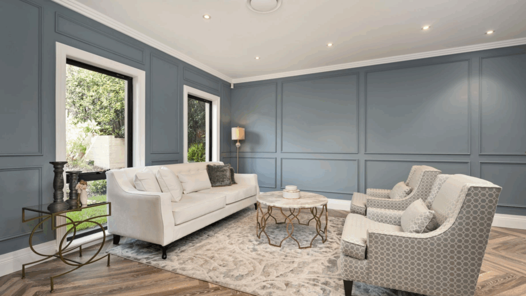
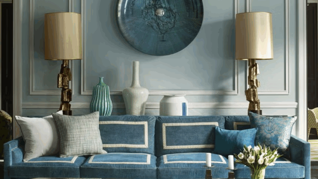
Imagine walking into a living room that feels like a breath of fresh air. I love using Province Blue as a primary wall color or as a statement furniture piece.
Sofas, armchairs, or throw pillows can instantly cool down a warm space. Remember to pair it with warm wood tones to create a balanced look that feels both modern and inviting.
Bedrooms
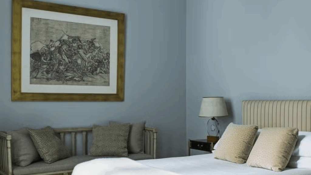
Your bedroom should be a place of rest. Province Blue works magic here. I recommend using it as an accent wall behind your bed; it creates depth without overwhelming the space.
Lighter colors can help a room feel more open and serene. Adding soft blue bedding or curtains brings a calm and soothing vibe.
Bathrooms
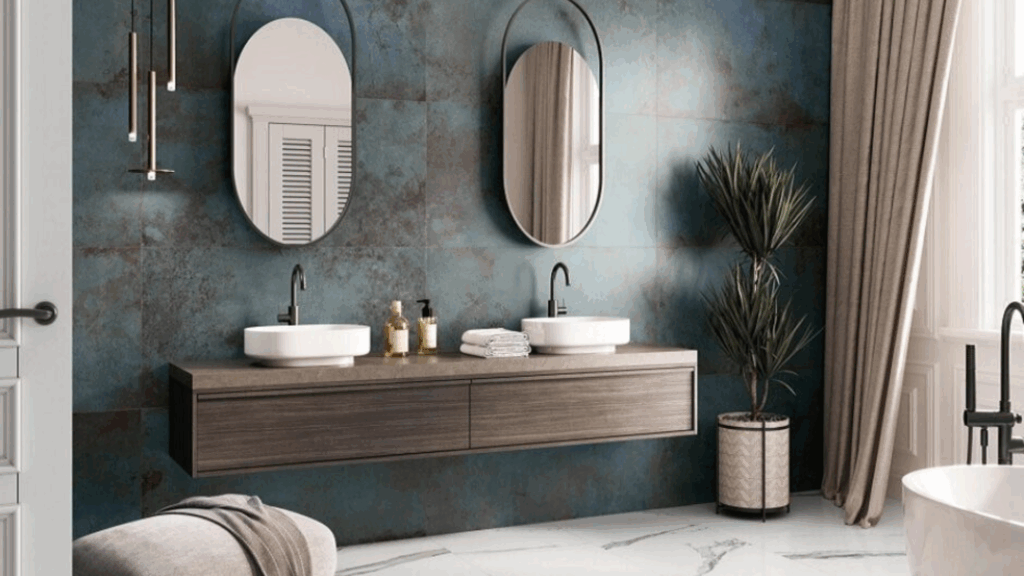
Bathrooms are perfect for Province Blue. The color mimics water and creates a clean, fresh atmosphere.
I’ve seen beautiful results with blue tiles, painted vanities, or even just blue towels and accessories. Small spaces come alive with this color, making them feel more open and refreshing.
Cabinetry
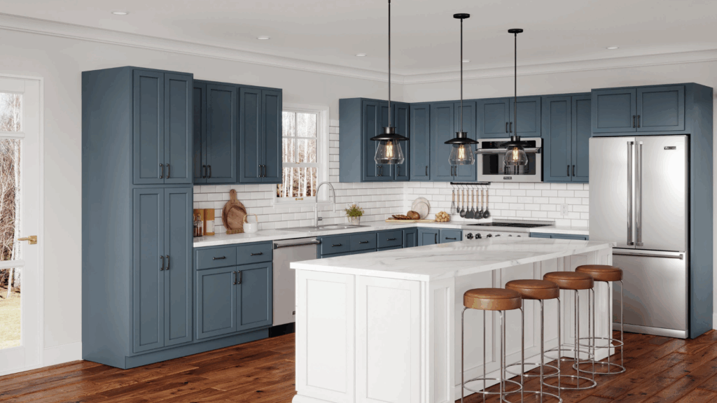
Don’t shy away from blue cabinetry! In kitchens or home offices, Province Blue can be a game-changer.
I love how it adds personality to cabinets. Imagine navy-blue kitchen cabinets with brass hardware; simply beautiful. It works equally well in bathrooms and laundry rooms.
Accent Walls
An accent wall is your chance to be creative. Province Blue can anchor a room or create a focal point.
I suggest you to choose a wall that gets good natural light. One bold wall can completely turn the feel of your space. Pair with neutral furniture to let the blue truly shine.
Flooring Options that Pair Beautifully with Province Blue
The right flooring helps Province Blue look its best. Since this color falls between blue and green, it complements both warm and cool tones.
- Light Oak or Whitewashed Wood: Light wood floors create a soft contrast. They help brighten the space and make the color stand out. This is a good choice for bedrooms, living rooms, or hallways.
- Warm-Toned Wood: Warm woods, such as honey oak or walnut, balance the cool tones in Province Blue. They add warmth without clashing. This combo feels natural and grounded.
- Natural Stone or Tile: Stone or tile floors bring in texture and variety. Go for beige, soft gray, or off-white shades. This pairing works well in bathrooms, kitchens, or entryways.
- Neutral Carpet in Beige or Warm Gray: A neutral carpet helps soften the space. Beige feels warm and cozy. Warm gray stays subtle and cool. Either choice allows Province Blue to stay calm and balanced.
Province Blue Compared to Other Warm Neutral Paints
Province Blue is a balanced, medium blue-green that evokes a sense of calm and softness. Compared to other warm natural paints, Province Blue stands out the most.
| Paint Color | Tone | Undertones | How It Differs from Province Blue |
|---|---|---|---|
| Province Blue | Medium blue-green | Balanced blue + green | Calm, soft tone with a subtle mix of blue and green |
| Aegean Teal | Deep blue-green | Strong teal | Darker and bolder; feels more saturated and rich |
| Woodlawn Blue | Light Blue | Blue + gray | Cooler and softer; lacks the green warmth of Province Blue |
| Palladian Blue | Light green-blue | Green + soft Blue | Lighter and airier, it has a stronger green feel |
| Smoke | Medium Blue | Blue + gray | More cool and crisp; no green undertone |
Trim and Ceiling Colors that Work with Province Blue
To make Province Blue stand out in the right way, it’s important to select the appropriate trim and ceiling colors. For trim, crisp whites like Chantilly Lace or Simply White offer a clean contrast.
These shades keep the space bright and sharp, especially in rooms with lots of natural light. If you prefer a softer look, off-whites are a good option.
Colors like White Dove or Cloud White feel warmer to me and blend well with wood tones or textured decor. These softer whites help you create a calm and connected room without a strong contrast.
When you’re painting ceilings, a flat white finish works best for me. It keeps the ceiling quiet and allows you to keep the wall color as the main focus.
A flat finish also reduces glare and helps you feel the room is balanced from top to bottom.
Using Province Blue in Different Styles
Province Blue is a versatile color that feels comfortable to me and complements a wide range of design styles you might choose. Its soft, balanced tone helps you create a space that fits in without standing out too much.
- Coastal space: Such as those in Province Blue, pair well with white walls, sand-colored accents, and light wood finishes. It brings a relaxed, breezy feel without going too bright.
- Traditional look: This color pairs well with dark wood furniture, brass fixtures, and classic patterns such as stripes or florals. It adds calm to the space while keeping things grounded.
- Modern homes: Province Blue offers a clean background. It looks good with black trim, white surfaces, and stone or metal accents. This gives a space a fresh but steady feel.
- Boho style: Try mixing Province Blue with woven textures, warm neutrals, and earthy materials for a unique look. It brings a soft, cool tone that balances out the natural details.
Conclusion
Color can change everything. Benjamin Moore’s Province Blue isn’t just another paint shade; it’s a story waiting to happen in your home. I’ve found every angle of this color, and now it’s your turn to make it your own.
Think beyond traditional color rules. Province Blue offers unexpected possibilities, even if you’re a design newbie or a seasoned decorator, this shade has something special for you.
Always test your color first. Paint a small section and watch how light changes throughout the day. Colors have personalities, and Province Blue is no exception.
Want to make a statement? Be brave and trust your instincts. Your space, your rules.
If you have any questions about Province Blue? Then drop a comment below. I’d love to hear about your color adventures and help you find the perfect shade for your home.