")
Stepping into the world of Spanish Olive (1509) feels like walking through a sun-drenched Mediterranean garden.
This warm, earthy green has quietly become a favorite among homeowners who want their spaces to feel natural and grounded.
Why is everyone suddenly loving this color? Simple – we’re all craving that connection to nature and calm that Spanish Olive delivers without trying too hard.
In this post, I’ll break down everything you need to know about this versatile shade:
- Its yellow-green undertones and how they shift in different lights
- The psychological effects (hint: it’s incredibly soothing)
- Where does it work best in your home
- Colors that pair perfectly with it
I’ve tested Spanish Olive in real homes, not just looked at paint chips. This guide cuts through the fancy talk to give you honest advice about whether Spanish Olive is right for your space.
The Rich Undertones of Spanish Olive by Benjamin Moore

Spanish Olive is more than just green. It’s a complex color with a story to tell. The base is a muted, earthy green that feels like home.
But look closer, and you’ll spot soft brown undertones that add warmth.
There are also hints of gray that keep it grounded. This mix is what makes it special.
Ever picked up a dried sage leaf? Or noticed the underside of an olive tree leaf? That’s Spanish Olive in nature.
Light changes everything with this color. In morning sunlight, the green wakes up and feels fresh. During sunset, those brown undertones glow, and the room feels extra cozy.
In rooms with cool, north-facing light, the gray notes become more obvious.
With an LRV (Light Reflectance Value) of 52.54, it’s not too dark or too light. This middle-ground LRV means it absorbs some light while still reflecting enough to keep spaces feeling open.
What I love most is how these undertones work together to create a color that feels present but never shouts. It has personality without demanding attention.
The Psychology of Spanish Olive by Benjamin Moore
Colors affect how we feel. And Spanish Olive has a superpower: it brings calm without boring you.
I’ve watched people walk into Spanish Olive rooms and literally take deeper breaths. The earthy green connects us to nature in a primal way. Your brain recognizes it as familiar and safe.
This color hits a sweet spot – warm enough to feel cozy but neutral enough to relax your mind.
Have you noticed how time slows down on forest walks? Spanish Olive brings that same quality indoors.
For those of you who want something beyond beige but fear going too bold, this color is your perfect middle ground.
It’s what I call a “gentle adventure” – it shows personality without shouting for attention.
Why Spanish Olive Is an Ideal Paint Color for Any Room?
1. Style Chameleon
Spanish Olive moves between design styles with ease. I’ve used it in sleek, minimal apartments where it feels classy and modern.
Then painted the same color in farmhouse kitchens, where it suddenly feels rustic and timeless.
You don’t need to commit to just one style with this color. It adapts as your taste evolves.
2. Natural Material Matchmaker
Have you ever noticed how colors in nature always seem to work together? Spanish Olive follows this rule perfectly.
It makes wood tones richer. Your oak floors will glow warmer. Walnut furniture will stand out more clearly.
I especially love how it pairs with woven rattan and jute, natural linen upholstery, terracotta pots and accessories, and brass or copper fixtures.
This color creates a backdrop that lets natural textures tell their story.
3. Space Adaptability
In small rooms, Spanish Olive doesn’t feel heavy or dark. The gray undertones keep it from overwhelming tight spaces. Yet in large, open areas, it doesn’t disappear like paler colors often do.
It has enough body to define a space without shrinking it. Think of it as the Goldilocks of green paint colors, not too bold, not too shy. Just right.
4. Refined Earthiness
You want the connection to nature, but you’re not trying to live in a literal forest. I get it. Spanish Olive offers that perfect balance
It’s clearly inspired by the natural world but with a polished edge that keeps your space looking intentional, not rustic.
Your guests will notice something special about your walls without immediately thinking “green room.” That subtlety is what makes it so sophisticated.
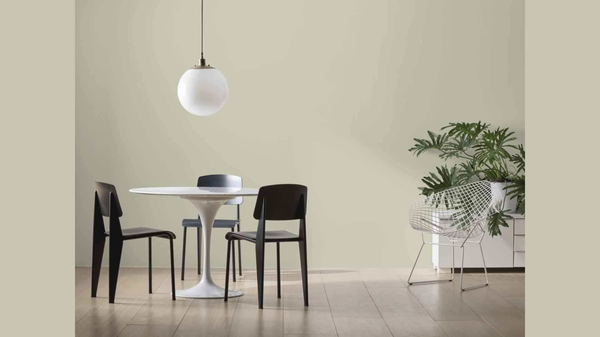
Best Places to Use Spanish Olive in Your Home
Spanish Olive by Benjamin Moore works well in many rooms throughout your home. This mid-tone green brings a sense of calm and connection to nature into your living space without being too strong.
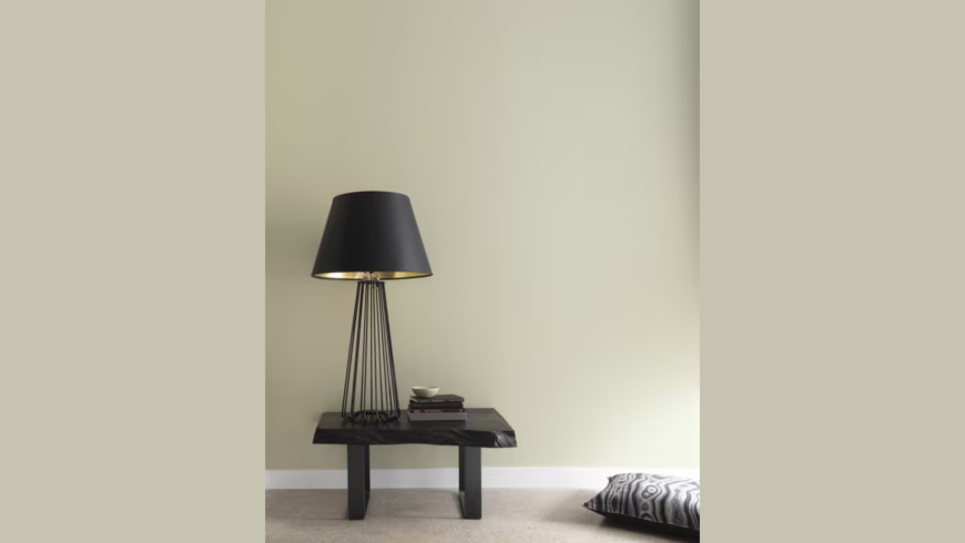
1. Bedroom Retreat
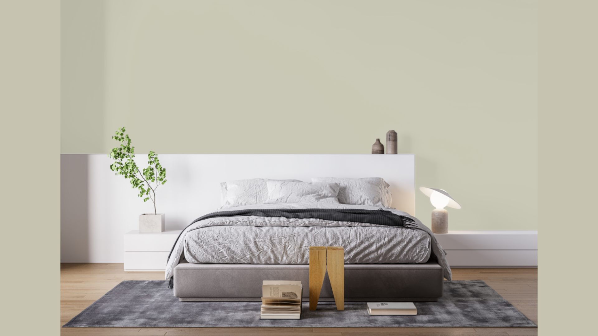
You deserve to end each day in a space that helps you unwind. Spanish Olive in bedrooms acts like a gentle sleeping pill for your eyes.
I recommend trying it on all four walls rather than just an accent.
The cocoon-like effect is worth it. Layer in different textures like chunky knit throws, linen duvet covers, velvet accent pillows, and woven rattan headboards.
These textures come alive against the Spanish Olive backdrop.
2. Kitchen Character
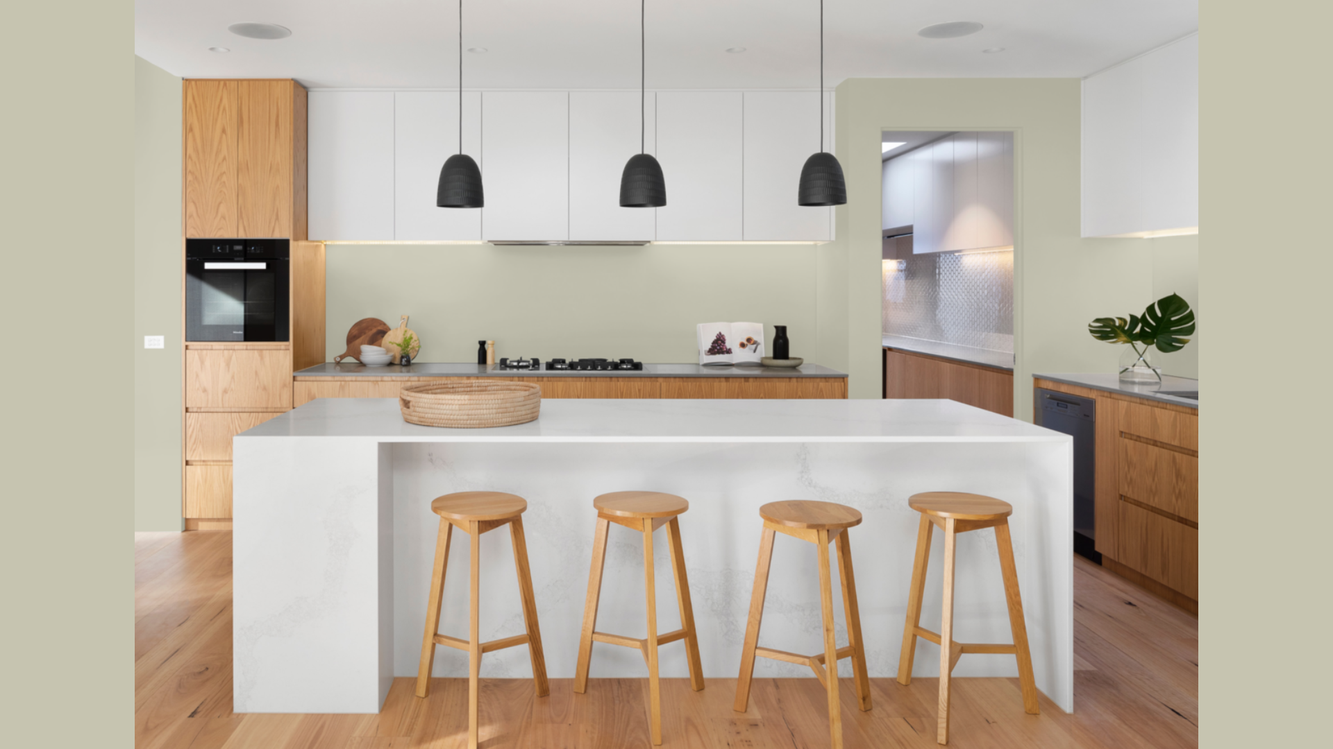
Kitchens with Spanish Olive cabinets feel both classic and current.
Not an easy balance to strike! If painting all cabinets feels too committed, try just the island or lower cabinets. This creates a grounded base with lighter upper cabinets.
Your countertops will look more expensive against this color, especially marble or butcher block.
I’ve noticed that kitchens with Spanish Olive tend to become the spots where guests actually gather, not just pass through.
3. Focus-Friendly Office
Working from home requires a space that keeps you alert but not overstimulated. Spanish Olive hits that productivity sweet spot.
Unlike stark white offices that can cause eye strain, this muted green creates a gentle background for computer work.
The earthy quality helps your mind stay grounded during stressful deadlines or endless Zoom calls.
Add a plant or two, and you’ve created a workspace that feels intentionally designed rather than hastily assembled.
Flooring Options that Pair Beautifully with Spanish Olive
When you select Spanish Olive for your walls, choosing the right flooring can make a big difference in how the color looks and feels in your home. These are some flooring options that work particularly well with this green shade:
1. Light Oak Hardwood
I’ve found that light oak floors create magical breathing room beneath Spanish Olive walls.
The contrast keeps your space feeling open and airy. Your eyes get a visual break as they move from the rich walls to the lighter floor.
This prevents the green from feeling too heavy or all-consuming.
Whitewashed oak works especially well in smaller rooms where you want the cozy feeling of Spanish Olive without making the space feel smaller.
2. Warm-Toned Woods
For a more enveloping, cohesive look, consider walnut or cherry floors.
I love how these warm-toned woods pick up the brownish undertones in Spanish Olive. The effect feels intentional and thoughtful, not matchy-matchy.
Your space will have that hard-to-achieve quality of feeling “designed” without trying too hard. Think of it as creating your own forest floor and canopy – a complete ecosystem of color.
3. Natural Fiber Rugs
Spanish Olive walls practically beg for natural fiber rugs. Jute, sisal, and seagrass all bring out the organic quality of this paint color.
I recommend choosing rugs with subtle patterns or textural variations.
The walls do the heavy lifting design-wise, so your floors can be more about texture than pattern.
These natural fibers add warmth while reinforcing the connection to nature that Spanish Olive starts.
4. Soft Gray Stone
When you want something besides wood, gray stone or porcelain tile creates a beautiful foundation for Spanish Olive walls.
The coolness of the stone balances the warmth in the green, creating a perfect tension that keeps things interesting.
I’ve used slate, limestone, and concrete-look tiles with Spanish Olive walls in bathrooms and kitchens with beautiful results.
The key is choosing stones with subtle variation rather than high-contrast veining.
Spanish Olive Compared to Other Warm-Neutral Paints
When I first saw Spanish Olive on my living room wall, I knew it was special. You might be wondering how it stacks up against similar Benjamin Moore options.
Let me break this down for you:
| Paint Color | How It Compares to Spanish Olive |
|---|---|
| Camouflage | Spanish Olive is a bit darker than Camouflage. When you put them side by side, Camouflage looks slightly lighter and more toned down. |
| Dry Sage | Spanish Olive feels warmer than Dry Sage. If you want a color with less gray and more warmth, Spanish Olive is your pick. |
| Saybrook Sage | Spanish Olive has less yellow in it than Saybrook Sage. It also has more depth, which gives walls a richer look. |
What makes Spanish Olive stand out? Spanish Olive is the perfect balance between earth tones and class. It’s not too yellow, not too gray, and not too light.
I’ve used it in both my kitchen and office. The color stays true in different lighting conditions – morning sun, afternoon shade, and even under lamps at night.
You won’t find another color that balances warmth and subtlety quite like Spanish Olive does.
Conclusion
Spanish Olive might be the hardest-working paint color I know. It brings warmth to modern spaces, cozy to rustic rooms, and a natural feel to any home in between.
What makes it special is its versatility without being boring. Unlike beige, it has character. Unlike bolder greens, it knows when to step back.
Always test before committing. Get a sample and check how it looks:
- In morning light vs. evening light
- Against your existing furniture
- Next to your flooring
I’ve painted hundreds of rooms over my career.
Spanish Olive remains a color I return to again and again for clients who want something real. Something that feels like home from the moment it dries.
If you’ve been stuck in beige-land but felt nervous about color, Spanish Olive offers the perfect first step into a more vibrant home.