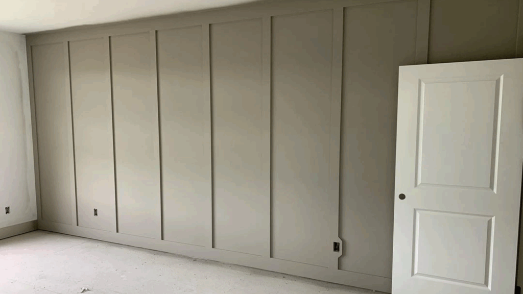
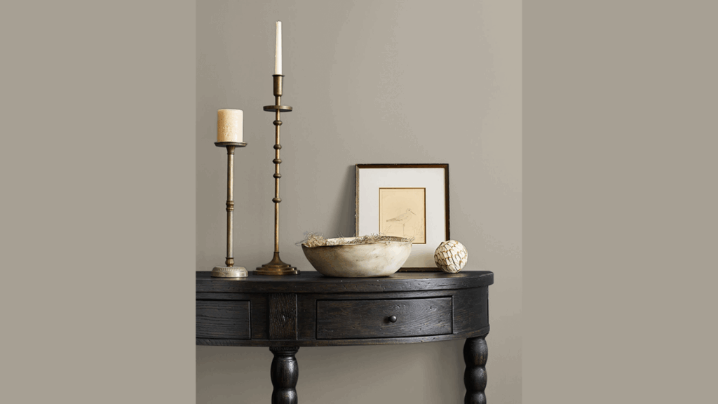
Choosing the right paint color can be tricky, especially when you want something that feels calm but still has personality.
In this post, I’m reviewing Sherwin-Williams’ Fawn Brindle (SW 7640), a warm, earthy tone that falls somewhere between greige and taupe. You’ll find everything you need to know, including:
- What Fawn Brindle actually looks like
- Its color codes and details
- How it compares to similar Sherwin-Williams shades
I used Fawn Brindle on a small home office wall and was surprised by how different it looked throughout the day, soft in the morning, richer by late afternoon.
This review is for anyone trying to decide if it will work well in their space.
What Is Fawn Brindle by Sherwin-Williams?
When I first looked at Fawn Brindle, I thought it was just another gray. But it’s not. It sits right between brown and gray with a hint of taupe, and it leans more warm than cool.
It’s not too dark or too light, which makes it easy to use in a lot of spaces.
In bright daylight, it looks more gray with soft brown in the background. But under warm indoor light, you’ll notice the brown tones come out more.
It can shift slightly depending on the time of day and the kind of bulbs you use.
If you’re looking for a neutral that feels cozy but still clean, this one fits the bill. I think it’s great if you want a paint color that feels grounded but doesn’t take over the whole room.
Key Color Specs and Codes
If you’re trying to get the right color without guessing, these specs will help. I’ve listed them so you can copy them quickly or look them up when you shop for paint.
- RGB: 190, 192, 187: These numbers show how much red, green, and blue make up the color. You won’t need this unless you’re doing design work.
- Hex Code: #BEC0BB: This is useful if you’re matching the color on a computer or website.
- LRV (Light Reflectance Value): 53: This tells you how light or dark the color is on a scale from 0 (black) to 100 (white). A 53 means it’s pretty balanced, not too dark or too light.
- Color Family: Gray: This helps you know what color group it belongs to. It’s neutral.
- Undertone: Cool gray with soft green hints. Undertones are the subtle colors you see under the main color, especially in different lighting.
Key Features and Attributes of Fawn Brindle

Fawn Brindle is one of those colors that feels easy and natural in any space. It’s calm and earthy without being dull, and it pairs well with a lot of other shades.
1. Neutral but Never Boring
I like Fawn Brindle because it gives you that balanced neutral look without feeling flat. It’s not too yellow, not too gray, and doesn’t shift weird in different lighting.
That makes it really dependable. If you’re nervous about bold colors or don’t want to repaint anytime soon, this one keeps things simple without being plain. It has just enough depth to feel interesting, even on all four walls.
2. Works Well with Other Shades
You can pair Fawn Brindle with a wide range of colors, which makes it super flexible.
I’ve seen it look great next to creamy whites, soft taupes, rich greens, and even navy blue. It also plays well with black hardware or wood furniture.
If you’re not sure how to tie a room together, this color helps everything feel more pulled together without trying too hard. It lets other features shine, but still holds its own.
3. Brings a Peaceful Mood
This color has a way of making a space feel settled and easygoing. It’s not flashy, so it doesn’t demand attention the way some bold colors do.
I think that’s why it works so well in spots where you want to relax, like bedrooms or reading corners. It gives off a steady, grounded feeling that helps calm your mind. You won’t walk in and feel overwhelmed by it.
4. Great for Any Room
Fawn Brindle is the kind of color that fits just about anywhere. I’ve seen it used in bedrooms, living rooms, kitchens, even bathrooms, and laundry rooms.
It also looks really nice on exteriors, especially with white trim or wood accents. Because it’s so flexible, you can carry it through your home and create a cohesive look without it feeling repetitive.
It adapts to different lighting and styles without clashing.
5. Easy to Live With
This is a low-maintenance color, and I mean that in the best way. It hides everyday smudges and scuffs better than bright white or super dark shades.
And because it’s not tied to one trend, it won’t look outdated in a year or two. If you want a paint color that won’t stress you out or require constant touch-ups, Fawn Brindle is a smart choice. It just works, and keeps working.
Application Tips for a Flawless Fawn Brindle Finish
If you’re planning to paint with Fawn Brindle, a few simple steps can make a big difference. I’ve worked with this color before, and here’s what helped me get a clean, even finish without frustration.
- Use a high-quality roller and angled brush: I always go for a good 3/8″ roller for walls and an angled brush for edges and trim. Cheap tools can leave streaks or shed fibers, which ruins the look.
- Plan for two coats: Even though Fawn Brindle has solid coverage, I always do two coats. The first layer gives you the base, and the second smooths everything out and deepens the color.
- Prime if you’re painting over a dark or bright color: If you’re covering a bold red, navy, or dark green, use a primer first. I’ve skipped this step before and ended up needing a third coat, totally not worth it.
- Stick with satin or eggshell finishes for walls: These give you a smooth look and are easier to clean than flat paint. I’ve found satin works great in kitchens and high-traffic areas, while eggshell is perfect for bedrooms.
- Matte works for ceilings or low-use walls: If you’re painting a ceiling or a space that won’t get touched often, matte is fine. Just know it’s harder to clean.
- Cut in before rolling: I always brush the edges and corners before rolling the main areas. It helps everything blend better and avoids those harsh lines.
- Don’t rush drying time: Let the first coat dry fully, usually about 4 hours, before starting the second. I’ve rushed it before, and it caused streaks when I rolled over damp paint.
Durability and Longevity of Fawn Brindle on Exteriors
I’ve seen Fawn Brindle used on all kinds of outdoor surfaces, siding, shutters, even front doors, and it holds up really well.
It’s a mid-tone neutral, so it doesn’t show dirt as quickly as lighter colors and doesn’t fade as fast as darker ones. That makes it a smart pick if you don’t want to be out there touching up every season.
With good quality exterior paint, Fawn Brindle usually looks fresh for about 5–7 years before needing a full repaint.
If you live in a sunny area, it’s worth using a UV-resistant formula to help the color stay rich longer.
I also recommend washing the surface once or twice a year with mild soap and water; it helps cut down on buildup and makes the paint last even longer.
Overall, it’s a solid, low-maintenance choice for outdoors.
Fawn Brindle vs. Other Sherwin-Williams Colors
If you’re trying to decide between Fawn Brindle and other popular Sherwin-Williams neutrals, it helps to look at how they compare in warmth, depth, and how they reflect light.
I’ve broken it down into a simple table so you can see the differences at a glance.
| Color | Warmth | Depth | Light Reflection (LRV) | What Makes It Different |
|---|---|---|---|---|
| Fawn Brindle (SW 7640) | Balanced, slightly earthy | Medium depth | 53 | Feels grounded and soft, sits between warm and cool, works well indoors and outdoors. |
| Repose Gray (SW 7015) | Cooler, with subtle blue undertones | Lighter than Fawn Brindle | 58 | Has a fresher feel, better if you want something lighter and more modern. |
| Intellectual Gray (SW 7045) | Warm with green undertones | Slightly deeper than Fawn Brindle | 36 | Feels more dramatic and moody, good for accent walls or cozy rooms. |
| Perfect Greige (SW 6073) | Warmer, strong beige influence | Deeper and richer | 42 | More warmth and depth work well with warm wood tones and traditional interiors. |
Conclusion
Fawn Brindle is definitely a safe bet if you want a neutral that feels grounded but not boring.
It works in just about any space, inside or out, and pairs well with so many other colors. I’d say it’s perfect for anyone who wants a calm, steady background that won’t go out of style.
If you’re not into trendy colors or constantly repainting, this one’s easy to live with.
I’ve used it before and would absolutely use it again, especially for bedrooms or siding. It gives a home a relaxed, put-together look without trying too hard.
I’ve recommended it to friends who didn’t know where to start with paint, and they’ve all been happy with how it turned out. If you’re on the fence, Fawn Brindle is one of those colors that’s hard to mess up.

