")
Sherwin-Williams Inkwell is one of those paint colors that instantly changes a room’s mood. I’ve used it enough to know it’s not just another dark shade, it’s a deep blue-black that can look bold in daylight and cozy at night.
In this blog, I’ll cover what makes Inkwell unique, how lighting changes it, and where it fits best in your home.
You’ll find insights on its characteristics, using it for various room styles, and how it compares to similar dark shades.
If you’re thinking about painting an accent wall, a whole room, or just curious about the color’s vibe, I’ll help you see what to expect before you open the paint can.
By the end, you’ll know if Sherwin-Williams Inkwell is the right shade for your next project.
What Is Sherwin-Williams Inkwell?
Sherwin-Williams Inkwell (SW 6992) is a deep blue-black paint color that adds depth and richness to any space. It’s part of Sherwin-Williams’ neutrals and dark tones collection, known for creating a bold yet balanced look.
Unlike pure black paint, Inkwell has subtle blue undertones that show up more in natural light.
In rooms with less light, it often looks nearly black, creating a bold and dramatic look. This mix of blue and black makes it a versatile choice for walls, cabinets, or accent spaces.
Homeowners often choose Inkwell when they want a color that feels modern, calm, and classy without being harsh.
It pairs well with white trim, warm wood tones, and metal finishes, making it easy to use in both contemporary and classic interiors.
Before choosing this color, it helps to know a few key details that define how it looks and performs. Below is a quick overview of its main specifications.
| Feature | Details |
|---|---|
| Color Name | Inkwell |
| Color Code | SW 6992 |
| Color Family | Blue-Black / Neutral |
| Finish Options | Flat, Satin, Semi-Gloss, Gloss |
| LRV (Light Reflectance Value) | 4 |
| RGB Value | 49 / 54 / 57 |
| Hex Value | #313639 |
| Best For | Accent walls, cabinetry, trim, and moody rooms |
| Complementary Colors | White, warm wood tones, gold, and soft gray |
| Paint Type Available | Interior and Exterior |
The Undertones of Sherwin-Williams Inkwell
The undertones of Sherwin-Williams Inkwell lean toward blue with subtle hints of gray, creating a cool and refined look. This balance makes it more than just a black shade; it carries depth that shifts with lighting.
In bright, natural light, the blue undertones stand out, giving the paint a softer, more inviting feel.
In dim or artificial light, Inkwell appears nearly black, adding a sleek and dramatic touch. Because of this shift, it works beautifully in both modern and classic interiors.
The color’s versatility makes it a great choice for accent walls, cabinets, or entire rooms.
If you want a dark paint with character, Inkwell gives a deep tone that’s bold yet easy to live with and style in any space.
Key Characteristics of Sherwin-Williams Inkwell
Before choosing Sherwin-Williams Inkwell (SW 6992), it helps to understand what makes this color stand out. Here are a few key characteristics that show how it looks, feels, and performs in real spaces.
1. Color Tone and Depth
When I first used Sherwin-Williams Inkwell, I noticed its deep blue-black tone that feels rich without being too dark.
It’s not a flat black; the blue undertone gives it dimension and makes it easier to match with other colors. You’ll see how it shifts slightly under different lighting, adding personality to your space.
This balance of depth and softness makes Inkwell a great choice for anyone who wants a dark color that still feels comfortable.
2. Mood and Atmosphere
I’ve found that Inkwell changes the mood of a room almost instantly. In daylight, it feels calm, balanced, and sophisticated, adding a quiet sense of confidence to any space.
At night, it becomes cozy, moody, and modern, giving the room a more intimate look.
You can use it to make your space feel grounded and stylish without it becoming too dark.
If you’re after a color that adds warmth, depth, and character, this shade gives your room that perfect, well-balanced mix.
3. Versatility in Design
One thing I like about Inkwell is how well it fits in different design styles. It works in modern, traditional, or farmhouse interiors, depending on how you pair it.
You can use it for walls, cabinets, or trim, and it always looks put-together.
It combines easily with white, beige, gold, and warm wood tones, giving you plenty of decorating flexibility. If you want one dark color that adapts to your home’s style, Inkwell is an easy pick.
4. Finish and Durability
From my experience, Inkwell performs well in any finish, whether you go for flat, satin, or semi-gloss.
Each finish gives a different feel: flat for a soft look, satin for walls, and semi-gloss for cabinets or trim. It’s a durable paint that holds up well in both interior and exterior spaces, resisting scuffs and fading.
If you’re planning to use it in high-traffic areas, choosing the right finish will help it stay beautiful and last longer.
How does Lighting change the Look of an Inkwell?
Lighting plays a big role in how Sherwin-Williams Inkwell looks. In bright natural light, the color shows more of its blue undertones, making it appear softer and cooler.
In low light or artificial lighting, it looks deeper and closer to black, giving a bold and dramatic effect.
North-facing rooms often make it appear cooler, while warm lighting or sunlight brings out its blue-gray balance.
Because of these shifts, it’s important to test Inkwell on your wall before painting the whole space. Seeing it at different times of the day helps you understand how it changes in your room.
This paint’s ability to adapt to lighting is what makes it stand out; it can look modern and moody in one space, then calm and elegant in another.
Room-By-Room Color Recommendations with Inkwell
Inkwell is a deep, rich color that can make any room feel cozy, stylish, and urbane. Using it thoughtfully in different spaces helps highlight features and create the right mood for each area.
1. Living Spaces
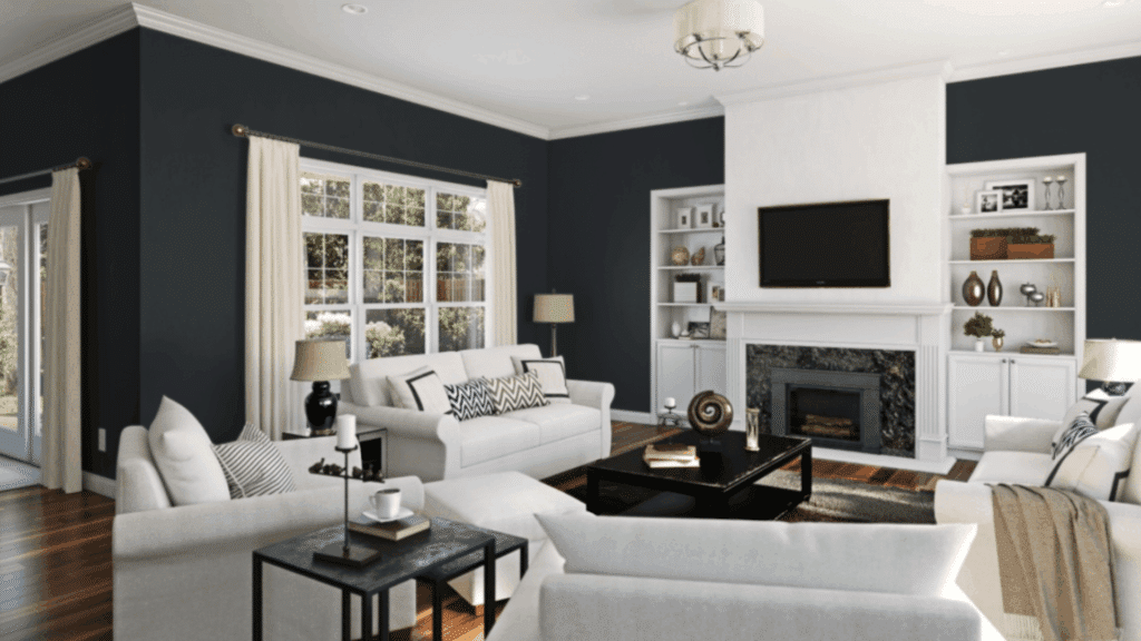
In living rooms or family areas, Inkwell works well as an accent wall or on cabinetry.
It adds depth and visual interest without overwhelming the space. Pairing it with lighter furniture, rugs, or artwork balances the dark tone, creating a welcoming and stylish environment.
This approach makes the room feel grounded, luxurious, and cozy for both relaxing and entertaining.
2. Bedroom
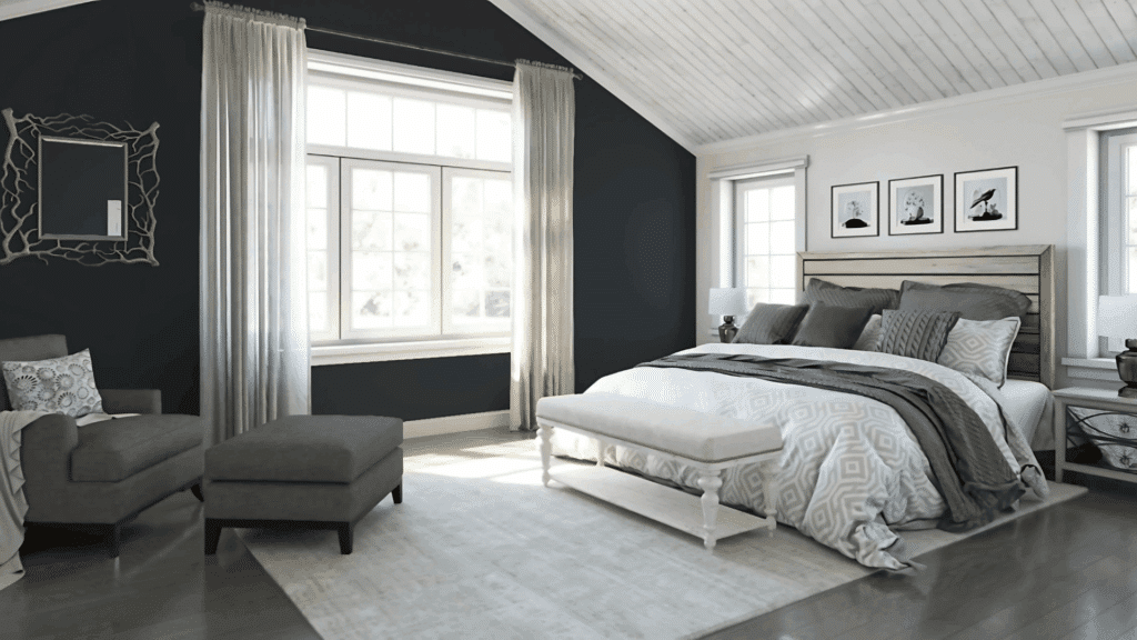
In bedrooms, Inkwell is perfect for feature walls or even ceilings. Its deep tone promotes a calm, restful atmosphere that helps with relaxation and sleep.
Combine it with soft bedding and lighter decor accents to avoid the room feeling too dark.
The color brings warmth and sophistication, making the bedroom feel like a cozy retreat where you can unwind and enjoy a peaceful environment.
3. Kitchen
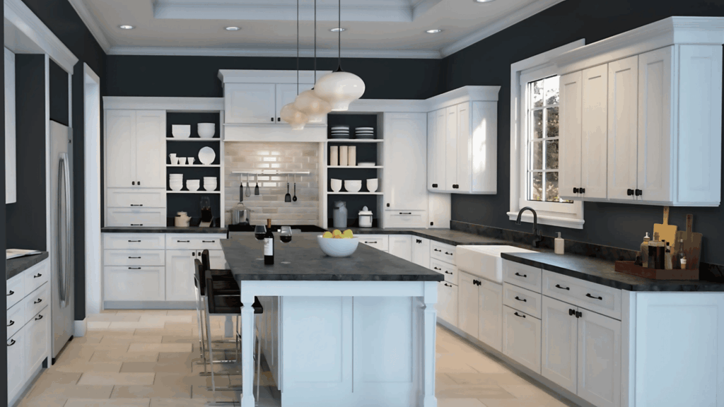
In kitchens, Inkwell is ideal for island cabinetry, accent walls, or even backsplashes. It creates bold contrasts with lighter countertops, cabinets, or appliances, giving the space a modern, stylish look.
The rich color adds drama without being overpowering and pairs well with metals like brass or stainless steel.
Using Inkwell in kitchens makes the space feel luxurious, unique, and visually interesting while still remaining functional and welcoming.
4. Bathrooms
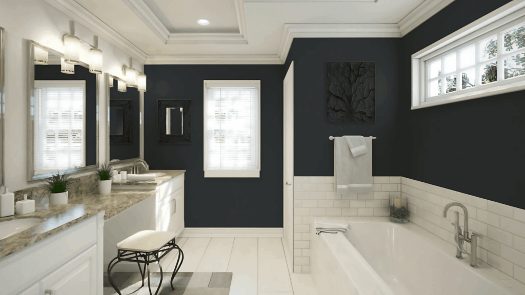
In bathrooms, especially powder rooms, Inkwell provides a luxurious and dramatic vibe.
Its deep, urbane tones make smaller spaces feel special and luxurious. Pairing it with bright fixtures, mirrors, or metallic accents ensures the room stays open and inviting.
This bold choice changes a simple bathroom into a stylish, memorable space that feels modern yet cozy.
Inkwell brings richness and personality, making even small bathrooms feel high-end and thoughtfully designed.
Designer Tips for Using Inkwell Effectively
If you’re planning to use Sherwin-Williams Inkwell, a few simple design tips can help you get the best results. These ideas make it easier to bring out the color’s depth and balance in any room.
- Test before painting: Try samples on different walls and check the color in daylight and artificial light.
- Pair with contrast: Use crisp whites, warm wood tones, or brass accents to balance its depth.
- Use on features: Apply Inkwell on cabinets, doors, or accent walls to add focus without darkening the entire room.
- Add texture: Mix matte and glossy finishes or layer fabrics to keep the space from feeling flat.
- Choose lighting carefully: Warm lighting softens the tone, while cool lighting enhances its blue side.
- Keep décor light: Use neutral or metallic accessories to keep the room open and balanced.
Inkwell Compared to Other Dark Paint Colors
When choosing a dark paint, it helps to see how Inkwell compares to other popular shades. Below is a quick comparison to guide your choice.
| Paint Color | Tone Description | Undertone | LRV | Best For |
|---|---|---|---|---|
| Inkwell (SW 6992) | Deep blue-black with a soft gray balance | Blue | 4 | Modern or classic interiors needing depth |
| Tricorn Black (SW 6258) | Pure, true black without undertones | Neutral | 3 | Sleek, modern spaces or exteriors |
| Naval (SW 6244) | Rich navy blue with strong depth | Blue | 4 | Bedrooms, offices, or feature walls |
| Iron Ore (SW 7069) | Charcoal black with warm gray tones | Warm Gray | 6 | Cozy interiors and kitchen cabinets |
| Cyberspace (SW 7076) | Cool dark gray with blue hints | Blue-Gray | 6 | Contemporary rooms and trim work |
Conclusion
Sherwin-Williams Inkwell is more than just a dark paint; it’s a color that adds personality and depth to any space.
After seeing how it shifts between blue and black tones, I’d say it’s perfect for anyone who wants a rich, dramatic look without feeling too heavy.
It works beautifully in bedrooms, offices, and accent walls where you want contrast and calm at the same time.
If you’re planning to use it, test a small area first to see how your lighting affects it.
Pair it with crisp whites, warm woods, or soft neutrals for balance. Inkwell proves that dark colors can be bold and comforting at once.
For me, it’s a top pick when you want sophistication that still feels easy to live with.