 by Benjamin Moore: Complete Color Review")
I’ve been painting rooms for years now, and nothing makes me second-guess myself quite like picking the perfect gray. Too blue? Too purple? Will it look like a sad rainy day or a cozy retreat?
That’s where Rockport Gray enters the picture.
This Benjamin Moore shade has been popping up everywhere lately. From Pinterest boards to real renovation projects, it seems like everyone’s curious about this particular gray.
But does it actually live up to the hype, or is it just another trendy color that’ll feel dated in two years? I spent weeks testing this shade in different rooms and lighting conditions. Let me walk you through what I found.
Rockport Gray Benjamin Moore Color Specifications
Rockport Gray is a warm, medium-toned gray from Benjamin Moore’s Historical Collection. It brings together brown, green, and violet undertones that create a surprisingly cozy neutral. This isn’t your typical flat gray; it has real personality and depth.
| Specification | Details |
|---|---|
| Color Name | Rockport Gray |
| Code | HC-105 |
| LRV | 35.65 – 36.61 |
| Undertones | Warm brown, green, violet |
| Collection | Historical Colors |
| Hex Code | #A9A194 |
| RGB Values | 169, 161, 148 |
How Lighting Affects Its Undertones
Rockport Gray is a chameleon that shifts throughout the day.
In northern light, those green undertones come alive. The color can read almost sage-like, especially in the morning hours.
It’s subtle but noticeable. Southern exposure brings out the warmth, making those brown undertones more prominent and creating a cozier feel.
Artificial lighting changes everything, too. Warm bulbs make it feel more beige and inviting, while cool LED lights can push it toward a flat, grayish-green that might not be what you’re after.
I always recommend testing samples under your specific lighting conditions before committing to a full room.
Best Rooms to Use Rockport Gray Benjamin Moore
This versatile gray works beautifully in multiple spaces. Its warm undertones create inviting atmospheres while maintaining that sophisticated neutral vibe everyone’s after.
Living Rooms
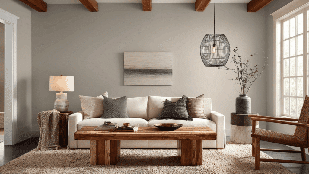
Living rooms benefit from Rockport Gray’s cozy warmth without feeling too heavy. It creates a grounded backdrop that works with both modern and traditional furniture styles.
The medium tone adds depth without making the space feel closed in.
Plus, it handles different lighting situations throughout the day reasonably well. If you’re hosting guests or just relaxing after work, this gray maintains its composure and keeps the room feeling welcoming rather than cold or stark.
Bedrooms
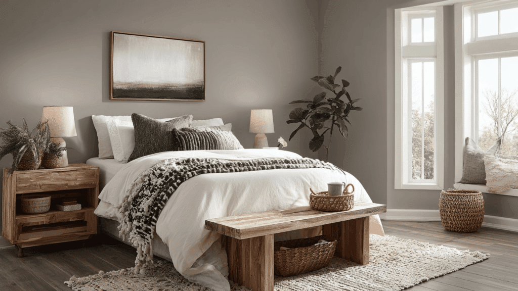
Bedrooms need that calm, restful quality, and Rockport Gray delivers. The warm undertones create a cocoon-like feeling that’s perfect for winding down at night.
It’s dark enough to feel intimate but not so dark that mornings feel gloomy. I’ve found it pairs beautifully with white bedding and natural wood furniture.
The subtle complexity keeps it from feeling boring, which matters when you’re staring at the same walls every single day.
Kitchens
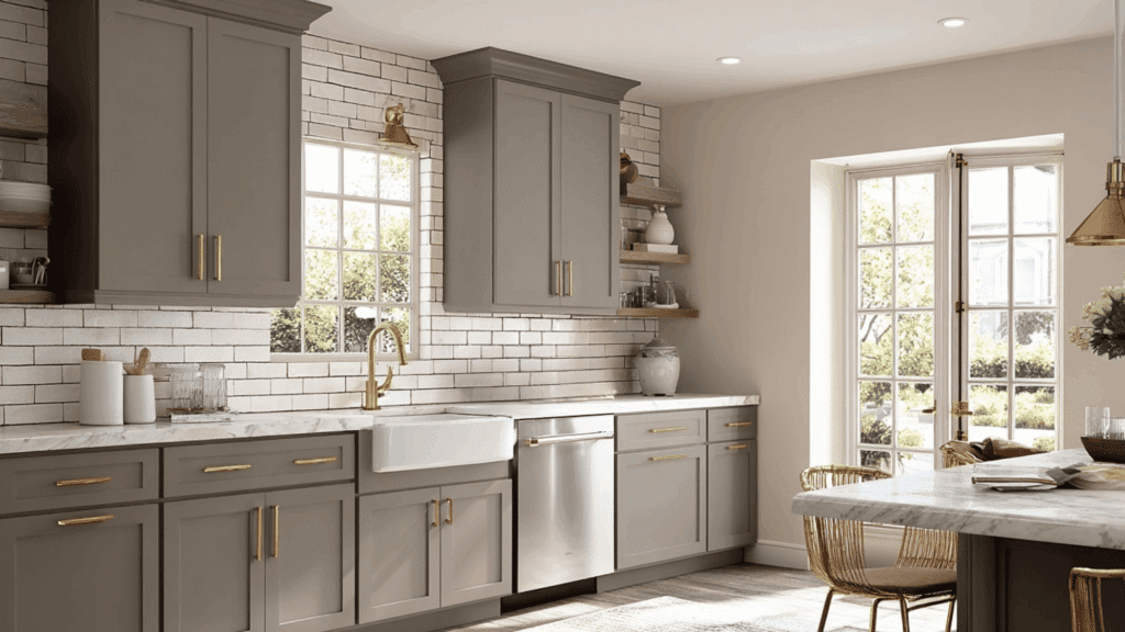
Kitchen cabinets in Rockport Gray have become increasingly popular, and for good reason.
The color adds character without overwhelming your space or clashing with countertops. It works particularly well with white subway tile, marble, or butcher block counters.
On walls, it creates a classic backdrop for white or wood-toned cabinets. It’s medium-toned, so adequate lighting is essential to keep your kitchen from feeling too dim during meal prep.
Exterior Siding and Trim
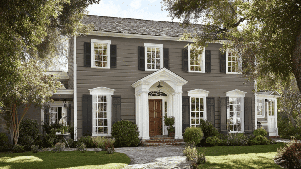
Exterior applications showcase Rockport Gray’s versatility brilliantly. As siding, it offers an ageless, historical look that complements a range of architectural styles, from colonials to farmhouses.
The warm undertones prevent that cold, institutional gray feeling some exteriors get. It pairs beautifully with white trim for classic contrast or darker accents for a more modern approach.
The color holds up well in different weather conditions and lighting, maintaining its character from sunrise to sunset without looking washed out or dingy.
Rockport Gray Benjamin Moore on Walls vs Cabinets
The performance of Rockport Gray changes dramatically depending on where you use it.
On walls, it reads lighter, and those green-violet undertones become more apparent, especially in rooms with ample natural light. The color breathes a bit and creates an airy backdrop.
On cabinets, everything intensifies. The darker application brings out the brown undertones more strongly, creating a richer, more grounded look.
Cabinet doors in shadow can appear quite dark due to that LRV of 36, so kitchen lighting becomes critical.
I’ve seen guests getting surprised by how different the same paint looks in these two applications. Always test samples on both vertical surfaces and cabinet doors before making your final decision.
Best Colors to Pair With Rockport Gray
Rockport Gray plays well with others. Its warm undertones make pairing straightforward, whether you’re going bold or keeping things subdued.
| Color Name | Color Type | Why It Works With Rockport Gray |
|---|---|---|
| White Dove | Warm white | Softens Rockport Gray and keeps spaces bright and balanced |
| Chantilly Lace | Crisp white | Adds sharp contrast for a clean, modern look |
| Simply White | Creamy white | Enhances the warm undertones without feeling yellow |
| Hale Navy | Deep navy | Creates bold contrast and adds richness |
| Kendall Charcoal | Dark gray | Builds depth and a layered, monochromatic palette |
| Edgecomb Gray | Light greige | Keeps the look cohesive and warm |
| Natural Wood Tones | Organic neutral | Brings warmth and texture to balance the gray |
Rockport Gray Paint Color Mistakes to Avoid
Even versatile colors like Rockport Gray can go wrong. Avoiding these common pitfalls will save you time, money, and the potential for a repaint disaster.
- Skipping the sample test: Never commit without testing it in your actual space and lighting conditions first
- Using it in windowless rooms: That LRV of 36 needs natural light, or it’ll feel like a cave
- Pairing with cool whites: Stark whites make the warm undertones look muddy and confused
- Ignoring your flooring: Cool-toned floors can clash with those warm brown and green undertones
- Painting without primer: The medium tone needs proper coverage, or previous colors will bleed through
- Choosing the wrong finish: High-gloss amplifies undertone,s while flat can look chalky in bright light
Conclusion
Rockport Gray isn’t a one-size-fits-all solution, but it comes pretty close. The warm undertones give it flexibility that stark grays just can’t match. Yes, lighting will shift how it looks; that’s part of its charm, really.
Before you buy five gallons, grab those samples. Test them everywhere. Morning light, evening light, next to your trim and floors. Give it a few days of living with it.
This color has earned its popularity for good reason. It brings warmth without going beige, depth without going dark, and character without demanding attention.
For a gray that actually feels like home, Rockport Gray delivers.