
I’ve noticed how much the right colors can change the feel of a room. If you’ve ever looked around your space and felt something was off, you’re not alone.
Choosing the right room color schemes can feel confusing, especially with so many options out there.
In this guide, I’ll walk you through simple ideas that actually work. You’ll find color combinations, easy tips, and common mistakes to avoid. I’ll also show you how to match colors with your furniture and Lighting so everything feels balanced.
You don’t need to be an expert to get this right. With a few smart choices, you can make your space feel calm, stylish, and comfortable. Let’s go step by step and help you create a look that truly fits your home.
How to Choose the Right Room Color Scheme for Your Space
Choosing the right room color scheme starts with understanding your space and how you want it to feel every day. Think about the room’s purpose.
Soft, neutral tones work best for relaxing spaces like bedrooms, while brighter or warmer colors can energize living rooms and kitchens.
Take a close look at your existing furniture, flooring, and décor, and choose colors that match or complement them.
Lighting is another key factor. Natural light can make colors look brighter, while artificial Lighting may change their tone. Always test paint samples on your walls before making a final decision.
You can also follow simple guidelines, such as the 60-30-10 rule, to keep your colors balanced. In the end, pick shades that reflect your style and make your space feel comfortable, inviting, and truly your own.
Popular Room Color Schemes That Always Work
Simple, timeless color combinations that suit any interior style and make your space feel balanced and inviting.
1. White and Beige
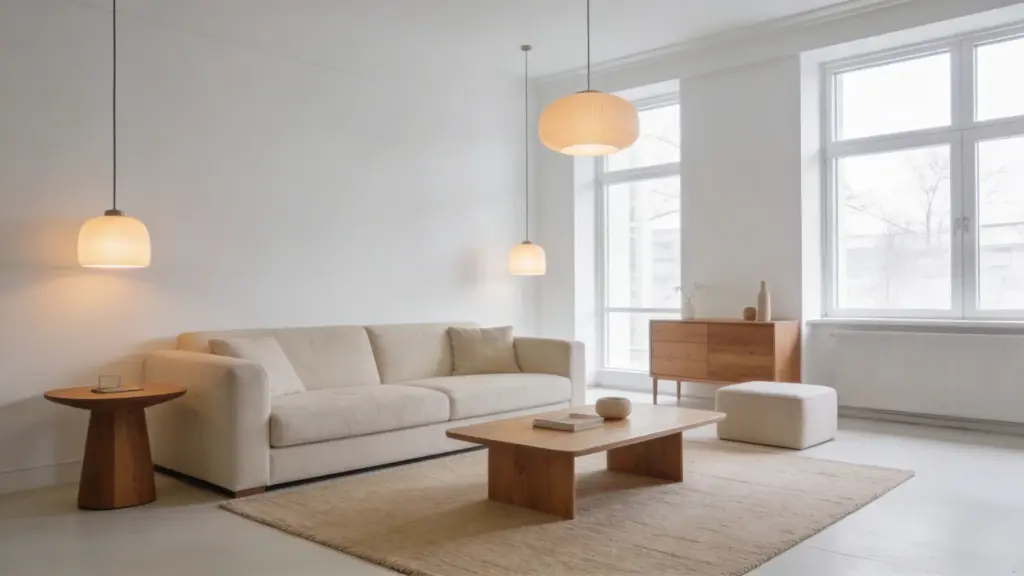
White and beige is a foolproof starting point for any room. White reflects light and keeps things feeling open. Beige brings warmth without weighing the space down.
Together, they create a look that feels clean, calm, and completely timeless. This combo works in bedrooms, living rooms, and small spaces alike. Layer textures through rugs, cushions, and curtains to add depth.
Finish with a wooden accent or some greenery to make the space feel complete and lived-in.
2. Gray and White
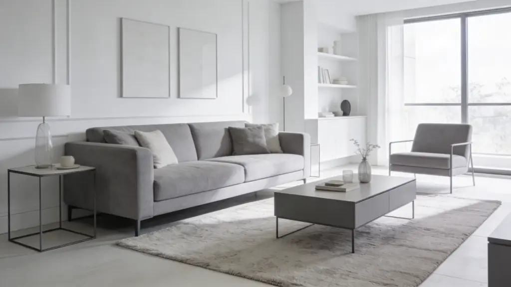
Gray and white is a simple combination that delivers a polished, put-together look without a lot of effort. White does the heavy lifting here.
Keep walls and larger surfaces light and bright to open the space up and make it feel fresh. Bring gray in through furniture, soft furnishings, or an accent wall to add depth and contrast.
Choose lighter grays for a relaxed feel or go darker for something more dramatic. Add metallic touches or soft fabrics to keep the palette from feeling too cold.
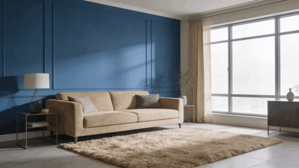
3. Navy Blue and White
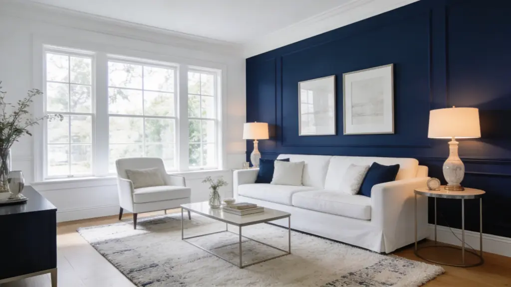
Walking into a navy blue and white room feels like a breath of fresh air. There is a crispness to it that is hard to replicate with other color combinations.
White opens the space up and keeps it feeling airy, while navy wraps the room in a quiet confidence and depth. It suits living rooms, bedrooms, and bathrooms equally well.
You do not need much navy to make an impact. An accent wall or a few bold furnishings is enough.
4. Black and White
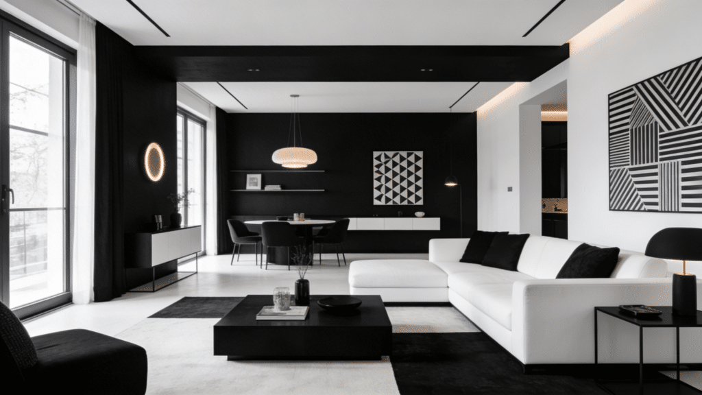
Black and white is proof that you do not need color to make a statement. This pairing is sharp, bold, and endlessly versatile across modern, classic, and minimalist interiors.
White creates a clean, spacious backdrop, while black adds definition and visual weight exactly where you need it. Use black on furniture, frames, and decor to create strong focal points.
When the contrast starts feeling too intense, soften it with layered textures like woven rugs, linen cushions, or natural wood accents.
5. Cream and Gold
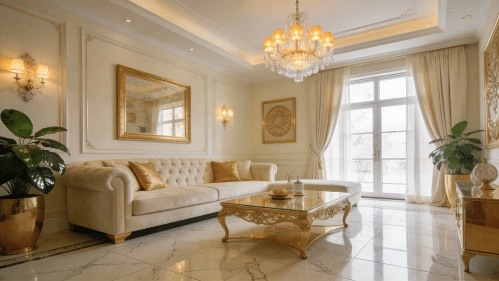
Cream and gold prove that elegance does not have to be loud. This pairing is warm, refined, and works effortlessly in living rooms and bedrooms alike.
Cream creates a soft, comfortable backdrop that keeps the space feeling light and breathable, while gold brings in just enough shine to lift the whole room.
Use gold intentionally on mirrors, light fixtures, and small decorative pieces to create subtle focal points. Soften the overall look with plush fabrics like velvet or linen for a cozy finish.
6. Blue and Gray
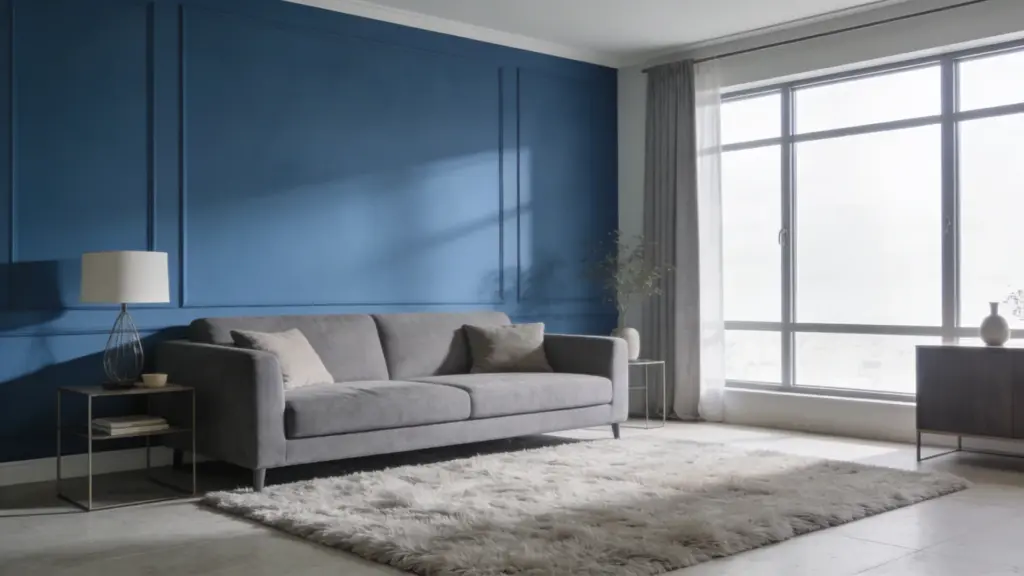
Blue and gray is a pairing that just feels right. Blue brings a quiet calm to any room, while gray keeps everything grounded and balanced.
Together they create a space that feels modern without being cold. Light shades keep things airy and open. Darker tones add depth and a moodier edge.
This combo works especially well in bedrooms and living rooms. Bring in white accents or natural wood elements to keep the space feeling fresh and welcoming
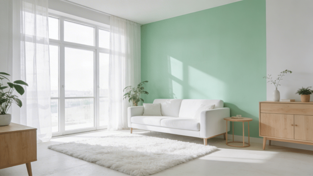
7. Green and White
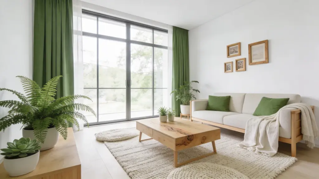
Green and white is a combination that brings the outdoors in without overwhelming the space. Let white handle the walls and larger surfaces to keep things bright and open.
Bring green in through furniture, soft furnishings, or a painted accent wall. Light greens feel peaceful and airy, while deeper shades add richness and drama.
Layer in wooden elements or real plants to strengthen the natural feel. The result is a space that feels clean, calm, and full of quiet energy.
8. Sage Green and Beige
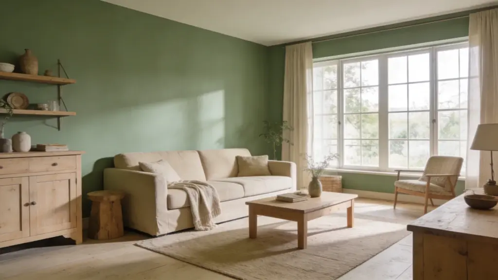
There is something about sage green and beige that makes a room feel instantly peaceful.
It is the kind of color combination that does not demand attention but quietly makes the space feel warm, grounded, and effortlessly stylish.
Sage brings a gentle natural quality, while beige wraps everything in softness and warmth. This pairing feels right at home in bedrooms and living rooms.
Add linen fabrics, wooden furniture, and a few organic textures to bring the whole look together beautifully.
9. Dusty Pink and Gray
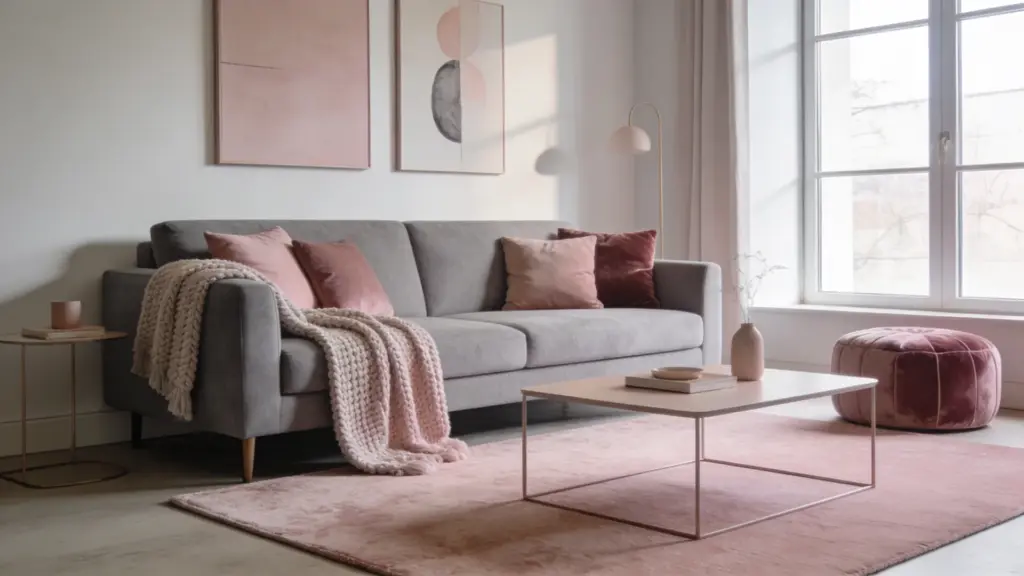
Dusty pink and gray prove that soft tones can still make a strong statement.
Gray acts as a steady, neutral foundation that keeps the space feeling calm and composed, while dusty pink adds a layer of warmth and personality that stops the room from feeling too plain.
Use gray on walls or larger furniture pieces and introduce dusty pink through cushions, rugs, and decorative accents.
Finish the look with silver or rose gold touches to add a polished, cohesive feel throughout.
10. Blush Pink and White
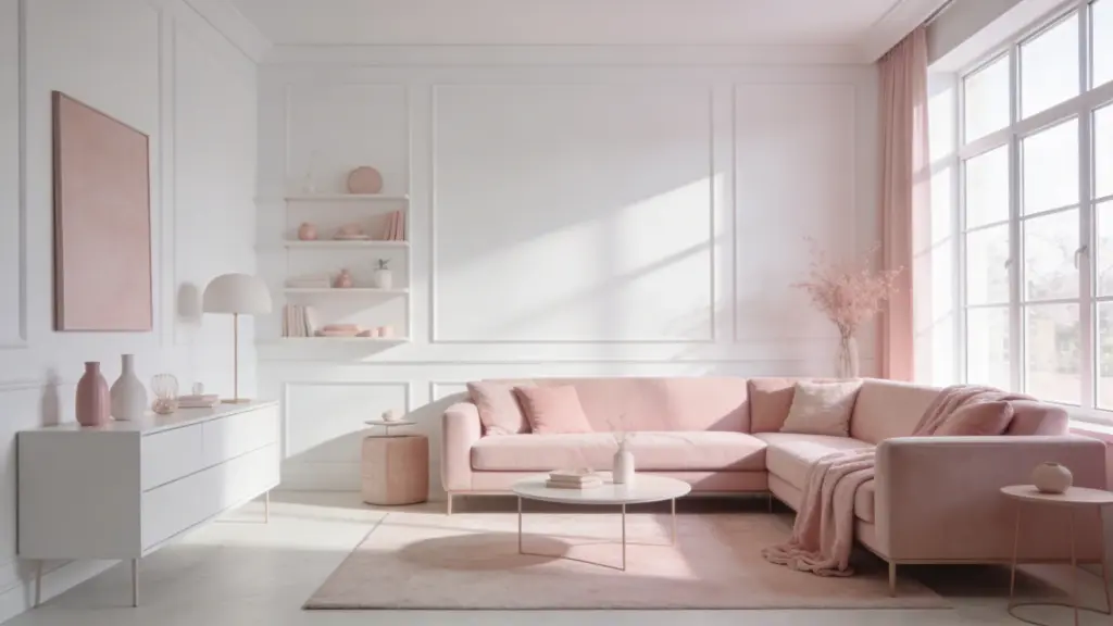
Blush pink and white create a space that feels soft, airy, and genuinely inviting.
White keeps the room open and full of light, while blush pink adds a gentle warmth that makes everything feel cozy without going overboard.
This combination is especially beautiful in bedrooms and living spaces where you want the atmosphere to feel calm and comfortable.
Bring blush in through bedding, curtains, or cushions and add light wood or gold accents to give the space a warm, polished finish.
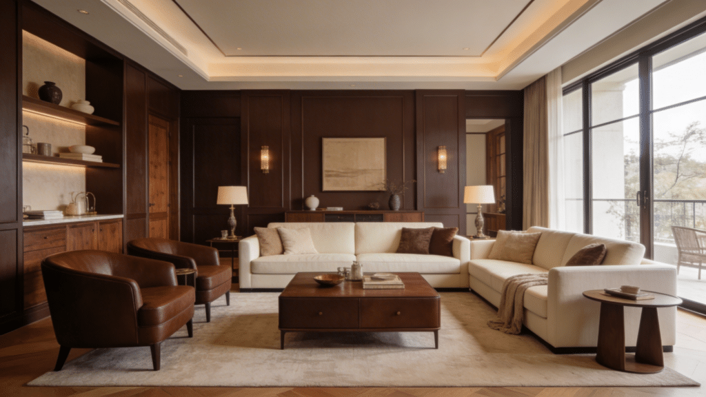
11. Charcoal and Wood Tones
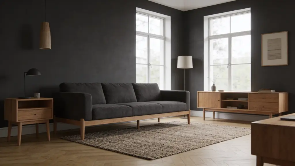
Charcoal and wood tones is a combination that feels bold and warm at the same time. Charcoal brings depth and a strong, modern edge to any space.
Wood tones soften that boldness and add natural warmth that keeps the room from feeling too dark or heavy. This pairing works really well in living rooms, bedrooms, and kitchens.
Use charcoal on walls or key furniture pieces. Let wooden floors, shelves, or accents do the rest. Add soft lighting to finish the look.
12. Teal and Gold
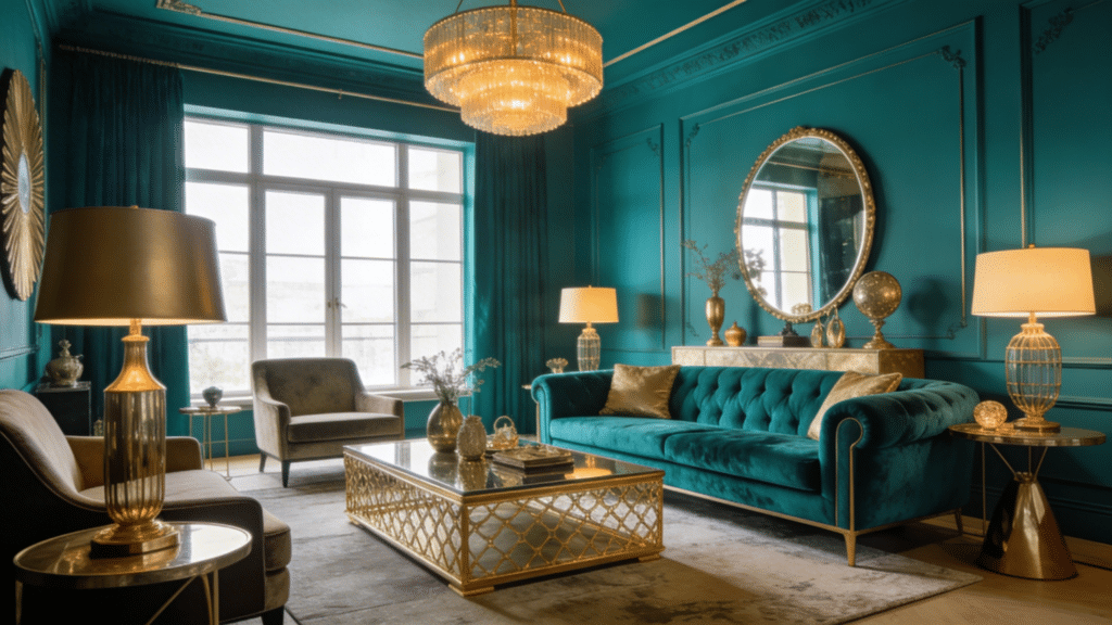
Teal and gold is a combination that looks far more expensive than it is. Here is how to make it work. Use teal as your anchor color on walls, a sofa, or a statement furniture piece to set a bold, confident tone.
Bring gold in through the details like light fixtures, mirror frames, cushion trims, or decorative objects.
Keep the rest of the space neutral so the two colors can shine without competing. The result is a room that feels rich, layered, and effortlessly stylish.
13. Mustard Yellow and Gray
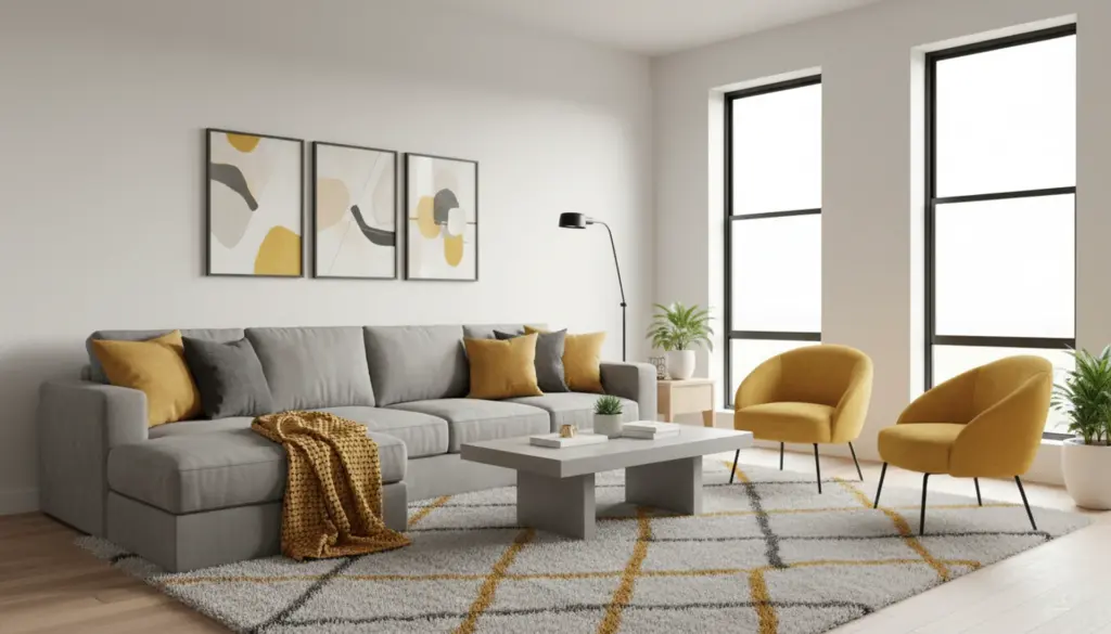
Mustard yellow and gray show that bold and calm can work together beautifully.
Gray provides a steady, neutral foundation that keeps the space feeling composed and modern, while mustard yellow brings energy, warmth, and a pop of personality that lifts the whole room.
Use gray on walls, larger furniture, or flooring and introduce mustard through cushions, rugs, throws, or decorative accents.
A touch of white or natural wood helps keep everything balanced and stops the mustard from feeling too overpowering in the space.
14. Olive Green and Brown
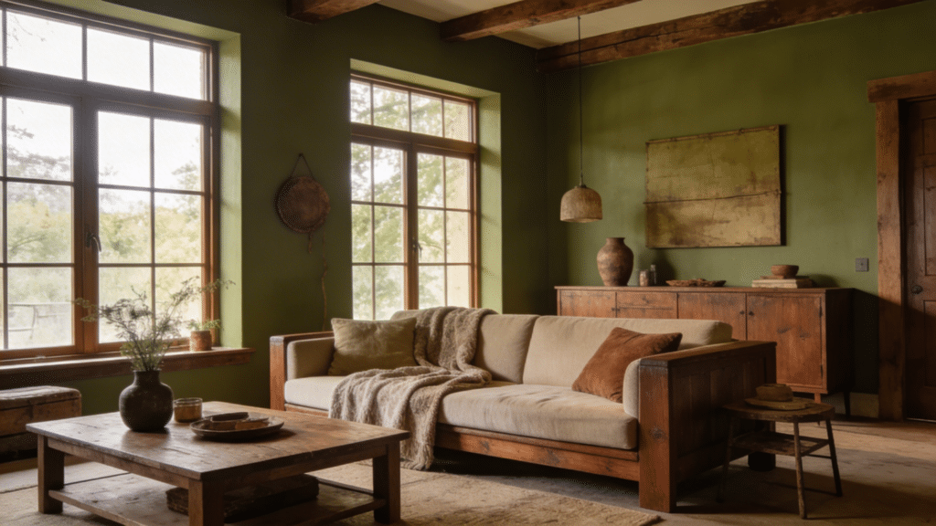
There is something deeply comforting about an olive green and brown room. It feels like the outdoors brought inside in the best possible way.
Olive green adds a muted, earthy quality that feels relaxed and organic, while brown grounds the space with richness and natural depth.
This pairing works beautifully in living rooms, bedrooms, and rustic-style spaces. Layer in cream or beige accents to keep things from feeling too heavy, and add natural textures like linen, jute, or raw wood throughout.
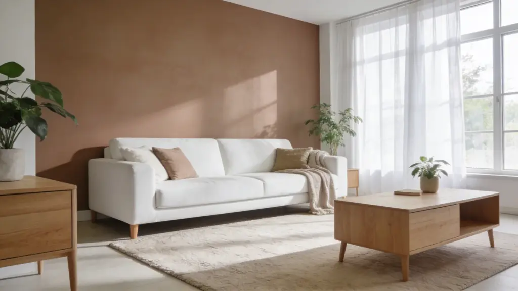
15. Terracotta and Cream
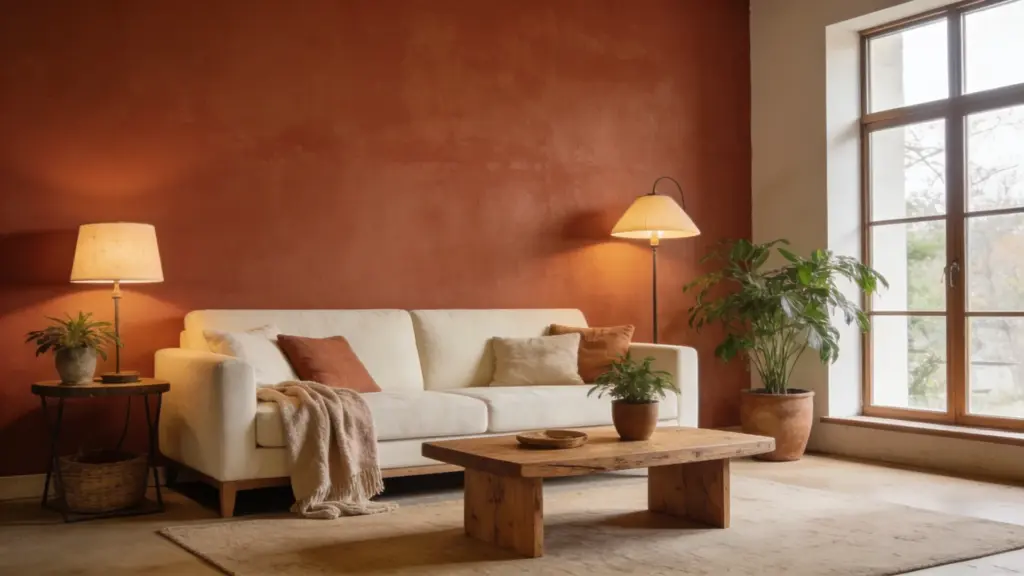
Terracotta and cream create a space that feels genuinely warm, lived-in, and full of character.
Terracotta brings a sun-baked richness that adds depth and a natural, earthy personality to any room, while cream softens the overall look and keeps things feeling light and breathable.
This combination works especially well in living rooms, dining areas, and cozy bedrooms.
Introduce terracotta through an accent wall or decorative pieces and let cream carry the larger surfaces. Add woven textures and wooden elements to complete the look.
16. Sky Blue and White
Sky blue and white is a combination that instantly makes a room feel fresh and easy to breathe in. White keeps things clean, bright, and open.
Sky blue adds a soft, peaceful touch of color that never feels too bold or overwhelming. This pairing works especially well in bedrooms, bathrooms, and smaller spaces.
Use sky blue on walls or textiles and keep larger furniture pieces white for balance. Bring in natural light and simple decor to complete the relaxed, airy feel.
17. Lavender and Soft Gray
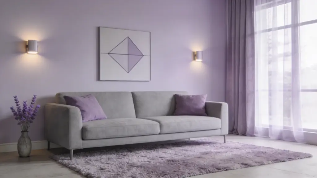
Stepping into a lavender and soft gray room feels like an instant exhale. There is a quiet, almost dreamy quality to this combination that makes it perfect for spaces where you want to feel calm and at ease.
Lavender brings a soft, delicate touch of color, while gray keeps everything grounded and balanced without dulling the mood. This pairing works beautifully in bedrooms and quiet corners.
Layer in light textures and warm, subtle lighting to make the space feel even more peaceful.
18. Peach and Ivory

Peach and ivory is a warm, gentle combination that is easier to pull off than you might think. Let ivory carry the larger surfaces like walls and main furniture pieces to keep the space feeling bright and open.
Bring peach in through softer elements like cushions, curtains, throws, or a decorative accent.
Keep the overall look light and uncluttered so the warmth of both colors can come through naturally. Add light wood or gold finishing touches to give the space a polished, elegant feel.
19. Burgundy and Beige
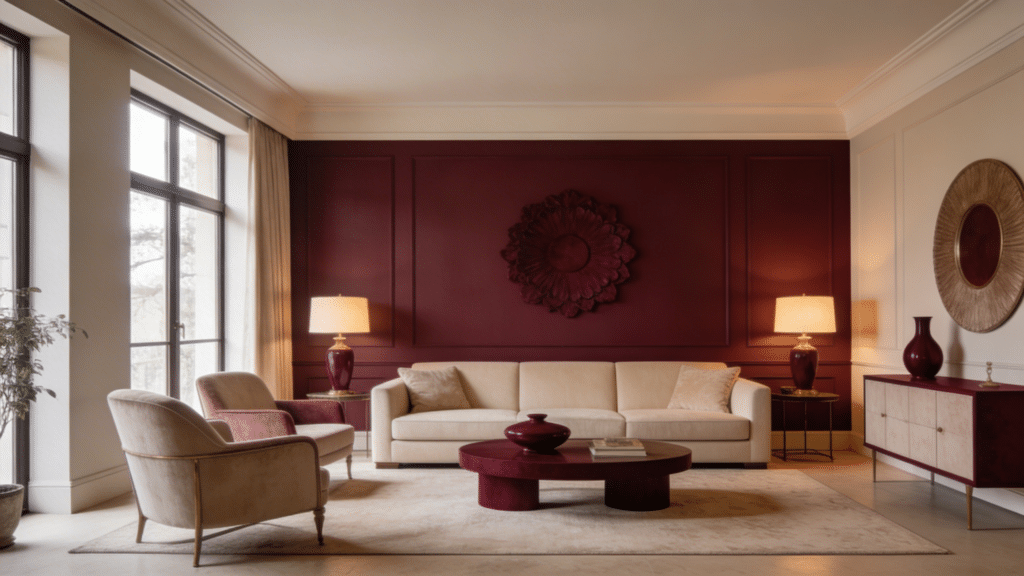
Burgundy and beige prove that rich, bold color and soft neutrals can work together without competing.
Beige creates a warm, steady backdrop that keeps the space feeling open and relaxed, while burgundy brings in depth, drama, and a sense of coziness that makes the room feel layered and intentional.
Use beige on walls and larger furniture pieces and bring burgundy in through cushions, rugs, or an accent wall. Gold or wooden accents tie everything together and add a final touch of warmth.
20. Emerald Green and Gold
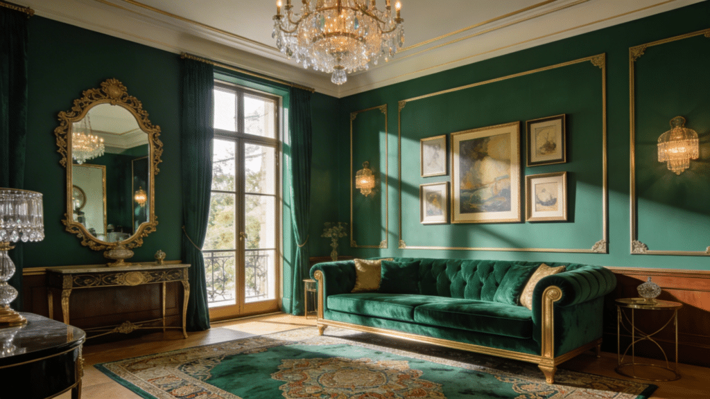
Emerald green and gold create a space that feels genuinely bold and luxurious without going over the top.
Emerald brings a deep, rich quality that gives the room real visual impact and personality, while gold adds warmth and a refined shine that elevates the whole look.
This combination works beautifully in living rooms, bedrooms, and any space where you want to make a statement.
Balance the richness with white or cream on larger surfaces and use gold through lighting, mirrors, and decorative accents.
21. Chocolate Brown and Cream
Chocolate brown and cream is a combination that feels instantly warm and inviting. Brown brings richness, depth, and a strong grounded quality to any space.
Cream softens that heaviness and keeps the room feeling light and comfortable. This pairing works really well in living rooms, bedrooms, and rustic-style interiors.
Use brown on furniture or an accent wall and let cream carry the larger surfaces. Add warm lighting and soft textures like wool or cotton to complete the cozy, layered look.
22. Coral and White
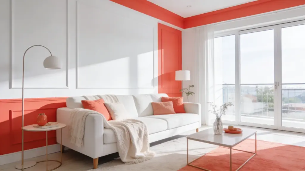
There is an energy to a coral and white room that is hard to ignore. It feels lively, warm, and genuinely cheerful without being too loud or overwhelming.
White creates a clean, open backdrop that lets coral do its job without taking over the whole space. This combination works beautifully in living rooms, bedrooms, and smaller spaces that need a lift.
Bring coral in through cushions, curtains, or artwork and keep the larger surfaces white to maintain a fresh, balanced feel throughout.
23. Aqua and Sand
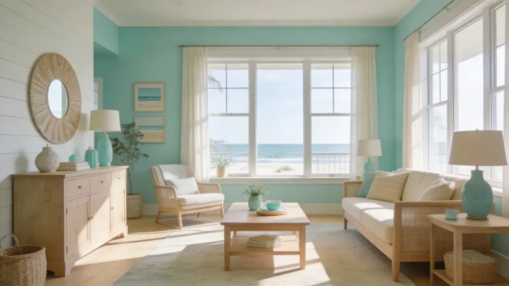
Aqua and sand create a space that feels calm, relaxed, and effortlessly laid back. There is a natural, coastal quality to this combination that makes any room feel like a quiet retreat.
Aqua brings a cool, refreshing tone that feels light and airy, while sand grounds the space with warmth and softness. This pairing works especially well in bedrooms, bathrooms, and living spaces.
Bring in natural textures like rattan, jute, or linen to enhance the breezy, unhurried feel of the whole room.
24. Red and White
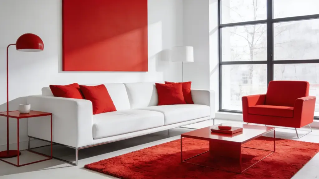
Red and white prove that bold and clean can work together really well.
White creates a bright, open foundation that keeps the space feeling balanced and uncluttered, while red brings confidence, energy, and a strong visual punch that stops the room from feeling plain.
This combination works particularly well in kitchens, dining areas, and modern living rooms.
Use red strategically through cushions, chairs, or statement decor pieces and let white lead everywhere else. Add simple patterns or metallic details to sharpen the overall look.
25. Yellow and White
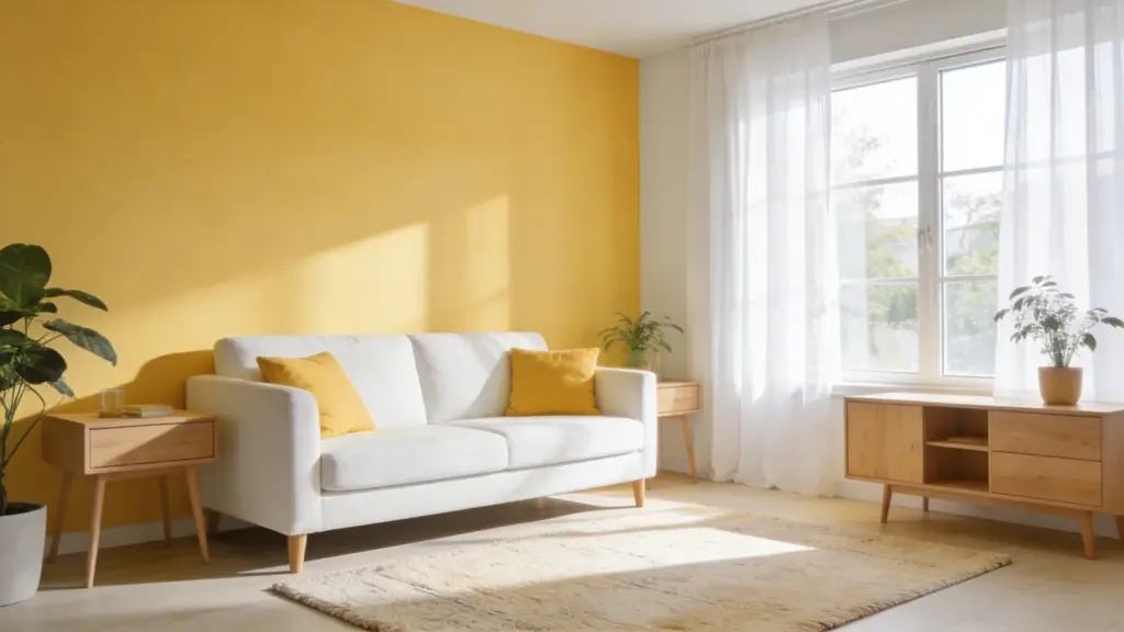
Yellow and white is one of the easiest ways to make a room feel instantly brighter and more alive. Let white handle the walls and larger furniture pieces to keep the space feeling open and clean.
Bring yellow in through cushions, curtains, throws, or small decorative accents to add warmth and a sunny personality without overwhelming the room.
Keep the overall look light and uncluttered so both colors have room to breathe. Add natural light and simple textures to enhance the fresh, uplifting feel.
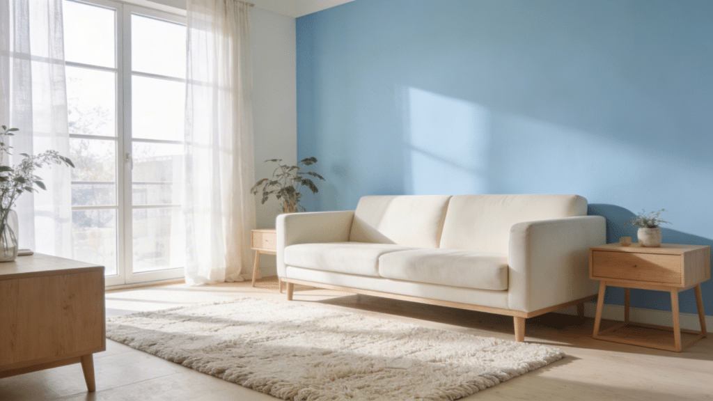
26. Blue and Beige
Blue and beige is a pairing that feels calm, collected, and effortlessly put together. Blue brings a cool, soothing quality that makes any room feel relaxed and easy to be in.
Beige balances that coolness with softness and warmth that keeps the space from feeling too cold or stark. This combo works well in living rooms, bedrooms, and offices alike.
Use blue on walls or accents and let beige carry the larger surfaces. Add white or natural textures for a finishing touch.
27. Mint Green and White
Mint green and white is a combination that makes a room feel instantly fresh and full of light. Let white handle the walls and larger furniture pieces to keep things clean and open.
Bring mint green in through an accent wall, decorative pieces, or soft furnishings to add a cool, gentle pop of color. Keep the overall look simple and uncluttered so both colors have room to shine.
Add light wood accents or simple textures to give the space a modern, refreshing feel.
28. Taupe and White
There is a quiet sophistication to a taupe and white room that feels both timeless and deeply comfortable. It does not try too hard, yet the result always looks polished and well considered.
White keeps the space feeling open and full of light, while taupe brings in a warm, earthy neutrality that adds depth without darkening the room. This pairing works beautifully in living rooms, bedrooms, and offices.
Layer in fabric textures and wooden accents to make the space feel genuinely cozy and inviting.
29. Black and Gold
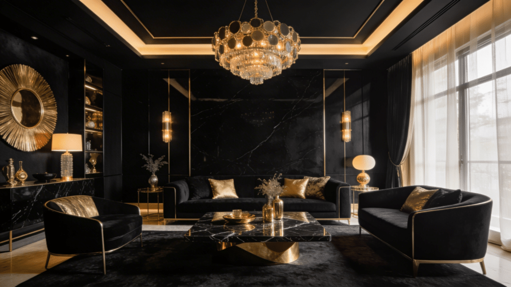
Black and gold is one of those combinations that feels instantly luxurious and bold.
Black brings a deep, dramatic quality that gives the room real weight and sophistication, while gold cuts through that darkness with warmth and a rich, refined shine that makes everything feel more elevated.
Use black on walls or statement furniture pieces and bring gold in through lighting, mirror frames, and decorative accents.
Balance the intensity with white or neutral tones to keep the space feeling stylish rather than overwhelming.
30. Silver and Gray
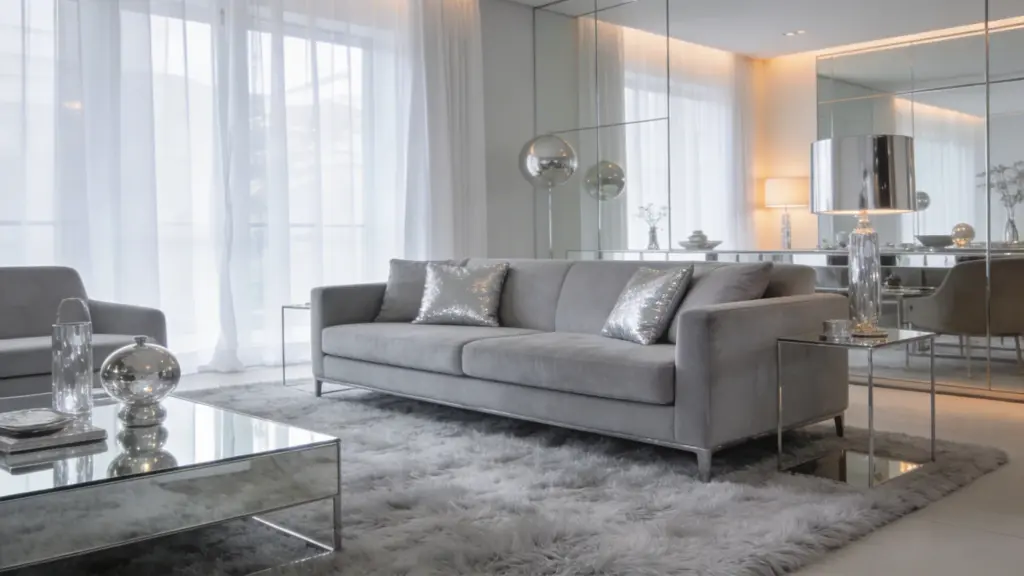
Walking into a silver and gray room feels like stepping into something effortlessly modern and refined.
There is a cool, sleek quality to this combination that works really well in contemporary spaces without feeling cold or unwelcoming.
Gray sets a soft, steady foundation that keeps the room feeling grounded and calm, while silver adds a subtle shimmer that lifts the whole space without demanding too much attention.
Layer in plush rugs, soft cushions, and warm lighting to keep the atmosphere comfortable and inviting.
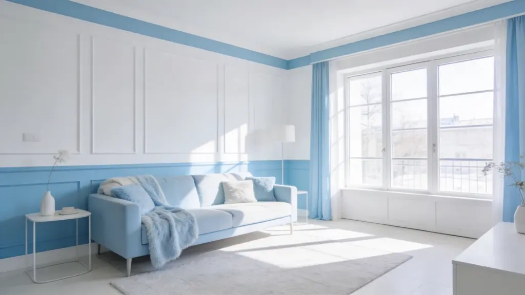
31. Soft Blue and Cream
Soft blue and cream create a space that feels genuinely calm, warm, and easy to settle into.
There is a gentle, unhurried quality to this combination that makes it perfect for bedrooms, living rooms, and any space where comfort comes first.
Soft blue brings a soothing, peaceful tone that keeps the room feeling light and airy, while cream adds a natural warmth that stops things from feeling too cool.
Add linen fabrics, wooden accents, and simple decor to complete the soft, welcoming feel.
Warm vs Cool Color Schemes: What Works Best?
Understand how warm and cool colors affect mood, space, and style to help you choose the right look for your room.
| Feature | Warm Color Schemes | Cool Color Schemes |
|---|---|---|
| Common Colors | Red, Orange, Yellow, Terracotta | Blue, Green, Purple, Teal |
| Mood | Cozy, energetic, inviting | Calm, relaxing, refreshing |
| Best For | Living rooms, dining areas | Bedrooms, bathrooms |
| Space Effect | Makes rooms feel smaller and warmer | Makes rooms feel larger and airier |
| Lighting Impact | Works well in low-light spaces | Best in well-lit or natural light |
| Style Match | Traditional, rustic, vibrant interiors | Modern, minimal, coastal interiors |
| Overall Feel | Warm and lively | Cool and peaceful |
Tips to Mix and Match Colors
Simple, practical tips to help you blend colors smoothly and create a well-balanced, stylish space.
- Start with a Base Color: Choose one main color to guide your entire scheme.
- Follow the 60-30-10 Rule: Balance colors with proper proportions for a clean look.
- Limit Your Color Palette: Stick to 2–3 main colors to keep the space simple.
- Balance Warm and Cool Tones: Mix them carefully to avoid clashing.
- Use Neutrals for Support: Add white, beige, or gray to soften bold colors.
- Test Before You Commit: Try paint samples on your walls first.
How Lighting Affects Your Room Color Scheme
Lighting plays a major role in how colors look in your room. Natural light changes throughout the day, making colors appear brighter in the morning and softer in the evening.
Rooms with plenty of sunlight can handle darker or cooler shades, while low-light spaces often look better with lighter or warmer tones.
Artificial Lighting also affects color. Warm lights can make colors look yellow or cozy, while cool lights can give them a bluish tone. This can change how your paint or décor appears at different times.
Always test your color choices under both natural and artificial light before making a decision. Paint samples on different walls and observe them throughout the day.
By understanding how Lighting works, you can choose colors that look consistent, balanced, and beautiful in any setting.
Common Mistakes to Avoid in Room Color Schemes
Avoid these common errors to keep your space looking balanced, stylish, and easy on the eyes.
1. Using Too Many Colors
Using too many colors in one room can make the space feel busy and unorganized. Instead of creating a stylish look, it often leads to visual clutter that feels overwhelming.
It’s better to stick to a simple palette of two or three main colors and use them consistently.
You can still add interest through textures and small accents. Keeping your color scheme simple helps create a calm, balanced, and more visually pleasing space.
2. Ignoring Lighting
Ignoring Lighting is a common mistake that can change how your room colors look. A shade that seems perfect in the store may appear very different under your home lighting.
Natural light, warm bulbs, and cool lights all affect color tones in unique ways. Without testing, colors can look dull, too bright, or uneven.
Always check paint samples under different lighting conditions to ensure your chosen colors look good throughout the day.
3. Skipping Paint Samples
Skipping paint samples can lead to costly mistakes and disappointment. A color that looks great on a small swatch may appear completely different once applied to your walls.
Lighting, room size, and surrounding décor can all change how a color looks. Without testing, you might end up with a shade that feels too dark, too bright, or simply off.
Always try samples on your walls and check them at different times of the day before making a final choice.
4. Clashing with Furniture
Choosing colors that clash with your furniture can make your room feel unbalanced and awkward. Even a beautiful wall color may not work if it doesn’t match your existing pieces.
Always consider your sofa, flooring, and décor before picking a color scheme. Look for shades that complement or blend well with what you already have.
Creating harmony between colors and furniture helps your space feel more put-together, comfortable, and visually pleasing.
5. Overusing Bold Colors
Overusing bold colors can make a room feel heavy and overwhelming instead of stylish. While strong shades add personality, too many of them can dominate the space and reduce comfort.
It’s best to use bold colors as accents rather than covering large areas. Pair them with neutral tones like white, beige, or gray to keep the look balanced.
This approach helps maintain visual interest while still creating a calm and inviting atmosphere.
Wrapping Up
Choosing the right colors for your space doesn’t have to feel hard or stressful. With the right ideas and a clear plan, you can create a room that feels comfortable, balanced, and truly yours.
It’s all about finding what works for your style, your space, and how you want to feel every day.
Take your time, test different options, and don’t be afraid to keep things simple. Small changes can make a big difference.
I hope these tips helped you feel more confident about picking the right color scheme. Now I’d love to hear from you—what colors have worked best in your space?
Share your experience or ideas in the comments below!