
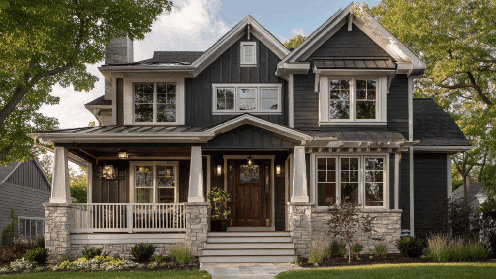
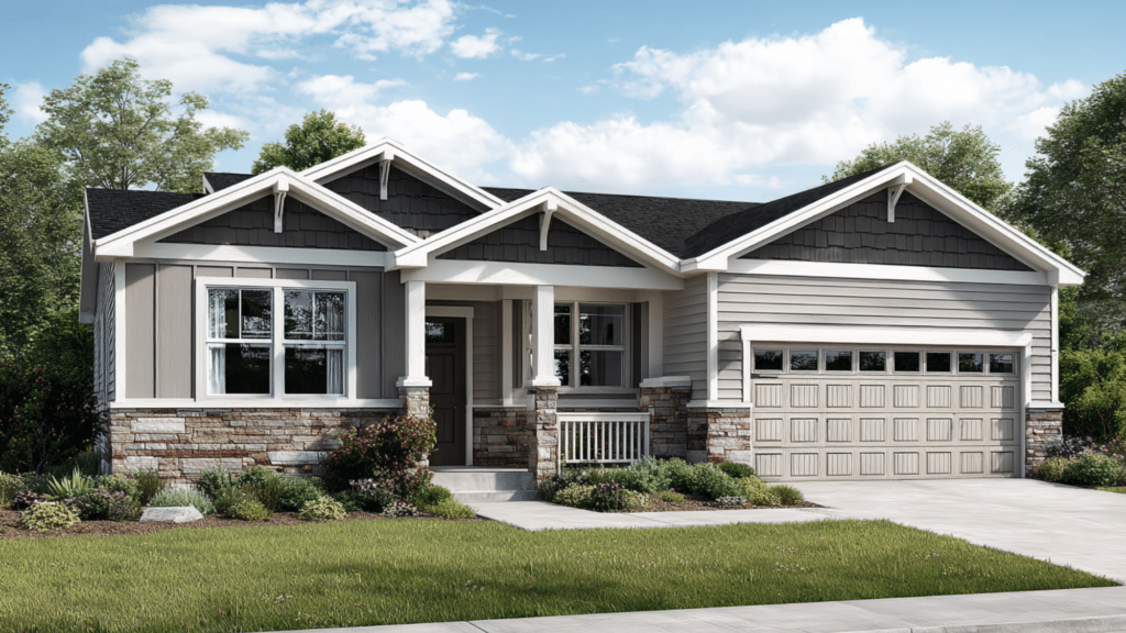
Many homeowners are turning to the Urbane Bronze exterior look because it brings a warm, modern feel to any house.
Sherwin-Williams created this rich color to blend calm, cozy tones with an earthy, organic style that works well in many neighborhoods.
As more people notice how striking yet practical it is, they also want to learn about the best Urbane Bronze coordinating colors to complete the look.
This blog helps readers understand why Urbane Bronze has become such a popular exterior choice and what makes it stand out on different home styles, lighting conditions, and materials.
About Urbane Bronze and its Color Specifications
Urbane Bronze from Sherwin-Williams is a deep, earthy neutral that blends brown, gray, and a hint of subtle green.
With an LRV of 8, it sits on the darker end of the color spectrum, giving it a bold look while still feeling warm and inviting.
In the Sherwin-Williams lineup, it falls within the darker neutral family, making it richer than typical grays but softer than pure black.
What makes Urbane Bronze stand out is its natural, grounded feel. Instead of looking flat, its mix of undertones adds depth and interest, helping homes appear modern, calm, and stylish.
Beautiful Color Matches for Urbane Bronze
Urbane Bronze coordinating colors help balance its rich depth, creating a warm, modern exterior palette that feels stylish, natural, and cohesive.
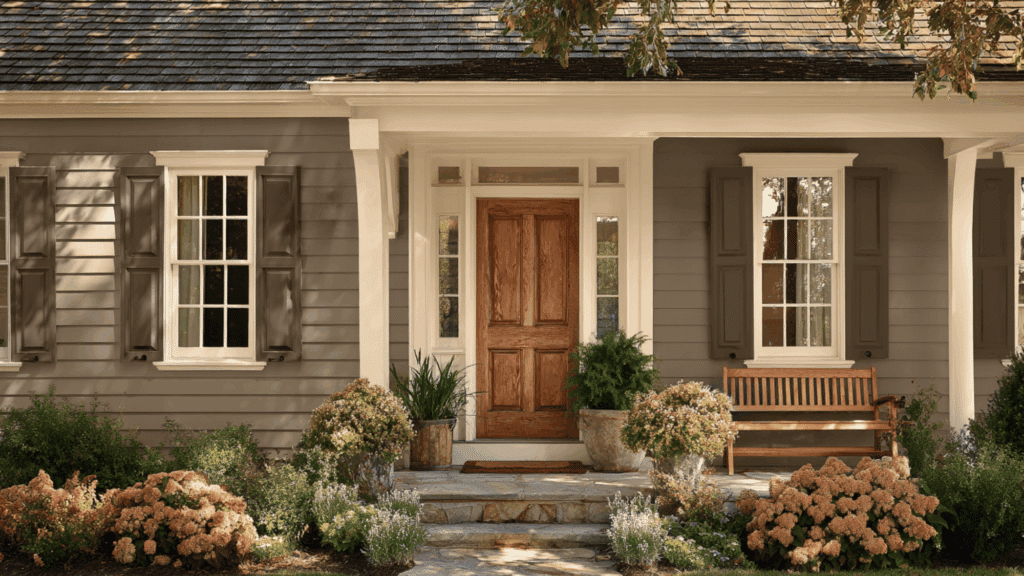
1. Sherwin-Williams Shoji White
Shoji White is a soft, warm white that pairs perfectly with the richness of Urbane Bronze. Its gentle warmth keeps the exterior from feeling too sharp while still offering clean contrast.
This color works well on trim, siding, or accents where a calm, inviting look is needed.
When placed next to Urbane Bronze, it brightens the overall palette and helps highlight architectural details without feeling harsh.
2. Sherwin-Williams Alabaster
Alabaster is a creamy off-white that adds warmth to an Urbane Bronze exterior.
It softens the darker tone while keeping the look bright and welcoming. Because Alabaster has subtle warmth, it pairs beautifully with natural wood, stone, and metal finishes.
Homeowners often use it for trim, fascia, or porch posts to create a balanced, timeless appearance that doesn’t feel too bold or too plain.
3. Sherwin-Williams Dovetail
Dovetail is a medium gray with warm undertones that match the earthy feel of Urbane Bronze.
It’s a strong partner when homeowners want a layered, modern look without sharp contrast. Dovetail works well for siding, detached structures, or trim on craftsman or contemporary homes.
Its depth allows Urbane Bronze to stand out while still keeping the overall palette grounded and cohesive.
4. Sherwin-Williams Eider White
Eider White is a soft, muted white with a touch of gray that complements Urbane Bronze nicely.
It brings a gentle contrast, making architectural lines clearer without overwhelming the darker color. Because it leans slightly cool, Eider White keeps the exterior from looking too heavy or warm.
It works especially well on modern homes or brick exteriors that need a clean but subtle partner shade.
5. Sherwin-Williams Repose Gray
Repose Gray is a popular light gray with balanced undertones, making it a flexible coordinating color for Urbane Bronze.
It adds a fresh, calm look when used on trim or nearby structures.
Repose Gray helps lighten the palette without creating a stark contrast. Its smooth, neutral appearance makes it ideal for homes with stone, cement board, or mixed exterior textures.
6. Sherwin-Williams Creamy
Creamy is a warm off-white that adds softness to an Urbane Bronze exterior. Its gentle yellow undertone warms up the palette, making the home feel brighter and more welcoming.
Creamy works beautifully on trim, shutters, or porch features when homeowners want a friendly, classic appearance.
The warmth of Creamy also brings out the richness of Urbane Bronze without competing for attention.
7. Sherwin-Williams Modern Gray
Modern Gray is a warm, light greige that pairs well with Urbane Bronze for a subtle, grounded look.
It offers a relaxed contrast, ideal for homeowners who prefer a softer palette rather than a high-contrast white-and-dark combination.
Modern Gray works on siding, garages, or accent walls, giving the exterior a natural, earthy feel that blends seamlessly with wood and stone elements.
8. Sherwin-Williams Peppercorn
Peppercorn is a dark charcoal gray that adds drama when paired with Urbane Bronze.
While both colors are deep, Peppercorn leans cooler, creating a sophisticated contrast without feeling too bold. This pairing works well for modern and contemporary homes wanting a stylish, moody palette.
Peppercorn is ideal for trim, shutters, or accent sections that need a distinguished but cohesive partner shade.
Pros and Cons of Urbane Bronze on Exteriors
Understanding the pros and cons of Urbane Bronze on exteriors helps homeowners decide if this bold, modern paint color suits their home.
| Pros | Cons |
|---|---|
| Creates a strong design impact | It can appear too dark in shaded areas |
| Warm but modern aesthetic | Undertones require sampling before committing |
| Pairs beautifully with wood, stone, and metal | May look flat on large homes without contrast |
| Hides dirt and scuffs better than lighter colors | Can absorb heat in hot climates |
| Works across many architectural styles | Not ideal for homeowners wanting a bright exterior |
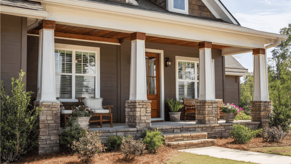
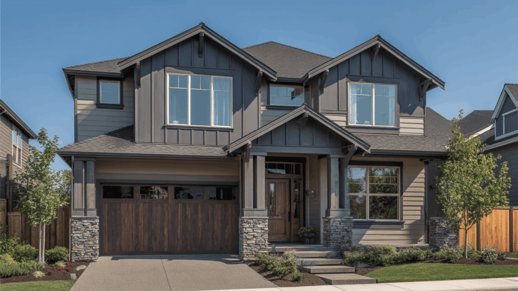
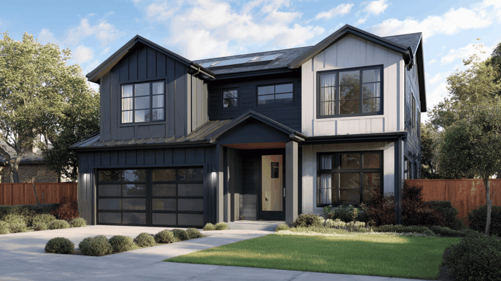
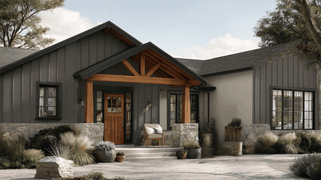
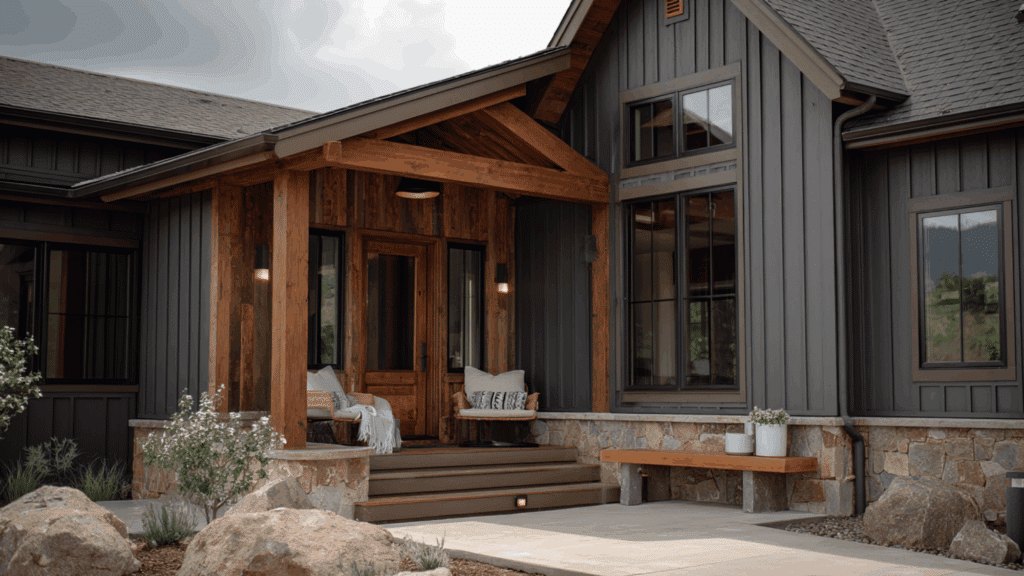
How Urbane Bronze Looks on Different Home Styles
Urbane Bronze creates a unique look for every home style, offering warmth, depth, and modern character across a range of exterior materials and designs.
- Modern Homes: Urbane Bronze gives modern homes a sleek, moody look with clean lines and bold contrast against metal or glass accents.
- Farmhouses: In farmhouses, Urbane Bronze adds warmth and depth, beautifully balancing rustic wood, white trims, and simple architectural details.
- Stucco Homes: Stucco exteriors look richer and more textured with Urbane Bronze, creating a smooth, stylish finish that feels warm and sophisticated.
- Brick Homes: Urbane Bronze pairs well with both red and white brick, adding modern depth while highlighting natural brick texture and color variation.
- Wood or Cedar Homes: Wood and cedar tones blend seamlessly with Urbane Bronze, creating an earthy, natural exterior with rich contrast and organic charm.
- Recommended Finishes: Use matte or satin for siding, and semi-gloss on doors or trim to highlight details and add subtle dimension.
To Conclude
Choosing an Urbane Bronze exterior allows homeowners to create a look that feels both stylish and grounded.
Its deep, earthy tone complements many materials, making it a reliable choice for long-lasting curb appeal.
When paired with the right Urbane Bronze coordinating colors, this shade can highlight architectural features and bring balance to different home styles.
With thoughtful sampling and the right finish choices, homeowners can feel confident using this color to achieve a polished and timeless exterior.