
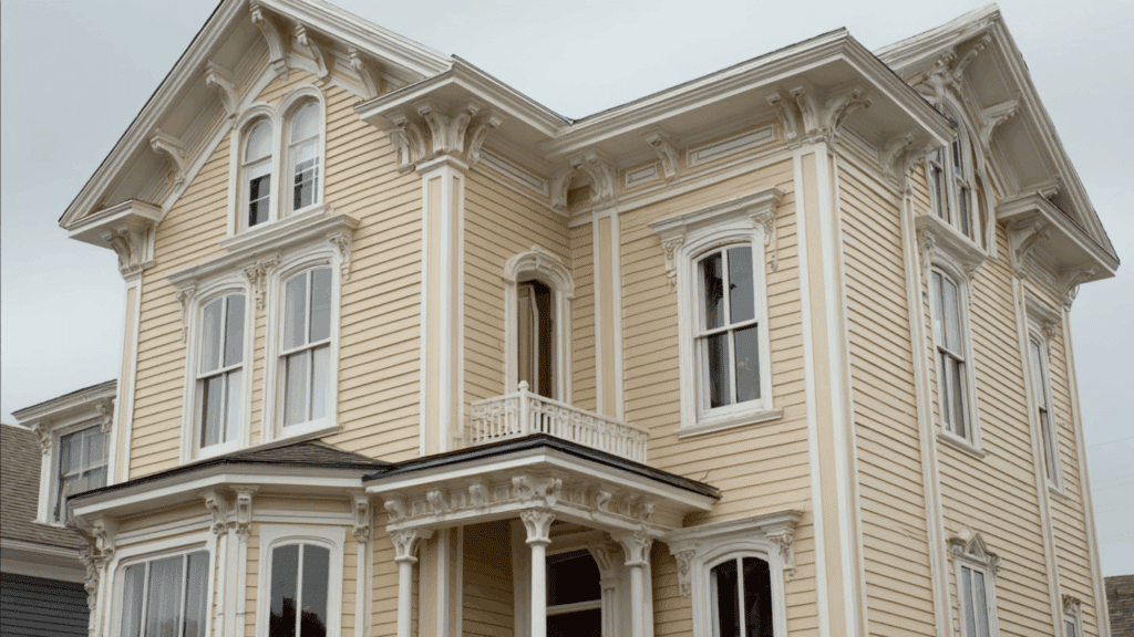
Victorian homes stand out on any street corner. Their bold paint choices tell stories from a different era.
But why did Victorian homeowners pick such striking color combinations? What made deep reds, forest greens, and rich golds the go-to palette?
The answer goes beyond simple taste. These colors reflected social status, technological advances, and cultural shifts during the Victorian period. Each shade carried a meaning that neighbors and visitors understood instantly.
This piece looks at the historical roots of Victorian house colors. It explains how paint technology, social customs, and architectural trends shaped the vibrant exteriors that still catch eyes today.
What were Authentic Victorian House Colors?
Victorian homeowners had access to a specific range of paint colors based on the technology of their time.
Early Victorians stuck with earth tones like ochre, brown, and muted greens. These pigments came from natural minerals and clays.
The 1870s changed everything. Chemical advancements brought richer, more saturated colors to the market.
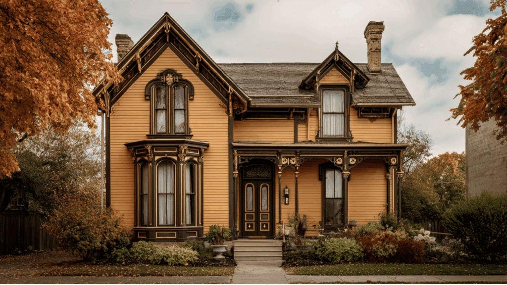
Deep burgundy, forest green, navy blue, and chocolate brown became popular choices. Cream, tan, and soft yellow worked as accent colors.
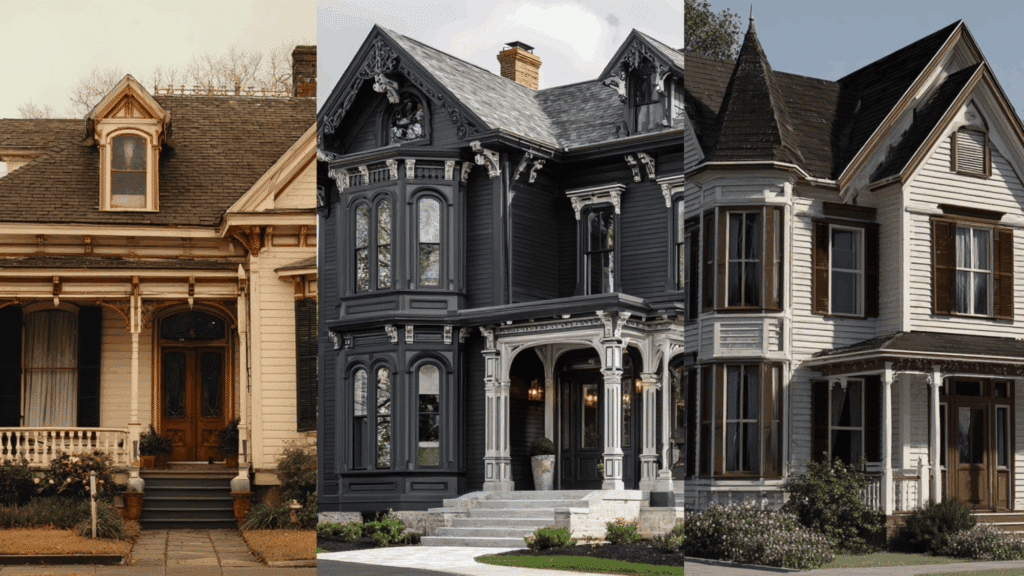
The famous “painted ladies” with their bright, contrasting trim emerged later in the Victorian era. But the original palette was actually more subdued than many people think.
Homeowners typically use three to five colors on a single house. The body color stayed darker, while trim and details got lighter shades for contrast.
Popular Victorian House Colors Used During the Era
Victorian house colors reflected wealth, craftsmanship, and technological progress, favoring rich, complex hues derived from natural pigments and early industrial paints for dramatic, long-lasting architectural expression.
1. Deep Red
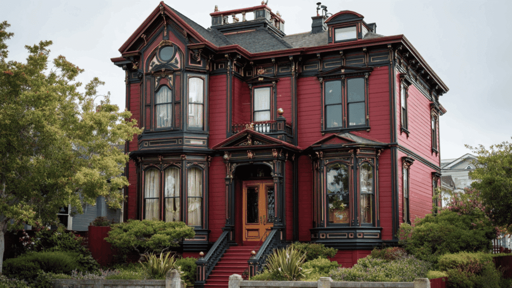
Deep red symbolized prosperity, strength, and permanence in Victorian architecture. Commonly produced from iron oxide pigments, it was used on brick exteriors, wood siding, and accent panels.
The color provided a stately, grounded appearance while aging gracefully, making it a trusted choice for prominent Victorian homes.
- Best Color Combinations: Olive Green, Cream, Charcoal Gray
- Modern Paint Suggestions:Sherwin-Williams Roycroft Red, Benjamin Moore Caliente AF-290
2. Burgundy
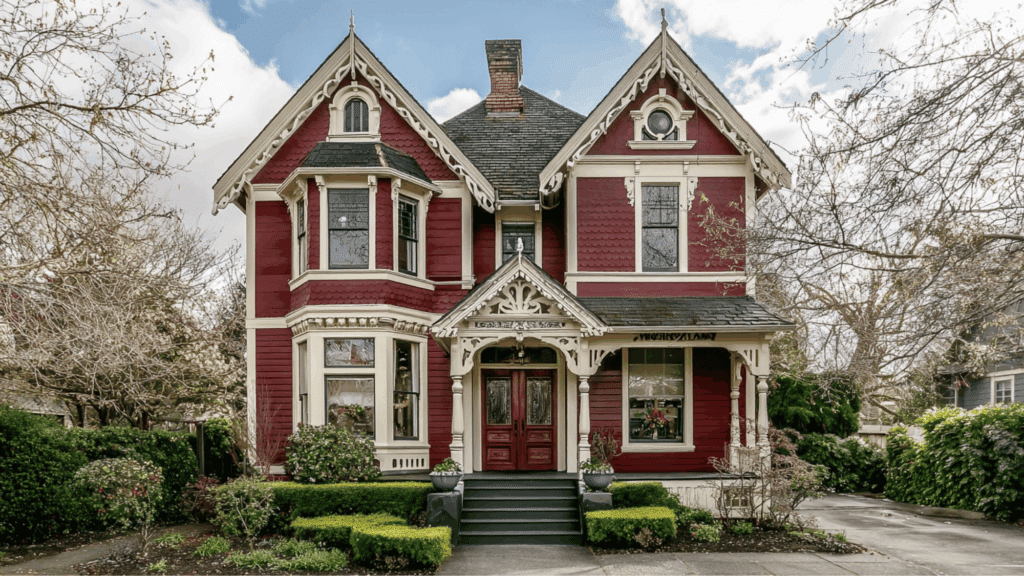
Burgundy conveyed luxury and refinement, often associated with wealth and cultural sophistication.
Victorians favored this deep wine tone for doors, trim, and sometimes full exteriors. Its richness paired well with ornate carvings and layered details, especially on Queen Anne homes where visual depth was essential.
- Best Color Combinations: Cream, Forest Green, Mustard Yellow
- Modern Paint Suggestions:Benjamin Moore Classic Burgundy HC-182, Sherwin-Williams Cordovan SW 6027
3. Olive Green
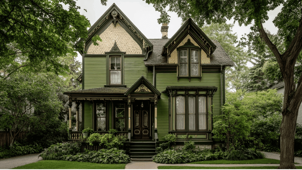
Olive green reflected the Victorian fascination with nature and organic pigments. Frequently used as a primary exterior color, it softened elaborate architectural details while grounding the home visually.
This earthy green blended beautifully with landscaped surroundings and allowed contrasting trims to stand out without overwhelming the façade.
- Best Color Combinations: Deep Red, Ochre, Cream
- Modern Paint Suggestions:Sherwin-Williams Rookwood Dark Green SW 2816, Benjamin Moore Tate Olive HC-112
4. Forest Green

Forest green represented stability, respectability, and refinement. Its darker tone enhanced shadows and depth, making it ideal for highly decorative siding or shutters.
Victorians used it to emphasize craftsmanship, especially on homes with complex woodwork, where darker hues helped highlight carvings and layered surfaces.
- Best Color Combinations: Burgundy, Cream, Mustard Yellow
- Modern Paint Suggestions:Benjamin Moore Essex Green HC-188, Sherwin-Williams Hunt Club SW 6468
5. Mustard Yellow
Mustard yellow introduced warmth and contrast into Victorian color schemes. Unlike modern bright yellows, this shade was muted and earthy, often derived from natural ochre pigments.
It was commonly used for trim or secondary siding, helping balance darker base colors while adding visual interest and richness.
- Best Color Combinations: Forest Green, Deep Red, Charcoal Gray
- Modern Paint Suggestions:Benjamin Moore Hawthorne Yellow HC-4, Sherwin-Williams Rookwood Antique Gold SW 2814
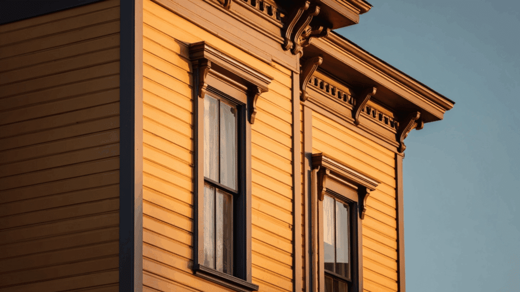
6. Ochre
Ochre was one of the most historically accurate Victorian pigments, sourced directly from natural earth minerals. Its golden-brown undertone made it a popular base color for exteriors.
Ochre paired well with darker trims, providing warmth, durability, and an understated elegance that suited many Victorian architectural styles.
- Best Color Combinations: Olive Green, Burnt Umber, Cream
- Modern Paint Suggestions:Sherwin-Williams Golden Rule SW 6383, Benjamin Moore Golden Straw 2152-50
7. Burnt Umber

Burnt umber offered depth and seriousness to Victorian exteriors. Often used for trim, shutters, or accents, it grounds brighter or warmer hues.
This rich brown highlights architectural features without overpowering them, making it an effective supporting color in multi-tone Victorian palettes.
- Best Color Combinations: Ochre, Cream, Deep Red
- Modern Paint Suggestions:Benjamin Moore Rustic Taupe 999, Sherwin-Williams Renwick Beige SW 2805
8. Chocolate Brown
Chocolate brown was valued for its richness and practicality. In industrial-era cities, it concealed soot and wear while maintaining a refined appearance.
Victorians used it on siding or trim to create contrast with lighter details, adding visual weight and elegance to ornate façades.
- Best Color Combinations: Cream, Mustard Yellow, Olive Green
- Modern Paint Suggestions:Sherwin-Williams Turkish Coffee SW 6076, Benjamin Moore French Press AF-170
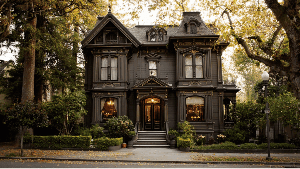
9. Charcoal Gray
Charcoal gray provided a dramatic, formal presence in Victorian architecture. It amplified shadows and highlighted intricate detailing, making it ideal for highly decorative homes.
Often paired with lighter trim, this color added sophistication while reinforcing the era’s preference for depth and strong visual contrast.
- Best Color Combinations: Cream, Mustard Yellow, Deep Red
- Modern Paint Suggestions:Benjamin Moore Kendall Charcoal HC-166, Sherwin-Williams Iron Ore SW 7069
10. Navy Blue

Navy blue became popular later in the Victorian era as pigment technology advanced. It symbolized confidence and modernity while remaining consistent with the era’s love for deep, saturated tones. Navy was often used as a statement exterior or accent color, especially alongside warm neutrals.
- Best Color Combinations: Cream, Ochre, Burgundy
- Modern Paint Suggestions:Benjamin Moore Hale Navy HC-154,Sherwin-Williams Naval SW 6244
11. Deep Plum
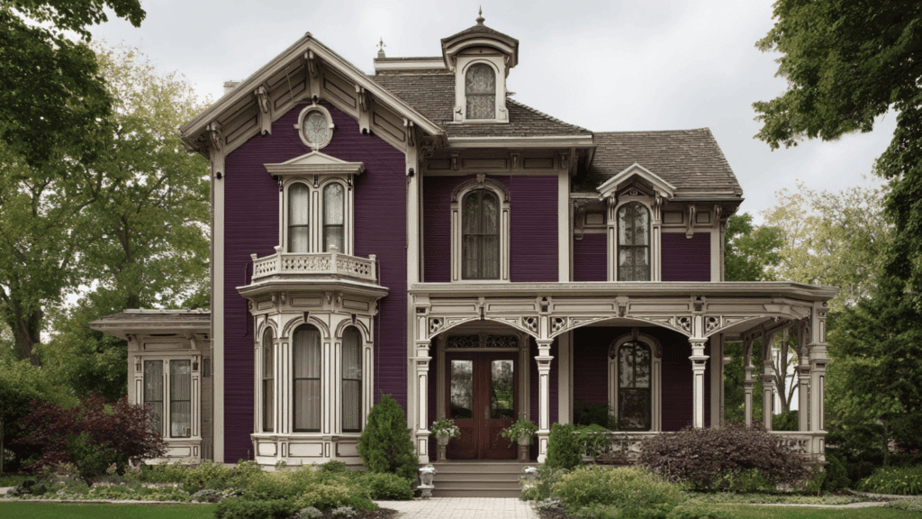
Deep plum added drama and artistic flair to Victorian homes. Used sparingly or as a statement color, it complemented ornate trims and emphasized decorative elements.
This bold hue reflected the Victorian appreciation for expressive palettes and worked best when balanced with lighter or neutral supporting colors.
- Best Color Combinations: Cream, Forest Green, Charcoal Gray
- Modern Paint Suggestions:Benjamin Moore Black Raspberry 2072-20, Sherwin-Williams Exclusive Plum SW 6263
12. Cream
Cream played a crucial balancing role in Victorian color schemes. Extensively used for trim, moldings, and decorative details, it softened bold base colors and highlighted craftsmanship.
Cream prevented darker palettes from feeling heavy while allowing architectural features to remain visually prominent and refined.
- Best Color Combinations: Burgundy, Forest Green, Navy Blue
- Modern Paint Suggestions:Benjamin Moore Swiss Coffee OC-45, Sherwin-Williams Alabaster SW 7008
Victorian House Colors by Architectural Style
Different Victorian architectural styles called for their own color schemes. The right palette highlighted unique features and stayed true to historical accuracy.
1. Queen Anne Victorian
Queen Anne homes celebrated bold contrasts and decorative excess. Deep red or burgundy covered the main walls, while forest green accentuated gables and trim.
Mustard yellow and cream highlighted spindles, brackets, and ornamental details that defined this exuberant style.
2. Italianate Victorian
Italianate designs borrowed from Italian Renaissance villas.
Ochre and olive green dominated exteriors, paired with chocolate brown for window hoods and cornices. Cream trim softened the earthy palette, while charcoal gray added definition to brackets and decorative elements.
3. Second Empire Victorian
Second Empire homes featured distinctive mansard roofs and formal symmetry. Navy blue or deep plum created dramatic backdrops for architectural details.
Burnt umber emphasized moldings and brackets, with cream highlighting window frames. Charcoal gray defined roof lines and ornamental ironwork.
4. Gothic Revival Victorian
Gothic Revival architecture drew inspiration from medieval churches.
Forest green and deep red dominated facades, reflecting the style’s romantic roots. Burgundy accented pointed arches and vergeboard trim.
Charcoal gray and cream highlighted Gothic details like trefoils and lancet windows.
Why Victorian Homes Used Darker and Bolder Colors
Victorian society had practical and symbolic reasons for choosing darker, saturated colors. Coal smoke and industrial pollution marked the era, especially in cities.
Dark exterior paint simply hid the grime better than lighter shades. Homeowners didn’t need to repaint as often. But status played an even bigger role. Rich, deep colors cost more money to produce and purchase.
A home painted in burgundy or forest green announced the owner’s wealth to everyone passing by. These pigments required expensive chemical processes that put them out of reach for working-class families.
The Victorian love of drama and ornamentation also drove color choices. Bold hues made architectural details pop. Darker backgrounds let cream and gold trim stand out.
The contrast created visual interest that matched the era’s taste for decoration and display.
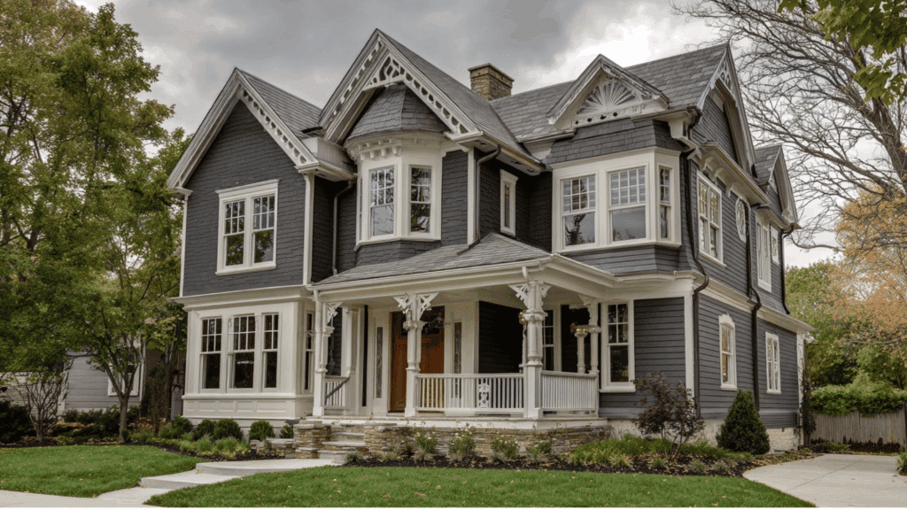
Victorian House Color Inspiration vs. Historical Accuracy
Modern “Victorian” paint schemes often stray from historical truth. Bright pastels and rainbow combinations look charming but weren’t authentic to the era. Here’s the real difference:
| Aspect | Historically Accurate | Modern Interpretation |
|---|---|---|
| Color Intensity | Deep, saturated, earthy tones | Bright pastels, vivid contrasts |
| Number of Colors | 3-5 colors per house | 6-8+ colors per house |
| Body Color | Dark (burgundy, forest green, brown) | Often light (pink, lavender, yellow) |
| Trim Colors | Cream, tan, soft yellow | White, bright colors, metallics |
| Accent Usage | Subtle, strategic highlights | Bold, rainbow-like combinations |
| Paint Finish | Matte or flat | Often glossy or semi-gloss |
| Historical Period | 1840s-1900s authentic palettes | 1960s-1980s “painted lady” trend |
| Purpose | Hide soot, show wealth | Create visual drama, curb appeal |
Conclusion
Victorian house colors weren’t random choices. They reflected the technology, social values, and practical concerns of their time.
Today’s colorful interpretations have their charm, but they miss the mark historically.
Authentic Victorian palettes relied on earthy, saturated tones with strategic cream or tan accents. Each architectural style had its own color language.
Homeowners restoring Victorian properties face a choice. Stick with historical accuracy or accept modern creativity. Either path works, as long as the decision comes from understanding what Victorian colors actually meant.