
Are you trying to find the perfect white paint but feel lost in a sea of options? I’m here to help you understand White Dove by Benjamin Moore – one of the most popular white paints for a reason.
In this article, I’ll explain:
- The exact undertones that make White Dove special
- Which rooms it works best in
- Colors and flooring that pair well with it
- How does it compare to other popular whites
As a decorator, I’ve used White Dove in countless home projects over the past 15 years. It’s my go-to white because it works almost everywhere without looking harsh or boring.
White Dove creates a clean, warm background that makes furniture and art stand out. If you’re looking for a white that feels fresh but not cold, you’re in the right place. I’ll solve your white paint confusion once and for all.
Why White Dove Works in So Many Spaces

White Dove is like that friend who gets along with everyone. I’ve used it in my kitchen, bedroom, and even my hallway, with great results every time.
What makes it so useful? It’s soft without being dull. The color has enough warmth that it doesn’t feel cold or stark like some whites can. It works with both modern and traditional styles. I’ve seen it make small rooms feel bigger and large rooms feel cozy.
In different lighting, White Dove stays pretty true to itself—a quality that’s hard to find in white paint.
Getting Into the Undertones of White Dove

Let’s talk about what’s really in this paint. White Dove has very soft yellow and gray undertones. These subtle hints give the white its warmth and depth.
The yellow is so faint you might not notice it at first. But it’s there, working to make the space feel welcoming rather than clinical. The gray keeps it from feeling too yellow or cream-colored.
I’ve found that these undertones stay balanced in most lighting situations. In north-facing rooms, you might see more of the gray. In warm afternoon light, the yellow comes forward a bit more.
How White Dove Can Shape the Feel of a Room
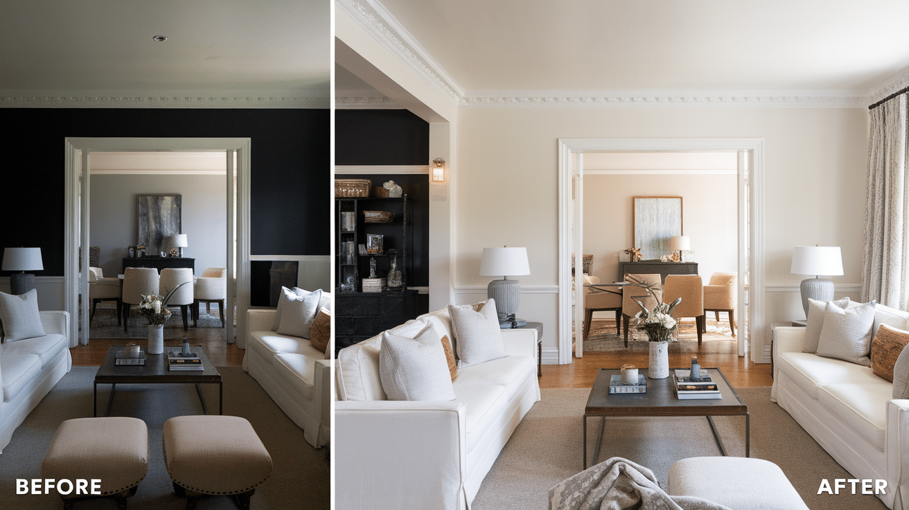
I painted my living room White Dove three years ago, and it completely changed how the space feels.
This color creates a clean backdrop that makes everything else in the room pop. Your furniture, art, and even plants will stand out more against these walls.
White Dove adds:
- A sense of calm
- An open, airy feeling
- Warmth without being yellow
- A clean look that isn’t harsh
The color also changes slightly throughout the day. Morning light brings out its warmer side, while evening light can make it appear more neutral.
Where White Dove Fits Best in Your Home
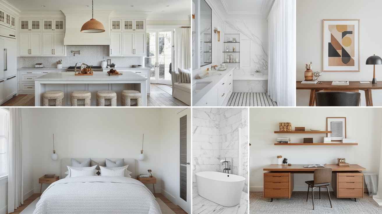
I’ve tried White Dove in almost every room of my house. Here’s where it works best:
Kitchens: Makes them feel clean and bright; works with all cabinet colors.
Living rooms: Create a neutral canvas for your furniture and art.
Bedrooms: Adds a calm, restful vibe without feeling cold.
Bathrooms: Looks clean without the harsh glare of pure white.
Home offices: Provide a focused background that isn’t distracting.
I wouldn’t use it in a room that already feels too cool or in spaces where you want bold color impact.
What Floors Work Well with White Dove?

Your floor and wall colors need to get along. I’ve paired White Dove with many floor types, and here’s what works:
Dark hardwood creates a striking contrast that makes both the floors and walls look better.
Medium brown wood brings out the warm undertones in White Dove.
Gray flooring can work if it has warm undertones. Too cool, and it might clash.
Light oak or maple creates a bright, open feel without contrast.
I once made the mistake of pairing White Dove with very red-toned cherry floors. The clash taught me that floors with strong red undertones might not be the best match.
Top 10 Colors That Go with White Dove
I’ve tested many color combinations with White Dove walls. These pairings have proven successful in my projects time and again:
1. Hale Navy (Benjamin Moore)

This rich, deep blue creates a stunning contrast with White Dove. I used this combination in my dining room with White Dove walls and Hale Navy on built-in cabinets. The classic pairing feels both timeless and fresh. It works especially well in spaces where you want a bit of drama without going too dark.
2. Revere Pewter (Benjamin Moore)

This perfect greige (gray-beige) flows beautifully from White Dove spaces. I often use this combo in open floor plans where I want subtle transitions between rooms. The two colors share similar undertones, making them natural partners.
3. Edgecomb Gray (Benjamin Moore)

A lighter, softer option that creates a gentle flow with White Dove. In my own home, I have White Dove in the kitchen that opens to an Edgecomb Gray living area. The transition is so subtle that many people don’t notice they’re different colors, but the spaces feel distinct.
4. Classic Gray (Benjamin Moore)

For a subtle, tonal look that adds just enough contrast. This pale gray picks up on the gray undertones in White Dove. I’ve used this pair in bedrooms for a calming, layered effect that feels sophisticated but not stark.
5. Kendall Charcoal (Benjamin Moore)

When you want a dramatic contrast, this deep charcoal works beautifully. I painted a client’s fireplace wall this color with White Dove surrounding walls. The contrast made both colors look more intentional and refined.
6. Sea Salt (Sherwin-Williams)

This soft green-gray feels fresh and natural next to White Dove. The subtle green tones create a calming effect that works well in bathrooms and bedrooms. I’ve paired these in a beach house with amazing results.
7. Iron Ore (Sherwin-Williams)

It’s almost black, but softer and more complex. White Dove trim with Iron Ore doors creates a striking look that feels modern yet timeless. I used this combo in my home office, and it makes the space feel purposeful and designed.
8. Sage Green Shades

Colors like October Mist (Benjamin Moore) bring out White Dove’s subtle warmth. The natural green tones complement White Dove’s softness. This combination feels organic and brings the outdoors in, perfect for spaces that overlook gardens.
9. Terracotta Tones
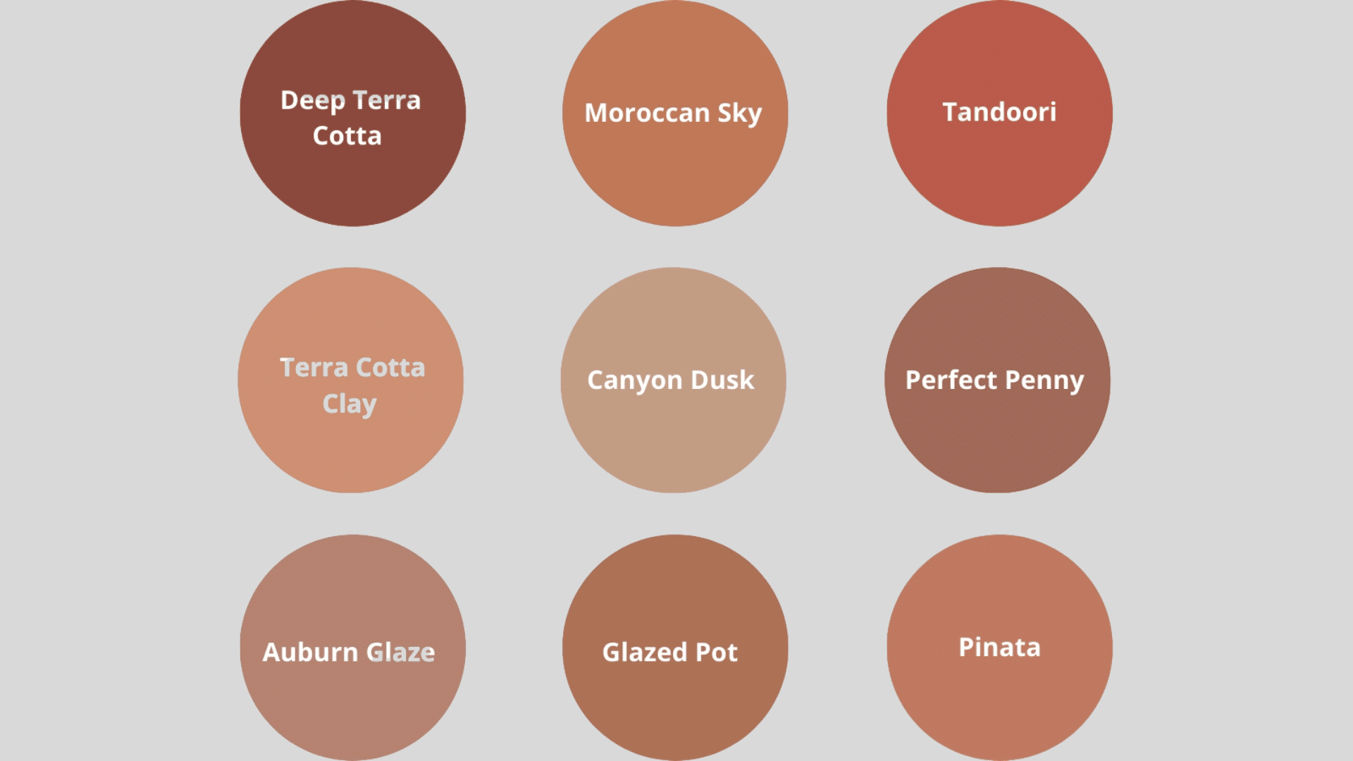
For an earthy, warm pairing that feels current yet timeless, I recently used White Dove with terracotta accents in a sunroom. The space feels cozy without being heavy, and the warmth in both colors speaks to each other beautifully.
10. Soft Blues Like Palladian Blue (Benjamin Moore)

Create a calm, coastal feel that never goes out of style. The cool tones in these blues balance the warmth in White Dove. I’ve used this combination in bedrooms, bathrooms, and living spaces with consistently positive results.
Remember that lighting affects how these combinations look in your space. I always recommend testing your pairings with sample boards before committing to the full paint job.
How to Use White Dove Without Making It Boring
White walls don’t have to be bland! I’ve found several ways to make White Dove walls interesting:
Mix up the finishes. I painted my walls in eggshell and the trim in semigloss for subtle contrast.
Add texture. White Dove looks amazing with textured elements like:
- Wood beams
- Stone accents
- Woven baskets
- Textured throw pillows
- Wall panels or wainscoting
Use it as a backdrop. I let White Dove be the canvas for:
- Bold art pieces
- Colorful furniture
- Plants and natural elements
- Patterned rugs
Try an accent wall. In my dining room, I painted three walls White Dove and one wall in a deeper color for interest.
White Dove vs. Other Popular Off-Whites
Not all off-whites are created equal. I’ve tested White Dove against other popular whites, and here’s how they compare:
- White Dove vs. Simply White: Simply White is brighter and crisper with fewer undertones. White Dove is softer and warmer.
- White Dove vs. Swiss Coffee: Swiss Coffee has more beige/yellow undertones. White Dove is more neutral.
- White Dove vs. Decorator’s White: Decorator’s White has cool blue undertones. White Dove is noticeably warmer.
- White Dove vs. Chantilly Lace: Chantilly Lace is a clean, bright white with minimal undertones. White Dove has more warmth and softness.
I painted sample boards of each and moved them around my house at different times of day. White Dove was the most consistent in all lighting conditions.
Conclusion
After using White Dove in dozens of homes, I can confidently say it’s one of the most versatile whites available. Its subtle warmth makes spaces feel welcoming without being too creamy or yellow.
White Dove shines in almost any lighting condition and works with most design styles, from modern to traditional. If you’re looking for a white that has character without being demanding, this is it.
However, it might not be your best choice if you want a stark, bright white or have mainly cool-toned furniture that needs a cooler white to match.
My top tip: Always test before committing. Paint a poster board with White Dove and observe it in your space during morning, afternoon, and evening light. This simple step has saved my clients from paint regrets countless times.
The perfect white exists, and for many homes, White Dove is it.
Frequently Asked Questions
Does White Dove Look Good in North-Facing Rooms?
Yes, but it will look a bit cooler. I have it in my north-facing office, and it still feels warm enough.
What Color Is the Trim if the Walls Are White Dove?
You can use White Dove for both! I often use the same color in different finishes – eggshell for walls and semi-gloss for trim.
Will White Dove Look Too Plain?
Not if you pair it with textures and some contrasting elements. It’s a beautiful background color that lets other things shine.
How Different Is White Dove from Pure White?
They are very different. Put them side by side, and you’ll see that White Dove has much more warmth and softness than a stark white.
What’s the LRV of White Dove?
The Light Reflectance Value is 85.38, which means it reflects a lot of light but isn’t the brightest white available.