
Benjamin Moore’s Amherst Gray is a go-to shade for people who want something bold but not too dark, stylish but not flashy. It’s a mid-tone gray with a strong character, offering just the right amount of richness without overwhelming a space. This color works well in different lighting and settings, making it a favorite for both inside and outside the home.
What sets Amherst Gray apart is how dependable it is. While many grays shift drastically depending on the time of day or lighting, this shade remains grounded. It gives structure to a room, works well with a range of styles, and carries just enough warmth to keep things from feeling flat or cold.
In this blog, we’ll talk about why Amherst Gray is such a popular color, what makes it special, and how to use it to make your home feel just right.
Why Amherst Gray Is the Perfect Choice for Your Space

Amherst Gray isn’t just another neutral paint. It has depth, warmth, and balance. It’s the kind of color that gives a room structure and calm at the same time. Unlike lighter grays, which can sometimes wash out in bright light, Amherst Gray keeps its body. And unlike deeper shades, it won’t make your space feel too small or too dark if used right.
Strong But Not Harsh
It’s darker than a typical gray but doesn’t lean into the “almost black” zone. This makes it great for people who want to add drama without losing comfort. You can use it in a large living area or even on all four walls in a bedroom and still feel relaxed rather than closed in. The strength of the color provides an anchor without overwhelming the room.
Flexible With Style
One of the best parts about Amherst Gray is how easy it is to match with different styles. In a farmhouse setting, it works well with natural wood and rustic accents. In a more modern home, it pairs nicely with metal fixtures and minimal decor. Traditional homes benefit from its warmth, while transitional homes find it balances old and new beautifully. It acts like a bridge, tying together furniture and finishes.
Works Year-Round
Some colors feel perfect in the summer but too cool in the winter. Others feel cozy in cold months but stuffy when it’s warm out. Amherst Gray works year-round. It doesn’t feel season-specific. That makes it ideal if you want a stable look that always feels like home, no matter the time of year.
The Rich Undertones of Amherst Gray: What You Need to Know
Every gray paint has undertones. Some lean blue, some brown, and some green. Amherst Gray carries a very soft green undertone. It’s not the kind of green you notice right away, but it gives the paint a bit of life. This undertone is what keeps the gray from feeling cold or too industrial.
You might not notice the green at first, but it shows up under certain lights—like natural daylight or soft indoor bulbs. The green works especially well with rooms that have wood floors, stone, or greenery nearby. It makes the paint feel connected to nature without being a “color” color.
If you’re pairing it with other shades, this undertone helps it work with both cool and warm palettes. That’s not something every gray can do. Amherst Gray sits right in the middle of that spectrum, making it easier to decorate around.
Tip: Always test Amherst Gray on a few walls before painting the whole room. Watch it throughout the day to see how it reacts to light. In some homes, it looks a bit warmer. In others, it feels cooler. The size of the room, ceiling height, and natural light all play a part.
The Psychology of Amherst Gray: How It Affects Your Mood
Colors aren’t just about looks—they shape how we feel in a room. Amherst Gray does a great job of setting the mood without being obvious about it. While some colors grab your attention right away, this one works quietly in the background, helping everything else feel more put together.
Calm and Order
Gray, in general, brings a sense of balance, and Amherst Gray does this with more warmth. It creates a peaceful atmosphere, which is great for rooms where you want to relax. In a living room or den, it helps the space feel calm without putting you to sleep.
Confidence and Comfort
There’s something strong about this shade. It doesn’t feel fragile or too delicate. Instead, it has a grounded quality. This makes it perfect for places where you want to feel secure and focused, like a home office or a study area.
Helps Other Colors Pop
Bright colors and busy patterns can get lost against white or light beige walls. But against Amherst Gray, they come to life. If you love using art, colorful pillows, or bold furniture, this shade gives them a base to shine from without competing for attention.
Where is Amherst Gray Best Used in an Interior?
Because of its balanced tone, Amherst Gray can be used just about anywhere. It’s neutral but not boring. Rich, but not heavy.
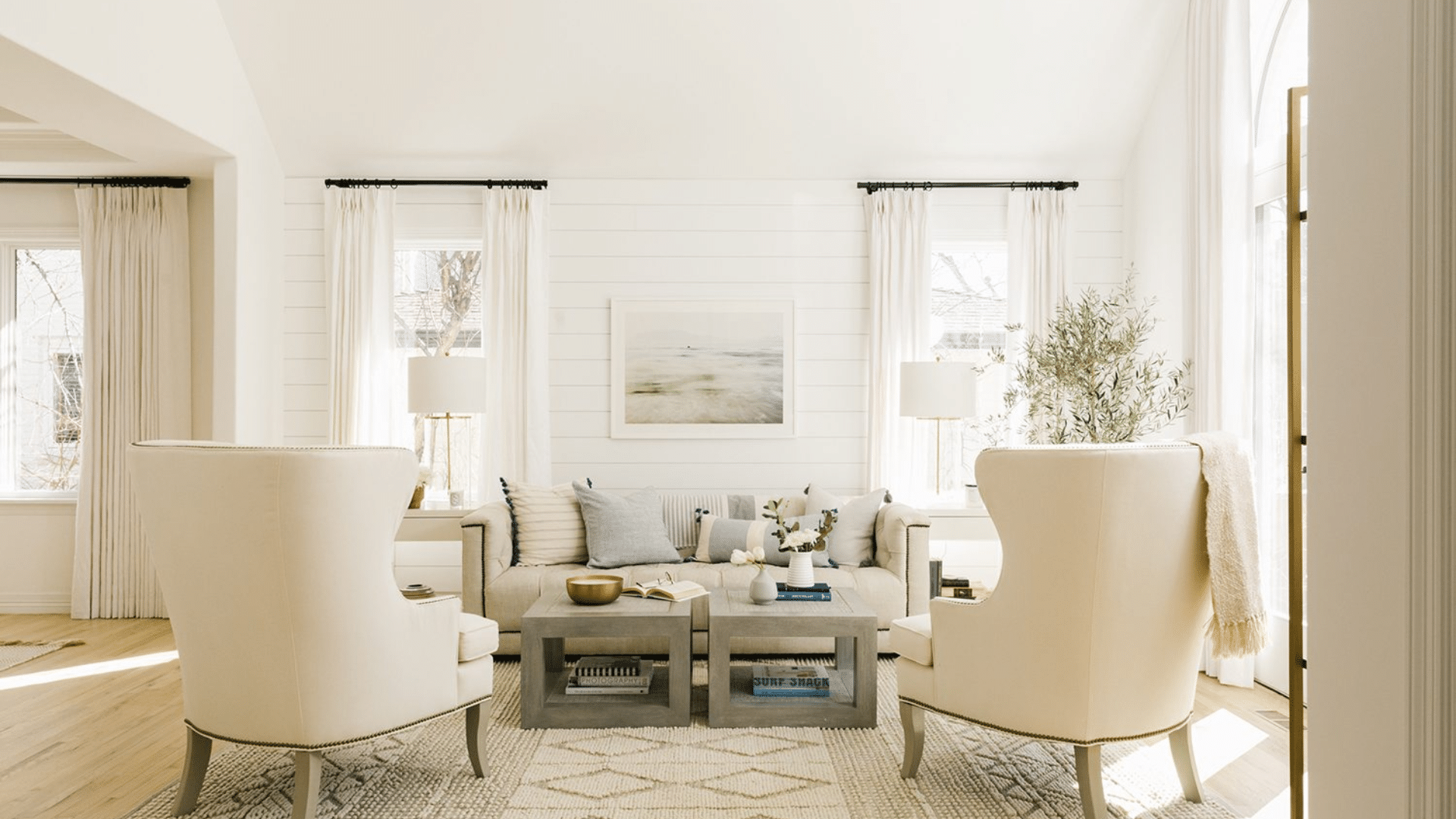
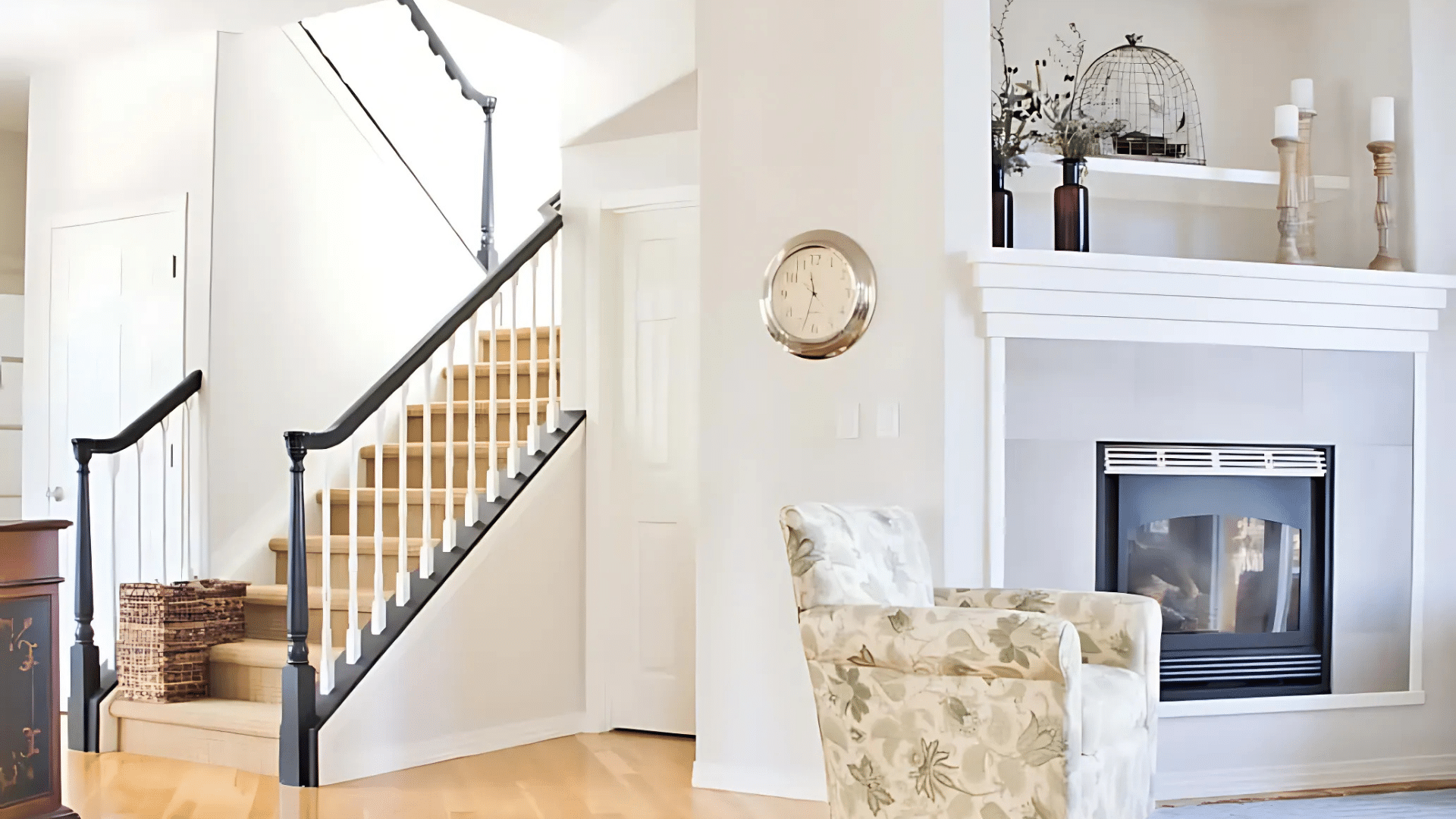
Living Rooms
In living rooms, Amherst Gray adds structure. If your room has large windows or lots of natural light, this paint will look even better. Pair it with warm woods and lighter textiles to make the space feel welcoming. It also makes a great backdrop for a gallery wall or built-ins.
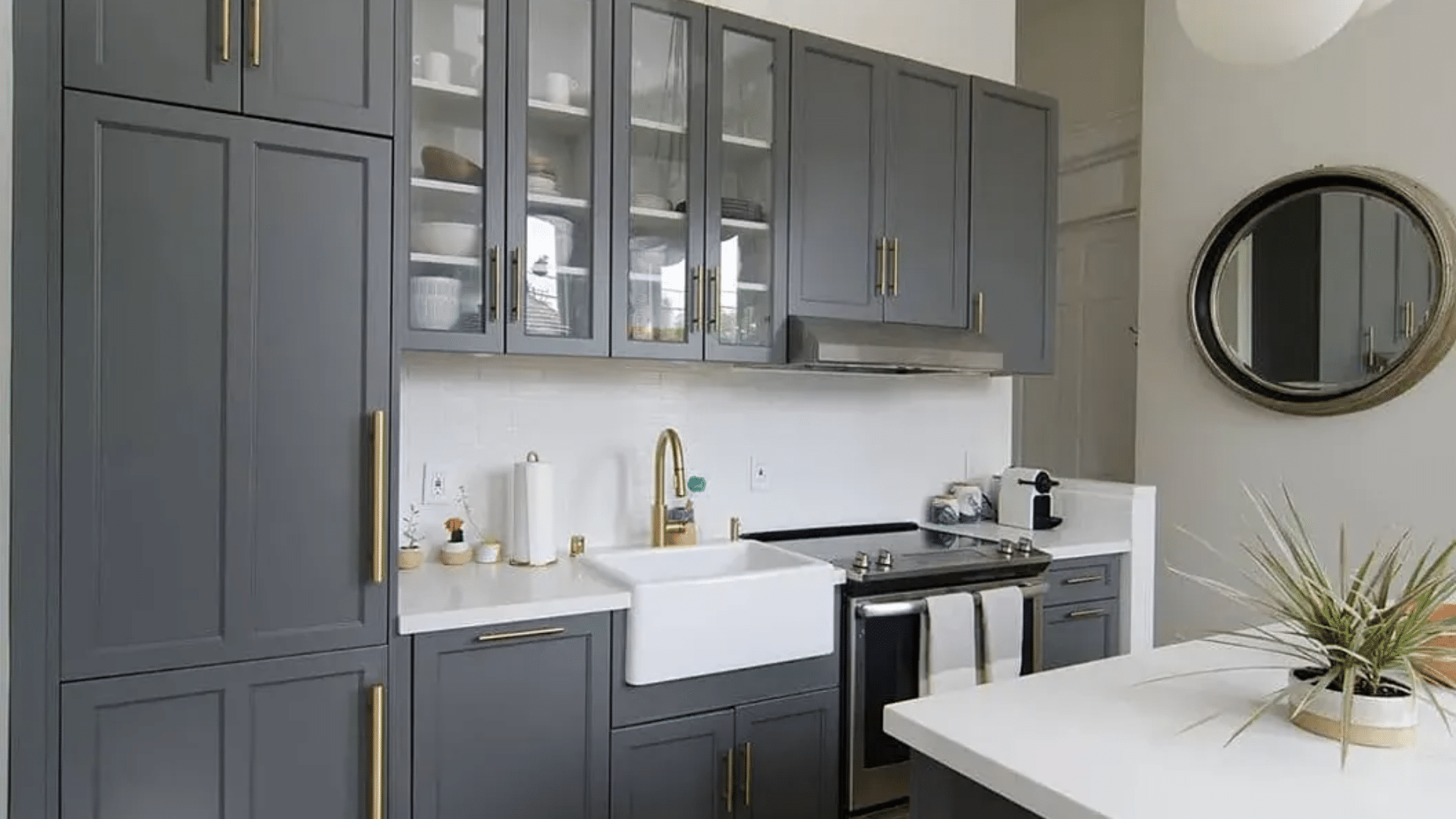
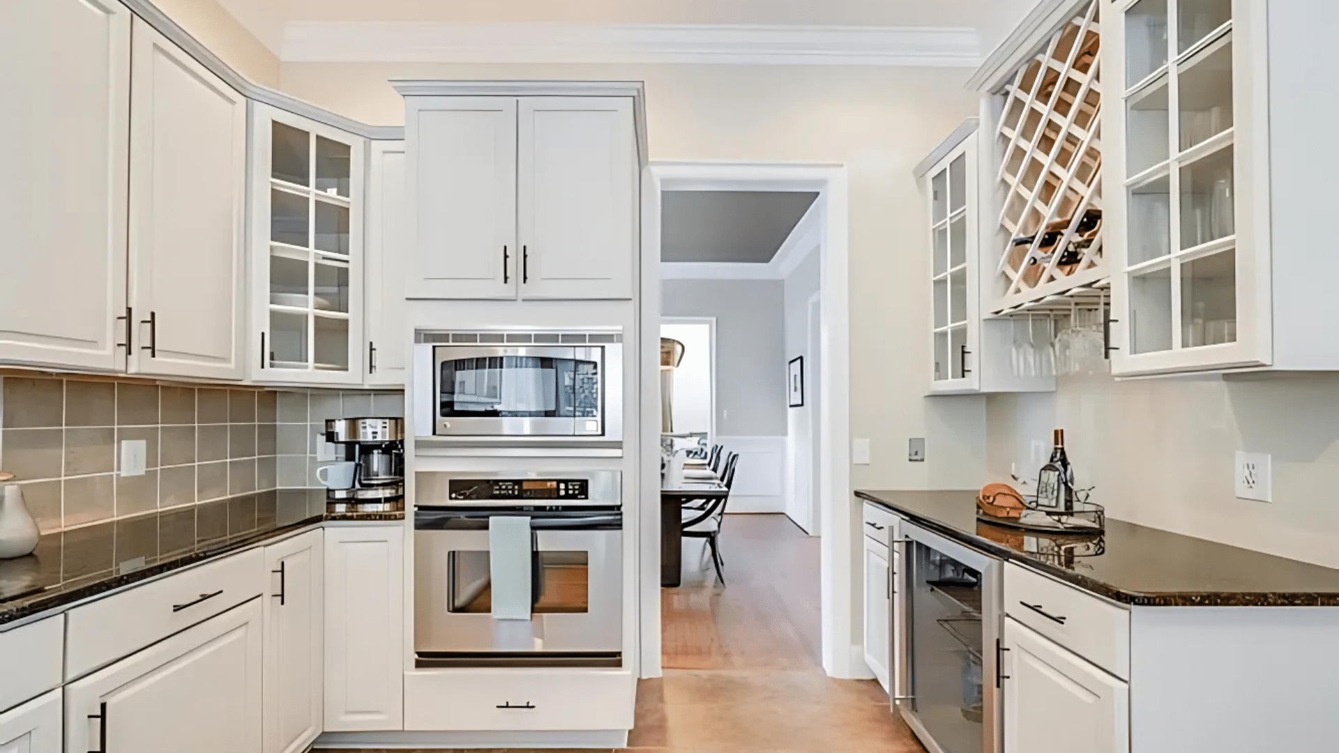
Kitchens
Amherst Gray on cabinets gives kitchens a refined look. It’s often used for lower cabinets or kitchen islands in a two-tone setup. The color works beautifully with white quartz counters, natural stone, and stainless-steel appliances. Even in all-gray kitchens, it doesn’t feel dull—it feels sharp and clean.
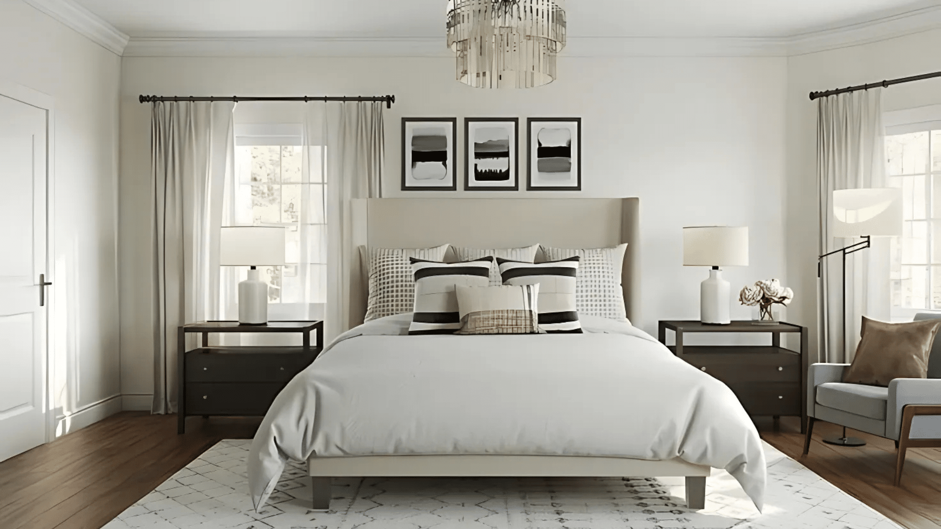
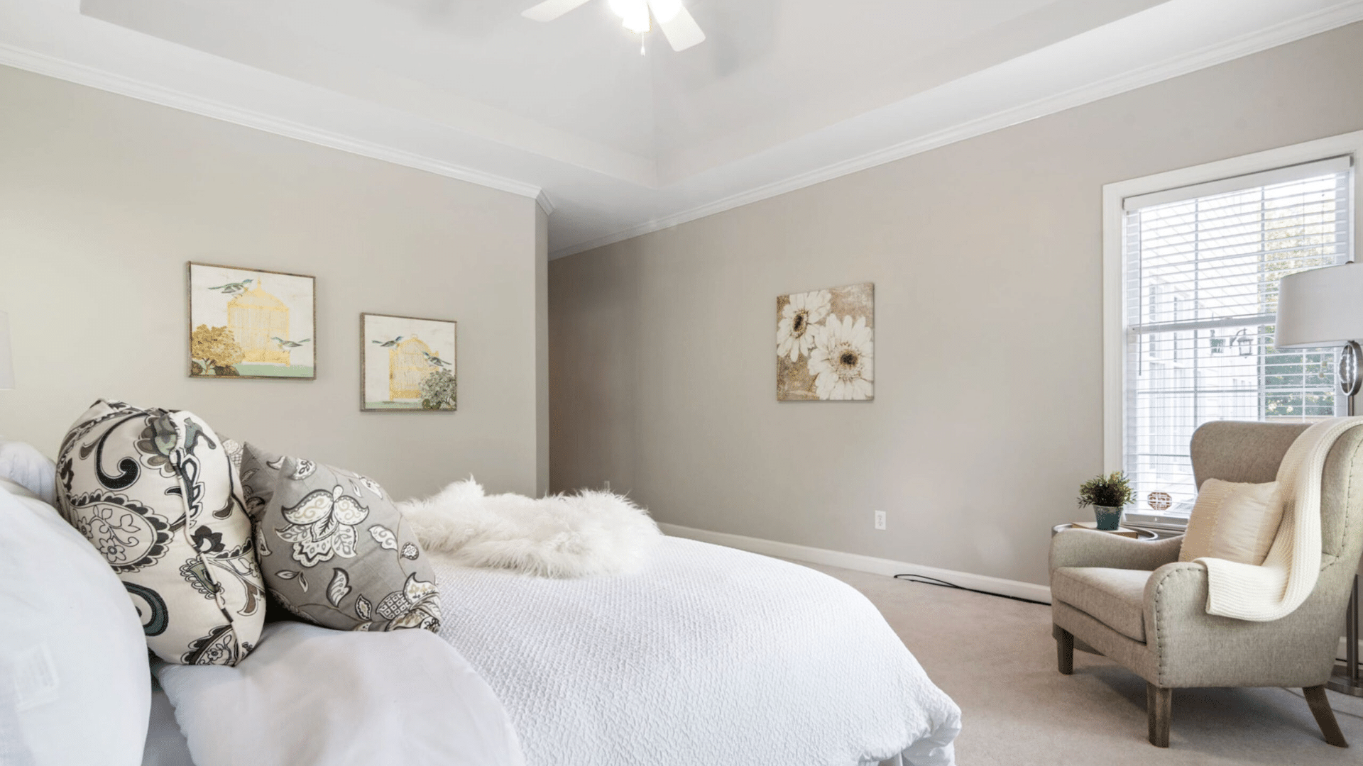
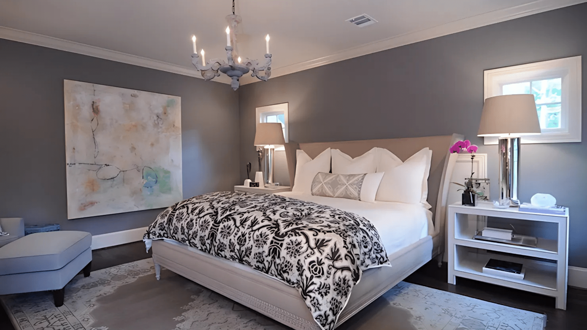
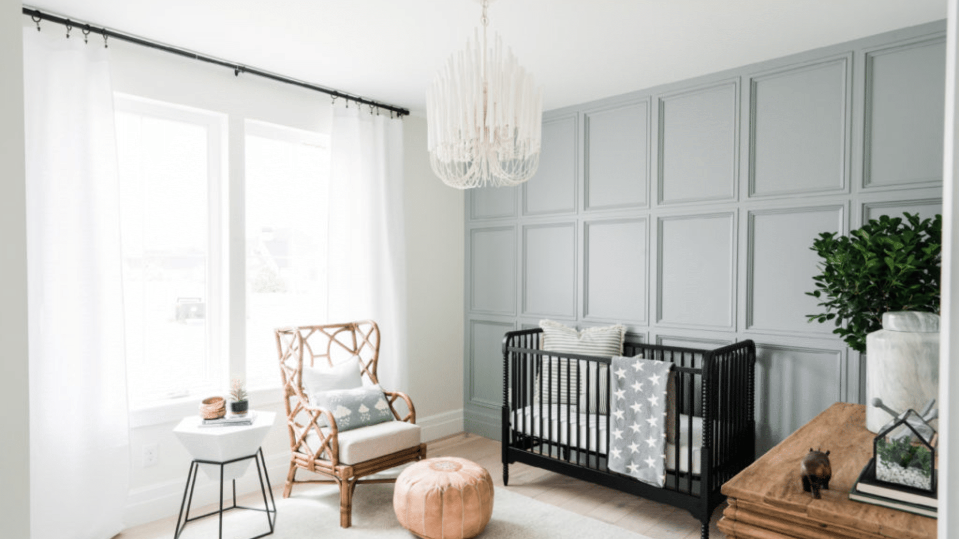
Bedrooms
This shade creates a restful atmosphere. It’s deep enough to make the room feel cocooned, but not so dark it’s overwhelming. Add white bedding, soft curtains, and wood accents for balance. If you want a subtle statement, try painting just the headboard wall.
Home Offices
In workspaces, Amherst Gray helps create focus. It’s not distracting, and it doesn’t make the space feel too sterile. The right desk and lighting create an environment where you can get things done while still feeling at ease.
What Kind of Floors Would Look Best with Amherst Gray?
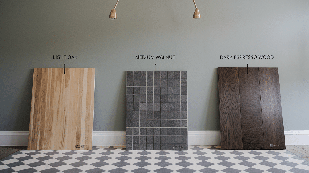
Paint and flooring work closely together. Amherst Gray needs the right floor tone to bring out its best qualities.
- Light Wood Floors: If your floors are oak, maple, or pine, Amherst Gray offers a lovely contrast. The lightness of the floor keeps the room from feeling too dark, even if you paint all four walls. This combo works well in Scandinavian-style spaces or transitional designs.
- Medium Wood Tones: Walnut, hickory, or medium brown floors bring out the warmth in Amherst Gray. These combos feel rich, layered, and comfortable. They also make the room feel grounded without feeling old-fashioned.
- Gray-Toned Tiles: Gray tile flooring, especially with texture or pattern, works well in bathrooms and kitchens. Just make sure the tile isn’t too blue or cool, as it might clash slightly with the green undertone. Warmer grays or stone-look tiles are a better match.
- Dark Floors: For those who love bold contrast, dark wood floors and Amherst Gray walls make a statement. Just be careful with lighting and ceiling color. Light-colored ceilings and trims are key to stopping the room from feeling closed in.
Top Color Combinations with Amherst Gray
Amherst Gray plays well with many other paint shades, which is part of what makes it such a versatile choice. Whether you want contrast, warmth, softness, or balance, pairing it with the right companion color can elevate the entire look of your space.
White Dove
Use White Dove on trim, doors, or ceilings to make Amherst Gray feel clean and bright. White Dove has a warm base, so it complements the subtle green undertones of Amherst Gray without feeling stark or too crisp. This pairing works especially well in traditional and transitional homes, where trim plays an important role in the room’s visual structure.
Pale Oak
Pale Oak is a light greige that works well in nearby or adjoining rooms. It creates a soft, smooth transition from one space to the next without a jarring shift in tone. This is a great choice for open-concept layouts where you want some definition between spaces but still want a connected, harmonious feel. Pale Oak keeps things light while allowing Amherst Gray to provide depth.
Revere Pewter
Revere Pewter is a classic warm gray that blends seamlessly with Amherst Gray. It’s a slightly lighter and more beige version of gray that feels inviting and cozy. Use Revere Pewter in shared spaces like hallways or dining rooms to soften the richness of Amherst Gray in living areas or bedrooms. Together, they make for a smooth, layered palette that doesn’t feel too cool or too warm.
Chelsea Gray
Chelsea Gray is a bit darker and richer than Amherst Gray. Use it for cabinets, interior doors, or furniture pieces to add contrast and texture to a room that features Amherst Gray walls. It’s especially striking in kitchens or offices where darker tones can add character without overwhelming the space. Chelsea Gray gives you a bold edge that still feels grounded.
Hale Navy
Hale Navy adds a deep, bold contrast to the calm and neutral presence of Amherst Gray. This combo is ideal for accent walls, textiles like rugs or throw pillows, or even exterior front doors. It brings energy and a modern feel to a room without making it feel cluttered. The two colors together create a look that is polished and confident.
Cloud White
If you want a white that doesn’t steal the show but still keeps things fresh, Cloud White is a perfect match. It’s soft and warm, which means it won’t clash with the undertones in Amherst Gray. Use it for trim, ceilings, or built-ins when you want a white that’s gentle on the eyes but still brightens up the room.
Classic Gray
Classic Gray is a very soft neutral that balances well with Amherst Gray. It’s great for ceilings, hallways, or adjacent spaces where you want a lighter feel but still want to stay within the gray family. Classic Gray helps soften the room and makes it feel cohesive without feeling monochromatic. It’s also a great backdrop for art and decor.
Boothbay Gray
Boothbay Gray has blue undertones, which can create a calm, slightly coastal feel when paired with Amherst Gray. This is a great combination for bathrooms, laundry rooms, or bedrooms. It works well with brushed nickel or silver hardware and keeps the space from feeling too warm or too cool. It’s also a great way to add a subtle splash of personality.
Balboa Mist
Balboa Mist is a light, warm gray that feels fresh and breathable. It’s great for open floor plans because it allows Amherst Gray to act as an accent or feature wall without creating too much contrast. This pairing keeps spaces feeling open and connected, and it works beautifully in homes with a lot of natural light.
Edgecomb Gray
Edgecomb Gray is a very soft greige that feels timeless and versatile. It’s ideal for rooms that need warmth but don’t have a lot of natural light. Use Edgecomb Gray in bedrooms, entryways, or upstairs hallways to keep things feeling warm and cozy while allowing Amherst Gray to shine in main areas. It also pairs well with warm wood tones and cream-colored fabrics.
These combinations work in different types of spaces—some formal, others more casual. Mix and match depending on your home’s layout, lighting, and how much contrast you want. The key is to find balance—using Amherst Gray as a strong, neutral anchor while letting the companion shades support and highlight it in the right places.
How to Incorporate Amherst Gray Into Your Home Decor
You don’t have to commit to painting all four walls right away. There are many ways to bring Amherst Gray into your home.
- Start Small: Try it in smaller ways—on a piece of furniture, in an entryway, or on a feature wall. It gives you a chance to see how it behaves in your space before going all in.
- Use It on Furniture: Painting a dresser or a set of dining chairs in Amherst Gray gives a strong visual base that isn’t too bold. It’s especially striking on shaker-style furniture or pieces with simple lines.
- Go With Architectural Features: If your home has wainscoting, built-ins, or paneling, Amherst Gray can highlight those features. It gives depth to areas that might otherwise get overlooked.
- Balance With Lighter Pieces: Gray can sometimes feel heavy if everything else is dark. Offset Amherst Gray with lighter curtains, rugs, and light wood. Plants and art also help keep things from feeling flat.
Amherst Gray vs. Other Warm Neutrals: A Comparison
Not all warm neutrals are the same. Some feel soft and cozy, while others bring more depth and boldness. Amherst Gray stands out because it has a rich, earthy feel but still works as a neutral. In this section, we’ll compare Amherst Gray to other popular warm shades to help you see the differences and pick the right one for your space.
Amherst Gray vs. Chelsea Gray
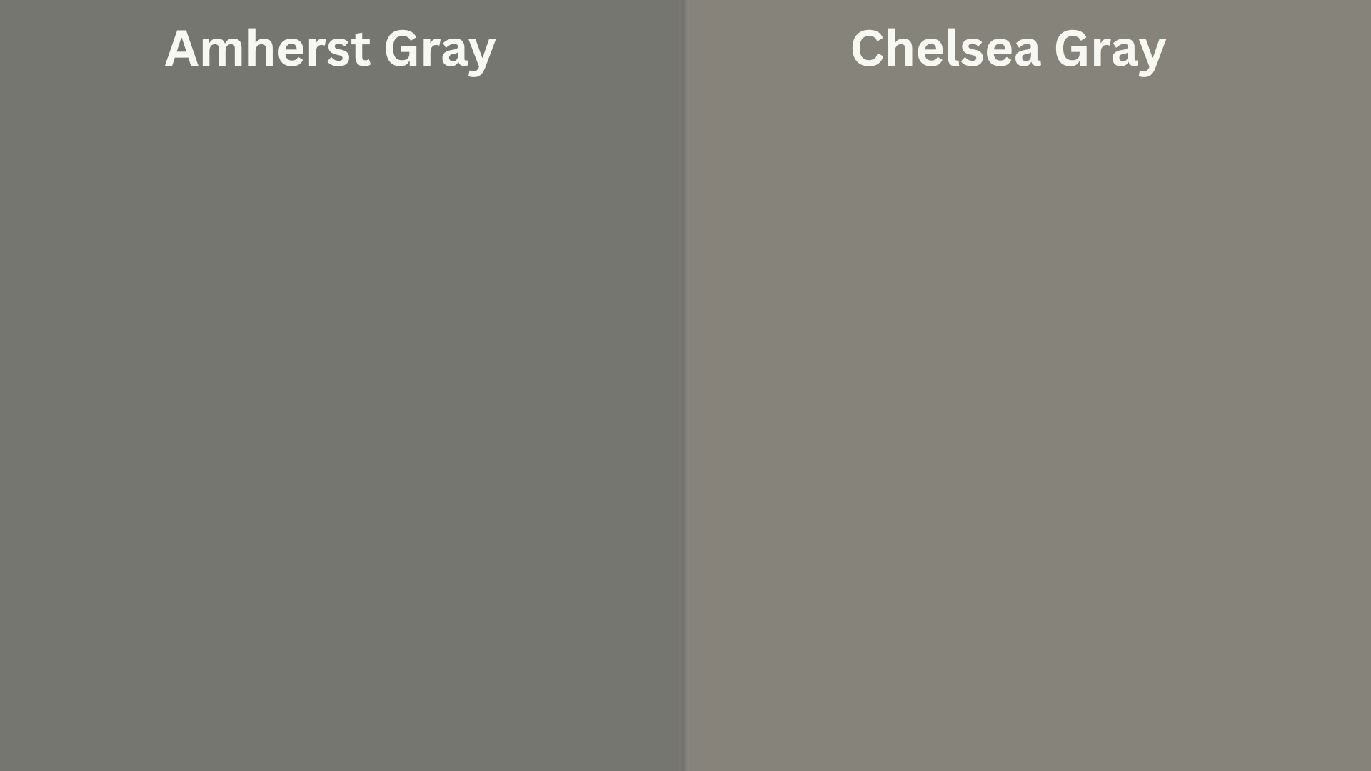
Chelsea Gray is a bit darker and has more brown in it. This makes it warmer, but also a little heavier. Amherst is more neutral and a bit easier to decorate around.
Amherst Gray vs. Kendall Charcoal
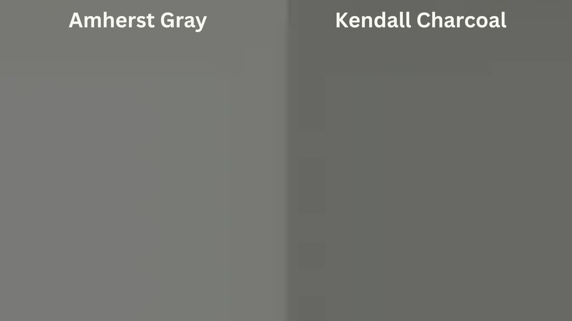
Kendall Charcoal is much deeper and can sometimes read as black. It works well in bold spaces, but Amherst Gray is more flexible. If you want depth without drama, go with Amherst.
Amherst Gray vs. Revere Pewter
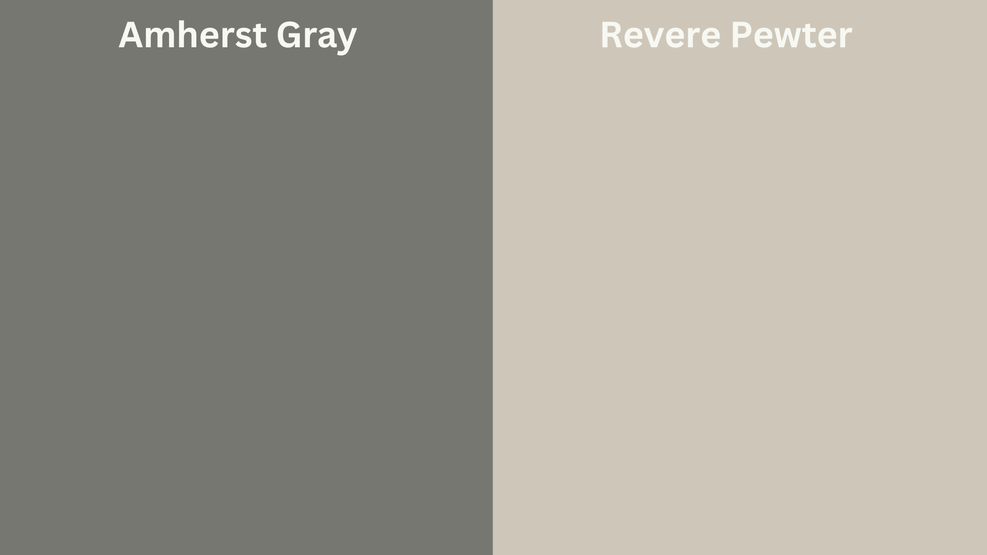
Revere Pewter is lighter and softer. It leans more greige than gray. It’s great if you want brightness, but Amherst gives a more grounded feel. Use them in rooms that connect to keep a smooth flow.
Amherst Gray vs. Edgecomb Gray
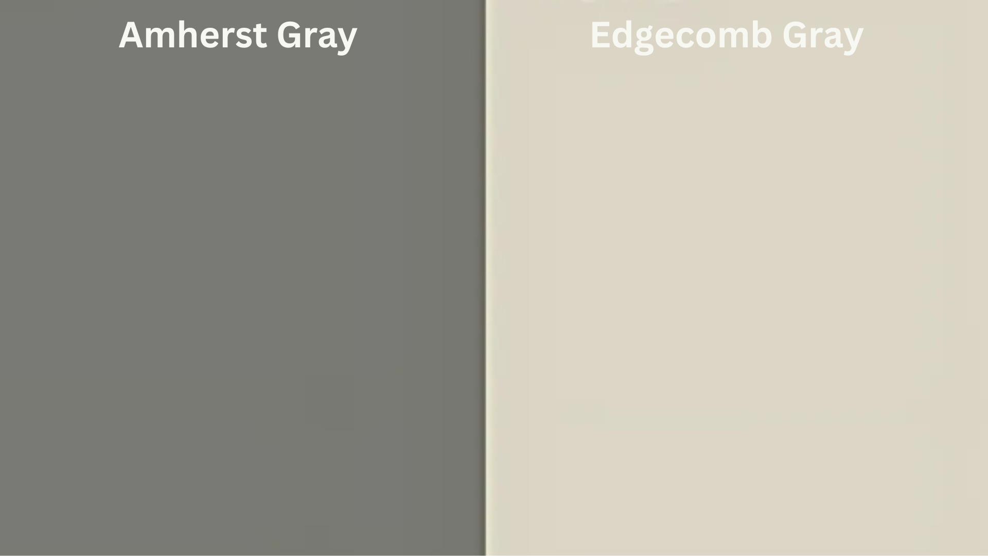
Edgecomb Gray is a very light gray. It’s almost an off-white in bright rooms. Amherst Gray, by comparison, gives much more definition. Use Edgecomb where you want light and subtlety. Use Amherst where you want strength and presence.
Conclusion
Benjamin Moore’s Amherst Gray is the kind of color that makes your home feel finished. It’s rich without being overbearing, warm without being too brown, and versatile enough to use almost anywhere.
Whether you’re painting a full exterior, adding depth to a room, or creating contrast in a kitchen, Amherst Gray gives you that clean, confident look without a lot of risk.
It’s consistent, balanced, and easy to style around. From modern spaces to traditional homes, this shade adapts well. With the right pairings—floors, fabrics, and fixtures—it can transform any room into a more grounded, welcoming space.
Frequently Asked Questions
Is Amherst Gray Good for North-Facing Rooms?
Yes. It brings needed warmth to cooler light and keeps the room from feeling too chilly. The green undertones help add balance to the blue-leaning light.
What Finish Should I Use for Amherst Gray on Walls?
Eggshell or satin finish works best. These finishes are easy to clean and offer a soft sheen that keeps the color from feeling flat.
Can I Use Amherst Gray for Kitchen Cabinets?
Absolutely. It adds just enough contrast without being too dark. It looks especially good with brushed nickel or matte black hardware.
Will Amherst Gray Look Green in My Home?
Sometimes. The green undertones can show up depending on your lighting and what colors are nearby. Test samples first to be sure.
Is Amherst Gray a Good Exterior Color?
Yes. It works beautifully with stone, white trim, and natural wood. It holds its color well in sunlight and gives homes a timeless look.