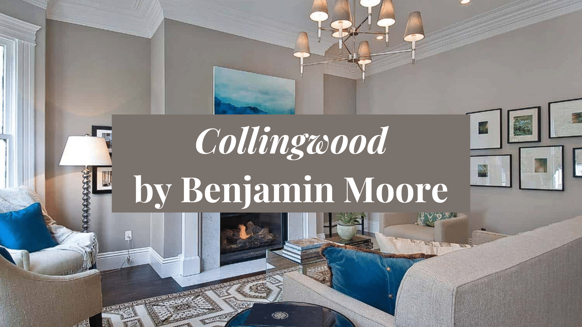
If you want a soft, warm gray that fits almost any room, Collingwood by Benjamin Moore is a great choice. It’s a light greige, which means it’s a mix of gray and beige. This gives it a calm, cozy look that feels clean and easy to live with.
Collingwood works well in living rooms, bedrooms, hallways, and even kitchens. It’s light enough to brighten a space but warm enough to keep it feeling inviting. This shade blends well with modern, farmhouse, and classic styles, making it super flexible.
No matter you’re painting a whole room or just an accent wall, Collingwood is a color that’s simple and timeless. In this blog, we’ll go over why so many people love it, where you can use it, how to pair it with other colors, and how it compares to similar shades. If you like easy, pretty neutrals, this one’s for you.
Why Collingwood (OC-28) by Benjamin Moore is Popular
Collingwood is famous because it’s one of those colors that works. Its perfect balance of gray and beige gives it a soft, cozy feel that’s not too warm and not too cool. People love it because it looks clean and fresh but still feels inviting.
Another reason it’s popular is that it’s super flexible. You can use it in almost any room, and it works well with all kinds of colors and styles. It doesn’t steal the spotlight, but it does help make everything around it look good.
It’s also part of Benjamin Moore’s Classic Color Collection, which means it’s a tried-and-true shade that designers and homeowners trust. If you’re looking for a light neutral that won’t go out of style, Collingwood is a great choice.
Specifications of Collingwood (OC-28) by Benjamin Moore

If you’re thinking about painting with Collingwood, here are some simple facts to help:
- Color Code: OC-28
- Collection: Off-White Collection and Classic Color Collection
- Finish Options: Available in matte, eggshell, satin, semigloss, and more
- RGB: Red 205, Green 201, Blue 192
- HEX Code: #CDC9C0
- Light Reflectance Value (LRV): 62.14 – which means it’s a light color that reflects a lot of light
- Undertones: Soft violet and beige mix
- Sheen Tip: Eggshell or satin is great for most rooms
These details help you know how light or dark the paint will look and what finish might work best. Collingwood is soft, smooth, and perfect for creating a calm, welcoming space.
Using Collingwood (OC-28) by Benjamin Moore

Collingwood is an amazing light neutral that can brighten up a room without feeling cold. It’s great for just about any space.
1. Living Rooms
Collingwood is a great choice for living rooms because it makes the space feel open, clean, and comfortable. It has just enough warmth to feel cozy without making the room too dark or heavy. This soft greige pairs perfectly with white trim, light wood flooring, and neutral furniture. Add in some soft textures like throw blankets, woven rugs, and cozy cushions.
2. Bedrooms
In bedrooms, Collingwood works like a dream. It helps create a peaceful, calm feeling that’s perfect for resting and recharging. Because it has both gray and beige tones, it works well with many bedding colors—like soft whites, beiges, light grays, and even blush pinks. It also looks good with wood furniture and warm lighting.
3. Kitchens
Collingwood is a fantastic choice for kitchens, especially if you want a look that’s clean and modern but still feels warm and inviting. You can use it on walls for a soft, neutral backdrop or on cabinets for a fresh, updated style. It works really well with white or light countertops, stainless steel or black fixtures, and even gold hardware.
4. Home Offices or Reading Nooks
This color is perfect for home offices or quiet corners where you like to read or think. Collingwood brings a gentle, focused energy to the space. It’s not too bright or too dark, which means it won’t distract you when you’re working or studying. Instead, it helps create a calm, clear-headed environment that’s easy to focus in.
5. Accent Walls
Even though Collingwood is light and soft, it can still work great as an accent wall. If your room has mostly white or lighter-colored walls, painting one wall in Collingwood adds just the right amount of contrast. It’s a gentle way to add interest without going too bold or dark. It’s a simple way to add depth and personality to your space.
6. Furniture
If you’re into DIY or want to give old furniture a new look, try painting it in Collingwood. It gives dressers, nightstands, shelves, and cabinets a soft, modern feel. Unlike bright white, Collingwood feels warmer and more relaxed, which can help your furniture blend better with the rest of your space.
7. Bathrooms
Collingwood is a top pick for bathrooms if you’re going for that clean, spa-like look. It adds a soft, soothing vibe that works well with white tile, light wood, or even marble. It looks great on walls, vanities, or even ceilings if you’re feeling creative. Add warm lighting, soft towels, and a few touches of greenery or decor, and you’ve got a bathroom that feels fresh, calm, and relaxing. Plus, since it’s a light color, it helps make small bathrooms feel bigger and brighter.
With Collingwood, you can bring warmth and brightness into your home without going too dark or too cool. It’s the perfect middle-ground neutral.
Coordinating Colors with Collingwood (OC-28) by Benjamin Moore

Collingwood is easy to match because it’s a well-balanced color. It works with many different tones and materials.
- Whites and Off-Whites: These clean colors make Collingwood stand out gently. Try them for trim, doors, ceilings, and even furniture for a soft, fresh contrast.
- Warm Neutrals: Beige, taupe, and greige tones pair really well with Collingwood. These warm tones keep the space feeling cozy and inviting.
- Soft Grays: Lighter or slightly darker grays help create depth. These cool tones blend nicely and give a smooth, calming look.
- Wood Tones: From light oak to deep walnut, wood adds texture and natural warmth. It pairs perfectly with Collingwood’s gentle undertones.
- Muted Blues or Greens: Soft colors like dusty blue or sage green bring in subtle contrast. These colors work great for accents like pillows, rugs, or even painted furniture.
- Gold and Bronze Accents: Warm metals like gold and bronze add class to a Collingwood room. Try light fixtures, hardware, or picture frames.
With Collingwood as your base color, you can easily build a soft, stylish space that feels both fresh and timeless.
Comparing Collingwood (OC-28) by Benjamin Moore with Similar Shades

There are many light neutrals to choose from, so let’s compare Collingwood to a few popular ones to help you decide.
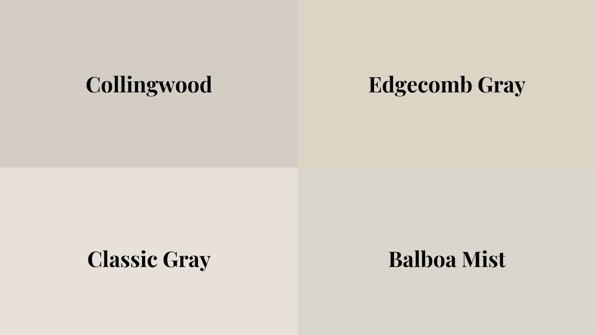
1. Collingwood vs. Edgecomb Gray
Edgecomb Gray is a touch warmer than Collingwood and leans more toward beige. It has a slightly creamy look that works well in traditional or farmhouse-style homes. If you want a soft, warm vibe, Edgecomb Gray might be the better pick. Collingwood is just a little cooler and more balanced, which makes it feel cleaner and more modern in some spaces.
2. Collingwood vs. Classic Gray
Classic Gray is much lighter than Collingwood and sits closer to off-white. It’s perfect if you want a super soft, barely-there wall color that still adds a hint of warmth. Collingwood, on the other hand, has more depth and body. It shows up more clearly on walls and gives a little more contrast, which helps bring out your trim, furniture, or décor.
3. Collingwood vs. Balboa Mist
These two colors are often compared because they’re very close. Balboa Mist has a tiny bit more of a purple undertone, which can show up depending on the lighting. Collingwood feels a bit more neutral and grounded. Both are great choices for light and airy spaces, but if you’re sensitive to undertones, Collingwood might feel more consistent and less changeable throughout the day.
Overall, Collingwood stands out for its soft, balanced tone. It’s a great pick if you want something warm but not too yellow and light but not too bright.
Reviews of Collingwood (OC-28) by Benjamin Moore
Homeowners and designers love Collingwood because it’s easy to work with and always looks good. It’s a light, warm gray that doesn’t feel boring or flat. People often say it makes their rooms feel clean, cozy, and open.
Many reviewers like that Collingwood changes slightly with the light. In bright rooms, it looks light and airy. In low light, it shows more of its soft, warm undertones. This little change gives the color more life and character.
People also love that it fits in with many home styles. From modern to farmhouse to traditional, Collingwood just works. It doesn’t fight with other colors or furniture—it blends in and supports the whole room.
Overall, reviews are very positive. Most people are happy they chose Collingwood and say they would use it again in other rooms. It’s a simple, pretty color that makes your home feel just right.
Conclusion
Collingwood by Benjamin Moore is a soft, warm gray that instantly makes any space feel welcoming. It has the perfect balance of lightness and warmth, creating a clean, calming atmosphere without being too cold or dull. Whether you’re painting a bedroom, hallway, kitchen, or office, Collingwood brings just the right amount of brightness and coziness.
This versatile color pairs well with whites, warm wood tones, soft blues, and muted greens, making it perfect for a variety of styles, from traditional to modern. Homeowners often say that choosing Collingwood is one of their best decisions because it fits so effortlessly into their spaces.
If you’re searching for a light neutral that adds peace and style, Collingwood is the ideal pick. It’s simple, easy to work with, and perfect for creating a relaxed, stylish home.

