
Have you ever walked into a room and felt instantly at peace?
That’s what happened when I first saw Cromarty on my client’s walls.
Many homeowners struggle to find the perfect shade that’s not too green or gray but still has enough character to make a space feel special. After testing countless paint samples and living with less-than-perfect colors, the frustration is real.
That’s why I’m excited to share my experience with Farrow & Ball’s Cromarty. Inspired by Scotland’s misty Cromarty Firth estuary, this light green-gray shade brings a soft, natural feel to any space.
As a color consultant who has tested this paint in real homes, I can tell you it’s more than just another neutral – it’s a color that truly transforms rooms.
What Makes Cromarty Timeless?
A Historical Perspective
I often tell my clients that the best paint colors have a story, and Cromarty’s tale is special. The color takes its name from the Cromarty Firth estuary in Scotland, a place known for its swirling mists mentioned in daily shipping forecasts.
This connection to nature makes sense when you see the paint in person – it has that same soft, misty quality.
Unique Color Properties
From my years of testing paint colors, I can tell you that Cromarty hits a sweet spot. It sits right in that perfect middle ground between green and gray.
What makes it stand out from other paints is how it plays with light throughout the day. Each time the sun shifts, you’ll notice subtle changes in its appearance.
The color has an LRV (Light Reflective Value) of around 60, but here’s what makes it special – it feels richer than that number suggests. I’ve found that Farrow & Ball’s unique formula gives Cromarty more depth than typical paints with similar LRV values.
Why Choose Cromarty For Your Home?
Versatility Across Spaces
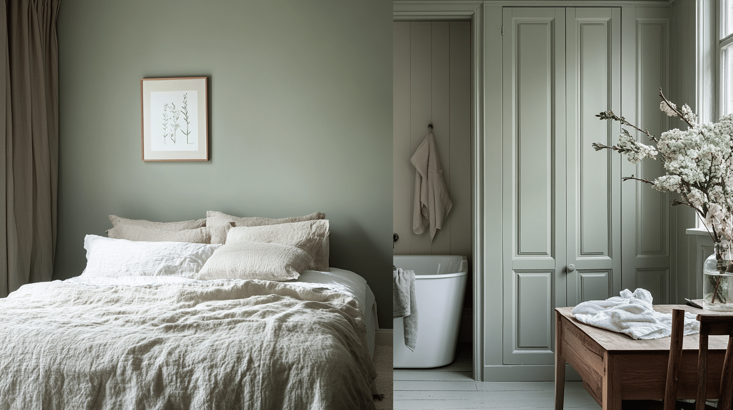
Based on my hands-on experience with this color, I’ve found Cromarty works best in specific spots in your home. It shines in standalone rooms like bedrooms and bathrooms. I recently helped a client use it in both spaces, and the results were stunning.
Here’s something important I’ve learned: While Cromarty is beautiful, it’s not ideal for open-concept areas. Instead, I suggest using it to create “jewel-box” spaces – individual rooms where the color can truly make its mark.
Mood And Atmosphere
One thing that sets Cromarty apart is how it adapts to different light conditions. In north-facing rooms, it adds warmth that cuts through cooler light. In south-facing spaces, it helps create bright, airy feelings without looking washed out.
I’ve noticed it brings a sense of calm to bedrooms – perfect if you’re aiming for a peaceful retreat. In bathrooms, it adds sophistication while maintaining a fresh feel. The color has enough presence to make a statement but remains soft enough to feel restful.
Complementary Colors And Pairings
Suggested White Trims And Ceilings
From my recent color consultations, I’ve pinpointed the best whites to pair with Cromarty. School House White is Farrow & Ball’s recommended match—it’s a balanced off-white that works perfectly. I also suggest checking out All White or Wimbourne White for trim.
I share a tip with my clients: stick with clean or slightly creamy whites. This helps Cromarty’s subtle green tones shine through beautifully.
Color Schemes
Let me share what I’ve found works best with Cromarty. Although technically called a blue-gray, Pigeon shares similar green undertones and creates a lovely tonal flow. Blue Gray is another solid option that complements Cromarty’s muted nature.
But I should mention what to avoid: I’ve learned that earthy tones can make Cromarty look out of place. Also, stay away from cool whites like Benjamin Moore’s Decorator’s White – they don’t play well together.
Practical Applications
Interior Paint Uses
Let me tell you about the real-world uses of Cromarty. I’ve seen it work well. According to Farrow & Ball’s specifications, this color shines in bedrooms and bathrooms.
I recently saw it used in a client’s space where they painted the walls, ceiling, and trim all in Cromarty – it created a beautifully cohesive look.
For kitchens, it makes a subtle statement on cabinets. Think of the British baking show’s kitchen cabinets – that same kind of soft, natural feel. A Cromarty kitchen island paired with warm white cabinets offers a fresh take on traditional spaces.
Exterior Applications
For exteriors, here’s something important to note: Farrow & Ball only sells Cromarty in one-gallon quantities in North America. While this makes whole-house exterior projects costly, it works beautifully for front doors.
Just remember to use the Modern Emulsion finish for exterior durability.
Is Cromarty The Right Choice For You?
When To Use Cromarty
Based on Farrow & Ball’s guidelines and documented applications, Cromarty works best in single, contained spaces. The paint brings a muted softness that’s neither green nor gray. I particularly like using it in rooms where you want a sense of calm and connection to nature.
Looking at real-world examples from the documentation, the color excels in:
- Bedrooms seeking a peaceful atmosphere
- Bathrooms need a spa-like feel
- Single rooms rather than flowing spaces
When To Avoid Cromarty
The source materials indicate specific situations where Cromarty might not be your best choice:
- Open-layout areas (the color is too saturated for large, flowing spaces)
- Rooms with very earthy finishes (it can create an unintended contrast)
- Spaces where you’ve used cool white colors like Benjamin Moore Decorator’s White
Cromarty: Comparing Shades And Highlighting Unique Features
| Aspect | Cromarty vs. Mizzle | Cromarty vs. Pale Powder | Cromarty vs. Dusty Miller (Benjamin Moore) | Unique Advantages of Cromarty |
|---|---|---|---|---|
| Color Depth | Lighter than Mizzle | More green-gray compared to Pale Powder’s soft aqua | Slightly more muted than Dusty Miller | Rich pigments that make up less than 8% of the tin |
| Tonal Balance | Leaning more into gray notes | Pale Powder pulls more blue tones | Cromarty offers a softer, subtler tone | Unique response to light, shifting beautifully throughout the day |
| Brightness | Mizzle appears more saturated in green | Pale Powder is lighter and brighter | Both are comparable, but Cromarty is softer | The water-based formula ensures it won’t yellow over time |
| General Comparison | Muted and versatile compared to Mizzle’s bolder green | Cromarty offers more depth and subtlety than Pale Powder | Closest dupe among alternatives yet retains the unique richness |
Purchasing Information
Where to Buy
Farrow & Ball Cromarty is available through authorized retailers and their official website. In North America, the paint comes in one-gallon quantities only. For quick service, look for local stockists who offer same-day pickup options.
Sample Pots and Testing
Testing Cromarty in your space is essential. Here’s how:
- Use SAMPLIZE peel-and-stick samples for accurate color representation
- Test in different areas of your room
- Check the color during various times of day
- View under both natural and artificial light
Proper testing is the best way to ensure you’ll love your color choice. These samples show you exactly how Cromarty will look in your specific lighting conditions.
Offers And Discounts
Free shipping is available on all Farrow & Ball orders. Check with your authorized Farrow & Ball retailer or visit their website for current promotions and availability.
Expert Tips For Sampling
Importance Of Testing
According to Farrow & Ball’s guidance, sampling is crucial before deciding. The best way to experience Cromarty’s true character is through SAMPLIZE’s peel-and-stick paint samples, which show you exactly how the color looks on your walls.
The paint reacts differently to light throughout the day, so testing helps you see:
- Morning light effects
- Afternoon sun impact
- Evening light changes
- Artificial lighting appearance
Avoiding Dupes
Here’s something important to note from the source materials: don’t try to color-match Cromarty at other paint stores. Here’s why:
- Paint sheen standards vary between brands
- What’s called “Modern Emulsion” at Farrow & Ball translates differently elsewhere
- Results from matching attempts are typically poor
- The unique formula affects how the color appears on walls
Remember, Farrow & Ball puts specific ingredients in their paints – about 92% of what makes these colors special isn’t even the pigment.
Conclusion
After seeing Cromarty in real homes, I understand why this Farrow & Ball color stands apart. Like its namesake Scottish estuary, it brings a natural softness that transforms spaces.
From bedrooms to bathrooms, this green-gray shade creates special and serene rooms. The color changes subtly throughout the day, adding depth that typical paints can’t match.
If you want to create a peaceful space that stays beautiful over time, Cromarty might be your answer. Just remember to test it in your lighting first – grab a sample and watch how it changes from morning to night.
This isn’t just another gray paint. It’s a thoughtfully crafted color that brings a bit of misty Scottish charm to any room it graces.