 by Benjamin Moore")
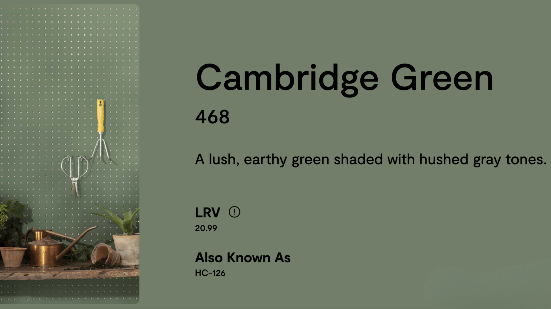
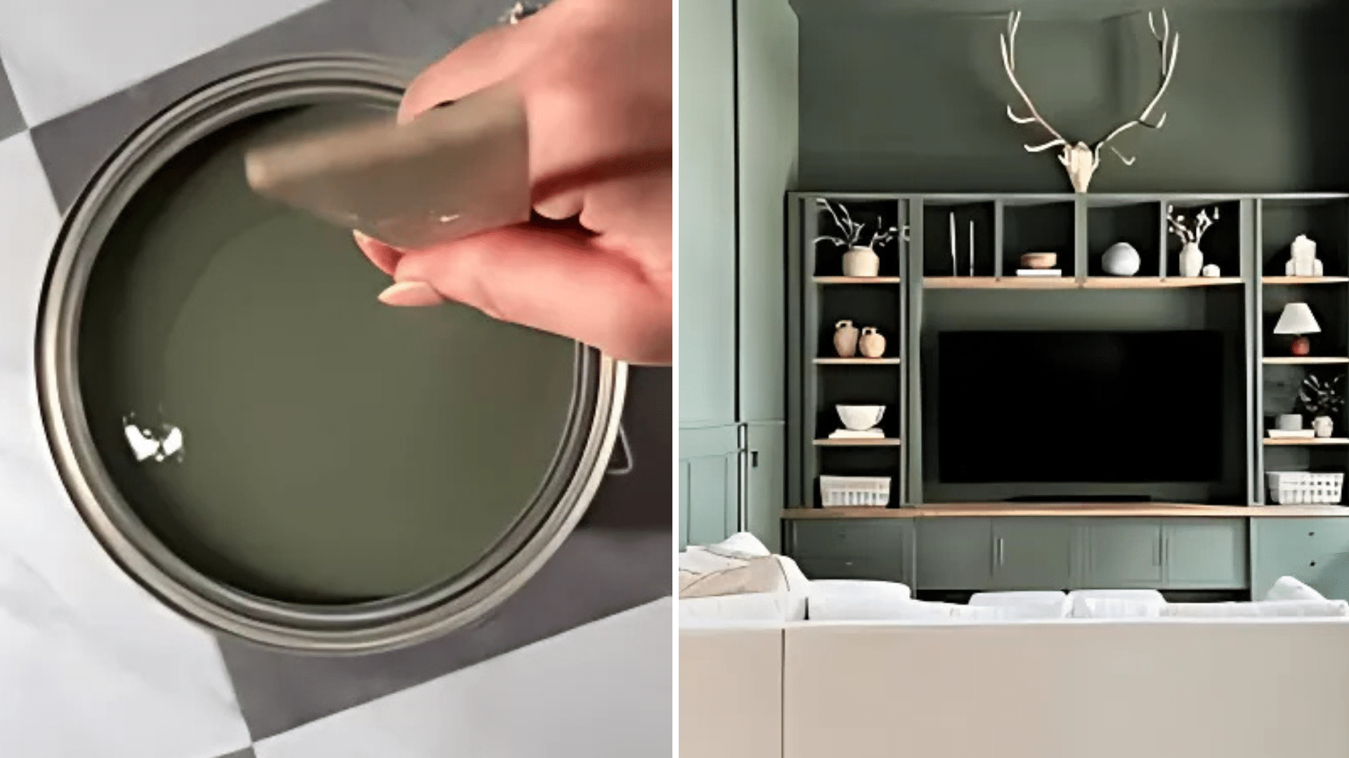
If you’re looking for a rich, calm color that makes your space feel cozy and stylish, Cambridge Green by Benjamin Moore might be just what you need.
Cambridge Green is a deep green with a hint of gray that adds a natural, earthy feel to any room. This color works great in living rooms, bedrooms, kitchens, and even offices. Whether you’re going for a modern, classic, or farmhouse look, Cambridge Green fits right in.
It’s bold without being too loud, and it helps create a relaxed, peaceful vibe in your home. In this blog, we’ll take a closer look at what makes this color so popular, where to use it, what it pairs well with, and how it compares to other greens. So, if you’re thinking about painting with green, stick around—we’ve got all the details you need.
Why Cambridge Green (HC-126) by Benjamin Moore is Famous
Cambridge Green by Benjamin Moore is loved for its rich, earthy look. It’s a deep green with a touch of gray, which gives it a calm and cozy feel. People like it because it works well in almost any room. If you’re painting a living room, bedroom, or even a kitchen, this color adds warmth and style.
Another reason it’s popular is that it pairs nicely with many other colors, like soft whites, creams, and even wood tones. It can fit with modern, classic, or farmhouse styles, so it’s super flexible. Designers and homeowners use it when they want a natural, grounded feel in their space.
Plus, it’s part of Benjamin Moore’s Classic Color Collection, which means it’s a trusted, timeless choice. All of this makes Cambridge Green a go-to paint color for many homes.
Specifications of Cambridge Green (HC-126) by Benjamin Moore
If you’re thinking about using Cambridge Green in your home, it helps to know a few key facts about the color. Don’t worry; this part is simple and useful!
- Color Code: 468
- Collection: Part of the Classic Color Collection
- Finish Options: Available in flat, eggshell, satin, semigloss, and more
- RGB: Red 120, Green 130, Blue 112
- HEX Code: #788270
- Light Reflectance Value (LRV): 20.99 – This means it’s a darker color and doesn’t reflect a lot of light.
- Undertones: A mix of green and gray
- Sheen Tip: Eggshell or satin works best for most walls
These simple details can help you choose the right finish and know what to expect. Cambridge Green is bold but balanced, making it perfect for cozy and calm spaces.
Using Cambridge Green (HC-126) by Benjamin Moore
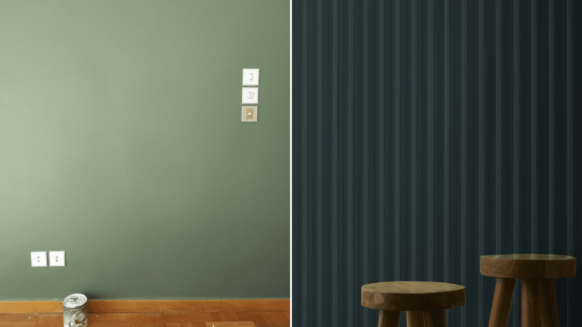
Cambridge Green is a beautiful deep green with a soft gray touch that works almost anywhere in your home. It’s bold but not too loud, which makes it a favorite for both big and small spaces. If you want a paint color that feels relaxing, natural, and a little bit dramatic, this one checks all the boxes.
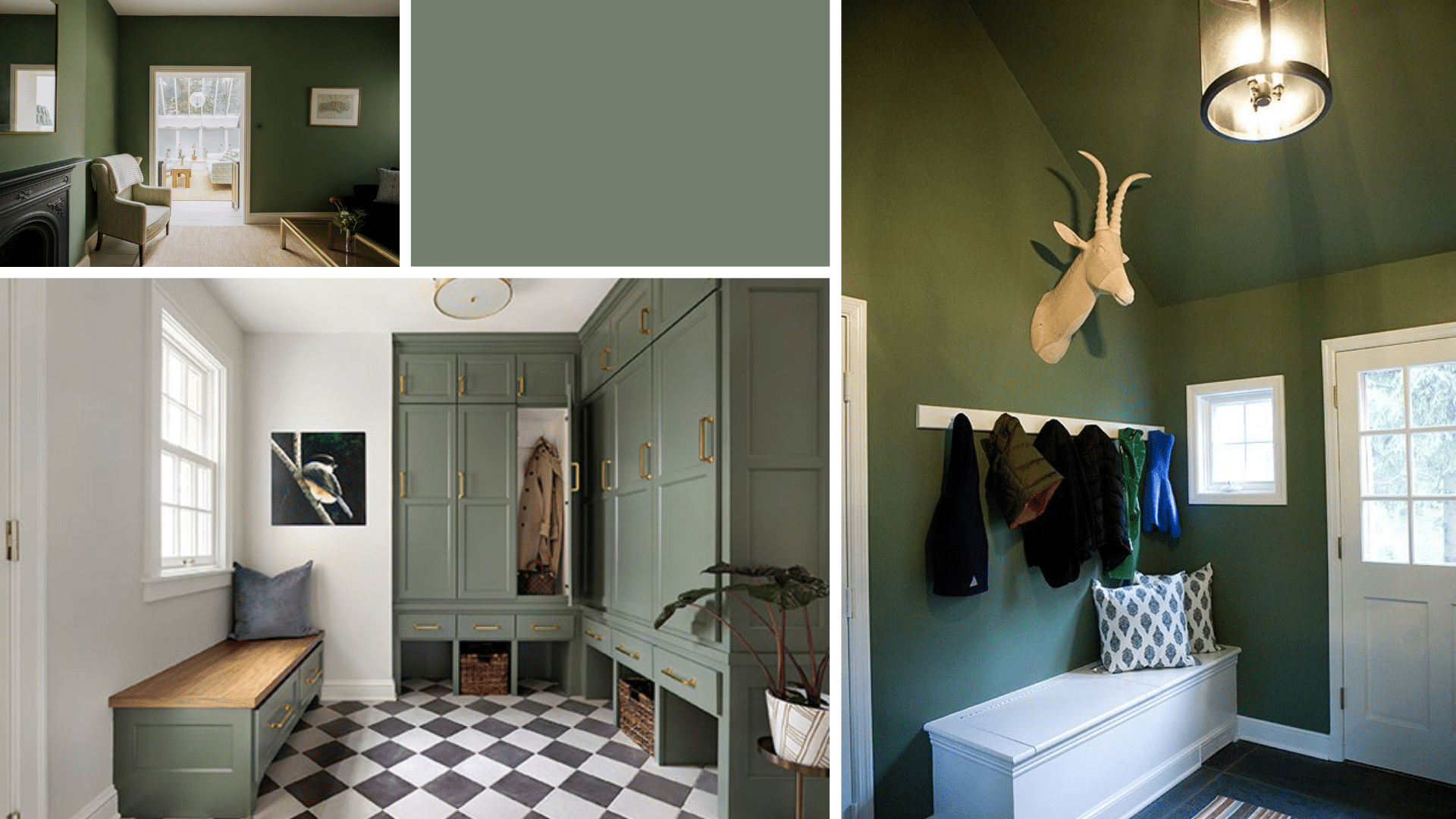
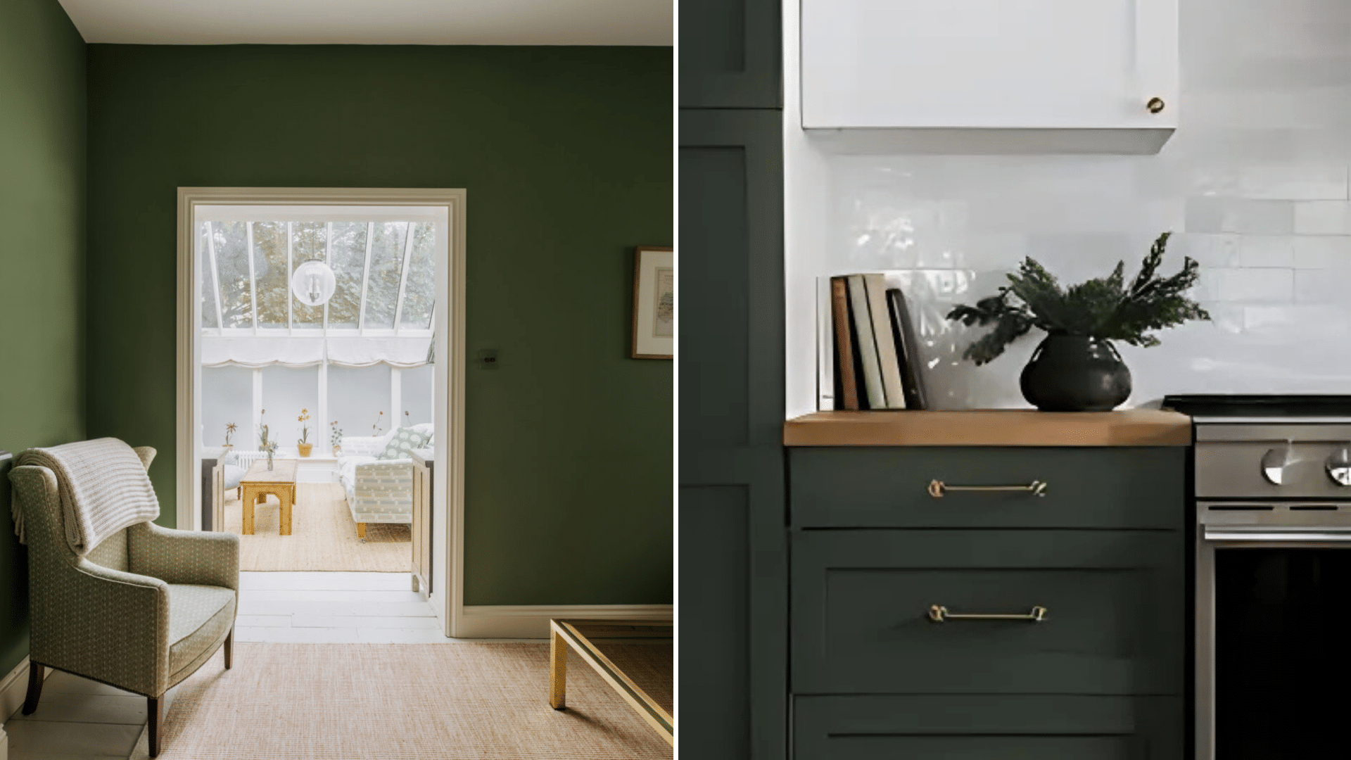
1. Living Rooms
Cambridge Green makes a living room feel cozy and pulled together. Paint all four walls for a bold, grounded look, or use it just on one wall for a stylish accent. It pairs perfectly with white or light beige trim, soft neutral rugs, and warm wooden furniture. Add in a few gold or brass accents to make the space feel extra classy.
2. Bedrooms
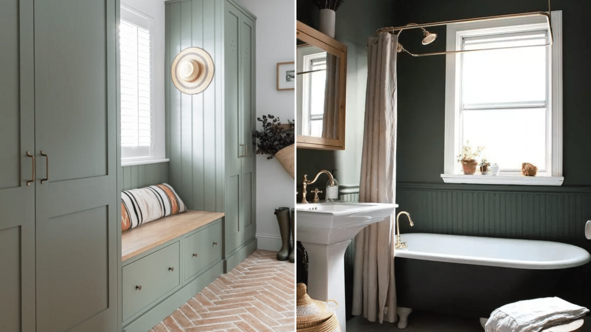
If you want your bedroom to feel like a peaceful retreat, Cambridge Green is a great pick. This color creates a soothing vibe that helps you unwind. Try it on every wall for a deep, calming look or just behind the bed for a cozy backdrop. Pair it with white or cream bedding, natural wood tones, and simple decor for a balanced feel.
3. Kitchens
Green in the kitchen? Yes, please! Cambridge Green looks amazing on kitchen cabinets, especially the lowers or the island. It brings in a natural touch that pairs well with stone countertops and white backsplashes. Add some black hardware for a bold twist, or go with brass for a warmer look.
4. Home Offices or Reading Nooks
This color is perfect for creating a quiet, focused space. Use it in an office, study, or little reading nook to bring in a calm, grounded feeling. It pairs nicely with dark wood furniture, leather chairs, or even soft gray accents. Cambridge Green helps reduce stress, which makes it a smart choice for work areas.
5. Accent Walls
If you’re not ready to commit to painting a full room, start with an accent wall. Cambridge Green makes a great statement behind a sofa, bed, fireplace, or built-in shelves. It draws the eye without feeling overwhelming and works with both modern and classic styles.
6. Furniture Makeovers
You can also use this paint color on old furniture for a quick DIY refresh. Paint a dresser, side table, or even a cabinet to give it new life. The deep green shade brings a pop of color without being too bright, and it works well with both metal and wood finishes.
7. Hallways and Entryways
Don’t forget the small spaces! Cambridge Green looks stunning in entryways or hallways where you want a rich, welcoming vibe. Pair it with mirrors, soft lighting, and simple decor to make these spaces feel just as cozy as the rest of your home.
8. Bathrooms
For a spa-like bathroom, try Cambridge Green on the walls or vanity. It feels clean, fresh, and calming, just like a peaceful retreat. Add in white tile, soft towels, and wooden accents to create a beautiful balance of nature and comfort. Finish the look with warm lighting and a few plants to make the space feel even more relaxing.
No matter where you use it, Cambridge Green by Benjamin Moore brings charm, warmth, and style to your home. It’s a flexible color that fits many designs, from modern to farmhouse to traditional. With the right touches, it can turn any space into something truly special.
Coordinating Colors with Cambridge Green (HC-126) by Benjamin Moore
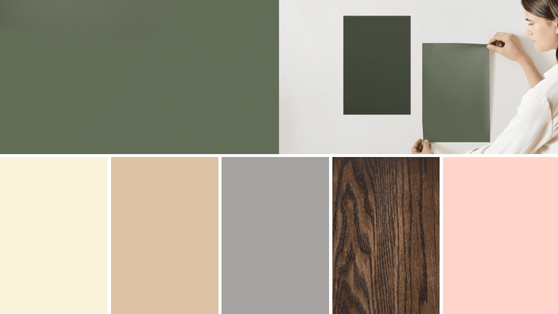
Cambridge Green by Benjamin Moore is a color that plays really well with others. Because it has soft gray undertones, it’s easy to match it with different shades and styles.
-
Whites and Creams: Pairing Cambridge Green with bright white or warm cream is always a win. These lighter shades help the green stand out without making the room feel too dark.
-
Warm Neutrals: Colors like beige, tan, and greige (a mix of gray and beige) work really well with Cambridge Green. These earthy tones bring out the green’s natural side and make the space feel warm and inviting.
-
Soft Grays: Since Cambridge Green already has some gray in it, soft gray walls or accents blend perfectly. You can use gray throw pillows, curtains, or rugs to create a smooth and stylish look.
-
Wood Tones: Natural wood furniture or floors look amazing with Cambridge Green. Lighter woods like oak or maple create a bright and airy feel, while darker woods like walnut add a touch of classiness.
-
Gold or Brass Accents: If you want to add a bit of glam, try gold or brass fixtures, picture frames, or lamp bases. These metallics pop against the green and give your space a more finished and fancy feel.
-
Muted Blues or Pinks: For a little color contrast, soft shades of blue or dusty pink can work really well. These colors don’t clash with the green but still add interest and charm.
When it comes to decorating with Cambridge Green, the key is to mix textures and tones that feel cozy and natural. Whether you’re styling a bedroom, living room, or kitchen, these pairings can help you build a space that feels balanced, beautiful, and totally you.
Comparing Cambridge Green (HC-126) by Benjamin Moore with Similar Shades
Cambridge Green by Benjamin Moore is a deep, earthy green with a soft gray touch. But if you’re picking a paint color, you might be wondering how it compares to similar greens.
1. Cambridge Green vs. Backwoods (469 – HEX #4B5842)
These two are very close on the paint chart, and at first glance, they may seem almost the same. But Backwoods is a bit darker and feels more like a deep forest green. It has a stronger, bolder vibe and works well for dramatic looks. Cambridge Green, on the other hand, feels softer and a bit more muted, which makes it easier to use in relaxed, everyday spaces.
2. Cambridge Green vs. Vintage Vogue (HC-110 – HEX #5B5E52)
Vintage Vogue is another deep green, but it has stronger olive and brown undertones. It brings a bit of a vintage or military-style feel to a room. Cambridge Green stays cooler and leans more neutral, which gives it a more calming, natural feel. If you want something earthy without looking too dark or heavy, Cambridge Green is a great pick.
3. Cambridge Green vs. Salamander (2050-10 – HEX #3E4B41)
Salamander is a much darker green, almost black, in low light. It’s perfect if you want something bold, moody, and dramatic. Because of its deep tone, it’s often used in small doses or as accent pieces. Cambridge Green is lighter and softer, making it easier to use on all four walls without feeling too intense.
4. Cambridge Green vs. Forest Floor (1498 – HEX #71704F)
Forest Floor has more yellow in it, giving it a warmer, slightly mossy tone. It brings a sunlit forest vibe to a space, while Cambridge Green feels cooler and more gray-based. That cooler tone makes Cambridge Green easier to match with modern decor, soft whites, and neutral accents.
In the end, Cambridge Green stands out because it gives you that deep, rich green look without being too overpowering. It’s a great in-between color—calm but still full of personality. Perfect if you want something bold but still easy to style.
Reviews of Cambridge Green (HC-126) by Benjamin Moore
Cambridge Green by Benjamin Moore has become a favorite for many homeowners and designers—and for good reason! People love how it brings a rich, earthy feel into a room without being too dark or overwhelming. It’s the kind of color that makes a space feel cozy, calm, and a little bit fancy all at once.
Many people say they chose Cambridge Green because it feels natural and peaceful. It’s especially popular in bedrooms, living rooms, and offices where you want a relaxing vibe.
Reviewers often mention that the color looks even better in person. It changes slightly with the light—sometimes more green, sometimes a bit more gray—which adds a lot of depth and character.
Overall, the reviews are super positive. People love how it transforms a room and works with so many styles, from modern to farmhouse. If you’re thinking about trying it, chances are you’ll be happy with the results, too!
Conclusion
Cambridge Green by Benjamin Moore is a rich, cozy color that works well in almost any room. Its mix of deep green and soft gray makes it calm, stylish, and easy to match with other colors.
Whether you’re painting a full room, an accent wall, or just a piece of furniture, this shade adds warmth and character without being too bold. It looks great with whites, creams, wood tones, and even gold or brass accents.
People love it because it’s both beautiful and easy to live with. It brings a peaceful, grounded feeling to your home and fits with lots of different styles, from modern to farmhouse. If you’re looking for a color that feels classic but still stands out, Cambridge Green is a great choice.
Give it a try in your next project, and you might be surprised by how much you love it. A little green can go a long way!