 by Benjamin Moore")
If you’re like me and looking for a calm, fresh color that brings a peaceful vibe into your home, Nelson Blue by Benjamin Moore is a beautiful option.
I love how this light, airy blue has a soft green undertone; it feels both soothing and stylish. It reminds me of a quiet beach morning or a clear spring sky, fresh, clean, and full of light.
Nelson Blue is part of Benjamin Moore’s Historical Color Collection, which I often turn to for its timeless and elegant shades.
I’ve found that it works well in a variety of rooms and styles, whether I’m going for a modern look, vintage charm, or relaxed coastal vibes.
In this blog, I’ll talk all about Nelson Blue, why it’s so well-loved, how I like to use it around the house, what it pairs well with, and how it stacks up against other soft blues.
By the end, you’ll have a clear idea of how to use this gentle, refreshing color to brighten up your space just like I did.
Why Nelson Blue (CW-635) by Benjamin Moore Is Loved
Nelson Blue stands out because it’s a light color that still feels full of life. It’s not too cold or too bright, it sits right in the middle, making it easy to work with.
People love it because it adds color without being too loud or overwhelming.
This color features a light blue base with a subtle touch of green, resulting in a soft, watery appearance.
It brings calmness and a clean, open feeling to any room. Whether you use it on walls, furniture, or even cabinets, Nelson Blue creates a space that feels light, breezy, and welcoming.
Since it’s part of the Historical Color Collection, it also brings a classic touch. That makes it a great choice for individuals who want something that feels fresh yet still retains a touch of history and charm.
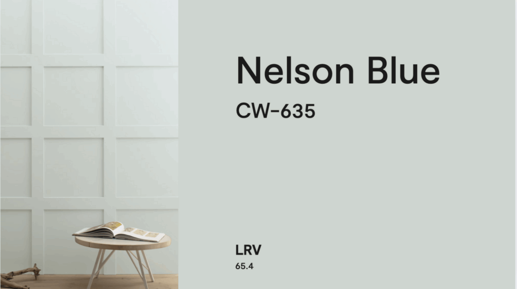
Specifications of Nelson Blue by Benjamin Moore
Before you choose Nelson Blue for your home, it’s helpful to know the technical details. These will guide you in picking the best finish and understanding how the color will look.
- Color Code: CW-635
- Collection: Historical Color Collection
- Finish Options: Available in matte, eggshell, satin, semi-gloss, and more
- RGB: Red 189, Green 213, Blue 210
- HEX Code: #BDD5D2
- Light Reflectance Value (LRV): 65.4 – A light color that reflects a good amount of light
- Undertones: Light blue with soft green and gray hints
- Sheen Tip: Eggshell or satin gives a soft glow without too much shine
With a high LRV, Nelson Blue is great for making rooms feel brighter and bigger. It reflects light well, so it works beautifully in both sunny and darker spaces.
Using Nelson Blue in Your Home
Nelson Blue is light, gentle, and easy to live with. It can be used in many parts of the home to create a calm, stylish look. Here are some of the best ways to use this pretty shade.
Living Rooms
Nelson Blue brings peace and brightness to the living room. I like using it on all the walls to make the room feel larger and more open, but it also works beautifully on just one wall for a soft pop of color.
It looks great with white trim, beige furniture, and natural textures like wood and rattan.
Add soft fabrics like linen curtains and cotton throw pillows to complete the look. This creates a relaxing, coastal-inspired space where everyone can feel at ease.
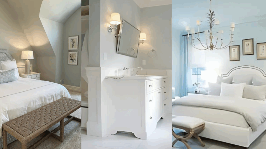
Bedrooms
This color is perfect for bedrooms because of its calming energy. I’ve used it on all four walls to create a soft, cozy feel.
It pairs beautifully with white bedding, light gray rugs, and wood nightstands. For a sweet, layered look, add soft green or pale pink accents.
If you want something a little more playful, Nelson Blue works well with patterned bedding or floral curtains, too.
Bathrooms
Nelson Blue shines in bathrooms. It creates a clean, fresh vibe and looks amazing with white tiles, marble countertops, or silver fixtures.
I like using it on the walls, the vanity, or even just the upper half of the room if I’m going for a two-tone wall look.
This color helps turn any bathroom into a relaxing, spa-like space.
Kitchens
Want a light and cheerful kitchen? Nelson Blue is a great pick. I’ve used it on upper cabinets, an island, and even a breakfast nook wall to add just enough color.
It pairs well with white or light wood cabinets, gold hardware, and soft gray or beige countertops.
If you have a farmhouse or coastal-style kitchen, this color fits right in.
Accent Walls and Furniture
Nelson Blue also works beautifully for accent walls, bookshelves, or painted furniture. I once painted a dresser in this soft blue shade, and it instantly became a stylish focal point without being too bold.
If you’re not ready to paint a full room, adding just a piece or two in Nelson Blue is a fun and simple way to try it out.
Colors to Pair With Nelson Blue
Nelson Blue is soft, airy, and balanced, so it’s easy to pair with other colors. Whether you like warm tones or cool shades, you have lots of options.
Whites and Off-Whites: Crisp white and creamy off-white make great partners for Nelson Blue. These colors help keep the space feeling fresh and open. Use them on trim, ceilings, or furniture to balance the blue.
Light Grays and Beiges: Cool grays and warm beiges both pair nicely with Nelson Blue. These neutrals keep the space grounded and create a peaceful, natural palette. Try using gray curtains, a beige couch, or a stone-gray rug.
Soft Greens and Sage: Since Nelson Blue has a hint of green, it pairs beautifully with other soft greens like sage, mint, or moss. These color combos feel very calm and earthy.
Warm Wood and Natural Materials: Wood accents bring warmth to balance the coolness of Nelson Blue. Light oak, rattan, bamboo, or warm walnut furniture adds texture and comfort. These materials create a cozy, beachy feel that works well in family spaces.
Blush, Peach, or Coral Accents: If you want to add a bit of fun, blush pink or coral brings energy without clashing. These colors work well in bedrooms, nurseries, or even living rooms. Try adding these colors through pillows, art, or small decor items.
Navy and Dark Blues: For more contrast, pair Nelson Blue with navy or indigo. This creates a fresh look that’s bold but still calming. Try using darker blues in rugs, curtains, or large furniture pieces.
Nelson Blue vs Similar Shades
There are many soft blue paints to choose from, each with its own personality. Nelson Blue stands out with its airy feel and gentle undertones, but how does it compare to other favorites?
| Paint Color | Main Undertones | Color Depth | Best For |
|---|---|---|---|
| Nelson Blue | Blue with green and gray | Light and crisp | Brightening small or dark spaces |
| Palladian Blue | Green-blue, warmer tone | Light, slightly warmer | Warmer, relaxed spaces |
| Woodlawn Blue | Blue-gray, more muted | Medium, dusty | Calm, muted rooms |
| Beach Glass | Green-gray, earthy | Medium-light, soft | Natural, beachy rooms |
| Gray Cashmere | Gray with soft blue | Light, soft gray | Neutral, calming spaces |
As you can see, Nelson Blue offers a unique mix of brightness and softness that works beautifully in many spaces.
Whether you want a fresh, beachy feel or a calm, neutral look, it’s a flexible color that fits right in.
Reviews of Nelson Blue (CW-635) by Benjamin Moore
Homeowners love Nelson Blue for its calm, beachy feel. Thanks to its high light reflectance, many say it helps small rooms feel bigger and more open.
It’s a popular choice for bedrooms, bathrooms, nurseries, and anywhere you want to feel peaceful and relaxed.
People also say it’s a great choice for open-concept homes, where one color flows through multiple spaces. It’s soft enough to work everywhere but still has enough color to feel special.
Reviewers often mention how Nelson Blue changes slightly throughout the day. In the morning, it looks bright and clear.
At night, the green and gray tones show up more, giving it a cozy, soft look.
Conclusion
Benjamin Moore Nelson Blue is a soft, pretty blue that brings light, peace, and freshness into your home.
Its hint of green and gray makes it feel natural and balanced, perfect for creating calm, relaxing spaces.
Whether you’re painting a bedroom, bathroom, kitchen, or just a piece of furniture, Nelson Blue offers a timeless look that works with many different styles.
It pairs well with warm woods, crisp whites, soft neutrals, and even brighter pops of color.
Nelson Blue is a wonderful choice if you want a color that feels peaceful, fresh, and easy to live with.
It brings out the best in your home without ever being too bold or too bland, just the right mix of style and comfort.