: The Perfect Bold Blue")
Are you stuck trying to find the perfect blue paint? I’ve been there, too. After using Blue Nova in my own home, I can share what I learned.
In this article, you’ll find:
- What Blue Nova really looks like (not just in fancy photos)
- Which rooms work best with this color
- Colors that match perfectly with it
- How to test it before spending money
I’ve used this paint in different rooms facing north and south. I’ve seen it in morning light and at night. I’ve made mistakes, so you don’t have to. My walls have been Blue Nova for three years now, so I know how it holds up over time.
Let’s find out if this blue is right for your home.
What Kind of Color Is Blue Nova?
Blue Nova (825) is a rich, deep blue with subtle purple undertones. It’s a strong color that makes a statement without being too bright or flashy. I think of it as the color of a twilight sky just as night begins to fall.
I’ve noticed it changes throughout the day. In morning light, the blue tones become clearer and more vibrant. By evening, it takes on a deeper, more mysterious quality, with the purple undertones becoming more apparent.
The color has an LRV (Light Reflectance Value) of approximately 17, placing it in the lower-medium range. This means it absorbs more light than it reflects, creating a sense of depth and richness on walls. The bold aspects of Blue Nova make it great for creating spaces that feel both cozy and dramatic.
What makes Blue Nova stand out is how it adapts to its surroundings. In some spaces, it appears more navy, while in others, the purple aspects become more noticeable. This ability to shift makes it work well in many different settings and with various decor styles.
What Rooms Work Best with Blue Nova?
Blue Nova, with its rich, deep blue tones, can transform various spaces in your home. This versatile color works beautifully in several rooms, each creating a unique atmosphere and aesthetic effect. I’ve seen Blue Nova perform well in various spaces:
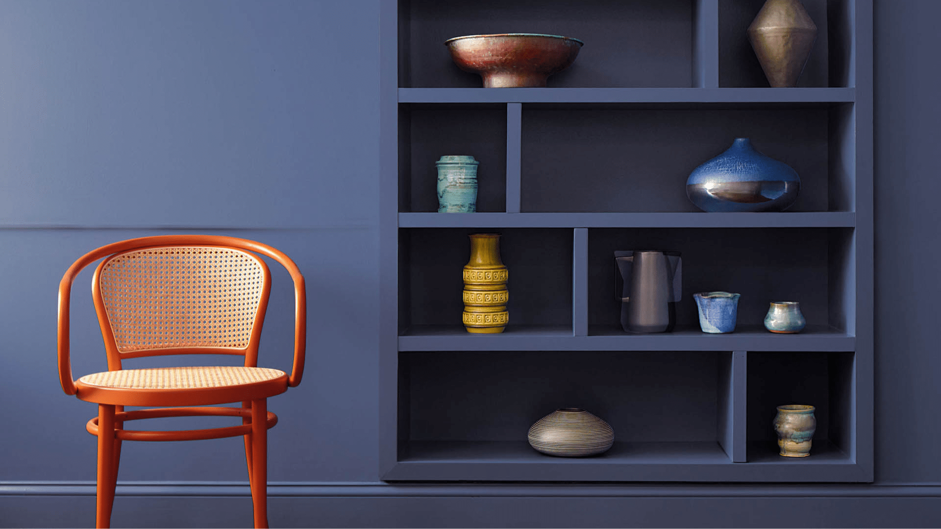
Living Rooms
This color makes living areas feel dramatic without being overwhelming. It creates a bold background that allows light-colored furniture and art to really stand out.
In my living room, Blue Nova walls make the space feel cozy while highlighting my cream sofa and brass accent pieces. The color works well in both large and small living spaces.
In larger rooms, it helps create zones and makes the space feel more intimate. In smaller living areas, paired with strategic lighting, it can add depth and interest without making the room feel cramped.
Dining Rooms
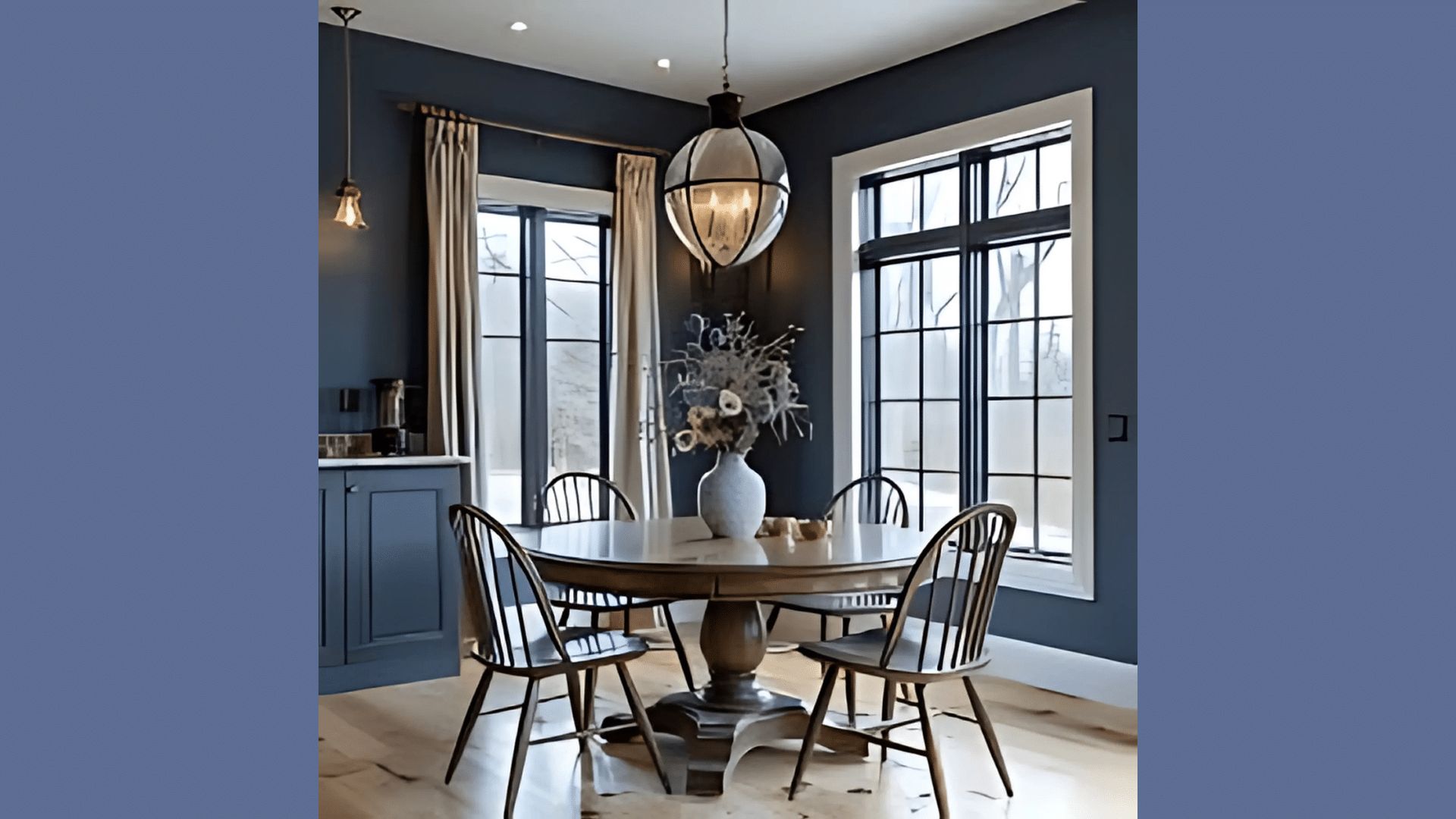
Blue Nova adds drama that makes meal times feel more special. It looks amazing in the evening light, taking on a deep blue-purple glow that makes everyone feel they’re dining somewhere special.
My dining room walls painted in this shade create the perfect backdrop for candlelit dinners. I’ve noticed that guests tend to linger longer at the table in this color room.
The rich blue creates a sense of luxury that enhances the dining experience. It also photographs beautifully during dinner parties, making your social media posts look more professional without any filters.
Bedrooms
The deep blue tones make bedrooms feel peaceful and intimate. This color creates a calming background that helps with relaxation and sleep.
In my guest bedroom, I paired Blue Nova with white bedding and silver accents for a luxurious retreat that feels both fresh and cozy. The color also tends to make bedrooms feel cooler, which can be helpful for sleep quality.
Studies show cooler room environments can improve sleep, and this blue light visually enhances that effect. I’ve found that the room temperature feels about 2 degrees cooler than it actually is because of the psychological impact of the blue walls.
Home Offices
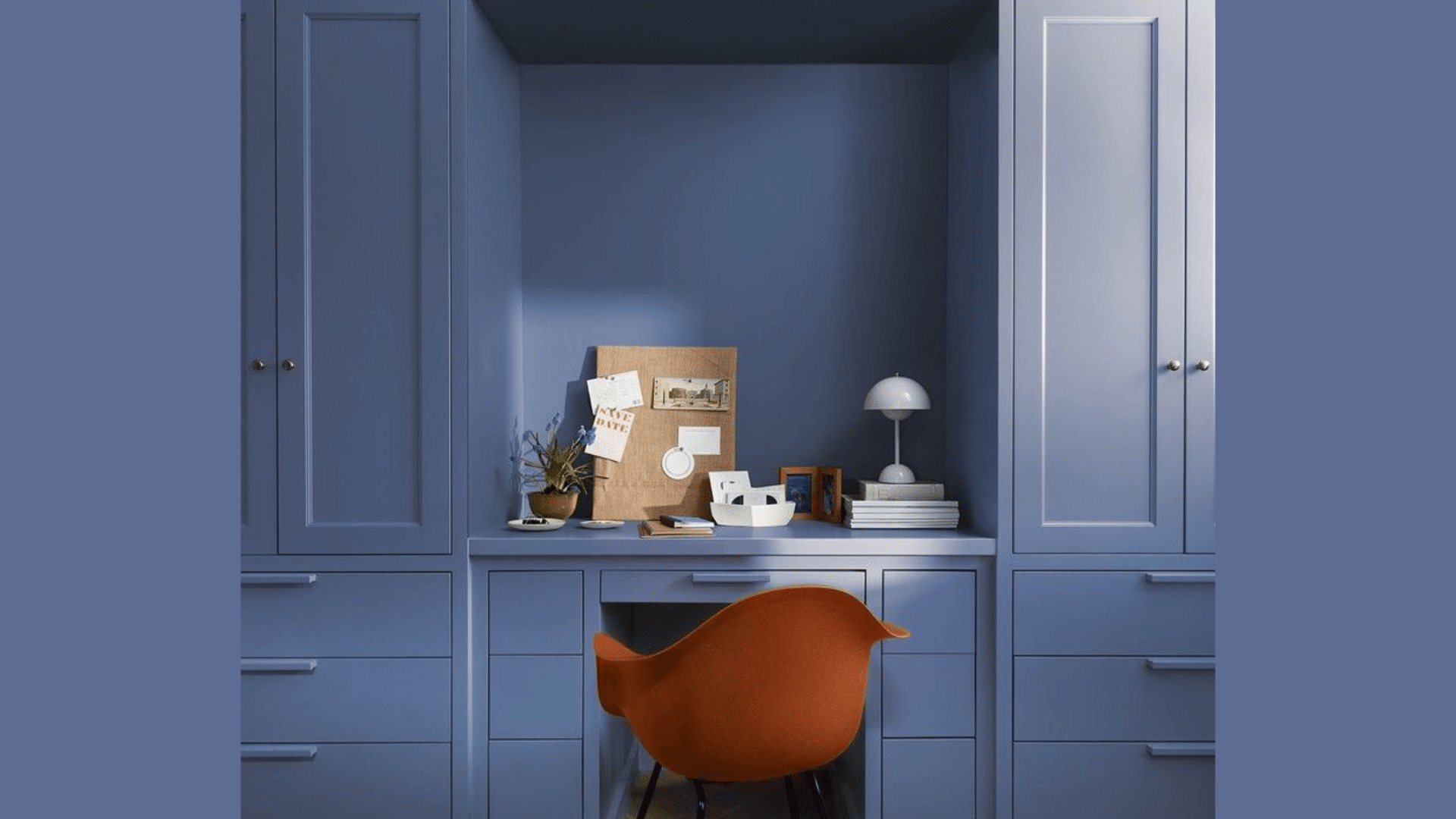
The color helps create focus and concentration. The rich blue feels professional yet interesting for long workdays. I painted an accent wall in my home office in this shade and find it creates the perfect background for video calls while keeping me productive.
Blue Nova is particularly effective in offices that face bright southern light, helping reduce glare and eye strain. The color appears to absorb some of the intensity of direct sunlight, creating a more comfortable work environment.
Powder Rooms
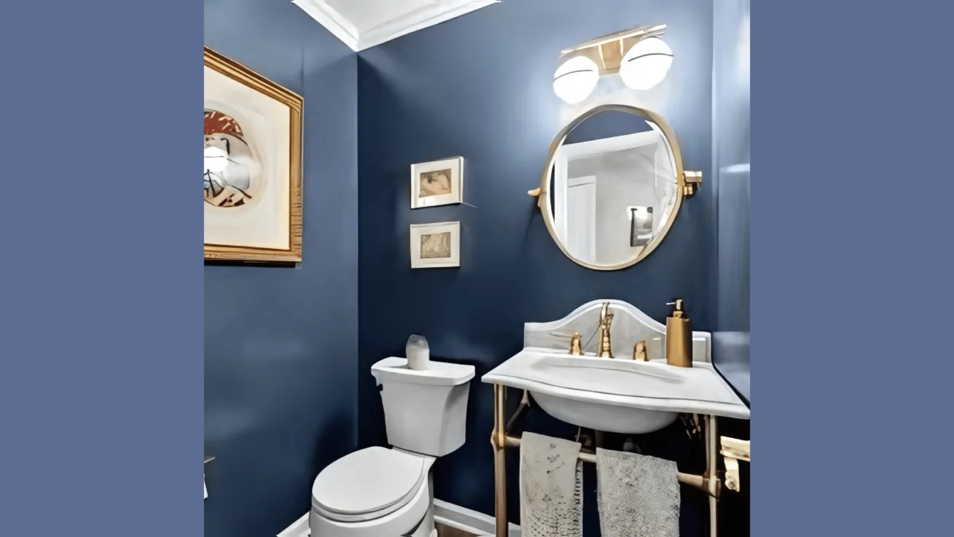
Blue Nova can transform a small powder room into a jewel box. The rich color works well in small spaces with good lighting, making them feel special and custom.
My friend painted her powder room this color with gold fixtures, creating a luxurious space that guests always comment on. The color is particularly effective in windowless powder rooms where you want to create a specific mood rather than relying on natural light.
The deep blue makes artificial lighting stand out more dramatically. In small spaces, it also hides shadows and corners, making the room’s dimensions less obvious and creating a more immersive experience.
What Colors Go Well with Blue Nova?
Blue Nova pairs well with many colors. Here are my top matches:
- Crisp whites: Create beautiful contrast against the deep blue
- Soft grays: Complement the cool undertones beautifully
- Brass and gold: Add warmth and luxury against the cool blue
- Light wood tones: Warm the space while maintaining contrast
- Soft pink: For an unexpected yet harmonious complement
For my bedroom, I combined Blue Nova walls with white trim and light oak furniture. The combination feels fresh and cozy.
What Style Works Well with This Color?
Blue Nova adapts to many design styles. In traditional homes, it highlights architectural details and classic furniture while adding depth and interest.
For modern spaces, it creates drama and a sense of luxury without feeling heavy. In coastal designs, it brings in a nautical feel without being too themed. Most impressively, Blue Nova works well in transitional homes by connecting traditional elements with contemporary pieces.
My own home mixes older items with newer pieces, and this color creates the perfect bold canvas for both. This flexibility makes it a smart choice if you like to change your decor or mix elements from different eras.
Is It a Warm or Cool Color?

Blue Nova is definitely a cool color. The blue-purple undertones give it that cool, calming feeling. I’d describe it as “deeply cool” – not the kind that makes a room feel cold or unwelcoming.
The subtle complexity adds interest to any space while maintaining the calming effects of blue. This balance makes it work well year-round in most homes.
| Characteristic | Blue Nova | What This Means For Your Space |
|---|---|---|
| Temperature | Cool | Creates a calm, sophisticated atmosphere |
| Undertones | Blue-purple | Adds depth without looking too bright |
| Light Reflectance Value | 16.98 | Deeper tone that creates drama while still having presence |
| Seasonal Feel | Year-round | Works well in both summer and winter settings |
| North vs. South Rooms | Adaptable | Appears more vibrant in south-facing rooms, more moody in north-facing rooms |
How to Test This Color in Your Space?
- Buy a sample: Get a small container of Blue Nova
- Paint a board: Use a 2×2 foot piece of poster board
- Move it around: See how it looks in different locations at different times of day
- Live with it for 3 days: Your first impression might change
When I tested Blue Nova, I was surprised by how different it looked from morning to evening. In my north-facing office, it appeared more navy. In my south-facing bedroom, the purple undertones were more noticeable.
What Paint Finish Should You Choose?
The finish affects how Blue Nova appears on your walls. Here’s what I suggest:
- Flat: Good for ceilings and low-traffic areas
- Matte: My top choice for most walls – the deep color looks rich without reflection
- Eggshell: This works in kitchens and bathrooms where you need to clean walls
- Satin: Adds a slight sheen, could make the color look lighter than expected
- Semi-gloss: Too shiny for Blue Nova walls, but works for doors and window frames
I used matte in my bedroom and eggshell in my bathroom. The eggshell finish makes cleaning easier without adding too much shine that would change how the color looks.
Real Home Ideas Using Blue Nova
I’ve gathered these ideas from my own home and friends’ houses:
- Accent wall: Blue Nova creates a focal point behind a bed or sofa
- Built-ins and bookcases: Painted in Blue Nova to add depth and interest
- Furniture: A dresser or cabinet painted this shade makes a statement
- Ceiling: Painted in Blue Nova with light walls for an unexpected touch of drama
- Kitchen island: An island in this color with white cabinets creates a custom look
My friend painted all her built-in bookcases Blue Nova with the walls in a soft gray, creating a custom look that highlights her book collection. It looks amazing and has inspired me to think about using it in more areas of my home.
Mistakes to Avoid
I’ve made some mistakes with this color. Learn from my experience:
- Using yellow-toned lighting with Blue Nova – Incandescent bulbs can make this color look muddy. Stick with cool white or daylight bulbs (3500-5000K) to showcase its true blue-purple beauty.
- Not getting enough paint – This deep color often needs three coats for full coverage, especially over lighter colors. Buy more than you think you’ll need.
- Not testing in your actual space – This color changes with lighting conditions. I was surprised how different it looked in my north-facing office versus my south-facing bedroom. Always test a large sample in your own space.
- Using only blue accents – This creates a room that feels one-dimensional. Mix in whites, metallics, and warm wood tones for depth and interest.
- Expecting it to look exactly like online photos – Every screen shows colors differently, and professional images are often edited. The only way to know how it will look in your home is to test it yourself.
Why People Like Blue Nova?
Blue Nova has become a favorite color for many homeowners, and I can see why. Its rich depth creates spaces with personality while still feeling livable. People like it because it’s not a typical navy – it has complexity without being hard to use.
The color creates dramatic spaces that still feel comfortable. It works with many decorating styles and doesn’t date quickly like trendier colors might. Whether in natural or artificial light, it maintains its character while shifting subtly throughout the day, keeping spaces interesting.
Is Blue Nova Right for Your Home?
Blue Nova creates spaces that feel both dramatic and peaceful at the same time. After using this color in multiple rooms over several years, I’m still happy with my choice. What makes it stand out is how it shifts throughout the day while maintaining its rich blue character.
It’s not a color that fades into the background. Instead, it creates a backdrop that makes your furniture and decor pop. This confident presence explains why it remains popular year after year.
In a world of safe neutrals, Blue Nova offers character and depth. It works with traditional, modern, and everything in between. Is it bold? Definitely, but it creates beautiful, livable spaces that feel unique and personal—and that’s what truly matters.
Frequently Asked Questions
Will Blue Nova Make a Room Feel Smaller?
Not if you use it right. Pair it with light trim, good lighting, and mirrors to keep the space feeling open while still enjoying the rich blue color.
How Many Coats of Blue Nova Will I Need?
Plan for at least two, possibly three coats. This deep color needs proper coverage, especially if you’re painting over a lighter shade.
Does Blue Nova Work in Rooms with Limited Natural Light?
Yes, but choose your lighting carefully. Use warm white bulbs (2700-3000K) to bring out the richness without making the space feel gloomy.
How Do Seasonal Changes Affect How Blue Nova Looks?
Summer light brings out more of the purple undertones, while winter light tends to make it appear more navy, so expect some seasonal variation.
Is Blue Nova a Trendy Color that Will Look Dated Soon?
No, it has staying power. Deep blues have been used in interiors for centuries, making Blue Nova a modern classic rather than a passing trend.