")
Looking for the perfect white paint for your home? Maritime White by Benjamin Moore might be your answer.
In this guide, you’ll learn:
- What makes Maritime White different from other whites
- Which rooms it works best in
- Color combinations that make it shine
- Simple ways to use it in your home
I’ve used Maritime White in over 25 homes over the years. These aren’t theories – they’re real results from actual projects. Finding the right white is difficult.
Some are too stark, others look yellow, and many show odd undertones. Maritime White solves these problems with its balanced tone and subtle warmth.
Let me help you decide if this flexible white is right for your space.
The True Character of Maritime White: What You Should Know
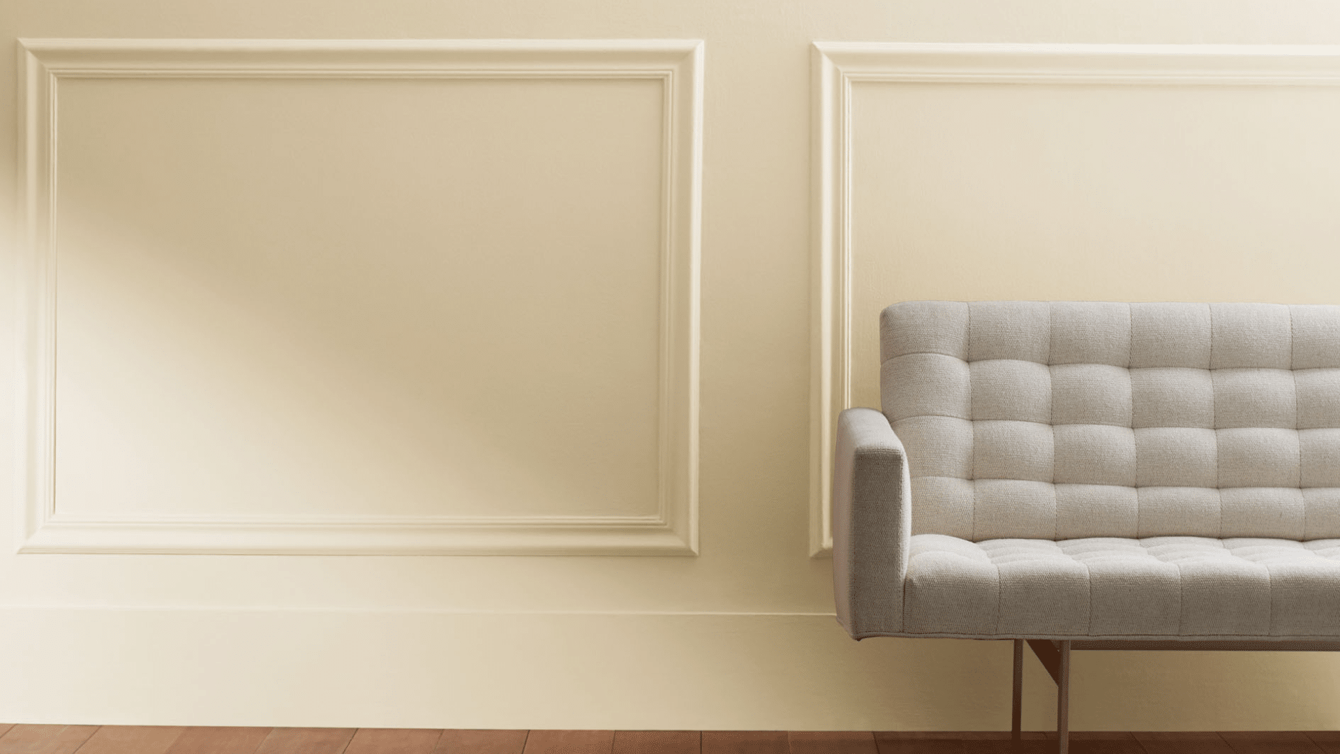
Maritime White (OC-5) is a soft, creamy white with subtle, warm yellow undertones. It’s not stark or harsh. Instead, it has a gentle depth that adds warmth to any room.
The color reminds me of fresh sea foam – clean but with hidden complexity. Unlike some whites that look too clinical or turn too yellow, Maritime White maintains its soft quality in various lighting situations.
This paint has good coverage and typically needs two coats. It works well on walls, trim, cabinets, and furniture, creating a smooth, natural finish on each surface.
What about the technical details? Maritime White has an LRV (Light Reflectance Value) of 71.6, placing it in the medium-high range.
This means it reflects a good amount of light to keep rooms feeling open and bright while still providing noticeable warmth. It belongs to Benjamin Moore’s Off-White Collection, which features timeless shades that work in many settings.
Many homeowners appreciate that Maritime White is available in multiple finishes. I typically recommend eggshell for living spaces, semi-gloss for trim and doors, and matte for bedrooms where a softer look is desired.
The Mood of Maritime White: How This Soft Color Changes a Space

Maritime White creates a feeling of openness mixed with comfort. When I painted my dining room with this color, the space felt both airy and welcoming.
This white makes spaces feel:
- Open without being cold
- Warm and inviting
- Fresh without feeling stark
- Peaceful and balanced
Large rooms with Maritime White walls feel bright and expansive, while small spaces gain light and openness rather than feeling cramped. This color makes rooms feel clean and thoughtful without being clinical.
Where to Use Maritime White in Your Home for a Bright Look?
I’ve found Maritime White works best in these areas:
- Living rooms: Create an open, welcoming setting
- Bedrooms: Promote a clean, restful space
- Home offices: Helps with focus without being too stark
- Kitchen cabinets: Add soft brightness that isn’t harsh
- Bathrooms: Makes small spaces feel larger
This color also looks fantastic on ceiling and trim, where it adds subtle dimension without stark contrast. I once painted a client’s entire living space with Maritime White, and it transformed the home into a bright, cohesive retreat.
What Flooring Looks Best with Maritime White Walls?
From my projects, these floors pair nicely with Maritime White:
- Dark walnut: Creates a beautiful contrast that feels grounded
- Light oak: Extends the bright, open feel
- Medium maple: Brings warmth that complements the soft white
- Natural stone: Adds texture that enhances the coastal feel
- Light gray carpet: Creates a soft, modern look
I find that almost any floor tone works well with Maritime White walls, which is part of its appeal. This flexible white adapts to your existing elements while keeping spaces feeling open.
Color Combinations That Go Well with Maritime White
Maritime White is a crisp, slightly warm white with subtle blue undertones that evokes coastal serenity. Let’s see some excellent color combinations to pair with Maritime White:
1. Benjamin Moore’s Hale Navy (HC-154)

This deep color creates a striking contrast with Maritime White. I like using it on kitchen islands or accent walls. The combination feels fresh and classic.
For a timeless look, try Maritime White walls with Hale Navy built-ins or furniture. This pairing works wonderfully in spaces with good natural light, as the white brightens the room while the navy adds depth.
2. Benjamin Moore’s Stonington Gray (HC-170)

This versatile gray creates a subtle palette with Maritime White. It’s calming and creates a gentle contrast. The combination feels modern and clean while still being very livable.
I love using Stonington Gray on adjacent walls to Maritime White for an understated, sophisticated look—the slight blue undertones in this gray work beautifully with the warm yellow undertones in Maritime White.
3. Benjamin Moore’s Soft Fern (2144-40)

This muted green creates an organic palette with Maritime White. The combination feels natural and balanced. I’ve used this in spaces where the green in furniture or accent walls adds life to white surroundings.
Soft Fern has just enough gray to complement Maritime White without competing with it. This pairing creates a fresh, nature-inspired palette.
4. Benjamin Moore’s Manchester Tan (HC-81)

This warm neutral brings more warmth to Maritime White, making the combination cozy and balanced.
I’ve used it in living spaces where beige furniture or textiles add depth to white walls. Manchester Tan’s warmth enhances Maritime White’s yellow undertones, creating a soft, timeless palette.
5. Benjamin Moore’s Kendall Charcoal (HC-166)

This deep gray creates bold contrast with Maritime White. I’ve used this combination in dining rooms and offices where the charcoal accents add substance and depth.
It creates a modern, clean look. Try using Kendall Charcoal on a single accent wall with Maritime White on the remaining walls, or incorporate charcoal through furniture pieces against Maritime White walls.
6. Benjamin Moore’s Breath of Fresh Air (806)

This light blue creates a coastal, airy palette with Maritime White. The combination feels clean and bright while maintaining a calm, cohesive feel.
Breath of Fresh Air has a subtle gray quality that connects well with Maritime White. This pairing works perfectly for creating a beach-inspired space. I often use this combination in bedrooms or bathrooms.
7. Benjamin Moore’s Black Satin (2131-10)

A true black creates a dramatic contrast with Maritime White. The combination feels bold yet clean. This works especially well in spaces where you want a modern, graphic feel.
In contemporary homes, this pairing creates a timeless look that doesn’t feel trendy. The black adds definition and structure to the soft white.
8. Benjamin Moore’s Sienna (2092-20)

For a warm, earthy palette, terracotta and Maritime White work beautifully together. The warmth complements the white’s yellow undertones.
This pairing works especially well in spaces with natural materials and textures. I love using Sienna as an accent color through accessories or artwork against Maritime White walls. This combination has a Mediterranean feel.
9. Benjamin Moore’s Salamander (2050-10)

This rich color creates beautiful depth with Maritime White. The combination feels bold yet balanced. I’ve used this in living rooms where teal furniture against Maritime White walls creates interest without being too much.
Salamander adds sophistication to Maritime White’s clean simplicity. For a fresh look, try using teal on an accent piece with Maritime White walls.
10. Benjamin Moore’s Rose Accent (1177)

Not a paint color, but bronze or brass metals look amazing with Maritime White. The warmth of these metals stands out beautifully against the soft white, adding life and interest to the space.
Try incorporating brushed brass light fixtures, cabinet hardware, or picture frames in a Maritime White room. The metallic elements add a touch of warmth without being too strong.
Simple Ways to Use Maritime White in Your Home
- Paint just the trim and ceilings for a clean look
- Use it on kitchen cabinets with dark countertops
- Try it on interior doors for a fresh update
- Use it for bathroom vanities to add bright, clean color
In my own home, I painted built-in bookcases with Maritime White. They became standout pieces that added clean lines to my more colorful living room.
Maritime White for specific projects: I’ve found this color particularly successful for several small projects.
For a client with an outdated dining set, we painted the table Maritime White while keeping the chairs in a contrasting color. The result was a custom look that felt both modern and timeless.
For those wanting to start even smaller, try painting picture frames or mirror frames with Maritime White. The color adds a clean backdrop for artwork without being too stark.
One creative homeowner even painted their kitchen open shelving with Maritime White while keeping the lower cabinets a deep navy – the effect was stunning!
Maritime White vs. Other Whites: What Sets It Apart
I’ve worked with many white paints. Let’s see how Maritime White compares to other popular whites:
| Color | Undertones | Best Uses | Room Types | What Makes It Different |
|---|---|---|---|---|
| Maritime White (OC-5) | Warm yellow | Full rooms, trim | Living rooms, bedrooms | Balanced warmth without being too stark |
| Simply White (OC-117) | Subtle yellow | Trim, cabinets | Kitchens, sunrooms | Much brighter and cleaner than Maritime White |
| White Dove (OC-17) | Warm gray | Full rooms, trim | Bedrooms, bathrooms | More gray undertones than Maritime White |
| Chantilly Lace (OC-65) | Minimal/neutral | Trim, modern spaces | Dining rooms, offices | Much cleaner, brighter, and more neutral than Maritime White |
| Cloud White (OC-130) | Subtle warm | Full rooms, trim | Living rooms, kitchens | Similar but less yellow than Maritime White |
What makes Maritime White special is its balanced undertones without looking too yellow or too stark.
It has character but isn’t tricky like some whites with strong undertones. I’ve seen homes where this color has looked good for many years without feeling dated.
How Maritime White Changes with Lighting?
This color shifts subtly with light. Here’s how it appears in different exposures:
- North-facing rooms: Can appear slightly cooler but still maintain its warmth
- South-facing rooms: Warmth becomes more pronounced, may show more yellow undertones
- East-facing rooms: Appears balanced in the morning, somewhat cooler in the afternoon
- West-facing rooms: More neutral in the morning, warmer and creamier as the day progresses
In rooms with lots of natural light, Maritime White maintains its clean character. In darker spaces, it can read as more muted. I always test it in different parts of a room before committing.
Design Styles that Work Well with Maritime White
Maritime White is flexible across many styles:
- Coastal: Perfect with blue accents and natural textures
- Modern Farmhouse: Works beautifully with black hardware and wood tones
- Transitional: Adds clean brightness to mixed material palettes
- Scandinavian: Complements light woods and clean lines
- Traditional: Pairs well with classic elements for timeless appeal
I wouldn’t use it in spaces where you want very stark, clinical white. But for adding soft, clean color, it’s excellent.
Conclusion
After testing over 40 white paints in the past eight years, Maritime White remains one of my top recommendations. It hits the sweet spot – clean without being too stark, warm without being too yellow-tinted.
What makes Maritime White special is its flexibility. I’ve used it in both modern apartments and historic homes with equal success. It adapts to almost any style. Always test before committing! Paint a large board and check it in your space at different times of day.
Don’t be afraid of its warm yellow undertones – that’s its best feature. Pair it with blues for contrast or warm woods for harmony.
Maritime White creates spaces that feel both current and timeless. It’s not a passing trend but a lasting choice that will enhance your home for years to come.
Frequently Asked Questions
Does Maritime White Work in Rooms with Limited Natural Light?
Yes, it works quite well. In low-light spaces, Maritime White helps brighten the room while providing a soft, warm glow rather than looking dingy or gray like some brighter whites can.
How Does Maritime White Change with North versus South Exposure?
In north-facing rooms, Maritime White appears slightly cooler but maintains its soft warmth. In south-facing rooms, the color becomes brighter and shows more of its warm qualities throughout the day.
Can Maritime White Work for Exterior Trim?
Absolutely! I’ve used it on several home exteriors, where it creates a clean, fresh look without the harshness of pure white. It pairs particularly well with gray, blue, or green siding.
How Long Does Maritime White Stay Relevant Before Looking Dated?
Maritime White has excellent staying power. Unlike trendy stark whites or very yellow creams, this balanced white has remained popular for many years due to its versatility and subtle warmth.