 Exterior Review")
Gauntlet Gray has quickly become a top choice for home exteriors across neighborhoods nationwide. This medium-dark neutral brings a rich, moody feel to homes while staying warm and welcoming. Unlike lighter shades that show dirt or bolder colors that limit styling options, Gauntlet Gray offers the perfect balance.
In this honest review, you’ll get:
- A complete breakdown of its color traits and undertones
- Practical pros and cons from actual homeowners
- Tips for matching trim, doors, and landscape elements
I’ve seen this color on dozens of homes across various settings and lighting conditions. My goal? To help you decide if Gauntlet Gray is right for your home without wasting time or money on the wrong choice.
Let’s look at what makes this shade work so well outside and when you might want to consider other options.
What Color Is Gauntlet Gray by Sherwin-Williams?
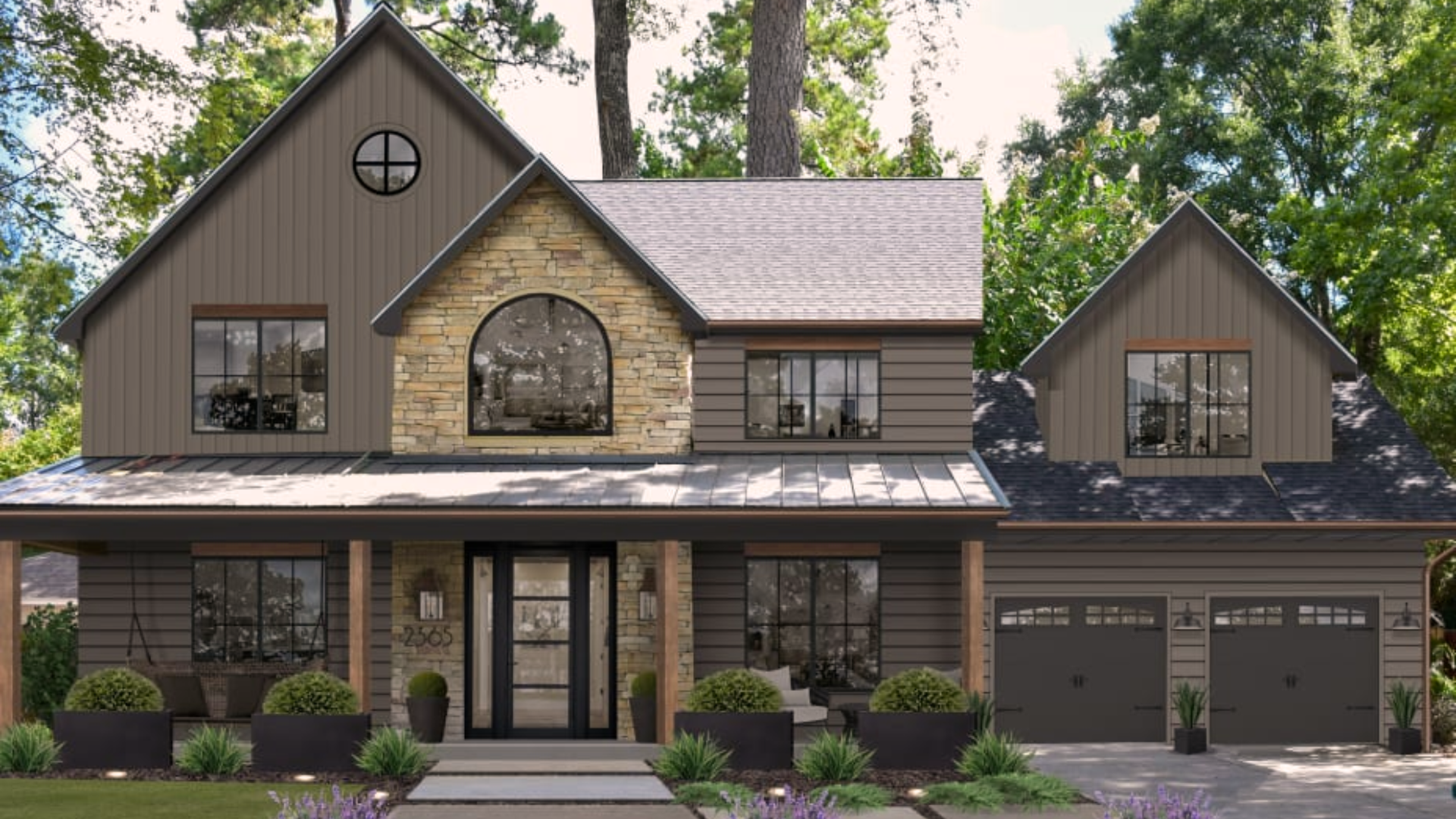
Gauntlet Gray is a deep, rich gray that feels warm and grounded rather than cold or flat. When I first saw this color on homes, I noticed how it stands apart from other grays on the market. This isn’t the chilly, industrial gray you might picture when someone mentions gray paint.
Instead, it has subtle brown undertones that give it depth and character. On the color scale, Gauntlet Gray sits right in the middle range – not too dark and not too light. It’s dark enough to make a statement, but not so dark that it feels heavy or overwhelming on a house.
You might notice it looks different throughout the day. In bright sunlight, it appears lighter and shows its warm side. During cloudy days or in shaded areas, it deepens and feels more classy.
What makes this color special? Its balance. Many grays lean too blue or too green, but Gauntlet Gray stays true to its neutral roots while offering enough warmth to feel inviting. When you see it in person, you’ll notice how it creates a solid, stable look without the harshness of darker shades.
Gauntlet Gray Undertones and Color Profile
Gauntlet Gray has hidden depths that aren’t obvious at first glance. When I study this color closely, I can see subtle brown undertones that warm it up. In certain lights, there’s even a hint of purple that adds richness without being obvious.
These undertones matter a lot for your home’s exterior. Why? They keep the gray from feeling cold or stark against the natural landscape. The warm notes help your house look welcoming rather than harsh.
The color has an LRV (Light Reflectance Value) of 17, which tells you it’s on the darker side of medium. This means it absorbs more light than it reflects, giving it that solid, grounded look.
What does this mean for your home? With its balanced profile, Gauntlet Gray fits many different house styles. I’ve seen it look beautiful on:
- Modern farmhouse exteriors with white trim
- Craftsman homes with natural wood accents
- Traditional two-story with classic details
You’ll notice that this color doesn’t fight with brick, stone, or wood elements. Instead, it lets those materials shine while providing a strong backdrop. When the sun hits it directly, the brown undertones become more visible. In shade, the deeper purple notes might show through.
This subtle shifting makes it more interesting than flat grays that look the same all day. The color stays true across seasons, which is why so many homeowners choose it for long-term satisfaction.
Pros and Cons of Using Gauntlet Gray Outside
After seeing Gauntlet Gray on many different homes, I’ve gathered honest feedback about its strengths and weaknesses. Before you commit to this color, consider these real-world pros and cons:
| PROS | CONS |
|---|---|
| Timeless appeal – This color won’t look dated in a few years like trendy colors might. | Too dark for some settings – On heavily wooded or north-facing lots, it can feel too heavy. |
| Hides dirt and stains – The medium-deep tone masks dust, pollen, and minor marks. | Not ideal with cool trim colors – Its warm undertones can clash with bluish-white or cool gray trim. |
| Looks good on many home styles – From modern to traditional, this color adapts well. | Shows up differently on samples – Small swatches rarely capture how it will look on a large surface. |
| Creates a rich, solid look – Gives your home a substantial, grounded feeling. | Absorbs heat – Like most darker colors, it can make walls slightly warmer in summer. |
| Pairs well with natural materials – Enhances stone, brick, and wood features. | It can feel too dark in winter- In areas with long, gray winters, it might add to the gloomy feel. |
| Makes trim and accents stand out – Creates nice contrast with lighter elements. | Needs the right light – Without good natural light, it can lose its depth and complexity. |
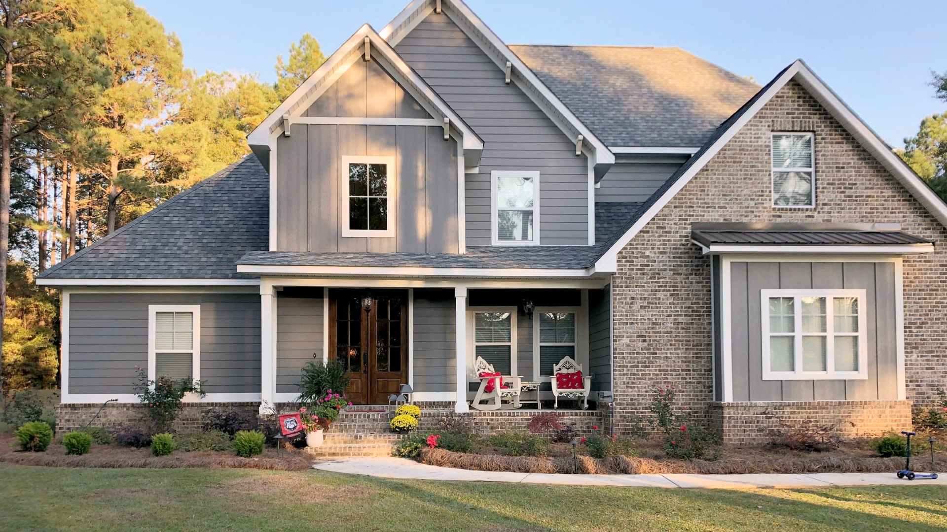
How Gauntlet Gray Looks on Exterior Walls?
Gauntlet Gray shifts and changes depending on where and how you use it. I’ve seen this color on dozens of homes in various settings, and it never looks exactly the same twice. On a full-sun south-facing wall, Gauntlet Gray appears lighter and shows more of its warm undertones.
The bright light brings out the brown notes, making it feel softer than you might expect from a gray. North-facing walls tell a different story. Here, the color deepens and can look almost charcoal in heavy shade. But it never feels cold or unwelcoming – that’s the magic of its balanced formula.
What about different house styles?
On modern homes with clean lines, Gauntlet Gray creates a strong, solid impression. The color feels purposeful and grounded. Traditional homes gain a touch of updated class. The gray is deep enough to feel important but not so dark that it loses the home’s friendly character.
You’ll notice that on larger wall sections, the color appears slightly darker than on smaller areas like gables or around windows. During morning and evening hours, Gauntlet Gray takes on a rich, almost velvety quality. The low-angle light brings out its depth in ways that noon sun doesn’t.
Most striking is how it pairs with landscape elements. Trees, shrubs, and flowers stand out beautifully against this backdrop. The neutral base lets your garden shine while still holding its own. When visitors see homes painted in this shade, they often describe them as stately, classy, and welcoming – never stark or severe.
Best Exterior Materials for Gauntlet Gray
1. Stone Pairings
I’ve seen Gauntlet Gray work wonders with stone accents, especially those with warm undertones. Natural limestone or fieldstone with tan, beige, or soft gray tones creates a perfect match. The paint color seems to pull out the subtle colors hidden in the stone.
You might notice how the gray enhances rather than competes with the natural texture. This pairing feels intentional and thought-out, not random or forced.
2. Brick Combinations
Brick and Gauntlet Gray form a strong team, particularly with warmer brick tones. Red brick, orange-toned brick, and even whitewashed brick all stand out nicely against this gray.
What I find most interesting is how the gray background makes the natural variations in brick more noticeable. Your brick features will gain more visual impact with this color behind them.
3. Wood Siding Applications
Wood siding takes on new life next to Gauntlet Gray. Cedar shakes, board and batten, or traditional clapboard all gain depth and character.
The contrast between the painted surfaces and natural or stained wood creates a rich, layered look. This works especially well for craftsman, farmhouse, or lodge-style homes where wood plays a key role.
4. Stucco Surfaces
On stucco, Gauntlet Gray shows off its smooth, velvety quality. The color adds weight and substance to this material, helping your home look solid and well-built.
You’ll find that the slight texture of stucco catches light in ways that bring out the color’s complexity. This pairing works in both traditional and more modern architectural styles.
5. Less Successful Pairings
Not every material brings out the best in this color. Very cool-toned materials like bluish stone or slate can create an unintended clash. The warm undertones in Gauntlet Gray might fight with these cooler elements.
Highly glossy or reflective materials can also create an odd contrast. The depth of Gauntlet Gray works better with materials that have some texture or a matte finish.
Lighting Effects on Gauntlet Gray Exteriors
Natural light changes everything when it comes to Gauntlet Gray. I’ve watched this color shift throughout the day on many homes, and the transformation can be quite striking. In direct morning sunlight, Gauntlet Gray wakes up with a warm glow.
The early rays bring out those hidden brown undertones, making the color feel friendly and welcoming. Your home will look softer and more approachable during these hours. Midday sun shows the most true-to-swatch version of the color. It appears as a solid, medium-deep gray with balanced undertones.
This is when you’ll see the color at its most accurate. Late afternoon light creates magic with Gauntlet Gray. As the sun lowers, the color deepens and takes on a rich, almost velvety quality. The golden hour light pulls out warmth you might not notice at other times.
On cloudy days, expect a different personality altogether. Without direct sunlight, Gauntlet Gray becomes more serious and substantial. The color feels deeper, more grounded, and slightly moodier.
Shadows cast by trees, overhangs, or nearby buildings will also darken the appearance. Areas under deep porches or heavily shaded walls can look almost charcoal in tone.
Before you commit to painting your entire house, try these simple testing tips:
- Paint a 2×2-foot sample board and move it around different areas of your home
- Check the color at different times of day (morning, noon, afternoon, dusk)
- Look at the sample during both sunny and cloudy weather
- Place the sample near existing elements (stone, brick, roof) to check compatibility
You’ll be surprised how different the same color can look as you move it from the front of your house to the back, or from a sunny spot to a shaded area.
Gauntlet Gray vs. Other Popular Exterior Grays
When choosing the right gray for your home, it helps to see how Gauntlet Gray compares to other well-liked options. I’ve seen all these colors on different houses and can share how they truly look side by side:
| COLOR COMPARISON | APPEARANCE | UNDERTONES | BEST FOR |
|---|---|---|---|
| Gauntlet Gray (SW-7019) | Medium-dark, balanced gray | Subtle brown and a hint of purple | Homes needing substance without heaviness |
| Dovetail (SW-7018) | Softer, lighter than Gauntlet Gray | More visible taupe undertones | When you want gray but fear going too dark |
| Peppercorn (SW-7674) | Notably darker than Gauntlet Gray | Slight blue-purple undertones | Making a bold statement or accent walls |
| Chelsea Gray (SW-2850) | Slightly lighter than Gauntlet Gray | Warmer with more visible brown | Traditional homes seeking timeless warmth |
Which should you choose? If your home gets plenty of natural light and you want a color with presence that isn’t overwhelming, Gauntlet Gray hits the sweet spot.
Pick Dovetail if you love the character of Gauntlet Gray but worry it might be too dark for your setting. It’s like a lighter, softer version of the same color family. Choose Peppercorn when you want to make a stronger statement or for accent areas like front doors or shutters.
Just know it will look quite dark, especially in shaded areas. Go with Chelsea Gray if your home has lots of warm elements like wood or brick, and you want a gray that leans more into the brown territory.
The most common mistake I see? People are choosing a gray that’s too light for exteriors. Remember that colors look much lighter outside than they do on small sample cards. Gauntlet Gray often appears just right outdoors, while lighter grays can look washed out.
Conclusion
Gauntlet Gray offers something special that many exterior colors miss – depth without darkness, character without complication. After reviewing countless homes wearing this shade, I’m convinced it deserves its popularity.
What makes it work so well? Its balance. Not too light that it looks flat, not too dark that it feels heavy. The color provides just enough richness to give your home personality while staying practical for everyday life.
Before you commit, please test it properly. Paint a large board, move it around your property at different times of day, and live with it for a week. This small step saves both money and headaches.
Remember that the perfect gray looks different for each home. Your lighting, surroundings, and existing elements all matter. Trust your eyes over any review – including mine!
If you want a timeless, adaptable gray with staying power, Gauntlet Gray deserves your consideration.